Popcorn Packaging Design

Avni Jain

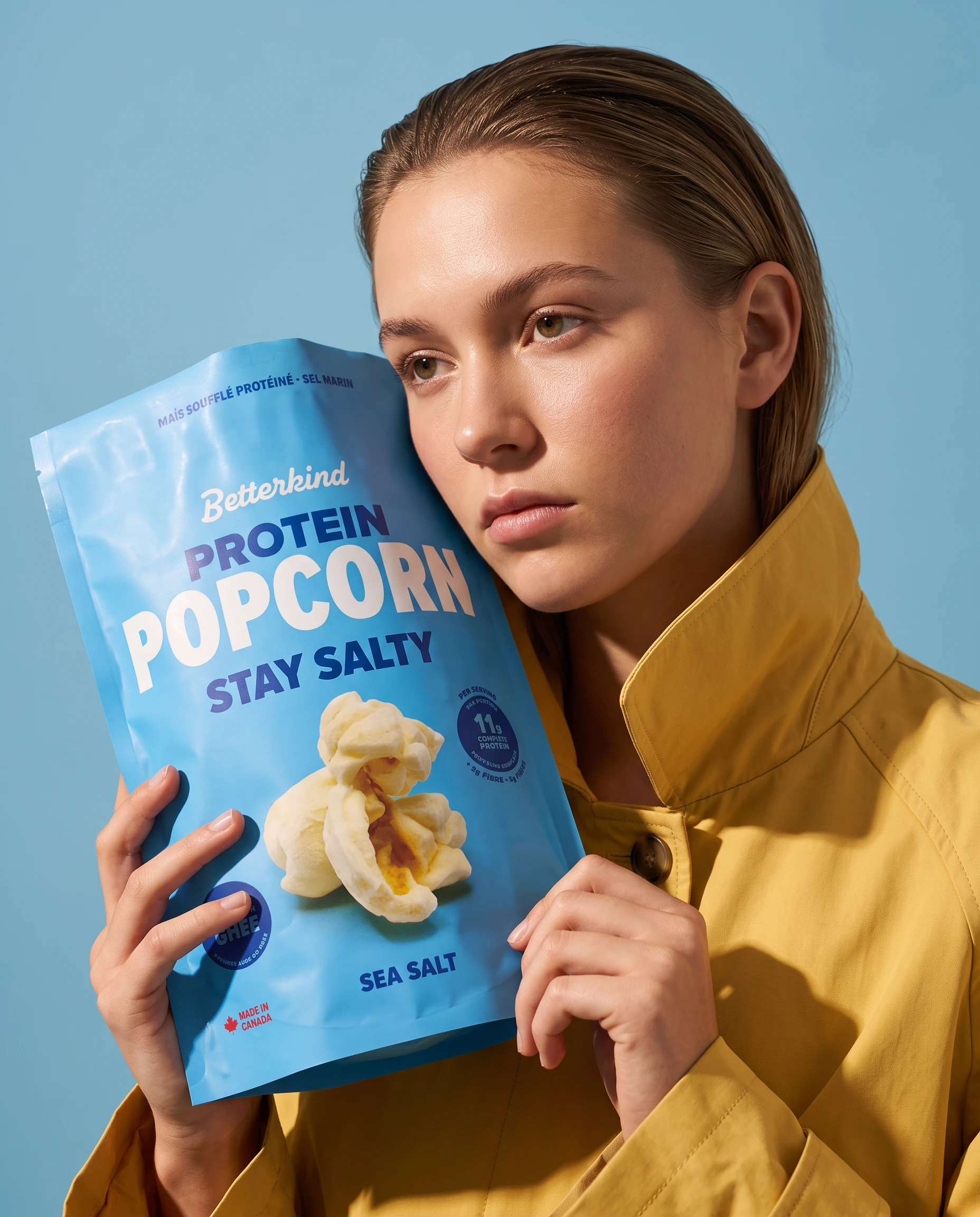
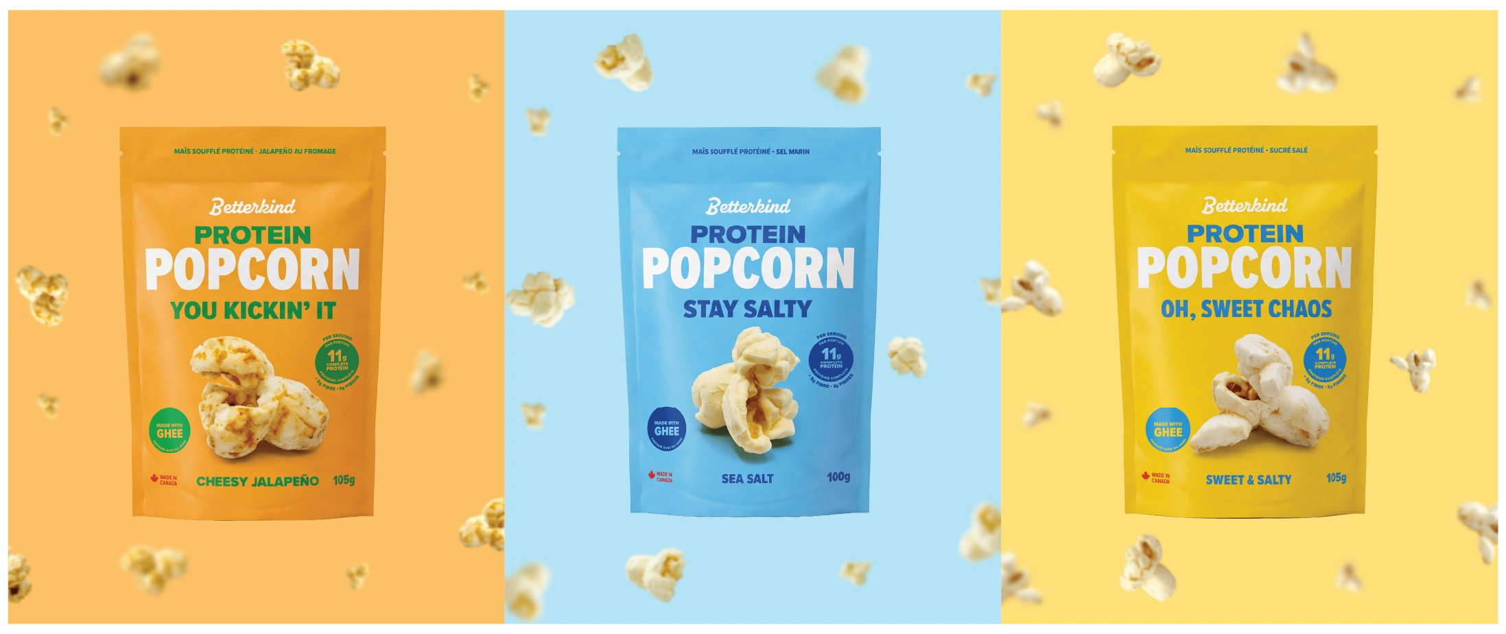
Designing a packaging system for Betterkind Protein Popcorn, putting a giant popcorn front and centre to own shelf attention. The oversized kernel becomes the hero, turning a familiar snack into an unmistakable visual cue that cuts through crowded shelves before the pack is even picked up.
Built around bold colour blocking, playful copy, and a confident typographic hierarchy create instant recognition across the range, making flavour differentiation quick without sacrificing consistency.
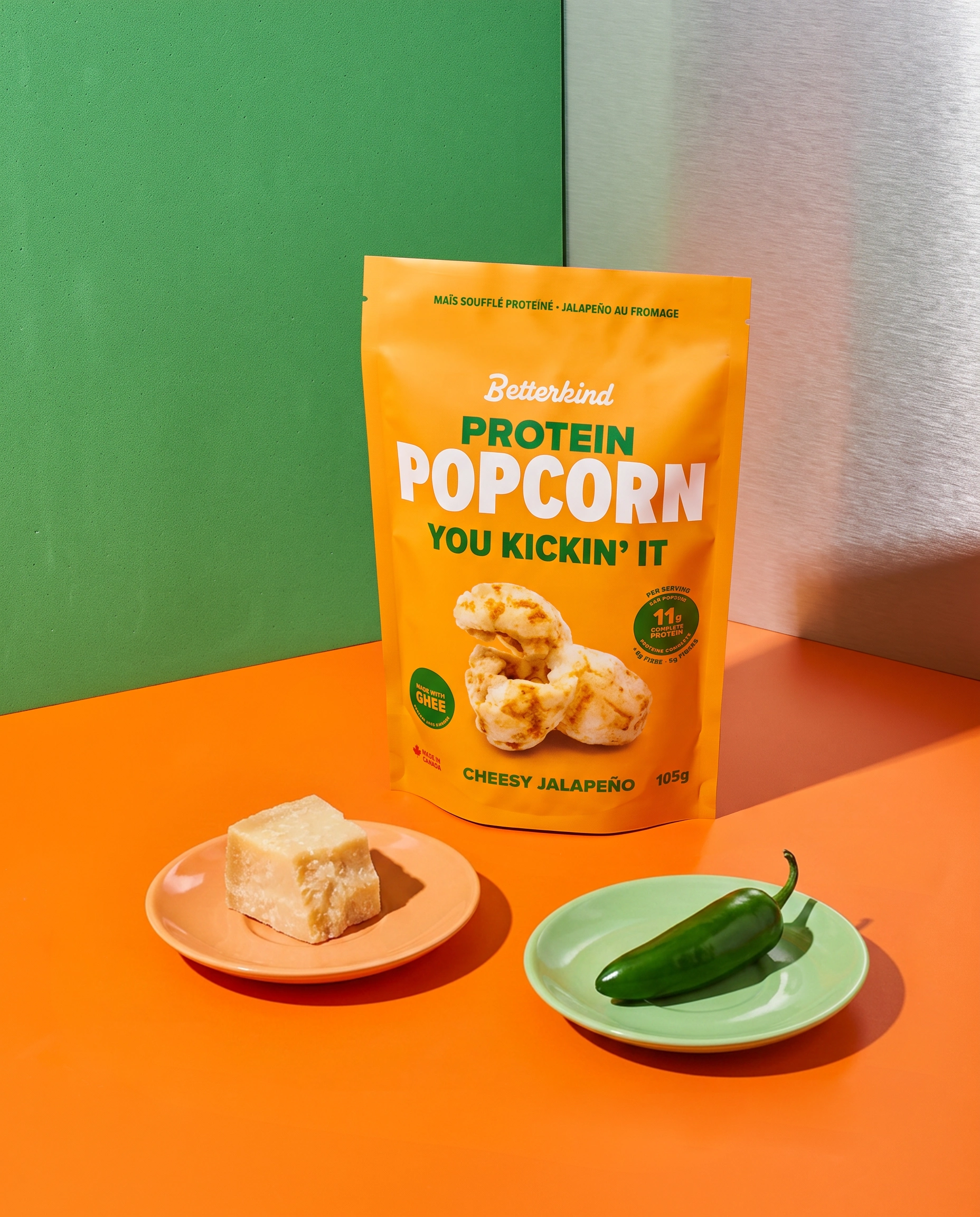
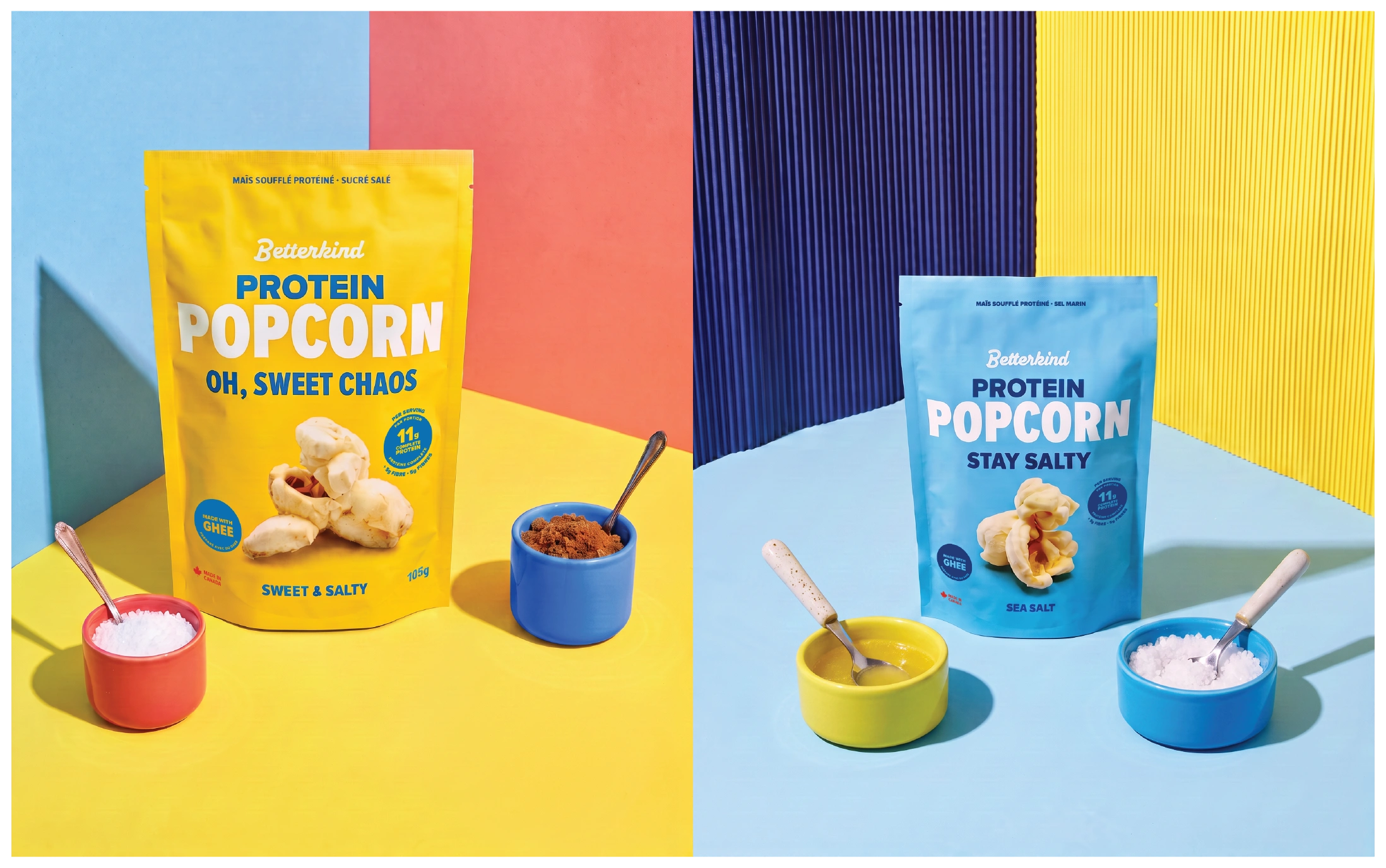
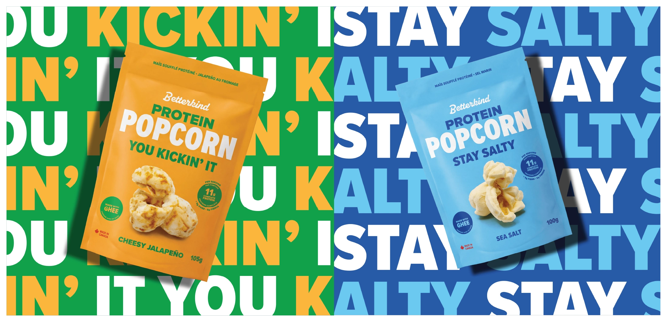
The design balances indulgence with a contemporary health-food appeal, giving protein popcorn a louder and a more approachable presence. Small functional details, from nutrition callouts to flavour labels, are integrated into the composition without competing with the main graphic gesture. The result is a packaging system that feels energetic and memorable.
Like this project
Posted Sep 16, 2026
Designing a packaging system for Betterkind Protein Popcorn, putting a giant popcorn front and centre with bold colours & typography to own shelf attention.
Likes
0
Views
4