Caterpillar | Hero-Redesign
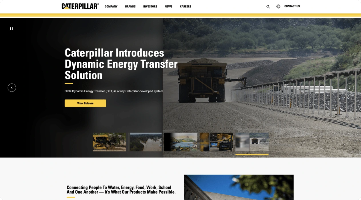
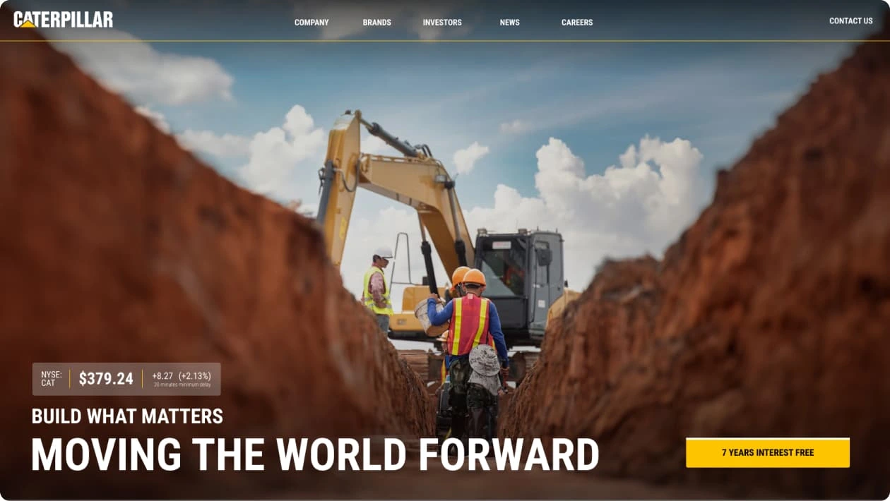


The challenge was finding an image that wasn't typical. I love choosing images that lend themselves to motion. Where sand is being kicked up in the air or something is causing your eye to move.
I learned this through @BrimhallAaron courses back in the day. He's an amazing photographer, go check him out.. you won't regret it. Although, I did find a crane kicking sand up in the air, it still didn't convey a message that I believe @CaterpillarInc Inc. wants to show the world.
Blessed by the design gods, I landed on this image on the right. (vertical , used @Photoshop for generative fill). Leading lines, taking you exactly where I want you.. looking at the synergy between a worker and his equipment and the result of it all right in your face.
Whoever took this pic... wow. What a vision. Blue skies were also important. I didn't want a gloomy day, orange sky or anything that didn't speak to a good day. Now, for the heading, I see a lot of public companies having their first hero title talk about some new advancement layered with 2 more slideshows.
Unfortunately, it's boring and doesn't get the user excited about the brand. After all, this page is going to show investors why this company is great. And if you don't do that on the hero section... welll.. yeah.
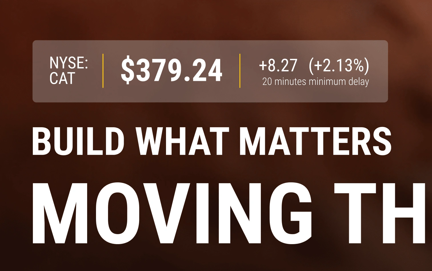
With this new heading, I wanted to inspire and uplift. With the UI, I kept it minimal so that it could sliggghtly blend into the image without loosing context. And my favorite part, the stock ticker. Hey mom, I did that!
Link to view all before & afters
Like this project
Posted Nov 1, 2024
I revitalized Caterpillar's hero section by implementing a bold, cinematic layout featuring their machinery in action, adding dynamic stock ticker integration.
Likes
6
Views
213

