Brand Identity Development for MXTC
Adrian Rovina
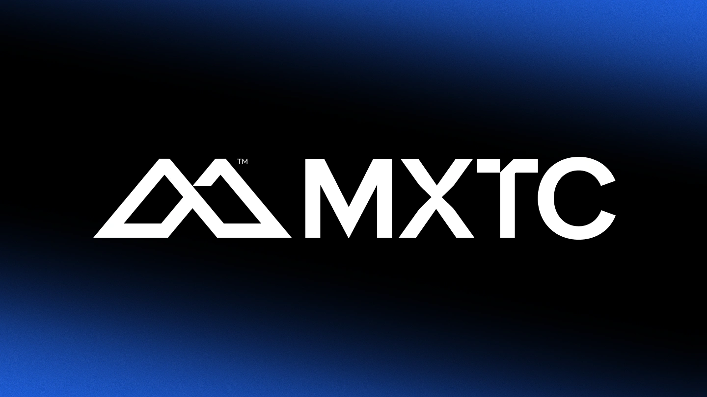
Meet MXTC,
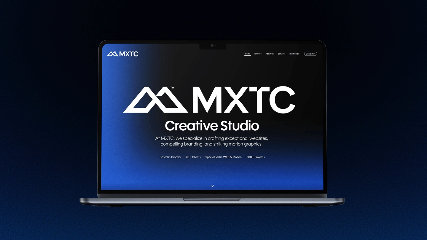
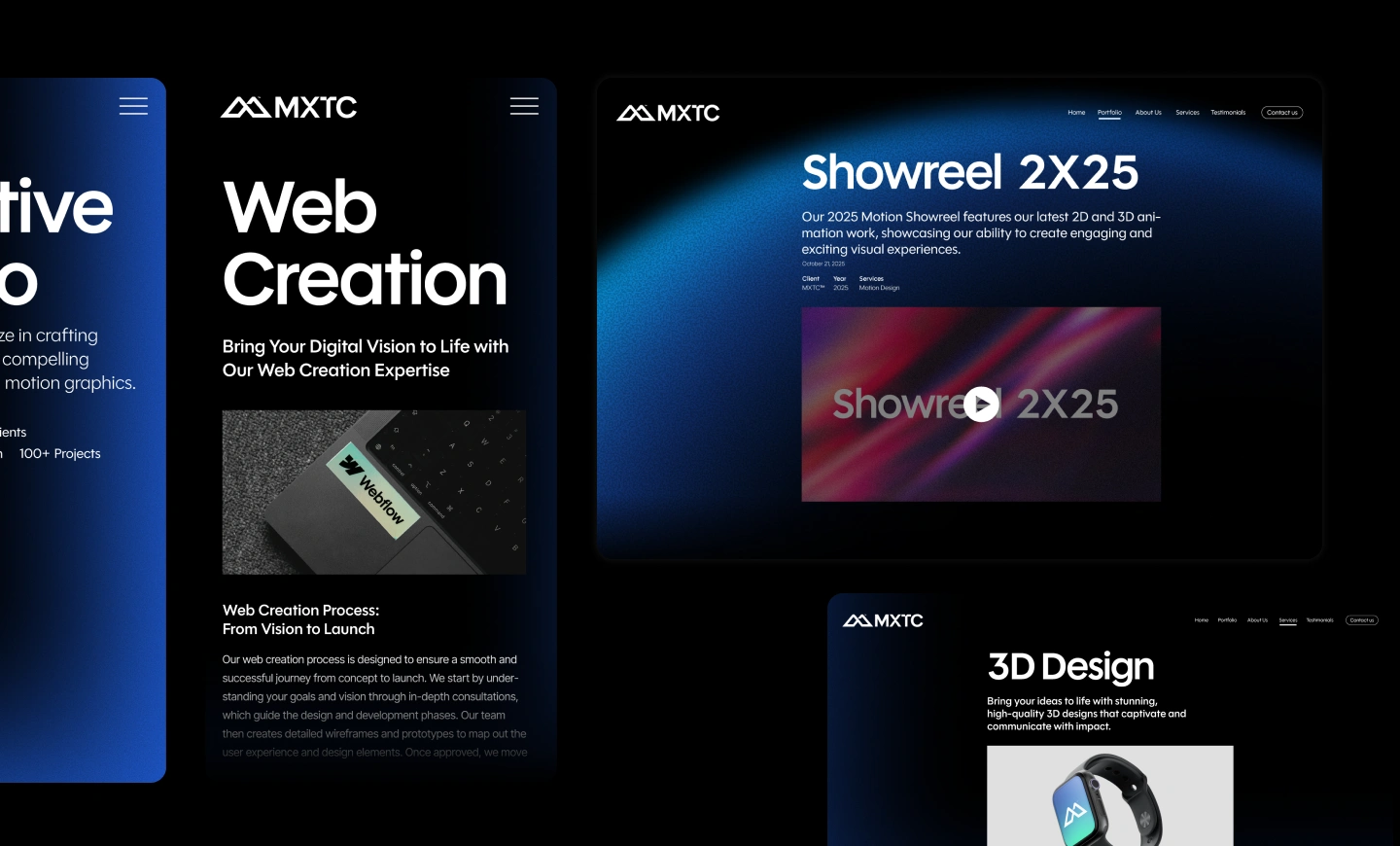
Fast-growing creative studio from Croatia. MXTC specializes in crafting Digital Experiences through Web, Motion, and Graphic Design.
After the initial analysis, it was clear that the core search of a brand identity is to visually represent the core values: Transforming Brands into Dynamic Visual Experiences.
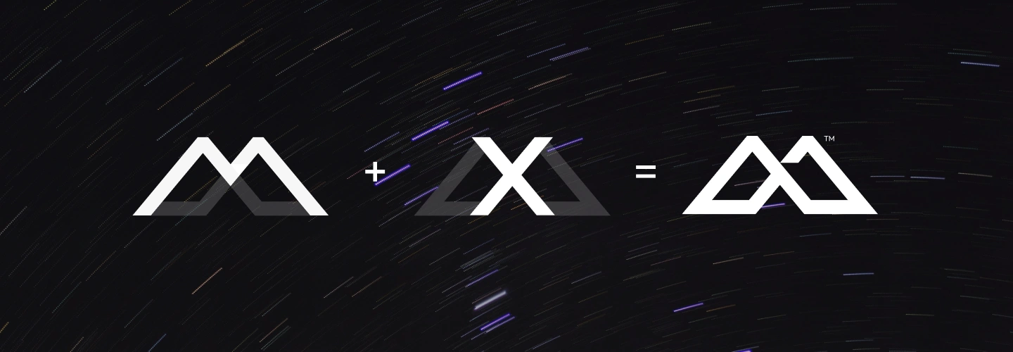
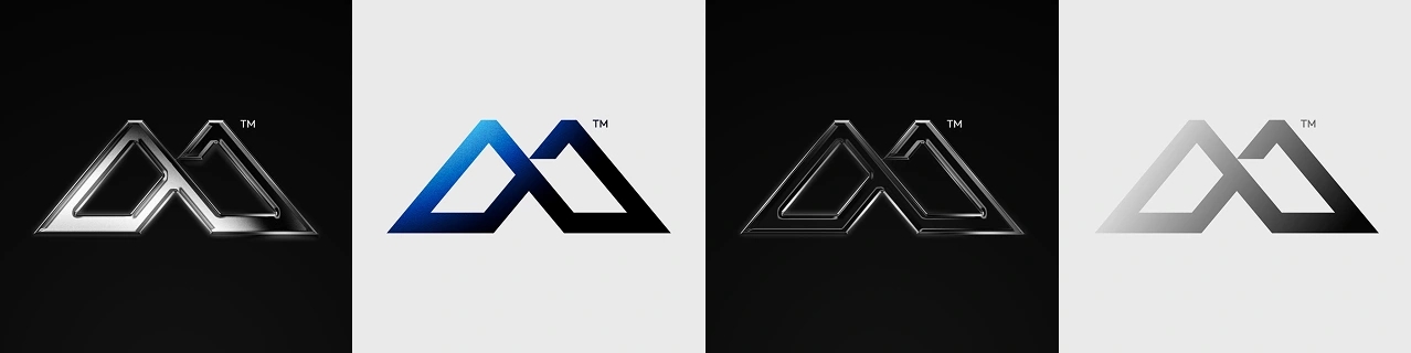
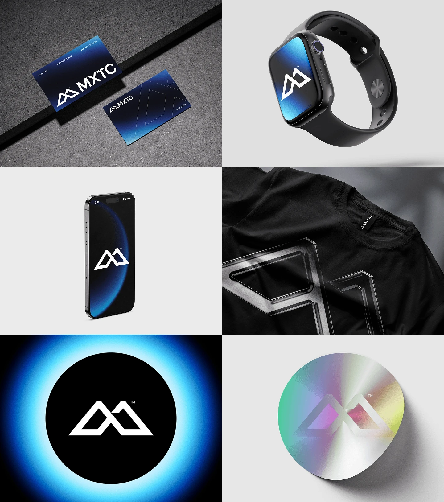
In gathered collaboration, the created symbol is a combination of letters m & x into a unified monogram. MX is the initial of MXTC, the shortcut name of the studio's founders, last name Matić. The form of a symbol is executed in sharp, clear, and dynamic visual language.
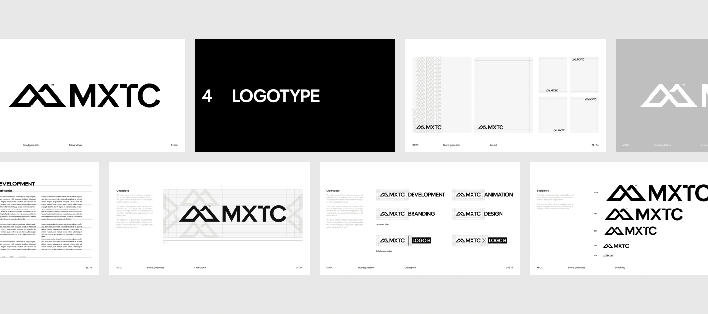
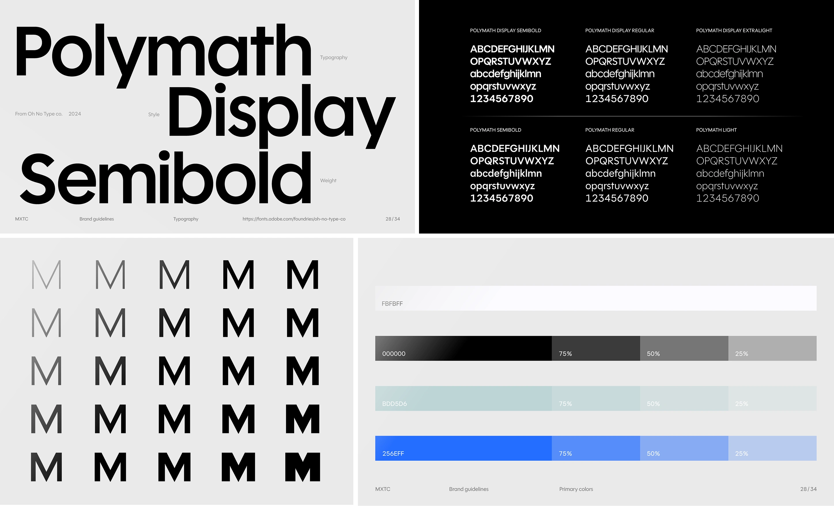
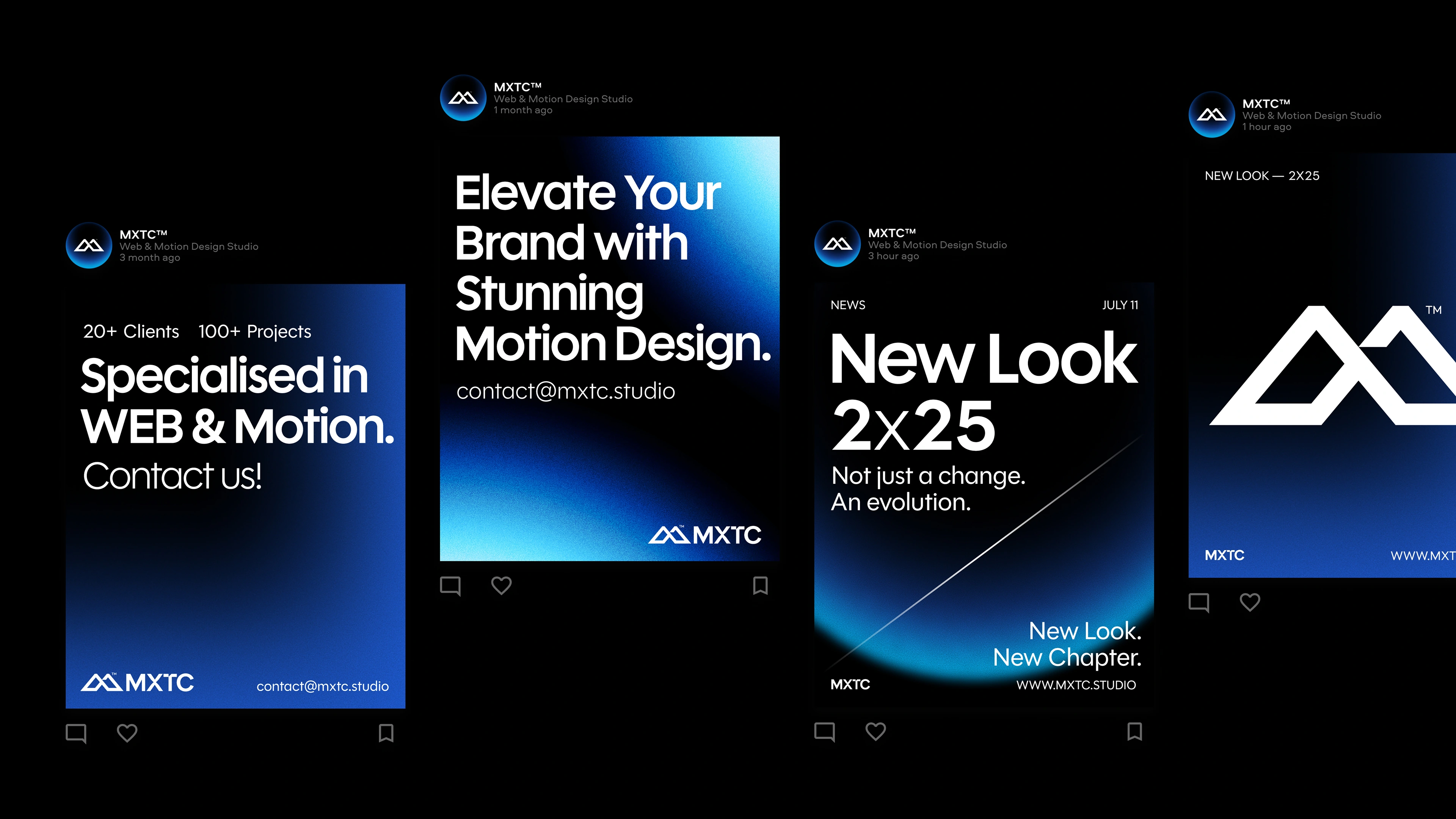
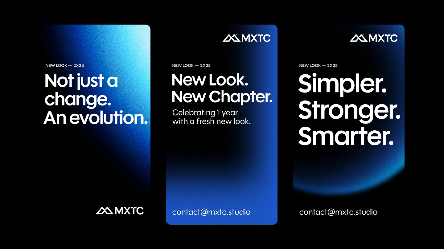
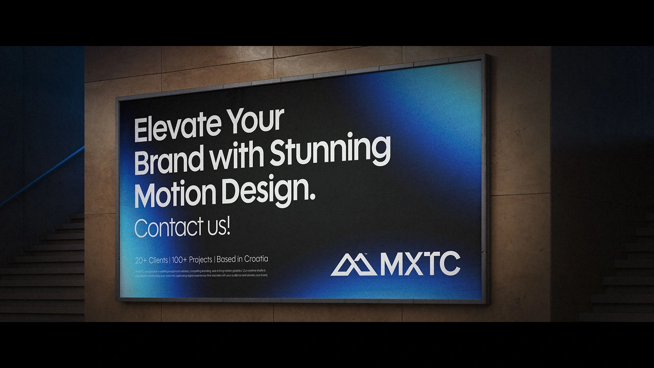
The rest of the visual language and application is followed by an abstract background extracted from the flow of animation. Typeface is geometric sans typeface Polymath. Character of typeface is sharp and clean, just as the main logo.
Grid in layout is strict and simple, with the origin point of a size of logo and its proportion in the chosen format.
Client: MXTC
Design: Adrian Rovina & Petar Matić (MXTC)
Art direction: Adrian Rovina & Petar Matić (MXTC)

Like this project
Posted Oct 14, 2025
Developed a brand identity for MXTC with a unified monogram and visual language.