Thrive Therapy | Brand and Web Design
Brand Designer
Graphic Designer
UX Designer

Adobe Illustrator

Adobe Photoshop

Figma
Overview
Finding a therapist that specializes in teen therapy can be pretty tricky. Finding a local location or an online platform specifically catering to teen therapy can be twice as hard.
That's where Thrive Therapy comes in. The website is to help parents and teens find the perfect fit for themselves or their teens to feel comfortable with opening up to someone they don't know. It can be a scary thing to reach out for help and Thrive Therapy is here to help every step of the way.

Problem & Solution
The design problem for Thrive Therapy does not have a website that provides a user-friendly experience for its users and not being able to convert site clicks to paid sessions for the providers, whether that's through digital marketing or organic searches through Google.
Goals/Requirements:
• Research competitors
• Create a memorable brand identity and easy-to-use experience
Competitors
These are some of the competitors for Thrive Therapy. They're all online therapy providers but don't specifically target a teen audience.
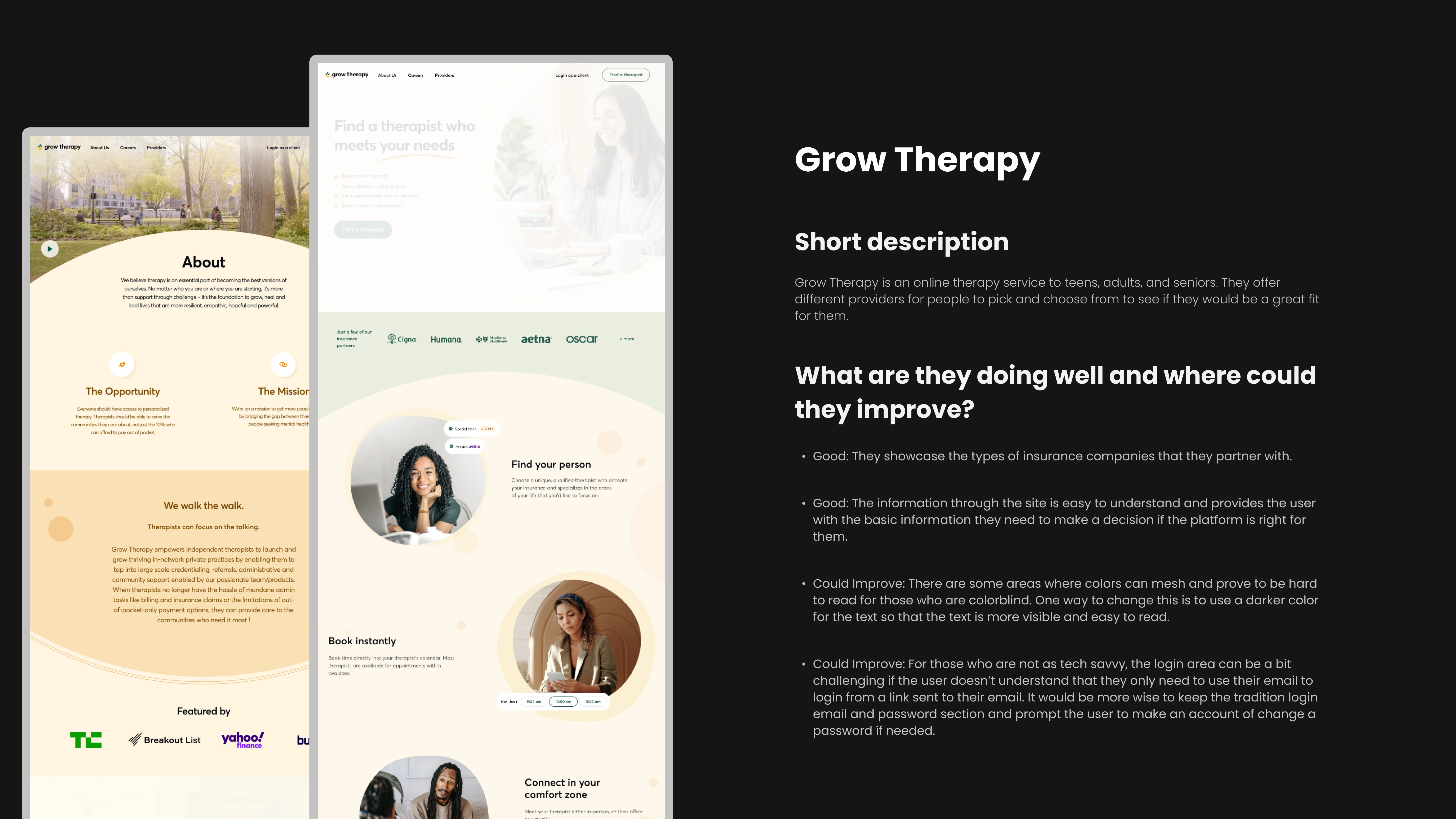
Competitor 1
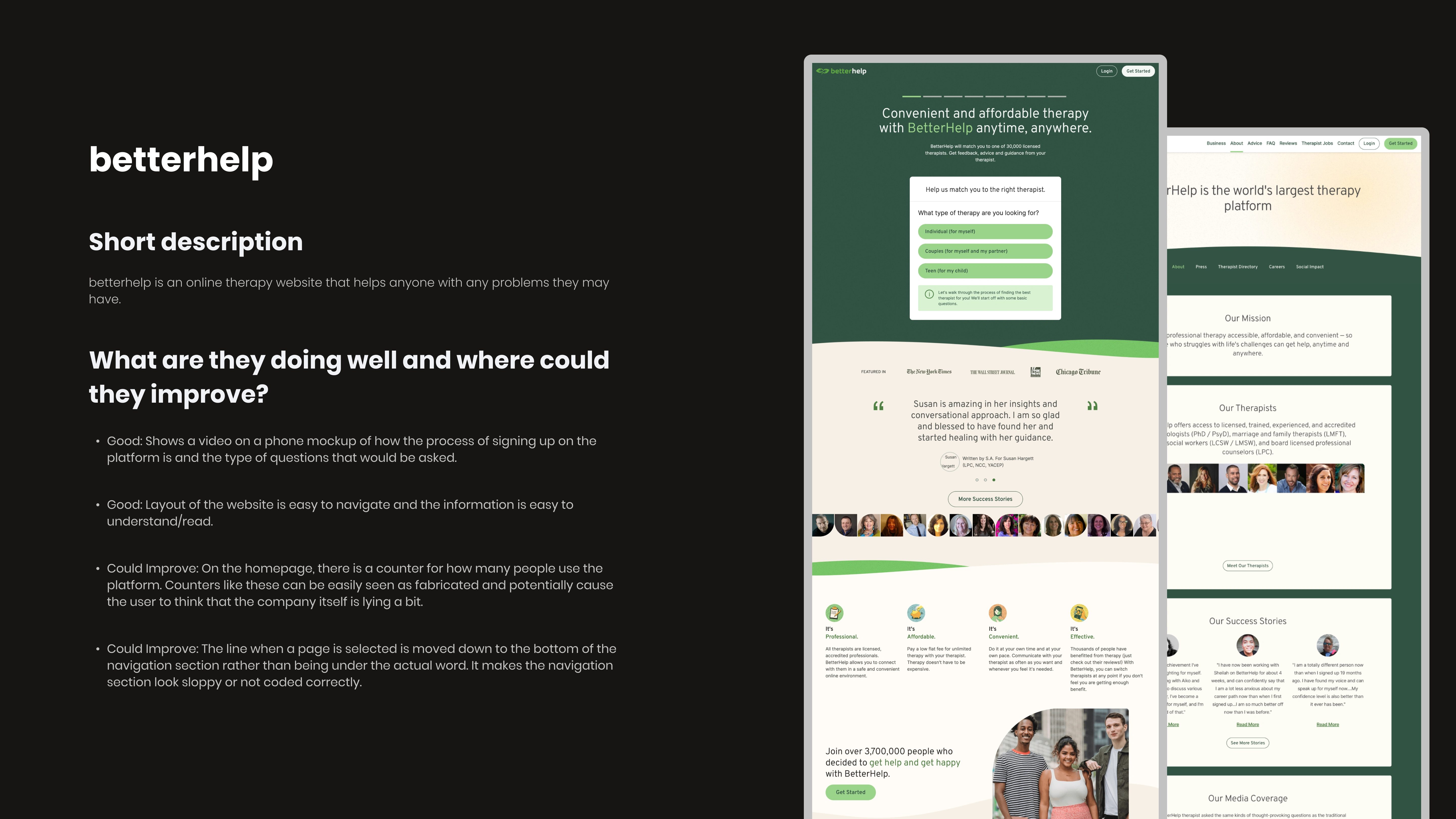
Competitor 2
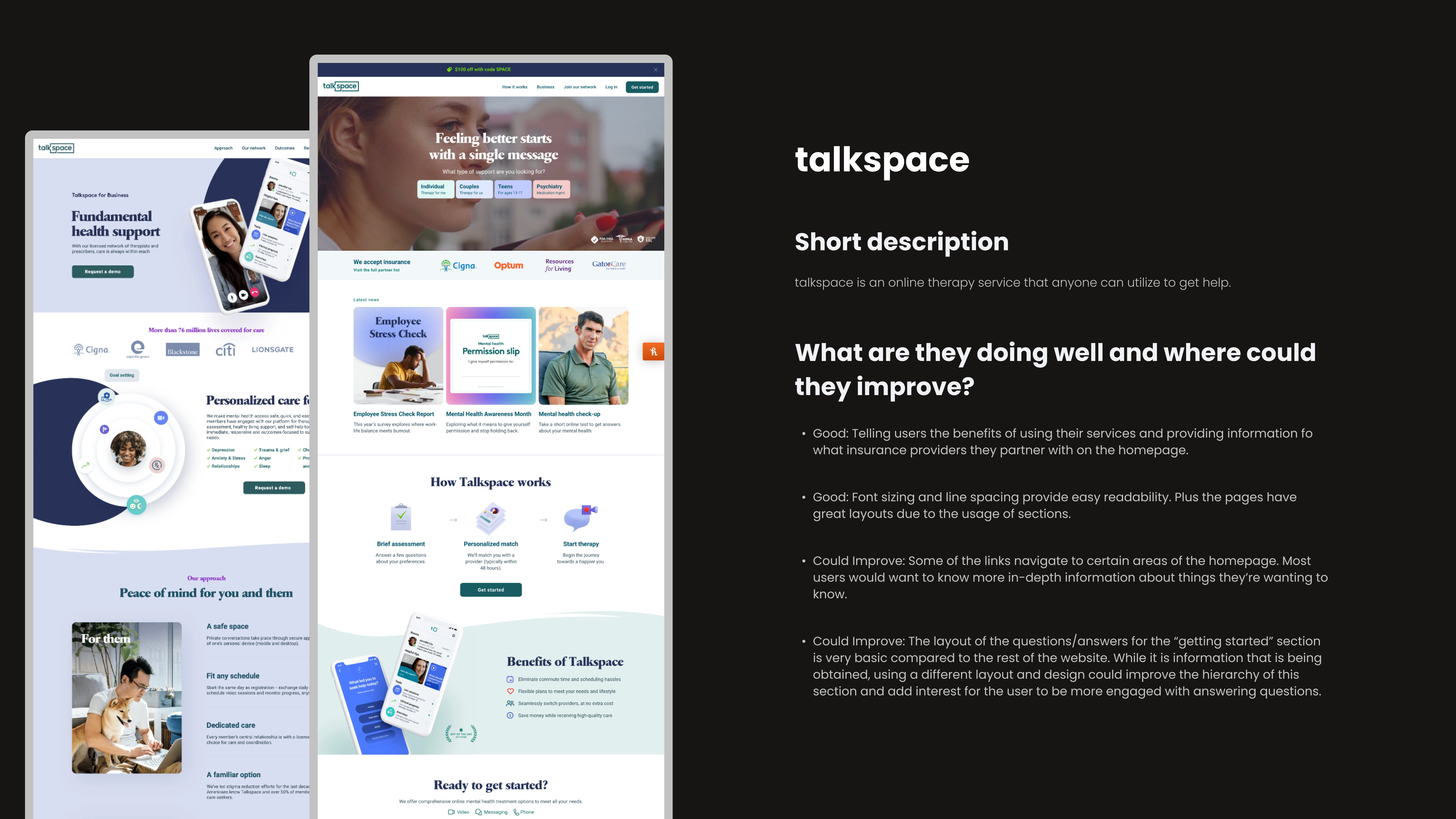
Competitor 3
Target Audience
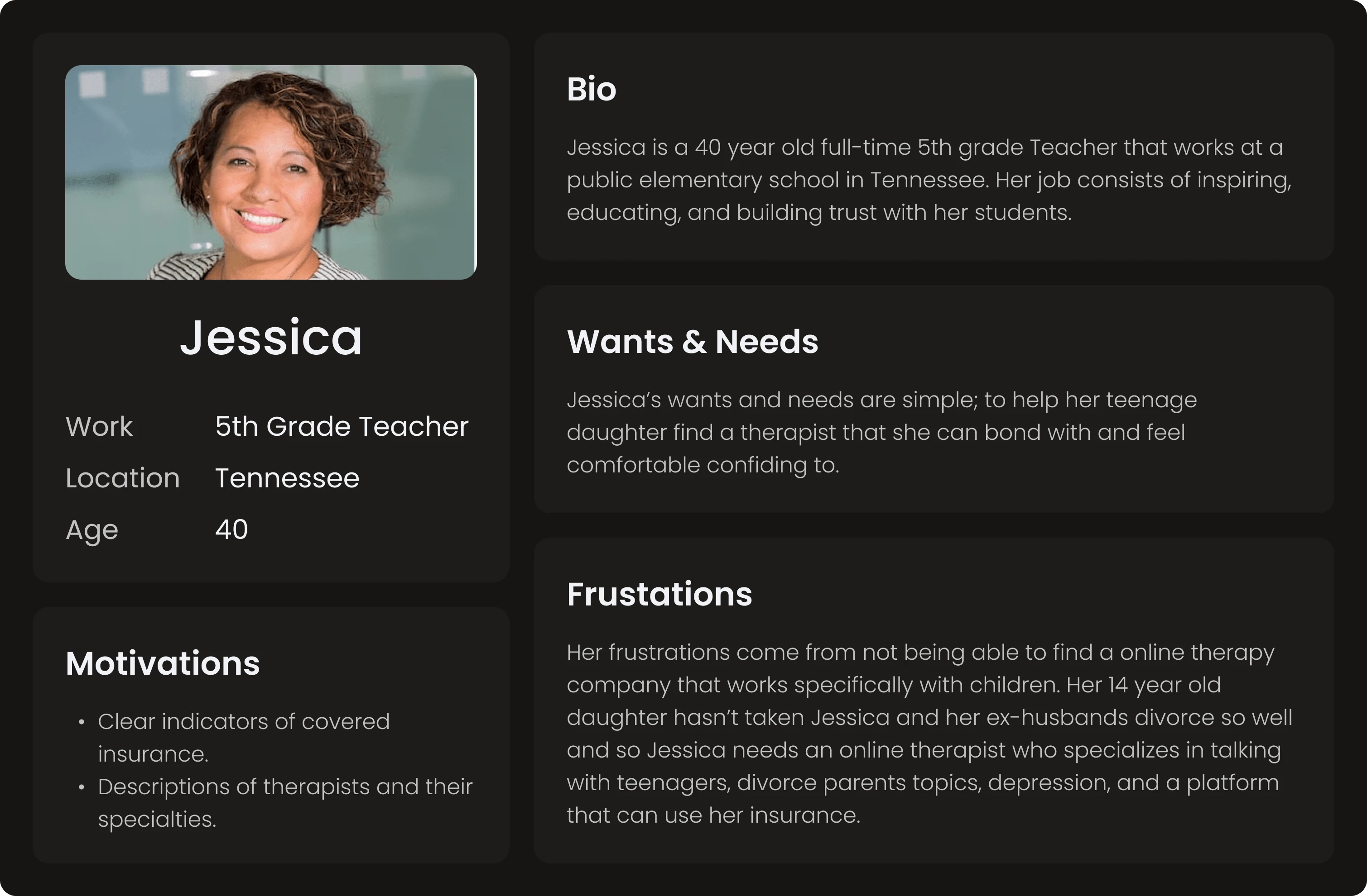
The target audience of Thrive Therapy is teens between the ages of 13 and 18, as well as their parents or guardians. These families and teens are either concerned for their mental well-being or their child's mental well-being. This could be from general anxiety, depression, or a mental disorder that hasn't been fully diagnosed.
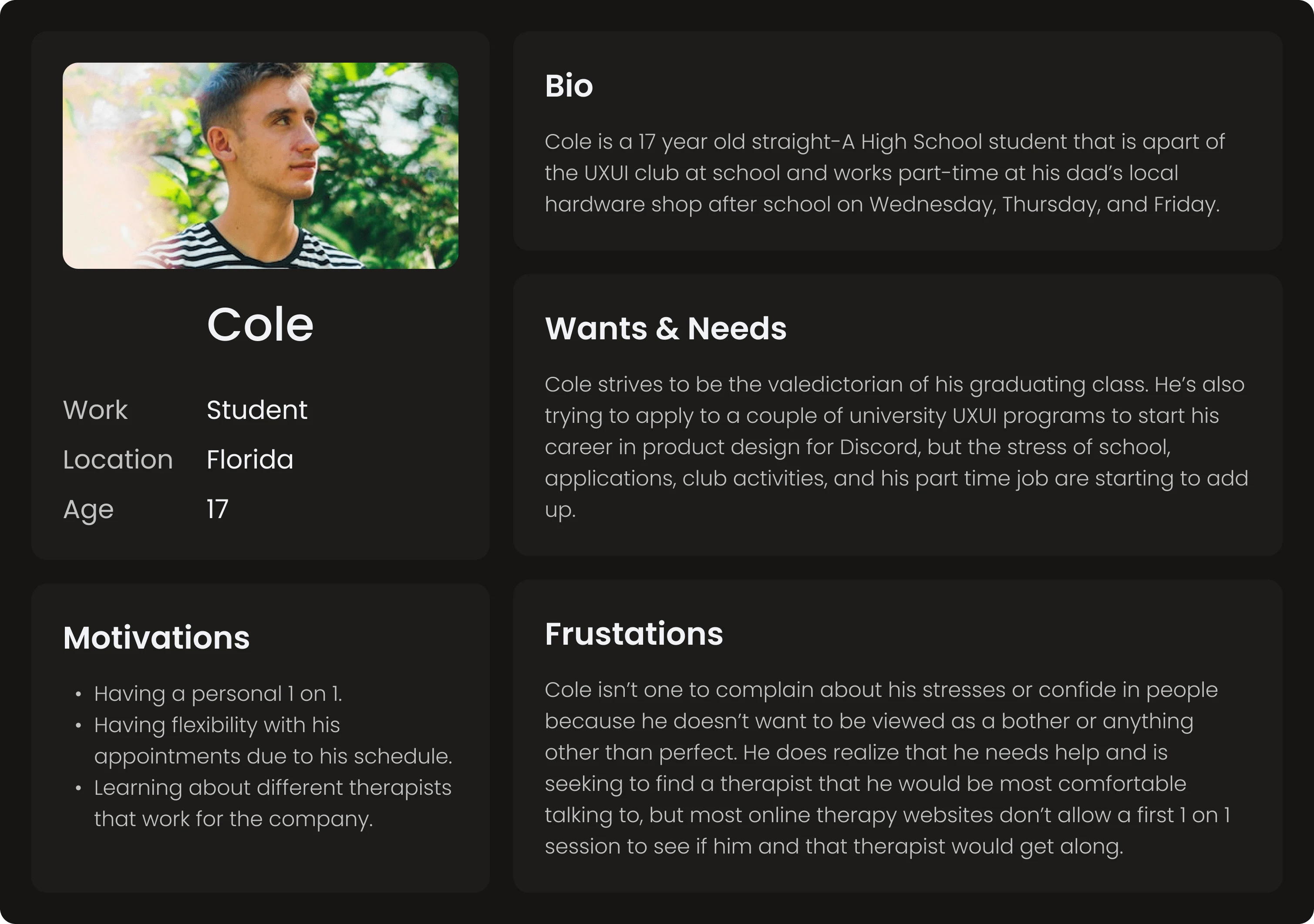
Target Audience 1
Target Audience 2
Mood Board
Thrive Therapy's mood board comprises photos that evoke friendliness, creativity, trust, and growth. From the colors in the images, examples of typography, smiles, togetherness, and a calm feeling are what Thrive Therapy tries to convey to its target audience.

Mood Board
Color Palette
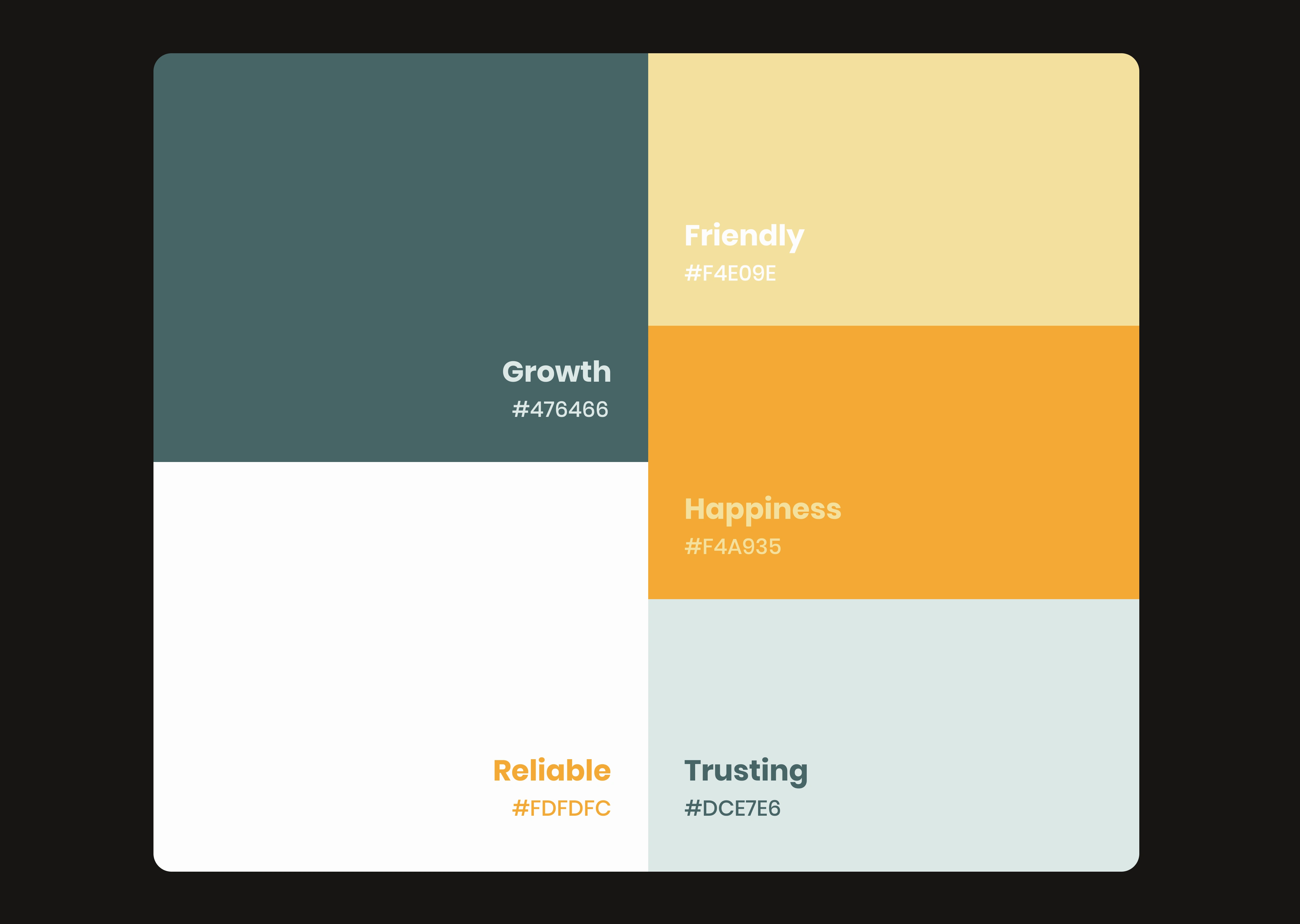
Thrive Therapy's color palette is made of shades of greens and yellows with an off-white to balance the brightness of the colors. The greens are meant to represent growth within a teen's mental development and healing journey while showcasing the trust they put in their therapist to open up. The yellows are to show the friendlier and happier side of the brand by expressing how the Thrive Therapy providers are always friendly in their approach and the happiness teens will have once they start opening up or finally get proper treatment.
Color Palette
Typography
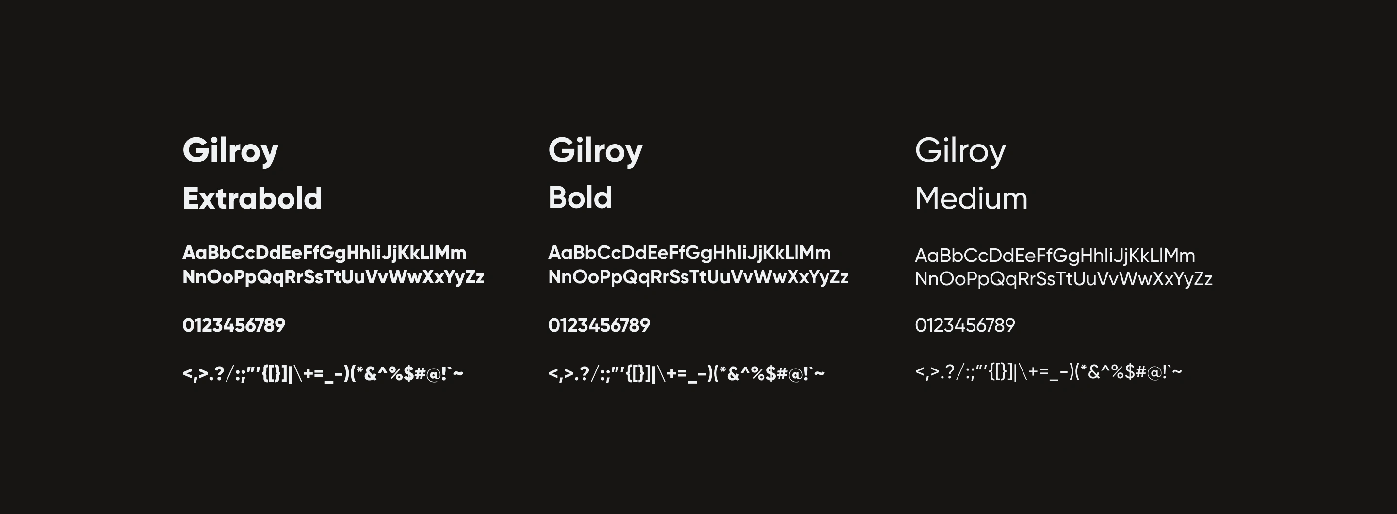
Thrive Therapy's typography is meant to be simple, easy to read, and bold enough for the reader to remember the contents of information they read on the website, social media posts, or ads. Using a sans-serif font can help elevate any eyestrain the reader may have and is modern enough to present a simple and clean design look. Gilroy is a perfect example of this because it is a geometric sans-serif font best suited for web, ads, and print (aka, signage and editorial) due to its versatility.
Typography
Pattern
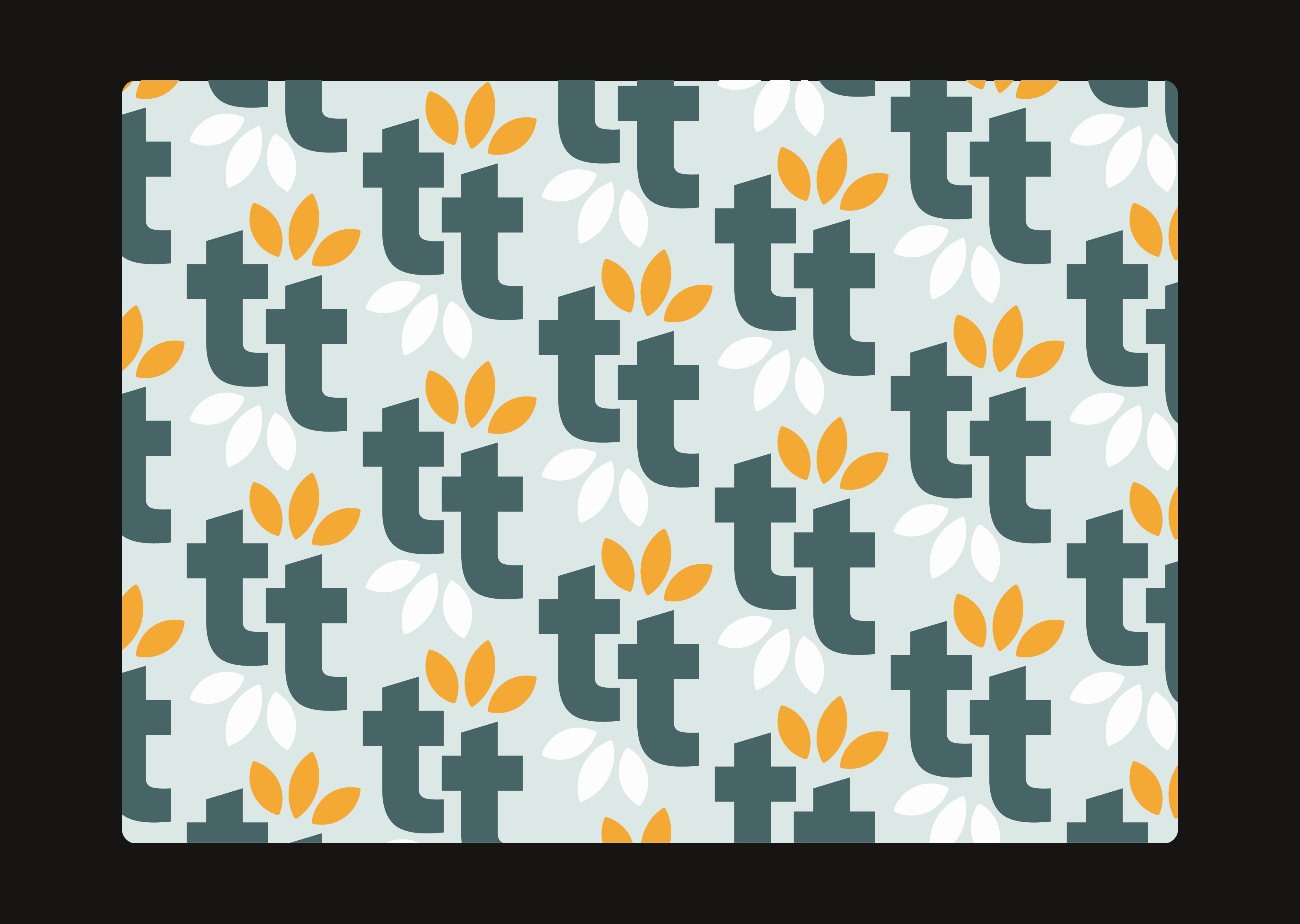
The pattern for Thrive Therapy is a representation of both the symbol of the brand and the first two letters of the company's name. Using white to split up the yellow and green colors provides the pattern with a nice balance and isn't so hard on the eyes.
Pattern
Logo
Thrive Therapy's logo is meant to represent the teen's growth that they will acquire as they continue their sessions with their provider. Using a flower to represent that development also provides a friendly touch to the brand. Also providing logo variations gives the company different uses for any designs they use. There is a primary logo with the symbol to the left and a wordmark to the right, a secondary logo with the stacked logo, and a third logo with the wordmark and flower leaves that replaces the dot over the 'i'.
logo gif
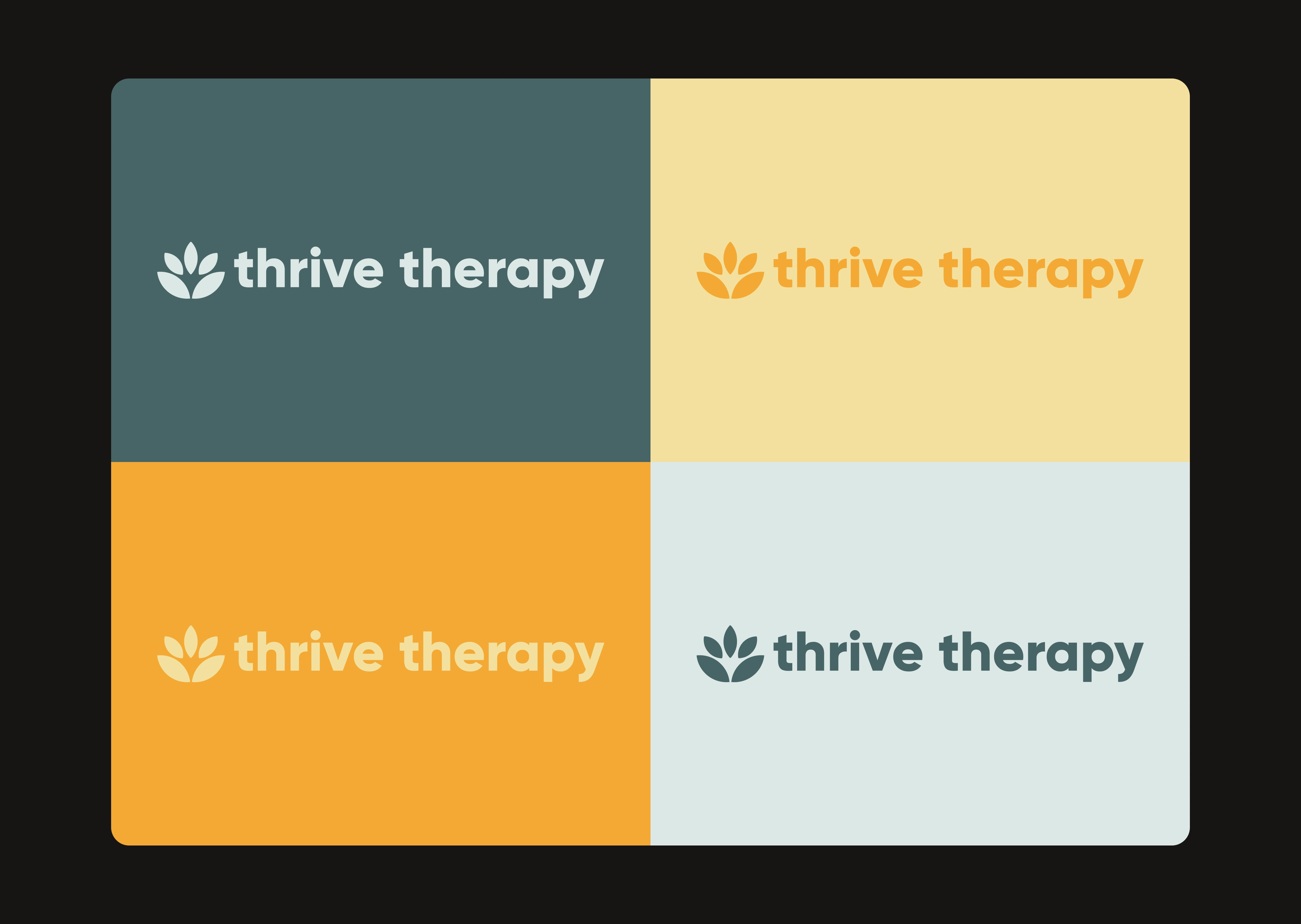
Primary Logo with Color Palette
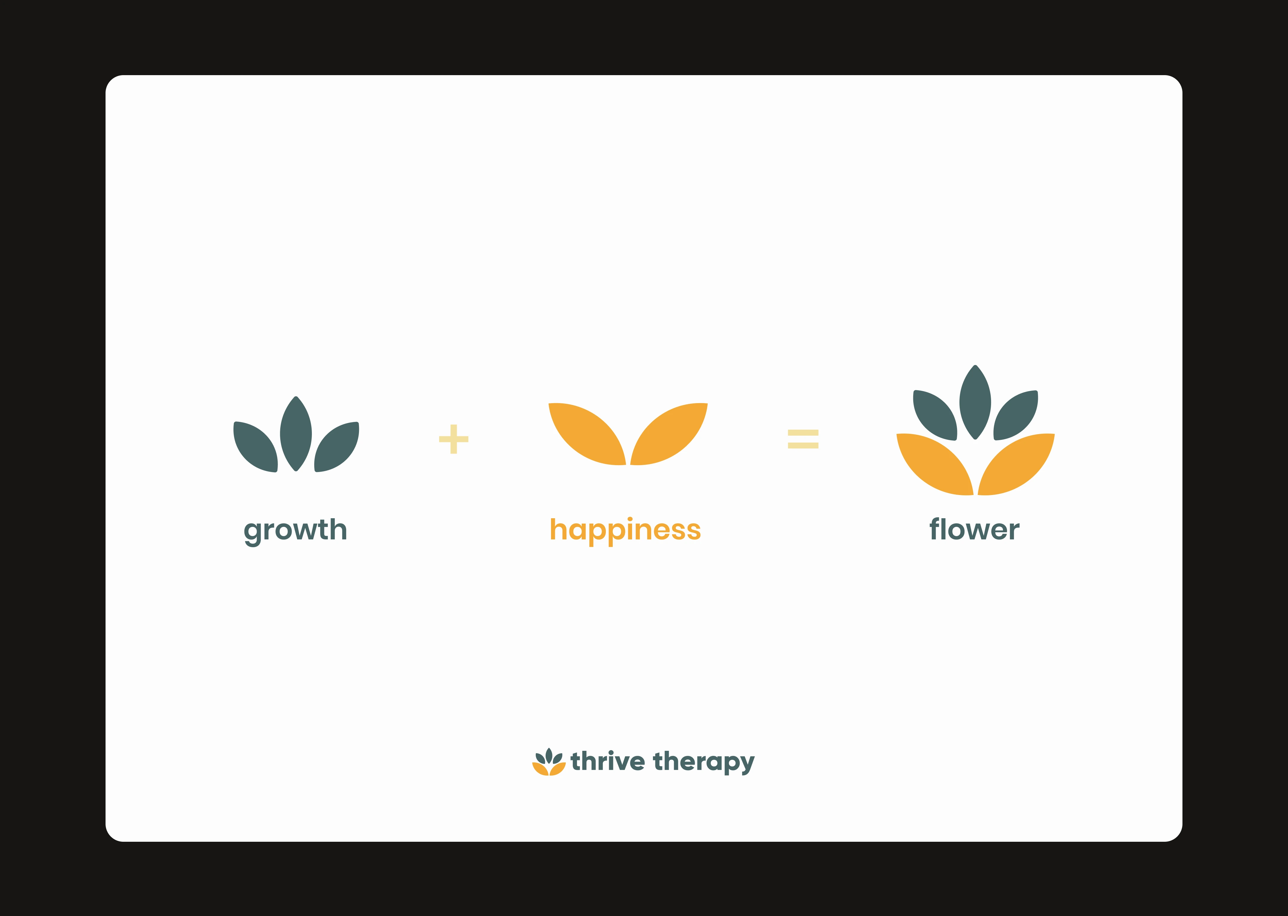
Symbol Deconstruction
Digital Assets
Thrive Therapy's digital assets should be fun, welcoming, friendly, and engaging. These designs can range from an email newsletter to the company's social media profile. Each design asset should make the reader or viewer want to explore the company more by visiting their social media accounts or website and learning more about what it offers.
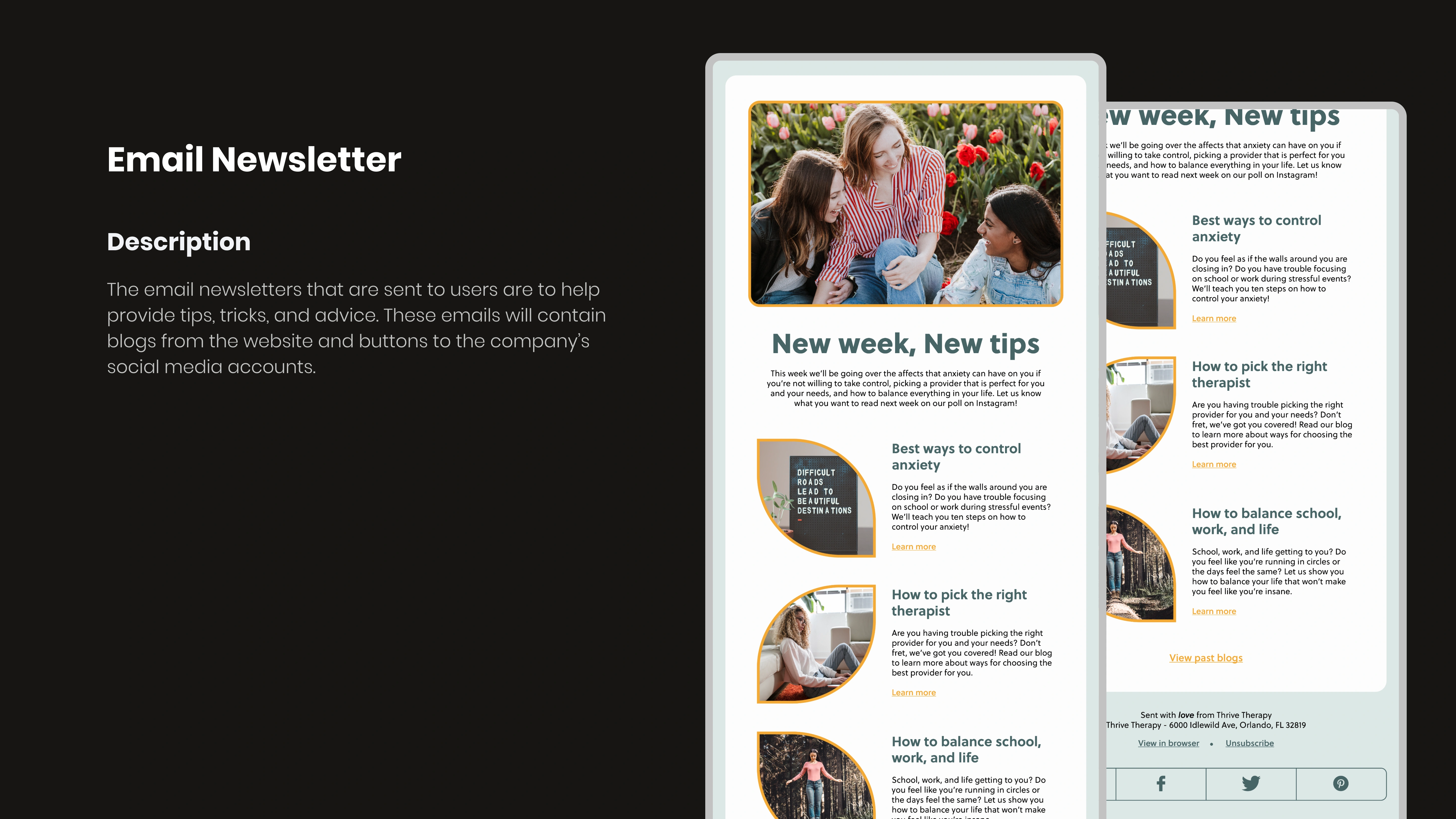
Email Newsletter
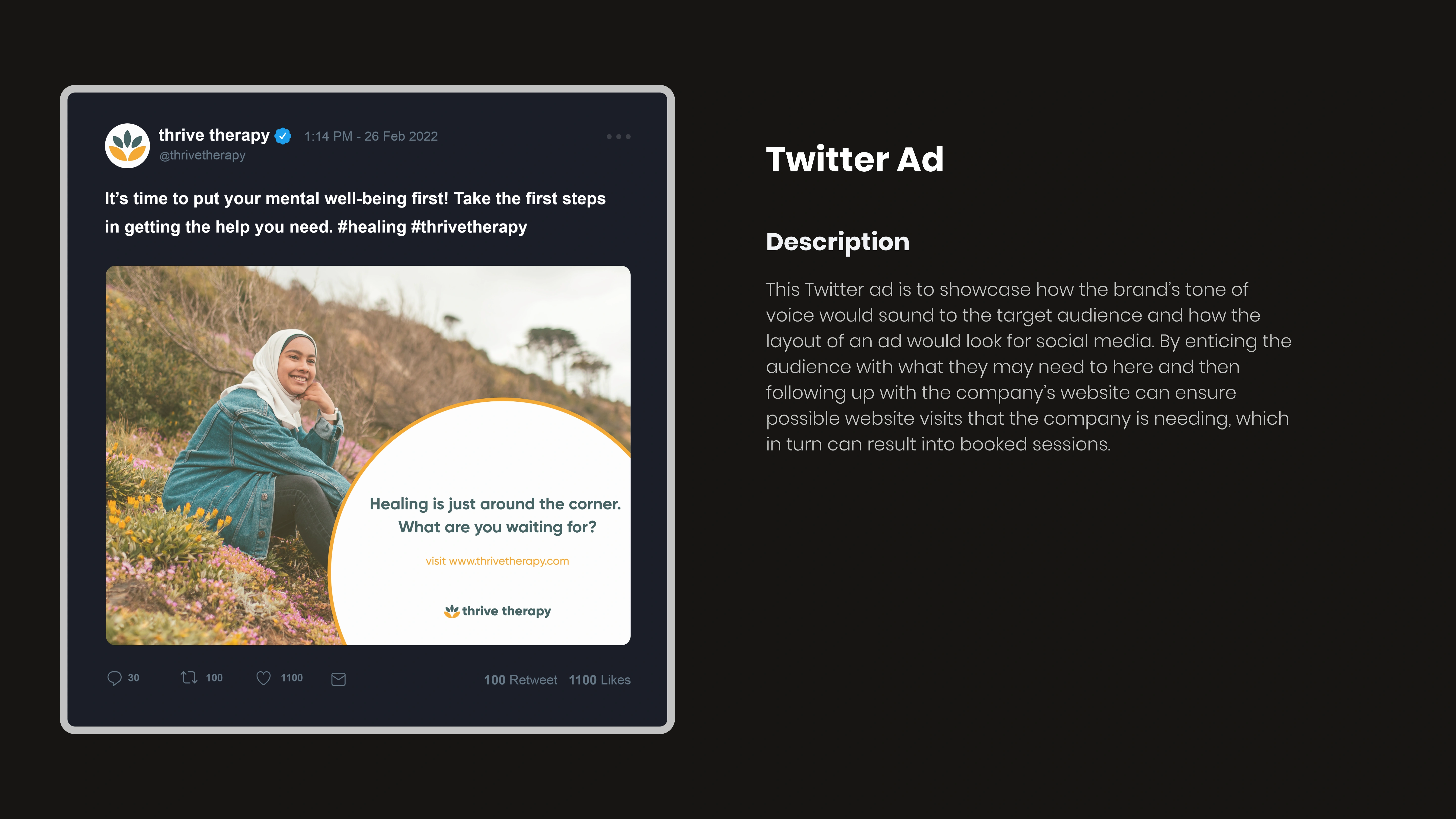
Twitter Ad
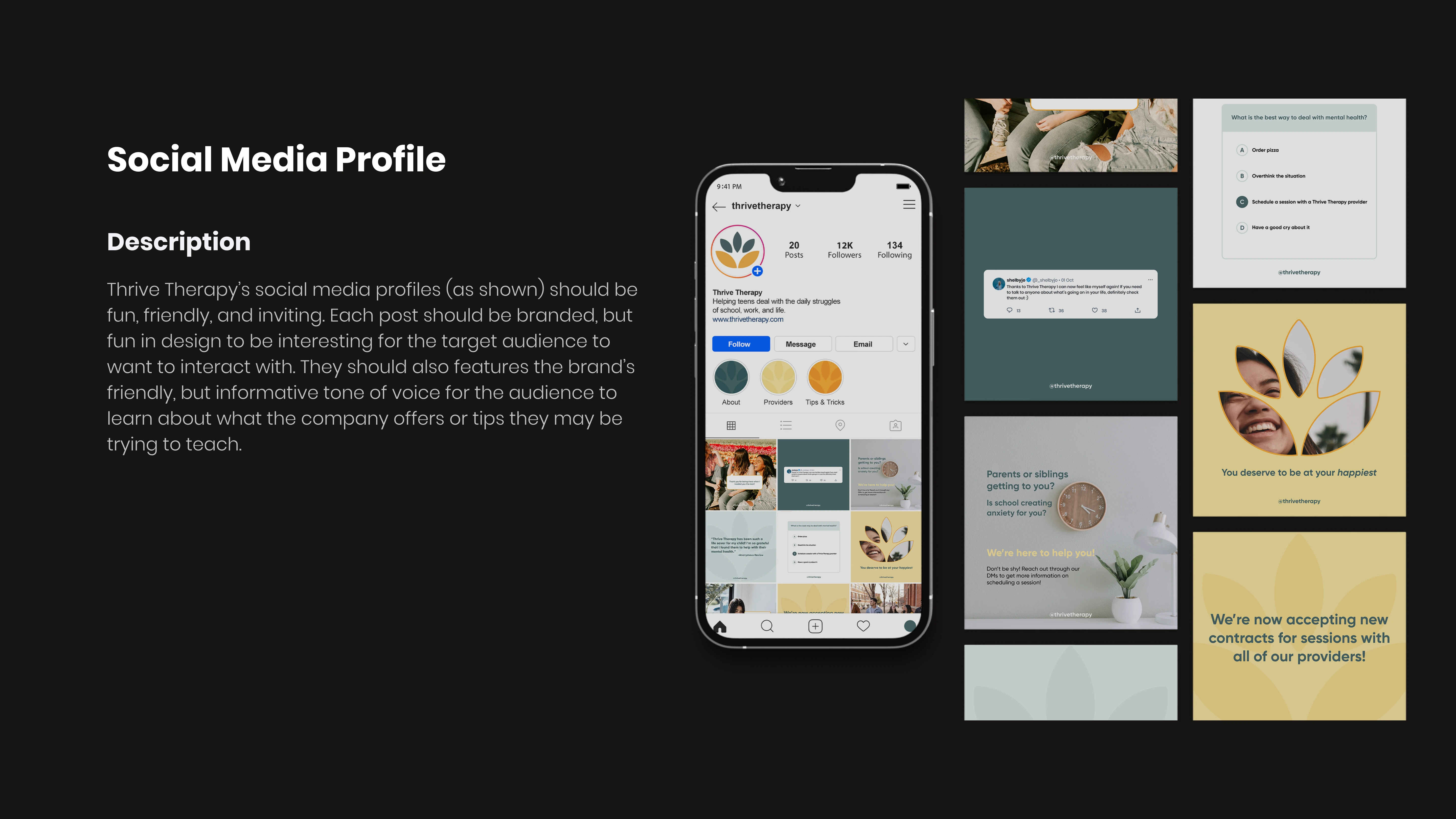
Social Media Profile
Web Design
Thrive Therapy's website design and layout are meant to be simple, informative, and user-friendly. The purpose of the website is to inform the user of the providers they have, the insurance companies they are partnered with, how booking a session and finding a therapist works, and any other information the user may want to know. The design was created in Figma using the Figma to Webflow plugin to achieve its layout. This allows the web design to be fully integrated into Webflow with just copy and paste.
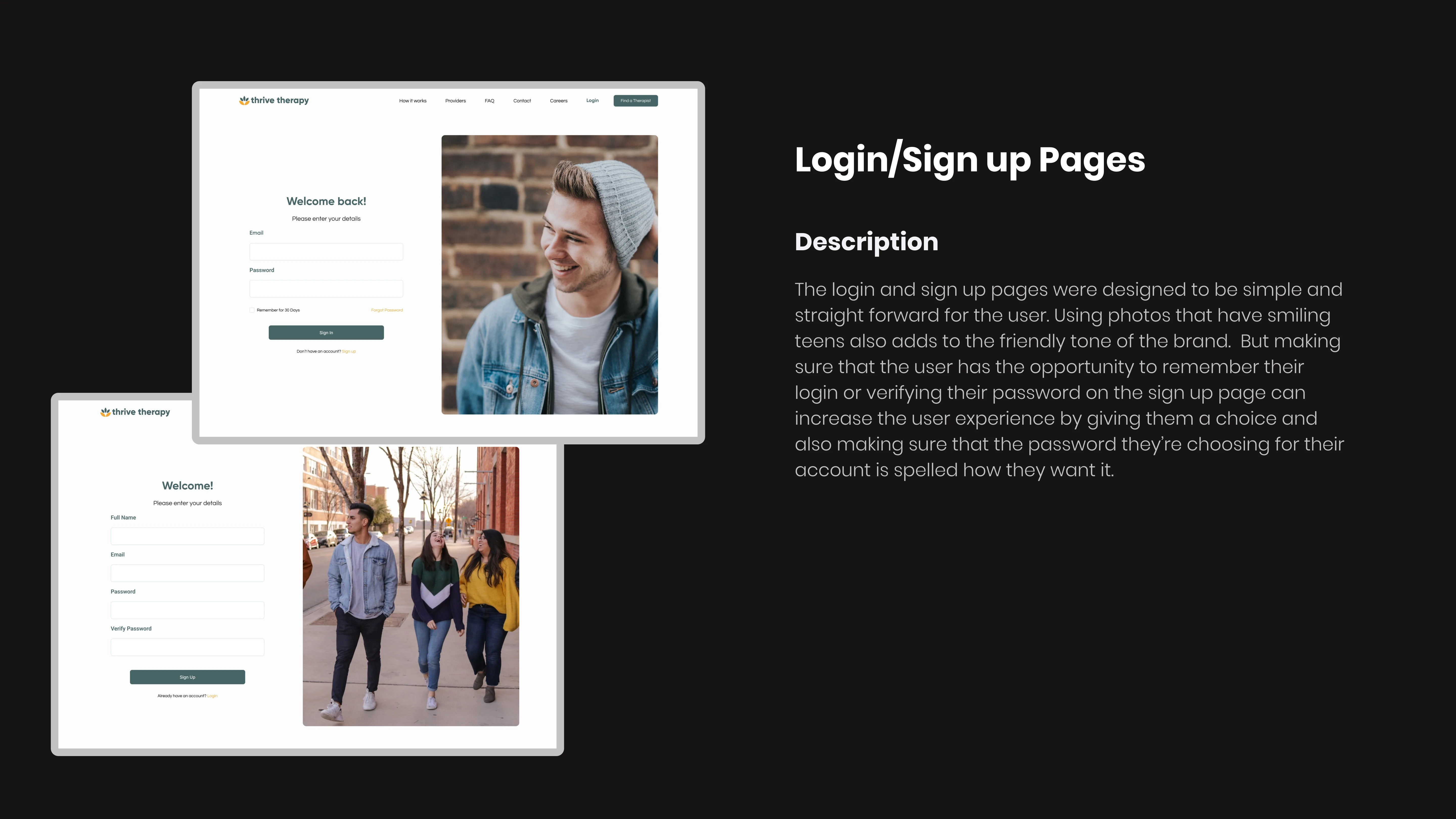
Login/Sign Up Pages
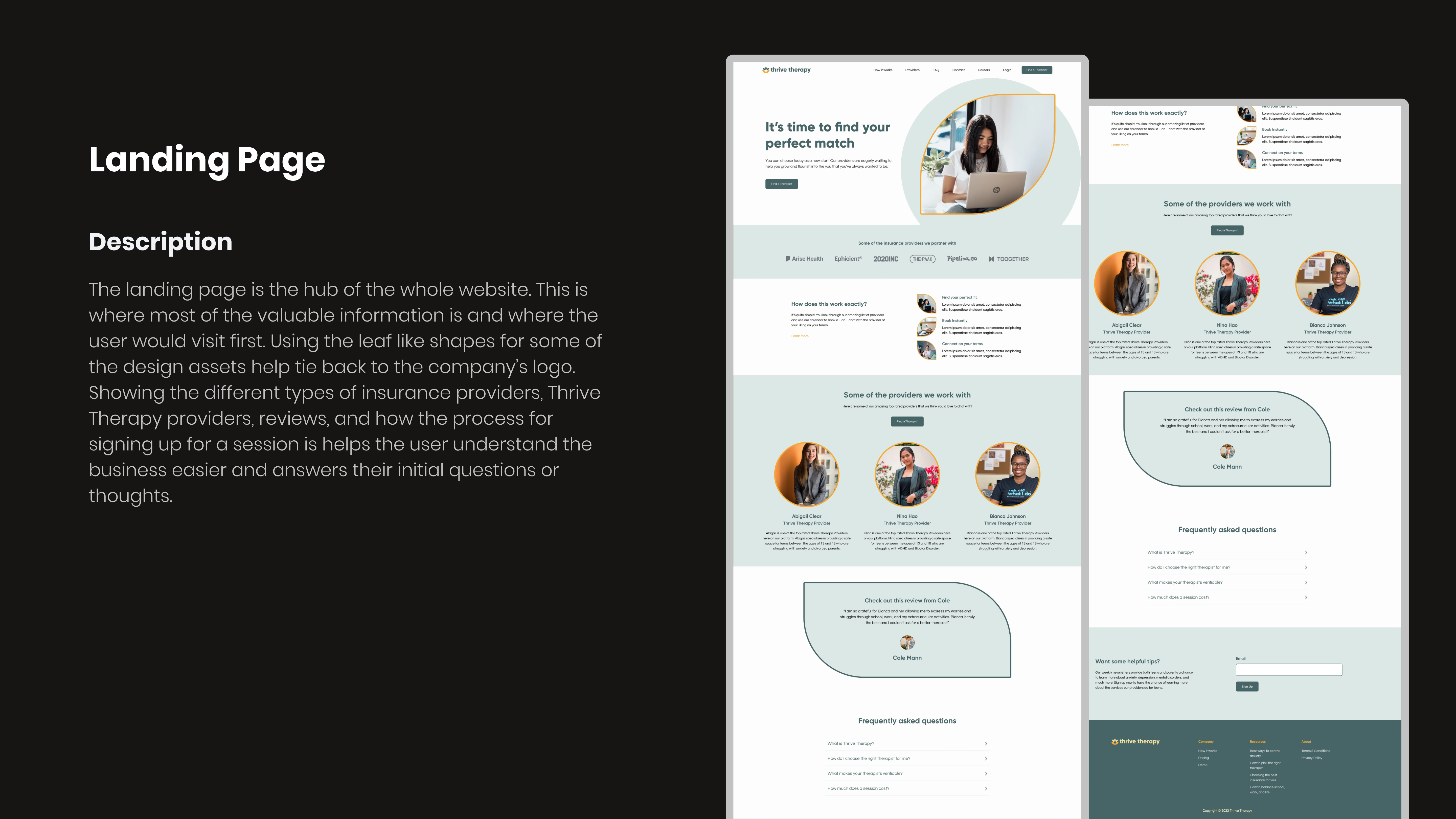
Landing Page
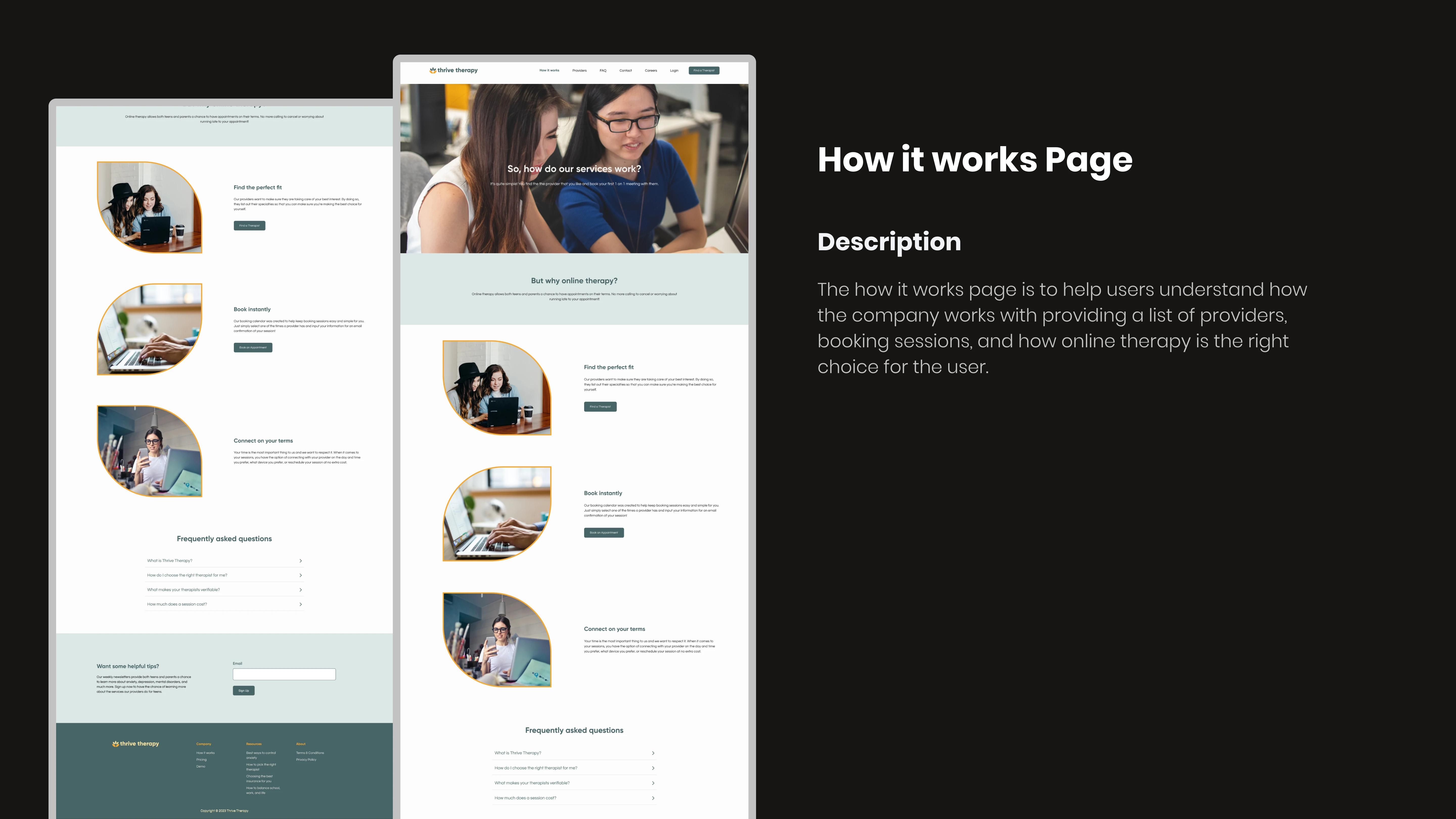
How it works Page
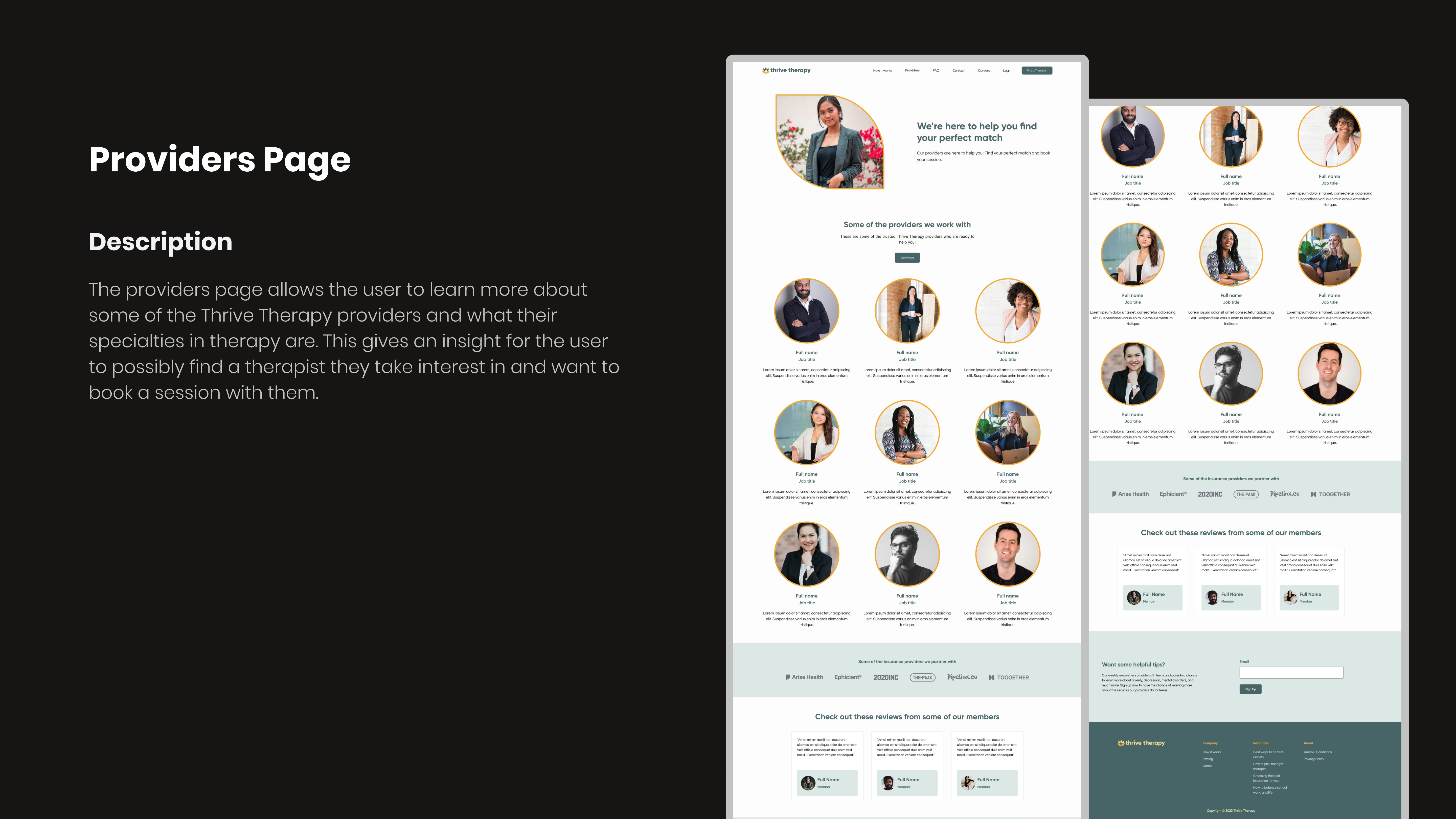
Providers Page
Results
The results of this brand are that the brand successfully showcases a friendly and welcoming demeanor, both through the designs and through the voice/tone of the brand. Also, the web design is easy to navigate for someone who may not know what they are looking for and even makes sure to answer any thoughts a teen or parent may have when looking for information on the business.
Takeaways
1. If I were able to have more time, I would have liked to do user testing to see what elements of the website should be revised and what should be added to make the user experience better.
2. I would add more pages to the website (i.e., a contact page, a blog page from the footer area, and a dedicated FAQ page).
3. Maybe add more digital assets to the brand (i.e., a YouTube ad and web ad).
Like this project
0
Posted Apr 3, 2023
This project aims to create a simplistic, friendly, and memorable experience for Thrive Therapy's users.
Likes
0
Views
15
Tags


Brand Designer
Graphic Designer
UX Designer

Adobe Illustrator

Adobe Photoshop

Figma


