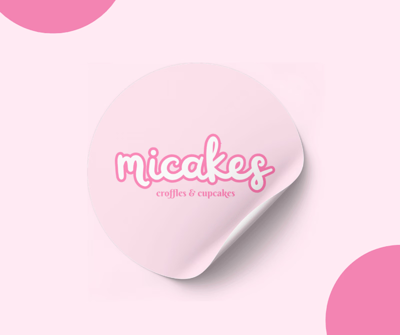
Micakes Croffles & Cupcakes

Shaizel Joseanne Espedillon
Graphic Designer
Logo Designer
Social Media Manager
Adobe After Effects
Canva
Google Drive
HOW "Micakes" started.
The logo created for "Micakes" croffles & cupcakes embodies a blend of elegance and playfulness, reflecting Mikaela's vibrant personality and the delightful offerings of her business. The choice of pink as the primary color was intentional, symbolizing creativity, charm, and a touch of sophistication. Pink is often associated with sweetness and femininity, aligning perfectly with the essence of Micakes' delectable treats.
The typography used in the logo strikes a balance between modernity and friendliness, ensuring readability and brand recognition across various mediums. The overall composition exudes a welcoming and inviting aura, inviting customers to indulge in the scrumptious world of Micakes.
In summary, the Micakes logo encapsulates Mikaela's vision, infusing her personal touch into a visually appealing and memorable brand identity that resonates with lovers of artisanal desserts.


