From Complex to Out-of-the-box Guided Data Entry
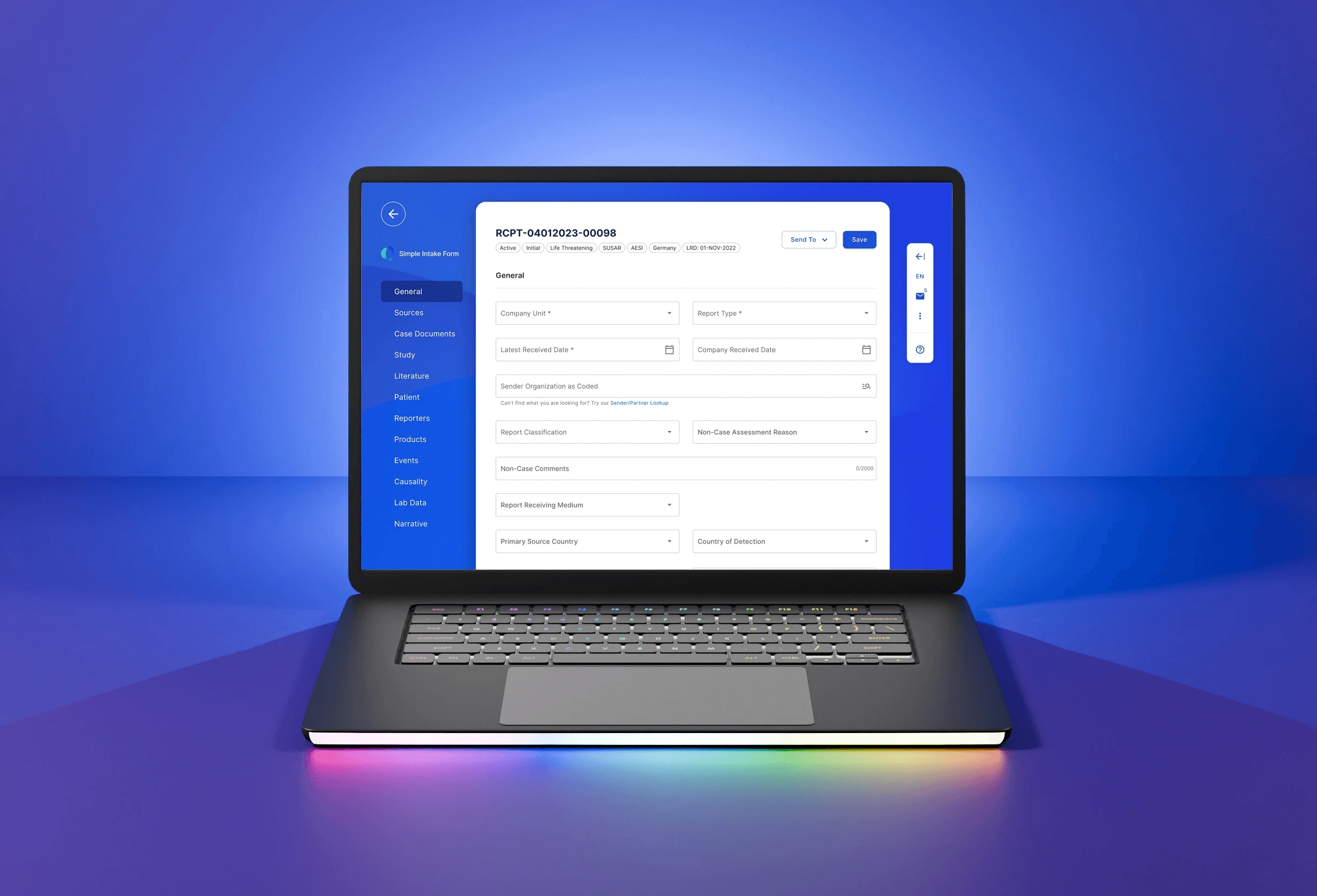
Dramatically simplifying a complex data entry form created a more accessible system that significantly enhances the data entry process for new users. This overhaul is viewed as a major improvement by 78% of users, resulting in increased user satisfaction and efficiency.
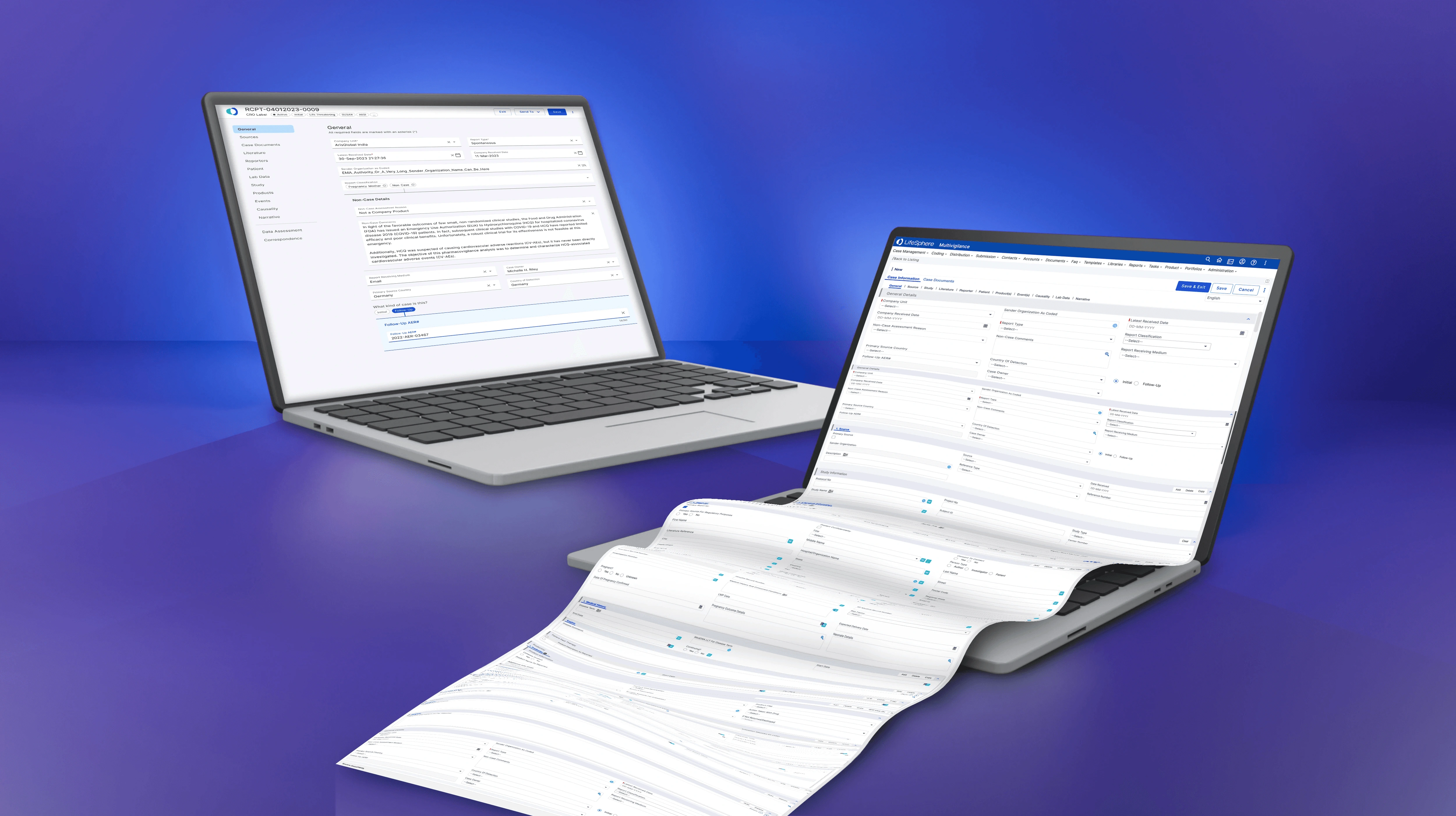
From Complex to Out-of-the-box Guided Data Entry
LifeSphere MultiVigilance (LSMV) emerges anew—an intricate system now transformed into a user-accessible entry point for tracking adverse drug interaction events, catering to case processors of all expertise levels.
78% of users consider the redesign of the LSMV Simple Intake Form (SIF) a significant advancement. A straightforward and intuitive interface made it easier to report cases with limited details.
The more intuitive and user-centric design process I implemented streamlined the process, allowing for a more inclusive and efficient data entry process.
Persona Realignment from Expert to Novice
They were case processors without previous experience at Roche, AstraZeneca, Bristol-Myers Squibb, Johnson & Johnson, or another pharmaceutical company.
The UX challenge centered on aligning the persona spectrum—shifting away from an expert-level case processor to a user with minimal experience to simplify the journey, previously muddled by the assumption of expertise and reliance on extensive training.
Emphasis was placed on usability and navigation, with the user’s journey being cumbersome and requiring lots of training and reading documentation.
Case processors, with or without experience, work quickly, accurately, efficiently, and accurately because their job performance is based on the number of cases a user can input and complete in a set amount of time.
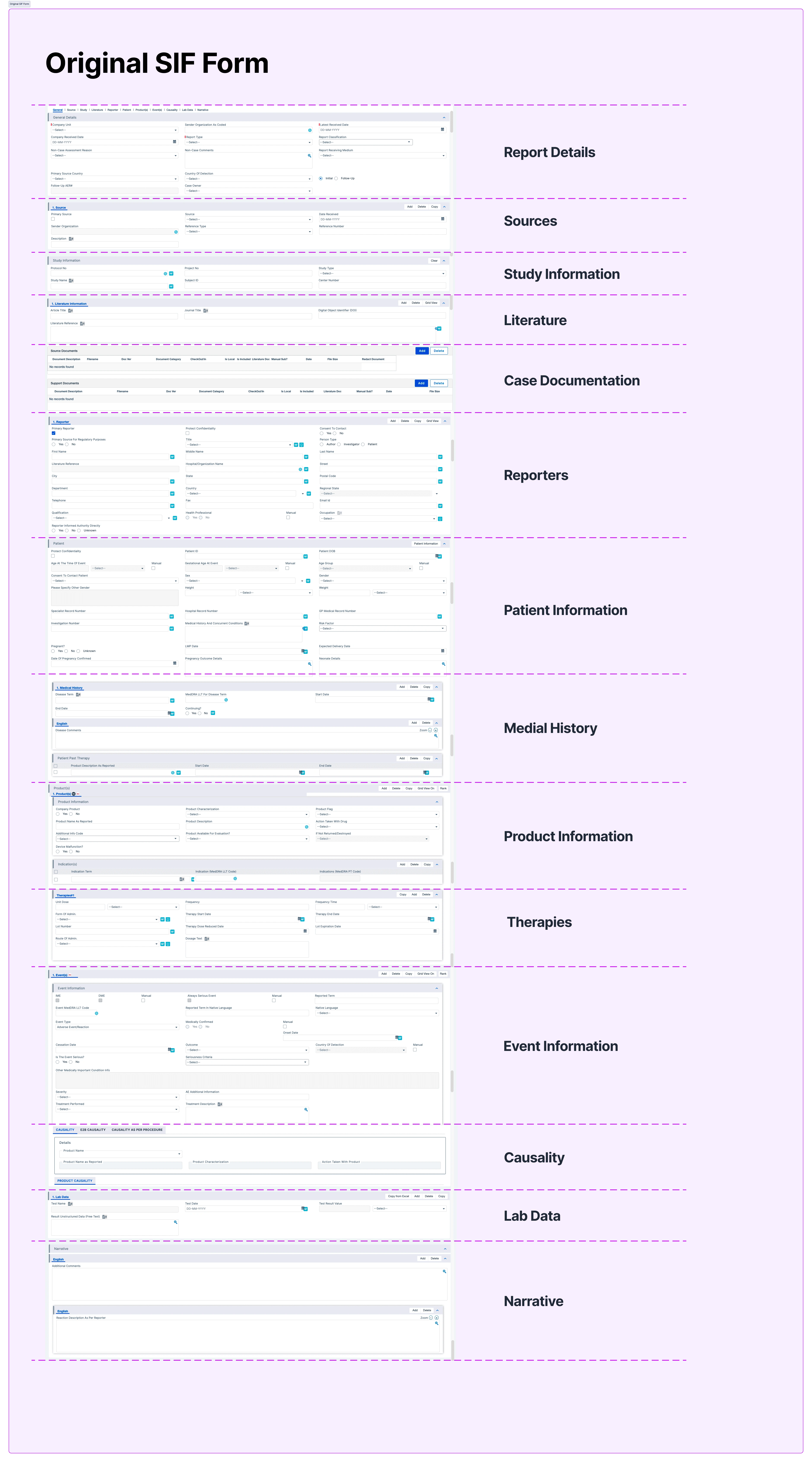
From 2000 Input Fields to User-Friendly
As part of the project, I needed to transform the SIF into an out-of-the-box (OOTB) solution that defies traditional input processes.
The previous iteration presented a condensed version of an overwhelming form with 600 of 2000 input fields—still far from novice-friendly.
My ambition was to craft an intuitive interface that novice users could navigate easily.
As part of my design process, I ensured that ArisGlobal's product suite could be seamlessly integrated and navigated by even the most inexperienced users. By collaborating with stakeholders and engineering partners, we addressed user needs and technological feasibility.
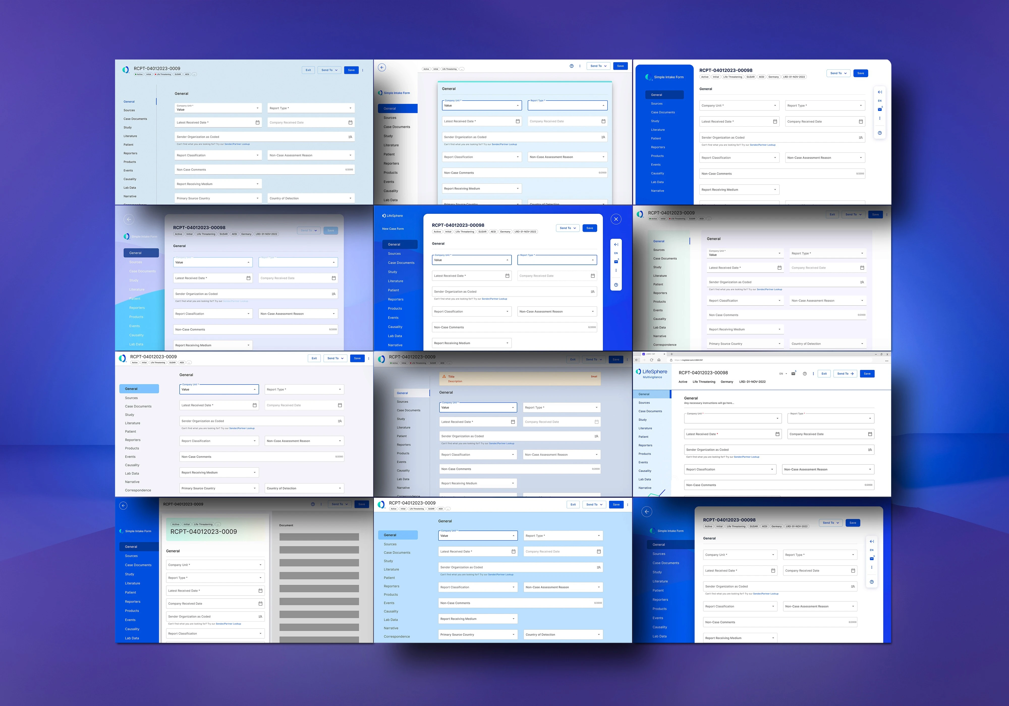
Architecting Clarity: From Divergent Layouts to Unified Ideation
Debates over the form's structure sparked a creative overhaul. This transformed original single-page views into a cohesive, user-centric architecture based on a stepper but revised to a step-through model.
The inherited wireframes lacked foundational research, leading us to question and ultimately reinvent our approach to prioritize quick mastery, speed, and efficiency in case processing.
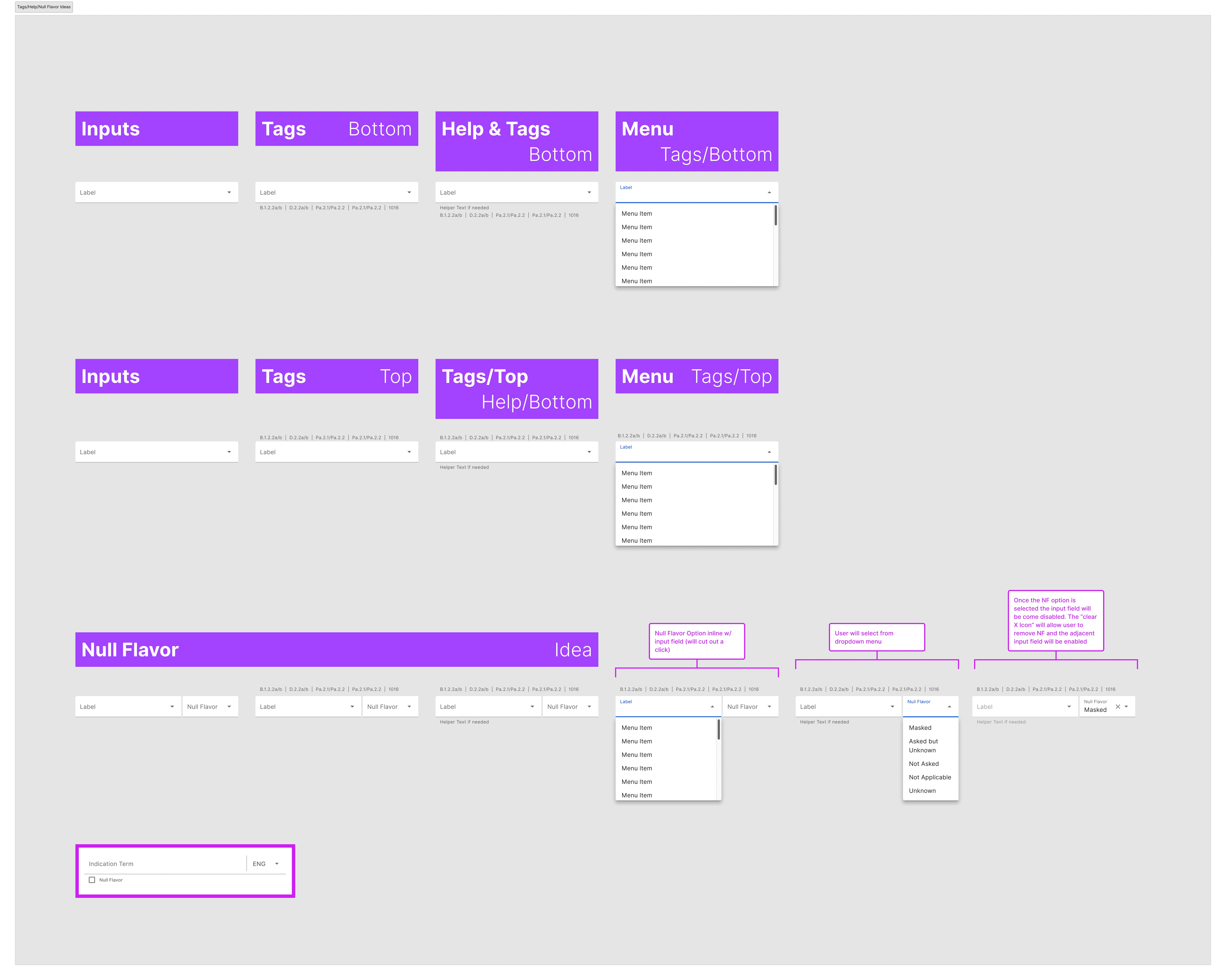
No Double Diamonds Here: The Spaghetti Graphic Process is More Like It
Despite lacking the structure of the Double Diamond Process, the spaghetti graphic offers a more flexible and adaptable approach to problem-solving. This method allows us to test and refine ideas quickly.
Initially, the wireframes were developed and handed over as a Stepper modal without considering the user journey or in-depth product knowledge.
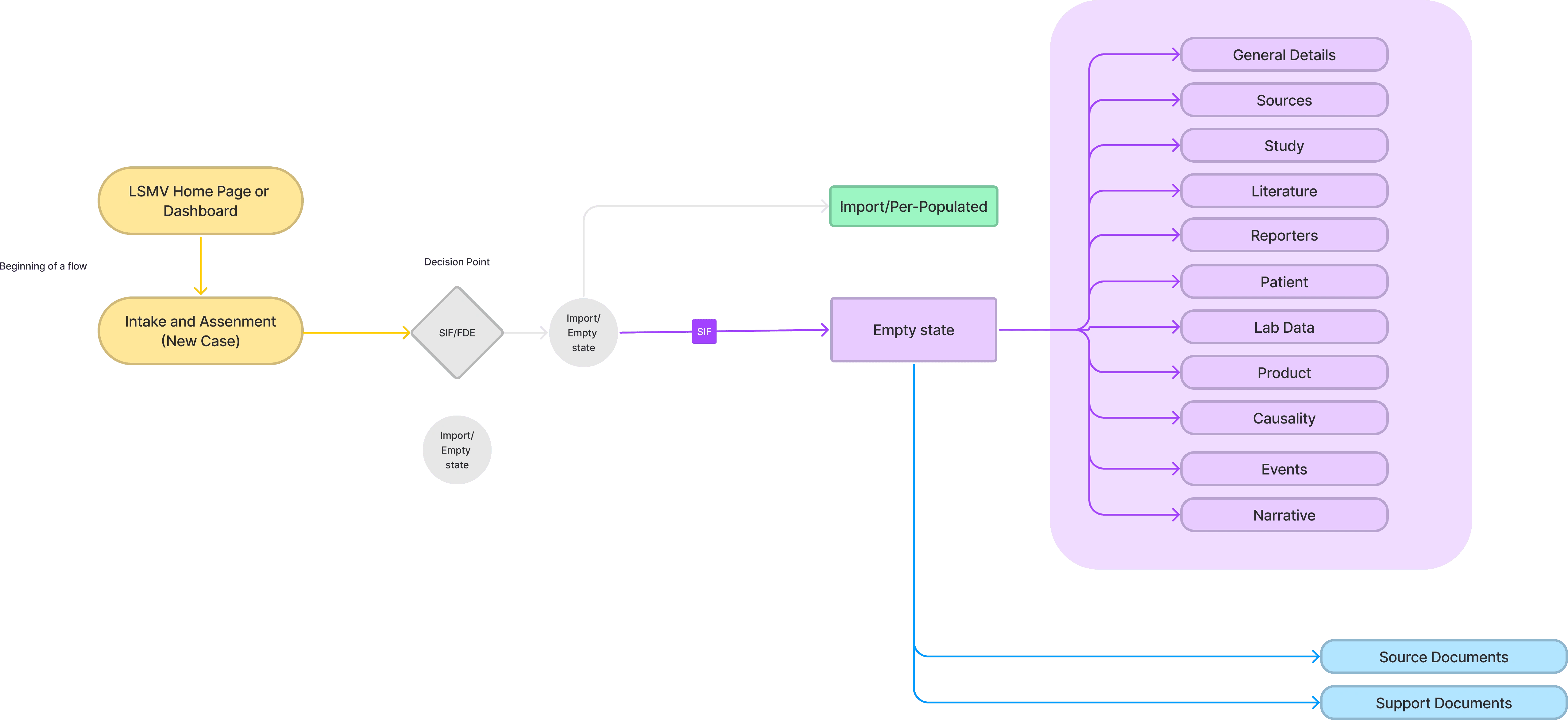
By creating a journey map and leveraging extensive product knowledge, I identified flaws in the wireframes. It was inappropriate to use a stepper approach for user's interactions, as the case processor journey is not linear. Users needed the flexibility to move back and forth within sections, and adhering to a set order was not practical. Thus, the Stepper was the wrong solution.
However, 86% of users thought the Stepper Modal structure was easier to navigate using keyboard keys than the endless scrolling page they previously used.
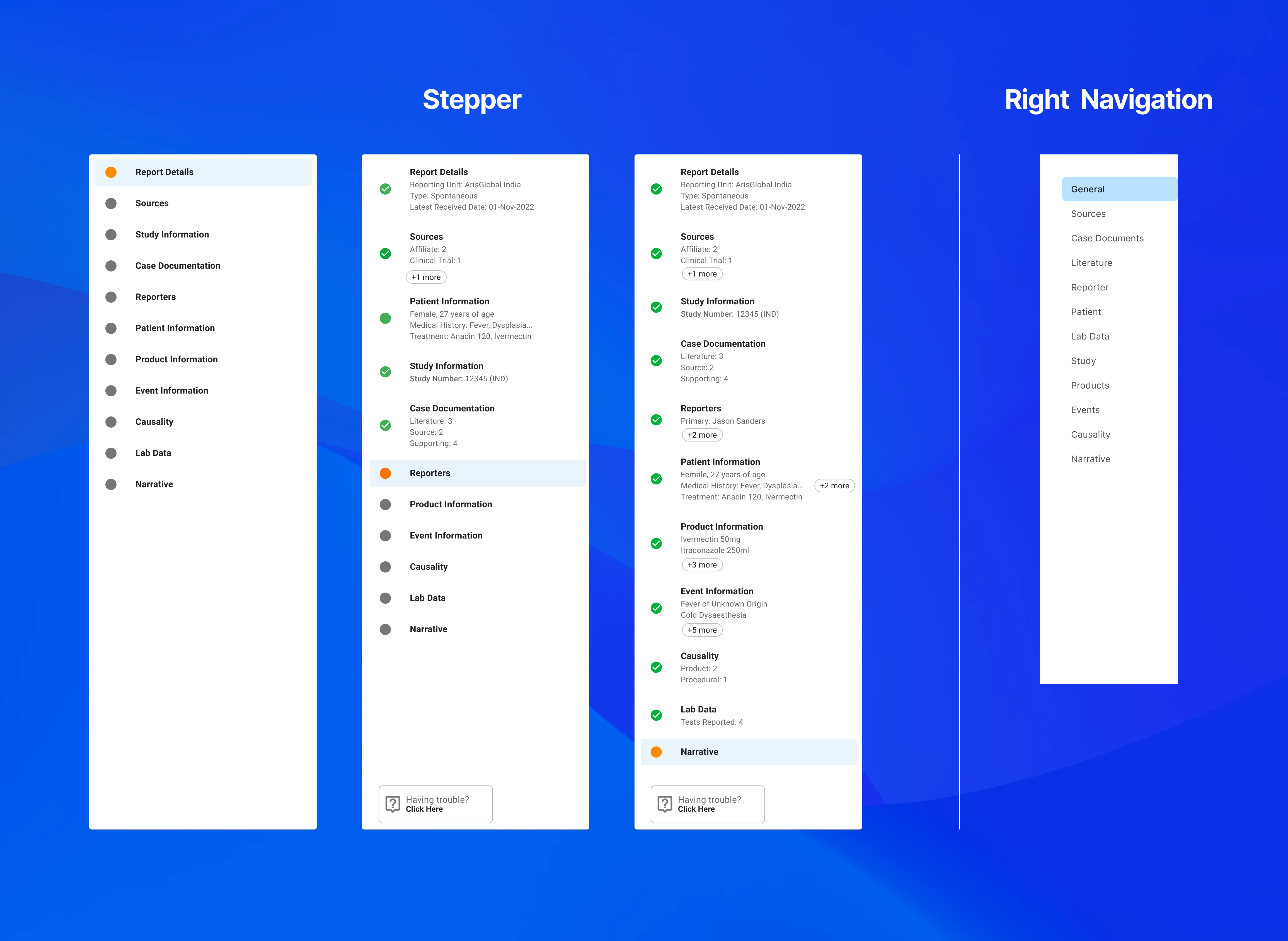
Moving forward, the full-page modal remained, although 63% of users did not understand how it worked within the LSMV software.
Like this project
Posted Oct 15, 2024
An end-to-end drug safety system consolidated into a single, unified safety database for monitoring and tracking all adverse events and serious and medically s…


