
A collection of logos and brand concepts across a range of industries, united by a focus on simplicity, clarity, and character. Each identity combines meaningful symbolism with considered typography to express the idea behind the brand. From geometric monograms to expressive illustrations, this collection explores how distinct visual approaches can serve a shared purpose: creating memorable marks that feel relevant to their audience and hold their own over time.
Inspired by the freedom of flight, a sculpted, wing-like mark reflects ambition, possibility, and the journey toward new beginnings. The balanced, ascending forms communicate progress and assurance, while the elegant serif typography and generous spacing create a timeless, premium presence. Together, the mark and wordmark express Lima’s role in guiding global talent toward a new life in the United States, pairing personal ambition with thoughtful, trusted support.
Built around the idea of moving money with confidence, CashUp pairs a circular symbol with directional arrows to suggest exchange, connection, and everyday financial progress. The balanced geometry creates a sense of stability and motion, while the bold, rounded typography gives the identity a friendly, approachable character. Together, the mark and wordmark position CashUp as a modern finance brand that makes managing money feel simple, helping people take control, build better habits, and move toward their next goal.
Inspired by the freedom of flight, a sweeping bird-like mark breaks through its frame, capturing the spirit of exploration and the possibility of something new. The fluid silhouette suggests movement and curiosity, while the bold, condensed typography brings energy and confidence to a simple, memorable identity. Together, the mark and wordmark reflect StillSoaring’s belief that life can still be an adventure, inviting people to keep exploring, try something unfamiliar, and have fun along the way.
Inspired by Western heritage and the open road, a bold cowboy portrait sits against a striped sunset, capturing a spirit of independence, adventure, and country pride. The circular emblem recalls vintage ranch graphics, while the tall, condensed typography gives the identity a rugged presence suited to statement sweatshirts. Together, the illustration and wordmark connect country style with pickup truck culture, creating a confident, memorable identity for a brand made to stand out at shows and beyond.
Inspired by the connection between routes, destinations, and people, a radial mark brings directional forms around a central hub, reflecting the coordinated movement of goods. The outward rhythm suggests reach and continuous motion, while the bold serif typography adds a sense of stability, experience, and trust. Together, the mark and wordmark position LongrunAi as an intelligent logistics partner, combining responsive thinking with dependable service to keep businesses moving over the long run.
Inspired by the connection between compassion and protection, a heart sits within a softly rounded shield, expressing care, reassurance, and human connection. The simple, balanced mark creates a welcoming presence, while the rounded sans serif typography gives the identity a modern, approachable character. Together, the mark and wordmark reflect WeCare’s vision of more connected healthcare, helping care teams simplify everyday workflows and spend more time on the people who matter.
Built from four rotated letter “b” forms, the circular mark turns Belza’s initial into a symbol of connection, coordination, and unified infrastructure. The balanced structure communicates precision and reliability, while the bold sans serif typography gives the identity a clear, confident, and approachable presence. Together, the mark and wordmark reflect Belza’s vision of simpler data center management, bringing visibility and control to the systems businesses depend on every day.
Inspired by the idea of a guiding star, a geometric mark reflects knowledge, clarity, and direction, expressing Aster’s role in helping entrepreneurs navigate financial decisions. The segmented star brings structure and openness to the identity, while the refined serif typography conveys experience, trust, and warm professionalism. Together, the mark and wordmark position Aster as a knowledgeable, approachable partner, bringing calm to complex financial matters and helping business owners move forward with confidence.
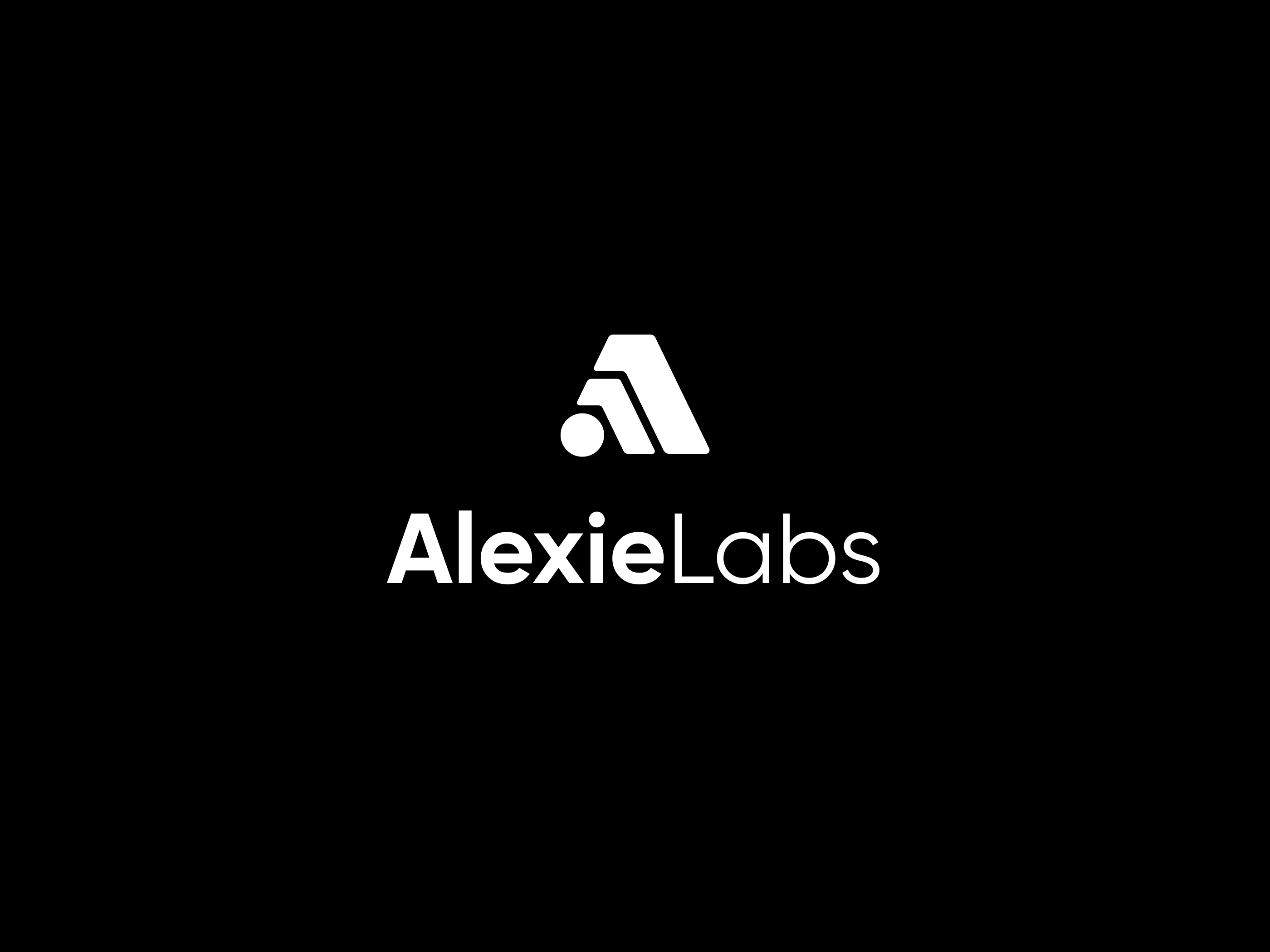
Inspired by the relationship between technology and cinematic storytelling, a geometric “A” combines layered forms with a circular point of light, suggesting depth, discovery, and creative possibility. The softly rounded geometry balances precision with warmth, while the contrast between bold “Alexie” and lighter “Labs” gives the wordmark a confident, contemporary character. Together, the mark and wordmark reflect a studio where technical research supports human creativity, bringing artists and intelligent tools together to shape new animated worlds.
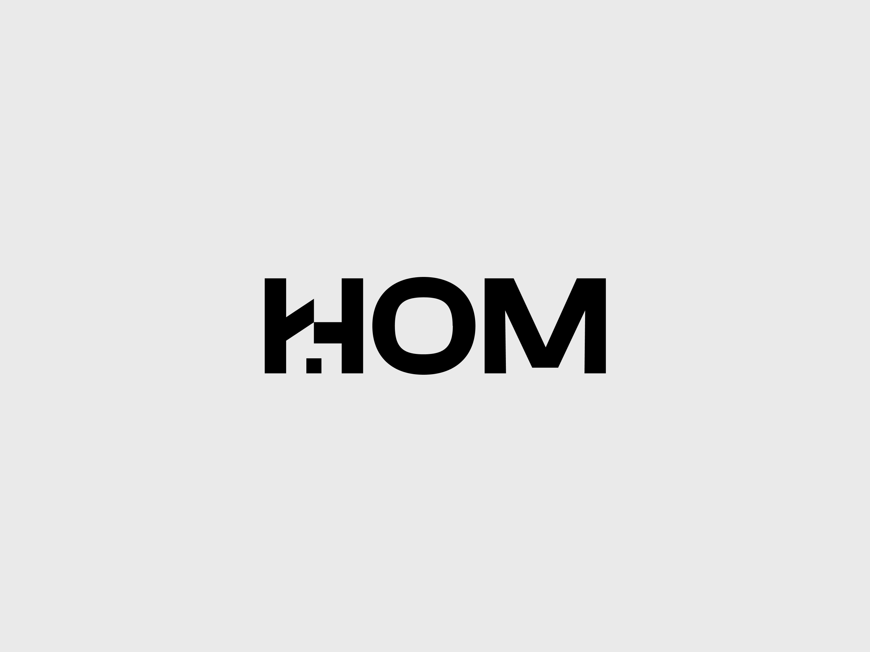
Inspired by the structure of a home, a custom “H” combines architectural angles with a small window-like detail, connecting the wordmark to the spaces people aspire to build. The bold lettering communicates strength and reliability, while the rounded “O” brings balance and an approachable character to the identity. Together, these elements reflect Hom’s role as a trusted starting point for building, connecting people with architects, contractors, and the expertise to take their homes from first idea to final detail.
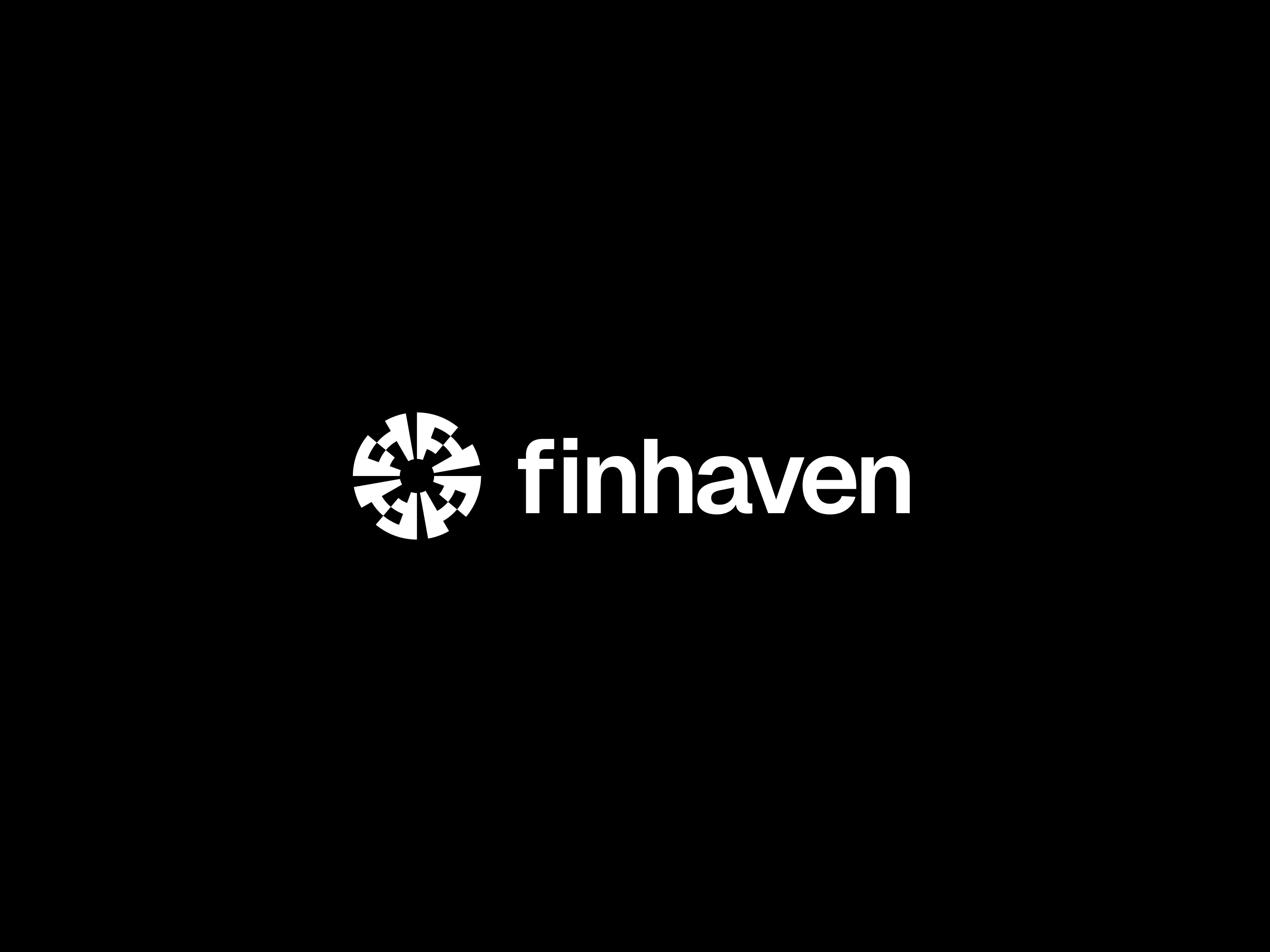
Connected and rotated “f” and “h” letterforms create a circular mark, turning Finhaven’s initials into a symbol of exchange, continuity, and financial connection. The radial geometry suggests coordinated movement, while the bold lowercase typography balances technical confidence with an open, approachable character. Together, the mark and wordmark reflect Finhaven’s vision of a more connected financial world, making complex systems feel accessible and giving people the confidence to move their money forward.
0 likes · 0 views · Nov 11, 2026