Redesign Remittance App | Mobile App Design

0
UX Researcher
UX Designer
UI Designer

Figma

Maze
FinTech
Topremit makes sending money abroad fast, easy, and affordable. No more long queues, paperwork, or slow transfers, just a seamless experience in a few clicks.
Overview
In 2021, it has been almost two years since its initial launch. We did 10-weeks redesign Topremit's remittance mobile apps with cross-functional team (Lead product designer, illustrator, UX writer, CEO, marketing lead, developers)
Result
Decrease time spent on transaction & refund history
Increasing user verification by XX%, Decrease holiday announcement complaint by XX%
My role
As a Product Designer, I handle the end-to-end process—from UX research and UI design to usability testing. This includes preparing and conducting user interviews, creating concepts and user flows, designing wireframes, and aligning updates with the team.
Problem statement
Users difficulties in accessing transaction history and refunds that can lead to increased customer support costs and potential loss of customers.
Business also want a better alignment with our visual branding and tone of voice that make customers more likely to trust and increase the reputation of the company.
Validating process
We did 7 in-depth user interviews
Criteria
Age 20-50, mobile app user, make a transaction in the last 3 months, old user (have used in more than 6 months) and new user (have used less than 6 months), verified and have at least 1 success transaction
Key findings
4 of 7 Rarely check the banner & country holidays, because users assume its promotional & tutorials
5 of 7 Often use “Send” button on the bottom, because users think the bottom bar has the important button and they are used to it.
6 of 7 Rarely use Invite & Recipient, because in Recipient section users can’t do anything
Define current pages
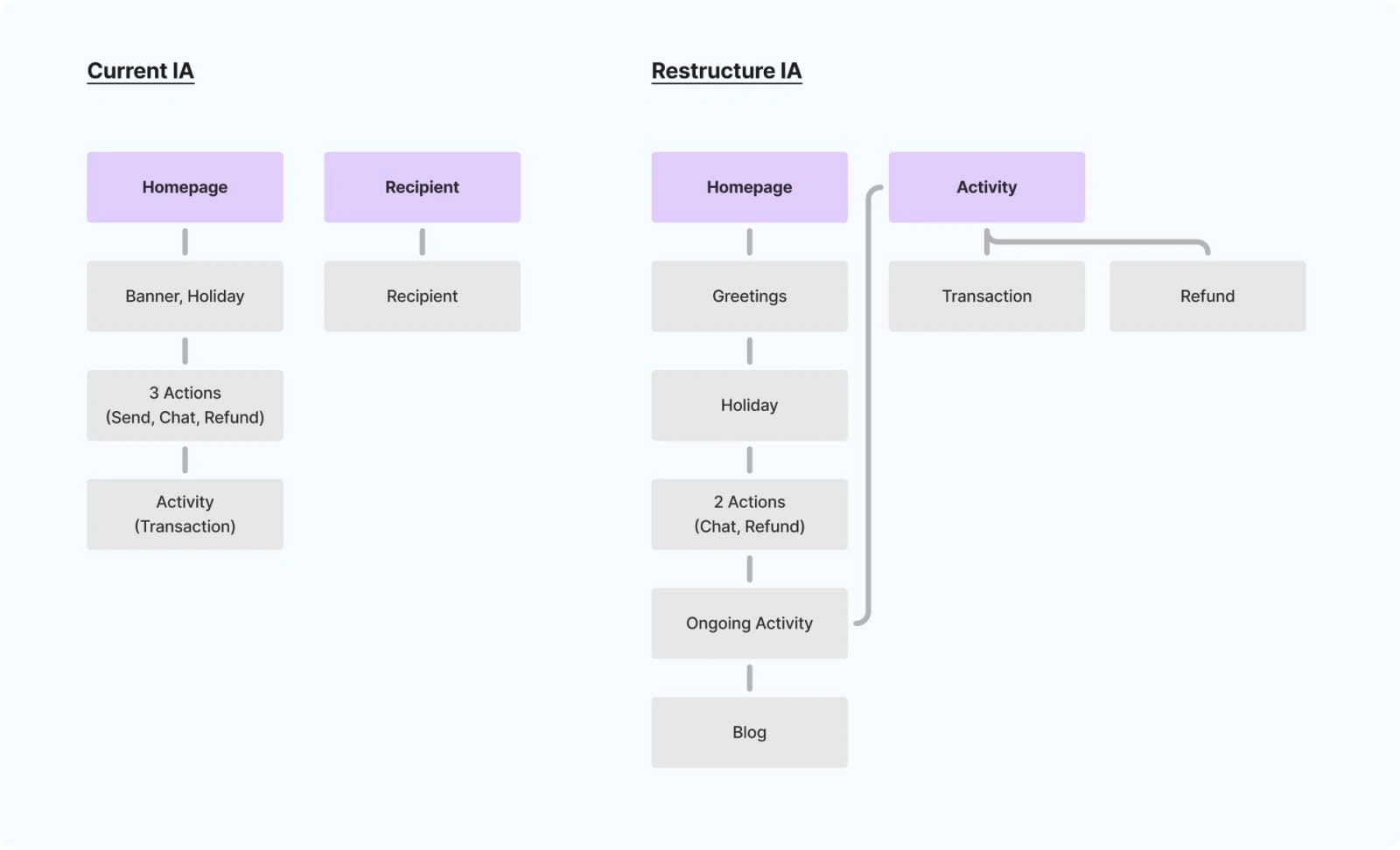
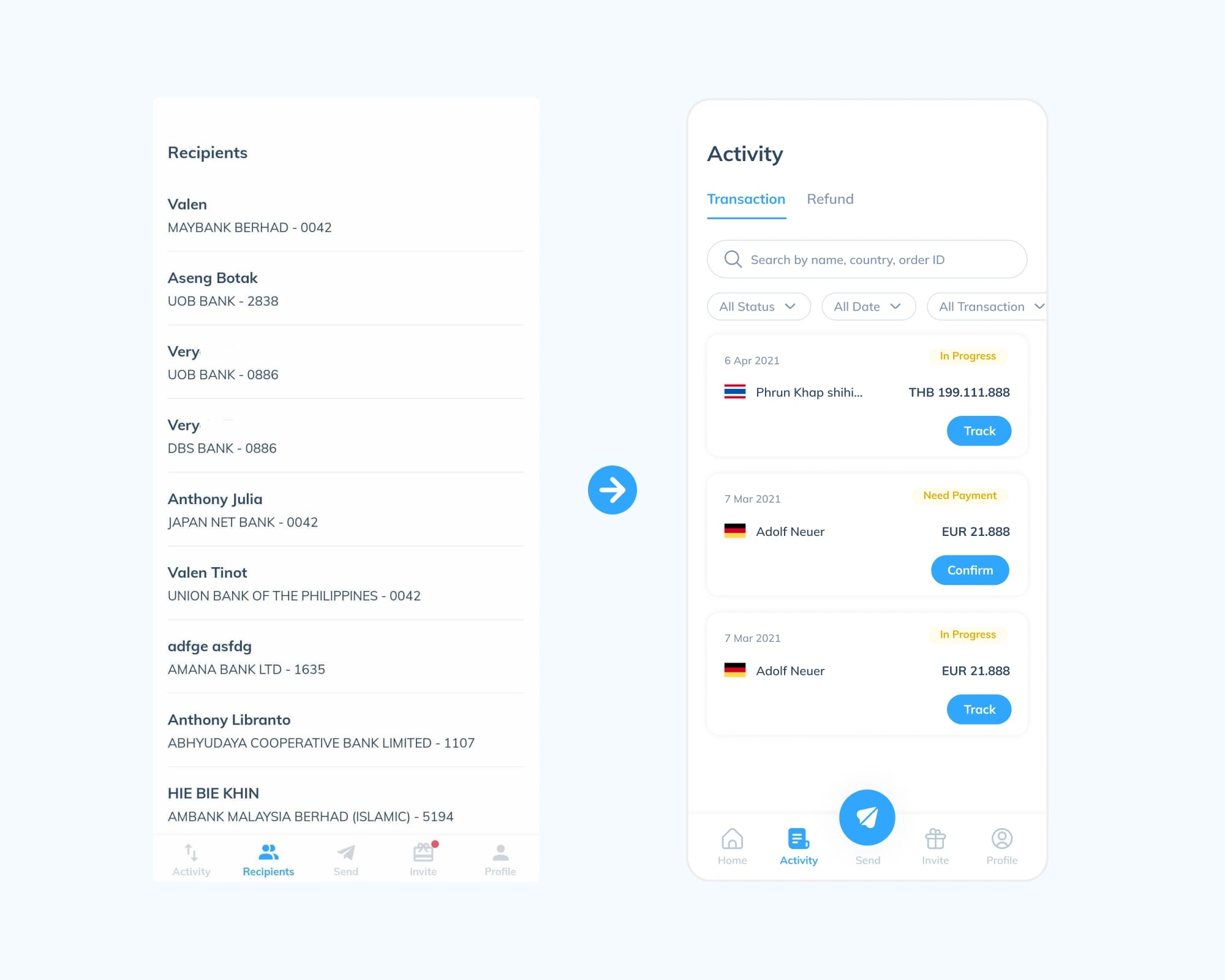
We decided to remove “Recipient” page due to technical issue that data can’t be edit, so we remove this page
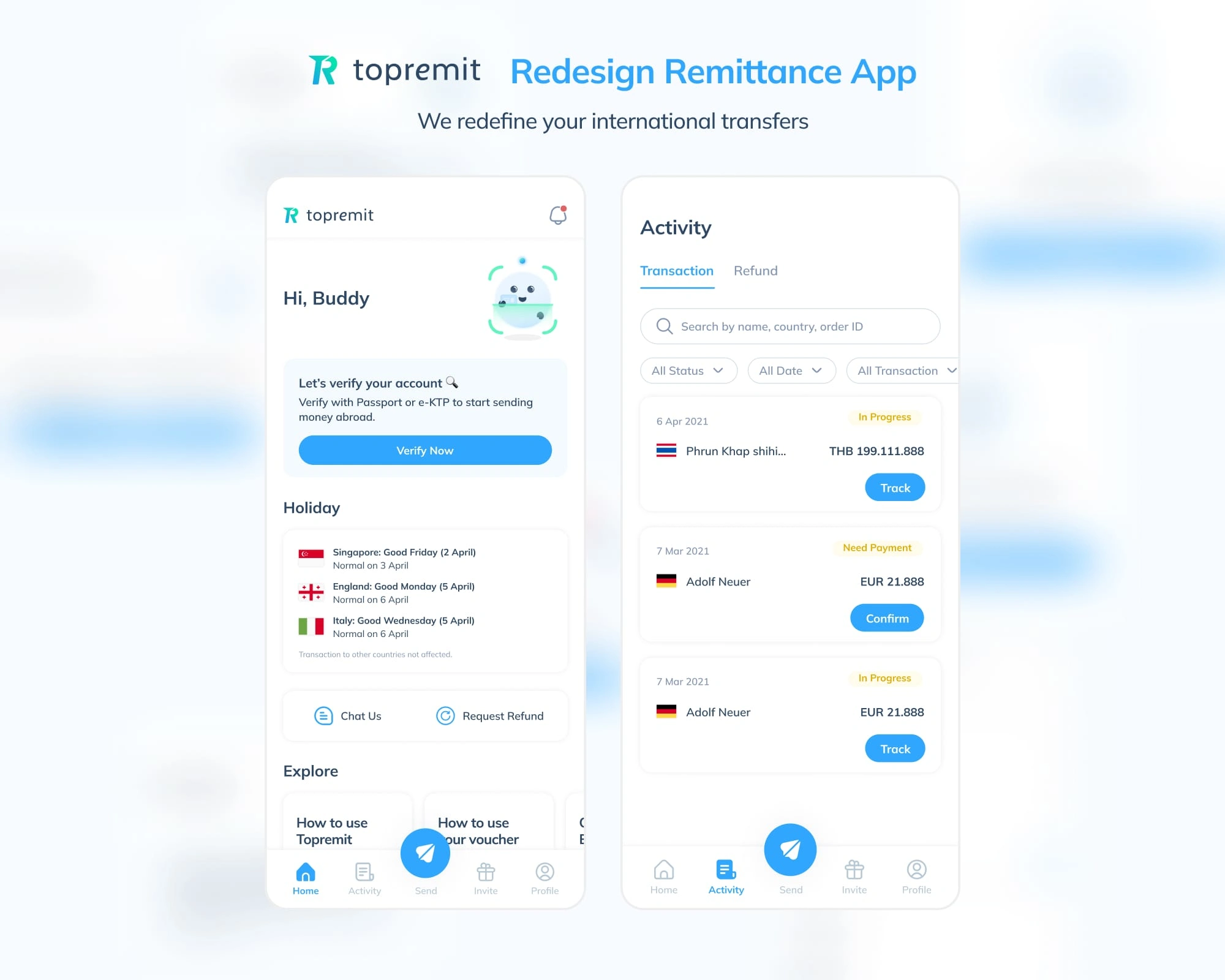
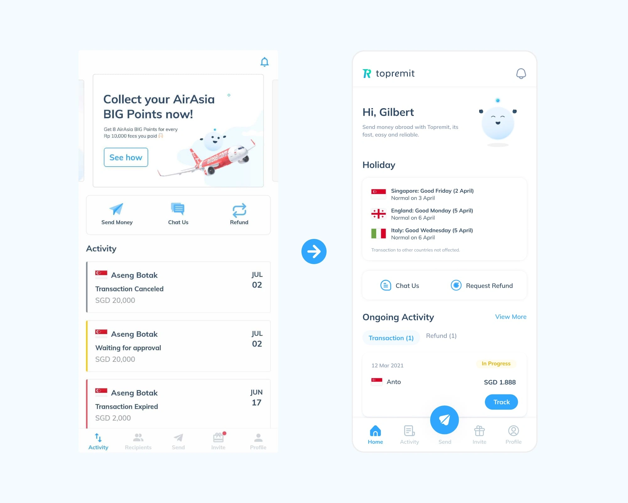
Final Design
Usability Testing
Usability Score: 79 of 100
The score little bit low of bugs and internet connection, which causes massive misclicks and give-ups (but gladly, Most of the users know how to do the tasks)
Rating experience: 4.2 of 5
The score little bit low of bugs and internet connection, which causes massive misclicks and give-ups (but gladly, Most of the users know how to do the tasks)
Learnings
Start with a warm(chit chat), neutral conversation to ease into the interview.
Have a partner during the interview to assist with documentation.
Like this project
0
Posted Mar 4, 2025
2 Key result: - Decrease time spent on transaction & refund history - Increasing user verification by XX%, Decrease holiday announcement complaint by XX%
Likes
0
Views
0
Timeline
Feb 1, 2021 - Apr 15, 2021
Clients
Topremit
Tags
UX Researcher
UX Designer
UI Designer
Figma
Maze
FinTech


AI Chatbot App | UX UI Design | Design System

Design FBA Sellers App | SaaS Design