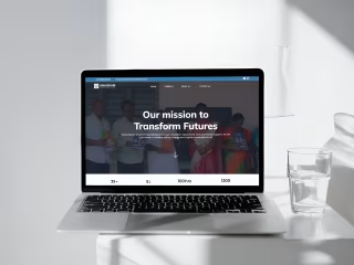
Echo AI Framer Website - SAAS

Venkat Durgaprasad
EchoAI Framer Website Project
Project Overview:
I had the opportunity to work on the EchoAI Framer website, focusing on enhancing the functionality and user experience of their blog pages. The main tasks included adding a Table of Contents to each blog post, implementing new CTA buttons, and updating the navigation banner to facilitate report downloads.
Key Features Implemented:
Table of Contents Integration:
Objective: Improve user navigation and readability on blog pages.
Implementation: Added a dynamic Table of Contents (TOC) to each blog post, allowing users to jump directly to different sections within the articles. This feature enhances user experience by making long-form content more accessible and easier to navigate
New CTA Buttons:
Objective: Increase engagement and conversions.
Implementation: Designed and integrated new Call-to-Action (CTA) buttons across the site, strategically placed to encourage users to take specific actions, such as signing up for newsletters or contacting the team for more information.
Navigation Banner Update:
Objective: Promote easy access to important resources.
Implementation: Updated the navigation banner to include a prominent button for downloading reports. This change was aimed at making valuable resources more accessible to users, thereby improving user engagement and satisfaction.
Outcome:
The enhancements made to the EchoAI Framer website significantly improved the overall user experience. The Table of Contents feature on blog pages made it easier for readers to find and focus on the content they were interested in. The new CTA buttons effectively drove more user interactions, and the updated navigation banner ensured that important resources were just a click away.
This project underscores my ability to blend design with functionality, ensuring that the website not only looks great but also performs efficiently to meet user needs and business goals.


