Built with Framer
OLMI Website Migration & Redesign
Mati | Kavaju Resa
OLMI Website Redesign: Clearer Communication for Independent Music Research
A full redesign and migration of OLMI’s website was carried out using Framer. The previous multi-page structure was replaced by a more organized landing page format to improve clarity and usability. See the live project here.
The redesign aimed to address a key challenge: the site’s original layout made it difficult for users to understand OLMI’s mission and access its most relevant publications. The new structure simplifies navigation and highlights the platform’s core initiatives and latest updates.
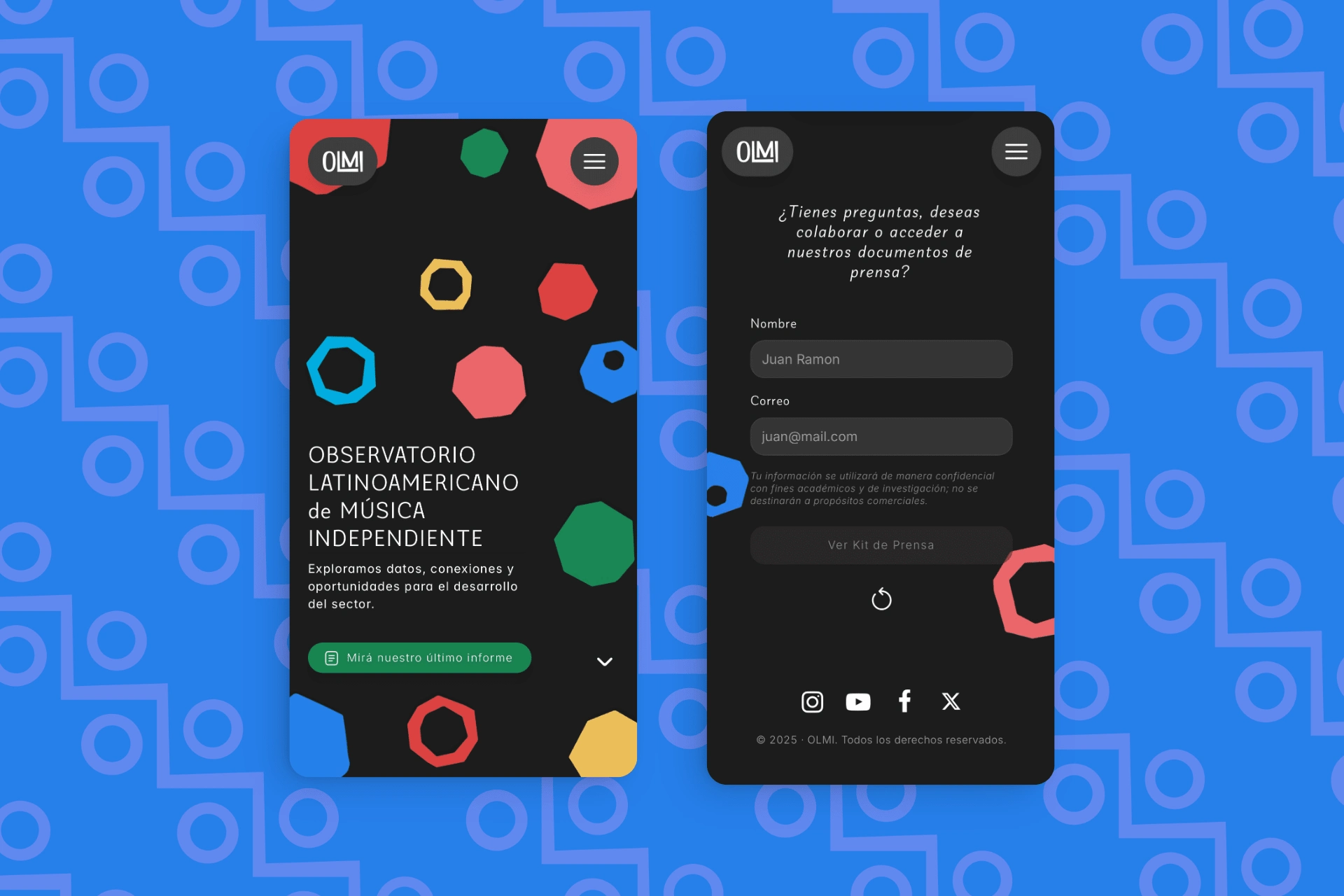
Mobile Views, Hero Section and Contact Form.
Visual elements and the original color palette were maintained, but reorganized to bring forward new content. The color system, inspired by different Latin American countries, supports OLMI’s regional focus — each tone or combination representing a specific country involved in their research efforts.
The landing page now gives greater visibility to the latest report, "Independent Music in Latin America: Value Chain and Digital Distribution", while also setting the foundation for future content expansion and full site updates.
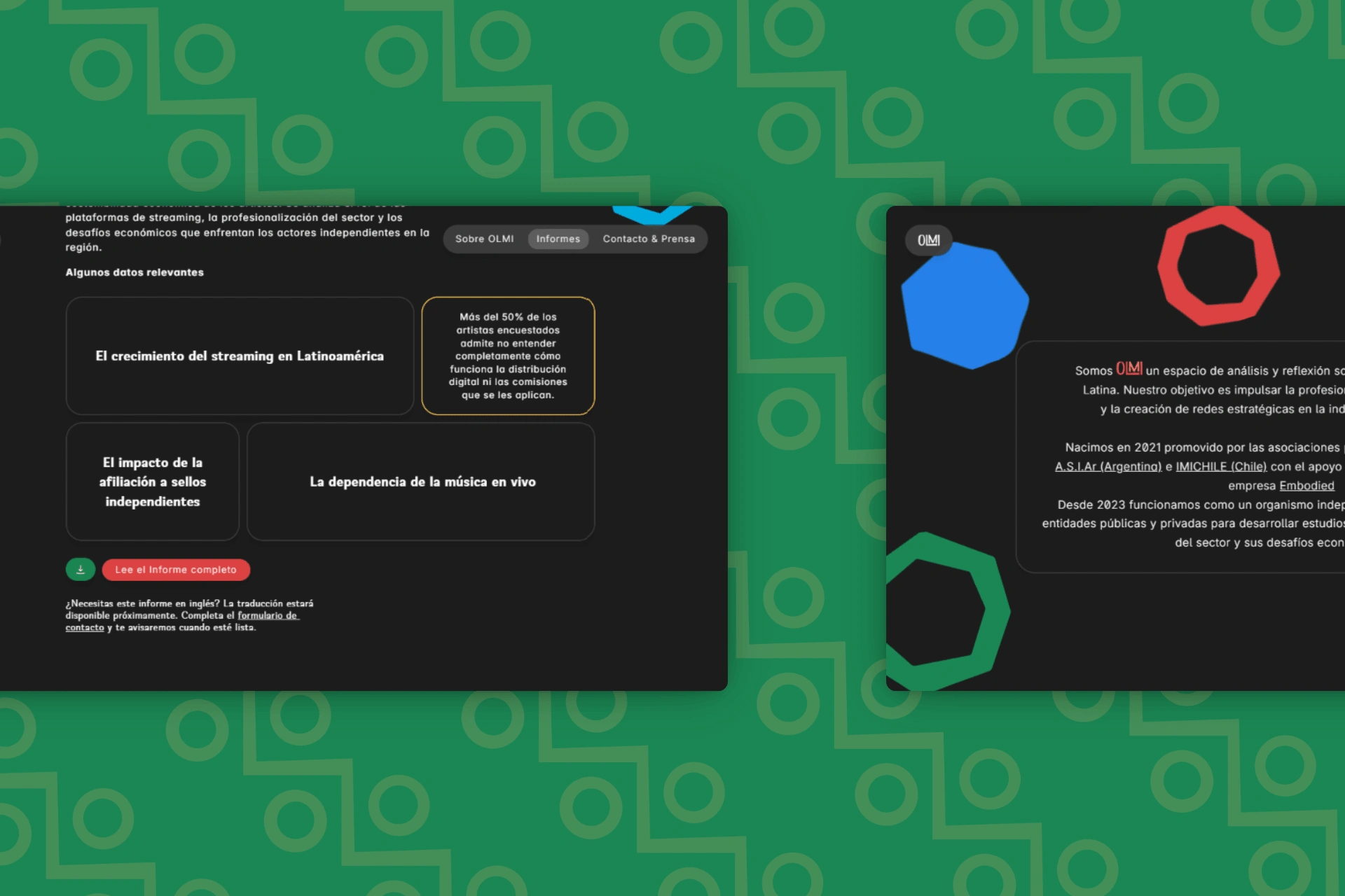
Desktop views, about section and latest reports.
Process and Role
The design process began with a strategic shift from a multi-page site to a streamlined landing page — a decision made to better fit the client’s timeline and budget. Once the visual materials and copy were provided, the redesign was built entirely in Framer, with small iterations based on client feedback to ensure clarity and consistency throughout the site.
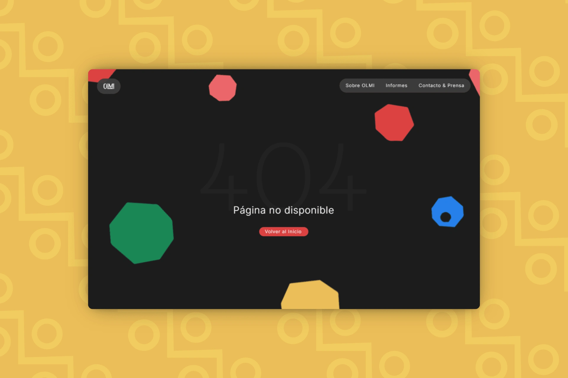
Page 404.
Result
As a result of the new site structure, improved SEO practices, and the client’s promotional efforts around the website update, OLMI has seen an increase in overall traffic, a 50% reduction in bounce rate, greater on-page engagement, and more frequent use of the contact form.
Look at the live page at this link 👇🏼
Like this project
Posted Apr 8, 2025
Landing page redesign in Framer for OLMI, improving content structure, usability, and access to key reports on Latin America's independent music scene.
Likes
10
Views
110
Timeline
Mar 24, 2025 - Apr 1, 2025