🎥 Showreel for Brand Agency

Ayan Seid


This one was a sprint — but the kind I weirdly enjoy.
Sploosh Media Lab asked me to craft a brand showreel for United Farmery Creamery to showcase their identity work. The goal? Make it feel premium, thoughtful, and ad-ready — something that doesn’t just show work, but helps bring in real leads.
I was in charge of everything: scripting the flow, editing, animating, designing transitions, building product mockups, handling sound design — the whole shebang. Used Premiere Pro, After Effects, Photoshop, and Illustrator to stitch it all together.
Here’s the twist:
I had to pull it off in just 2 days. The initial assets were… let’s say, “less than polished.” Mockups were rough, direction was vague, and I had to dig deep to make sense of the branding with minimal data.
Instead of fighting the chaos, I leaned into it. I built a visual rhythm around their circular logo — using forward-moving transitions that pulse with the beat. That shape became my storytelling anchor. It pulled viewers in, guided their eyes, and brought consistency to scattered assets.
forward-moving transitions
One of the biggest lessons I took from this? How to build a clean workflow when everything feels messy. No excuses, just solutions.
The final result went beyond what the client expected. Not only did it position United Farmery in a premium light — it actually drove quality leads when they ran it as part of their ad campaign.
Scroll through to check out some BTS:
→ rough storyboards
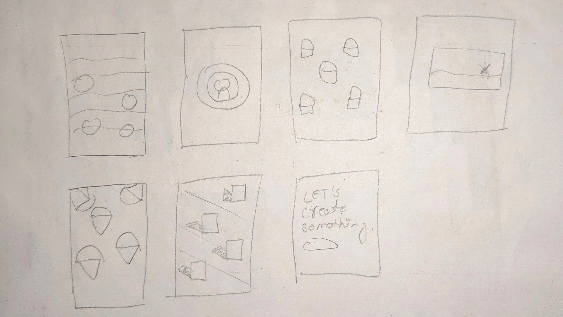
→ animation breakdowns
Like this project
Posted Jul 27, 2025
Crafted a brand showreel for Sploosh Media Labs to showcase their client work.
Likes
1
Views
7
Timeline
Jan 16, 2025 - Jan 18, 2025

