
Your website doesn't need more sections. It needs more clarity.
I've seen landing pages with:
10+ sections
Multiple CTAs
Long paragraphs
Too many animations
And way too much information.
The result?
Visitors don't know where to look.
A better approach:
1. Make the value proposition obvious.
2. Give the page a clear visual flow.
3. Use fewer, stronger CTAs.
4. Remove anything that doesn't support the goal.
5. Let the design breathe.
Good web design isn't about how much you can fit on a page.
It's about how quickly someone understands it.
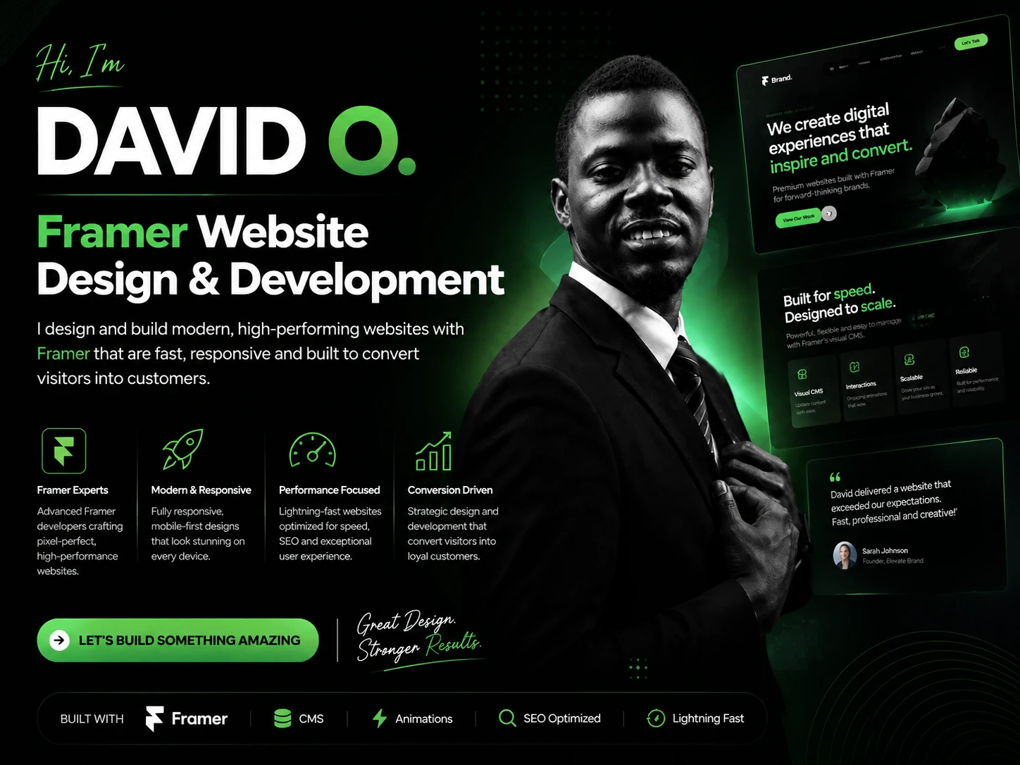
0 likes · 0 views · Aug 18, 2026
Your website doesn't need more sections. It needs more clarity. I've seen landing pages with: 10+ sections Multiple CTAs Long paragraphs Too many animations ...


