Built with Ideogram
Synthetic Visions : Between Stasis and Motion
Okoye C
Synthetic Visions : Between Stasis and Motion
I designed this project as a deliberate exploration into the capabilities of generative artificial intelligence specifically using Ideogram AI to bridge the gap between rigid graphic design and dynamic photographic energy. My goal was to move beyond simple image generation and instead use the AI as a tool for curated artistic direction by creating two distinct yet complementary series exploring contemporary portraiture. I wanted to challenge the AI to maintain strict stylistic consistency across radically different visual languages. The collection is divided into two studies where one focuses on static graphic reductionism and the other on kinetic photographic realism. Both series utilize portraiture not just to capture a likeness but to establish a specific mood and aesthetic identity mimicking high end editorial content like magazine covers and album art.
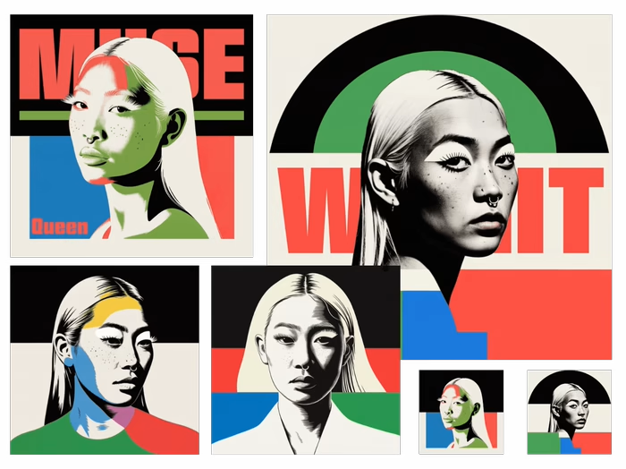
In the first series featuring the female subject, my inspiration was drawn heavily from mid century modernism, Bauhaus principles, and Constructivist poster art. I restricted the color palette to a striking combination of deep reds, royal blues, kelly greens, and stark blacks against cream backgrounds. This approach is intensely graphic rather than realistic. I experimented with rendering techniques to push the AI to simulate analogue printing methods. Some images utilize heavy woodcut style shadowing and bold vector linework while others incorporate halftone dot patterns and stippling to suggest vintage screen printing. I utilized bold geometric shapes such as circles and sharp horizons to frame the subject's stoic gaze. The integration of massive sans serif typography like MUSE, WAIT, or NORMAL ISSUE was crucial because it transformed the portraits into cohesive pieces of graphic design meant to feel like avant garde fashion publications.
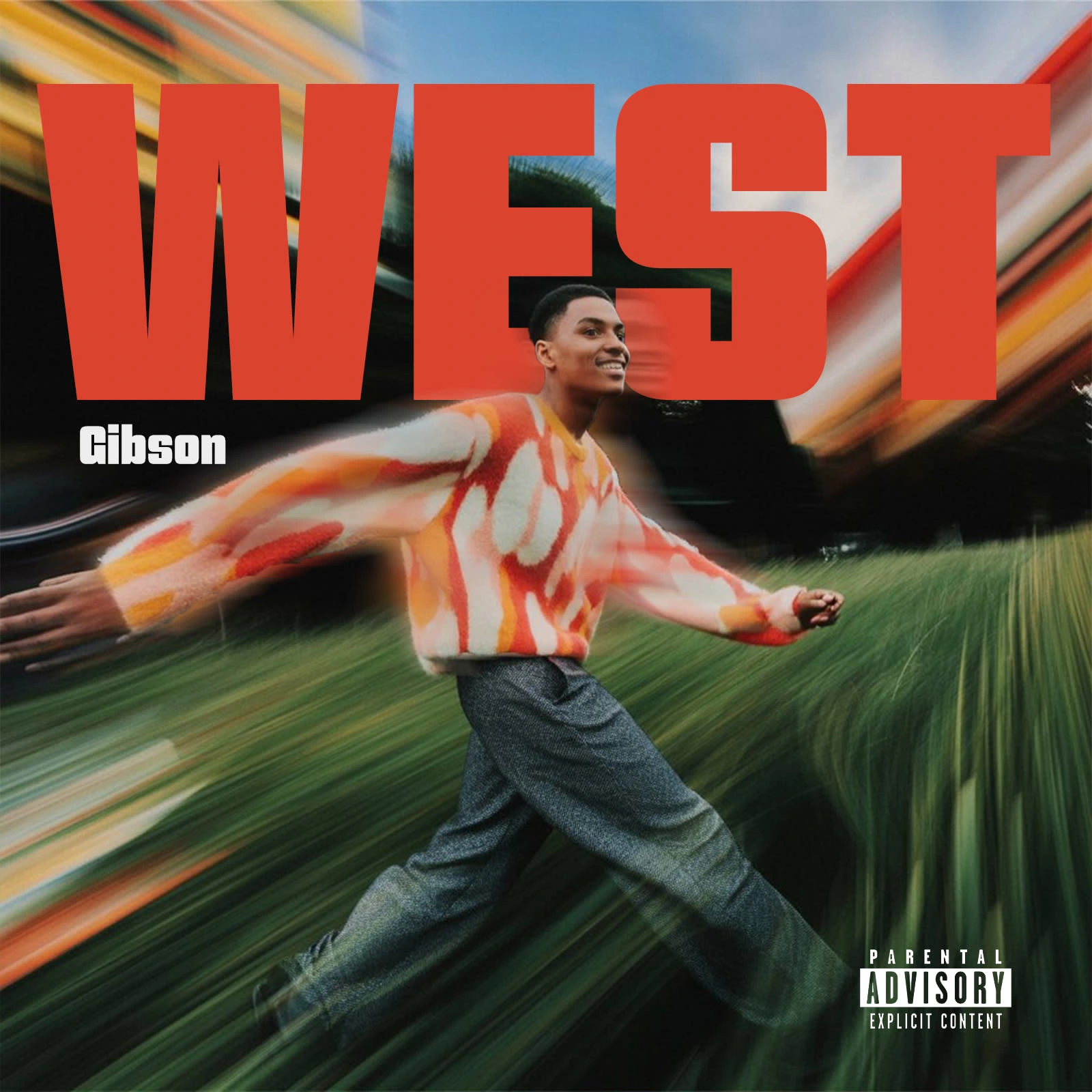
The second series shifts entirely away from the flat graphic plane into a hyper dynamic photographic world defined by aggressive motion. I utilized intense radial blur effects centered tightly on the subject to create a sense of explosive speed and vibrant energy. Contrasting the stoic nature of the graphic series, the subject here is full of life and movement in a natural grassy environment. The blur smudges the rich colors of his patterned sweater into streaks of light making the subject feel like the calm center of a chaotic world. The final image in this set titled WEST demonstrates how this aesthetic translates directly into commercial art by applying explicit content labeling and typography to create a convincing modern hip hop album cover.
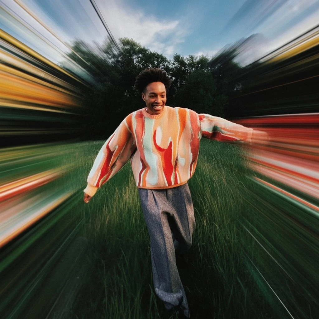
Working with Ideogram AI required a disciplined approach to prompting because the success of these images was about defining the rules of the world they inhabit. For the graphic series I had to enforce strict constraints on color banks and demand specific rendering styles like vector art or linocut to prevent the AI from reverting to photorealism. For the kinetic series the challenge was balancing the intensity of the radial blur while ensuring the subject's face remained perfectly sharp and the focal point of the composition. Ultimately this project serves as my study in controlling aesthetic output proving that generative art tools can produce highly specific and consistent bodies of work when guided with clear artistic intent.
Like this project
Posted Jan 15, 2026
I merged graphic minimalism and kinetic motion with Ideogram AI to create an editorial series using primary colors and high speed energy.