BridgePoint Logo Design
Katelynn Platzer
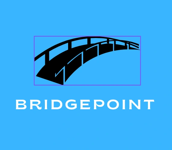
Logo Concept: BridgePoint– Connection and Stability
Design: A minimal arch or bridge shape with two anchor points connected by a smooth curve, symbolizing unity and reliability. The brand name appears below in clean, bold lettering.
Meaning: The bridge symbolizes connection, support, and progress—perfect for brands focused on consulting, tech, education, or community building. The design evokes trust and forward movement with visual clarity.
Like this project
Posted Jun 10, 2025
The arch symbolizes connection and stability, representing how the brand brings people, ideas, or services together with trust and support.