🗺️ Tag-Along
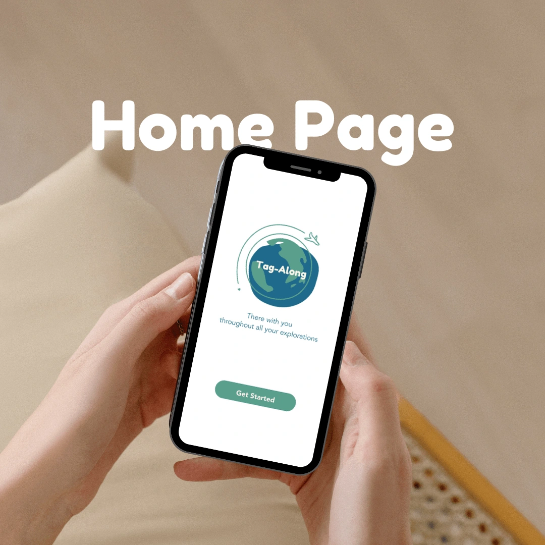
There with you throughout all your explorations
Tag-Along is a travel app that equips users with everything they need in the event of an emergency during their travels.
The app has features such as a travel quiz to gauge one's understanding of travel insurance and later curate them. policy that best fits their needs for their next adventure. Another feature is the Travel Buddy Bot which aids users with translation, the location of emergency services, and more.
The Research
Our team that worked on Tag-Along wanted to solve a problem initially revolving around trip planning, but after going through our research process it took a turn and we decided to pivot to focus on travel emergencies (specifically travel insurance). This approach allowed us to dig into the insights and create something that fits where there was an actual need. The underlying feeling that we got from interviewees and after our affinity mapping session was that people are worried. So, how could we make them feel more confident and comfortable during their travels?
Affinity Mapping
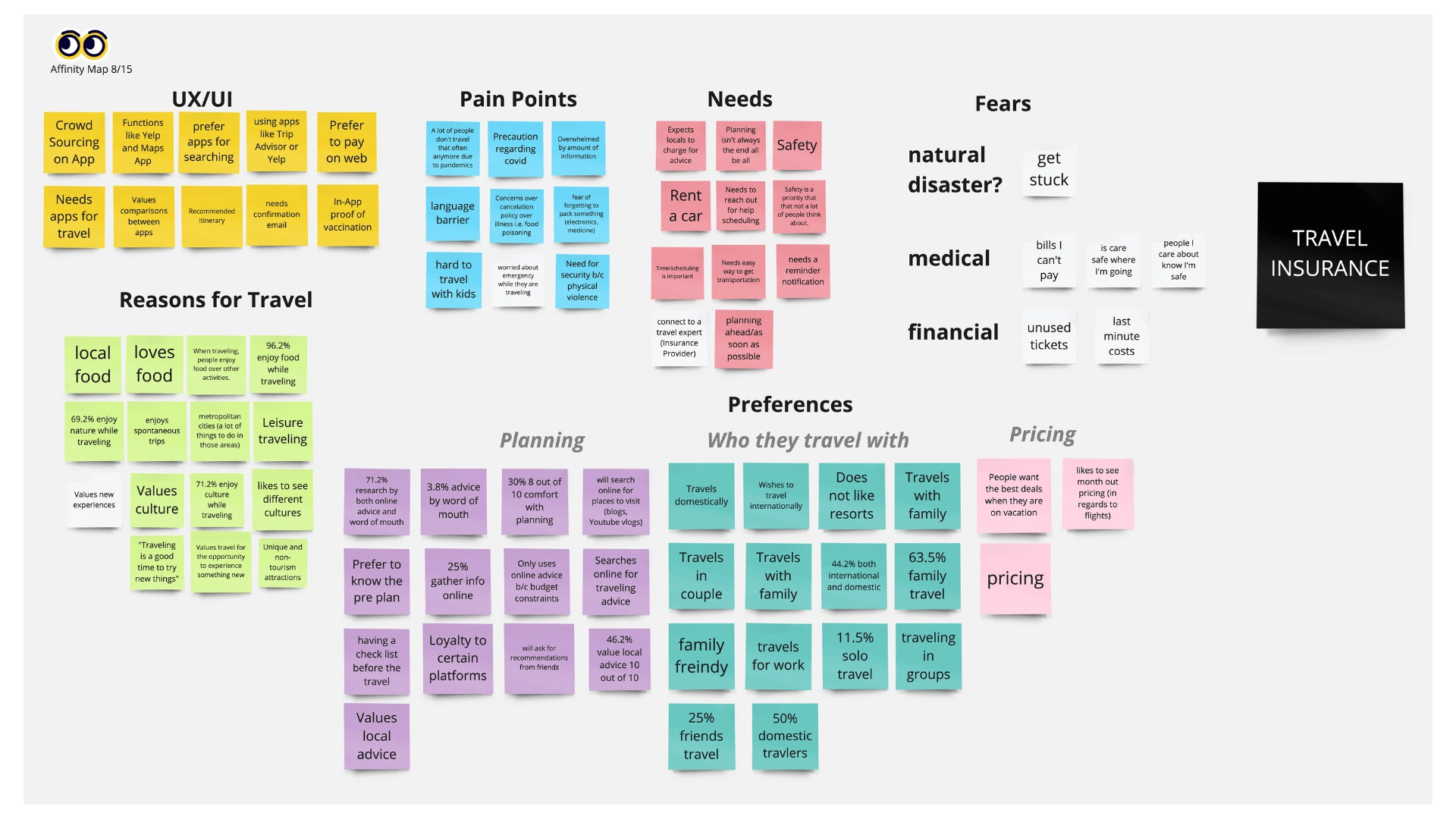
Affinity Mapping Session Completed
Interview User Insights
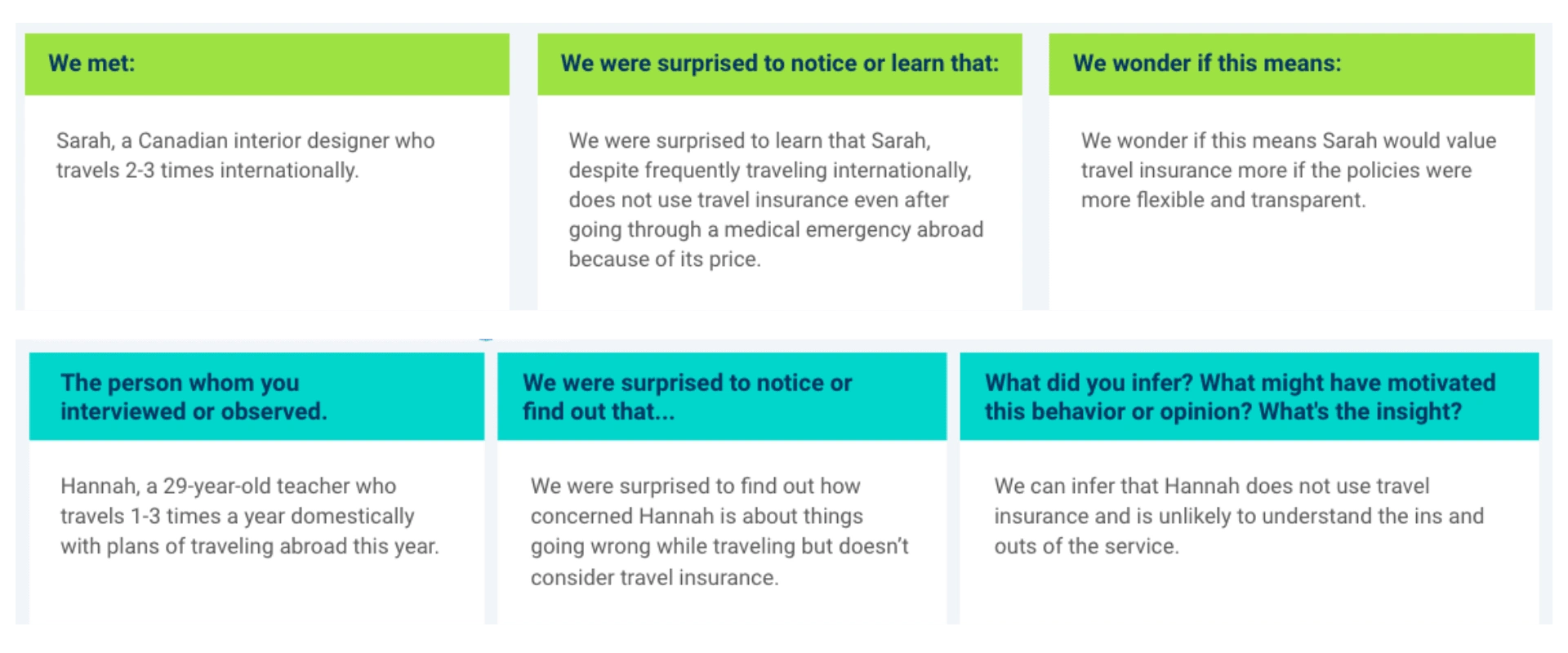
Insights from two user interviews
User Journey
The Design
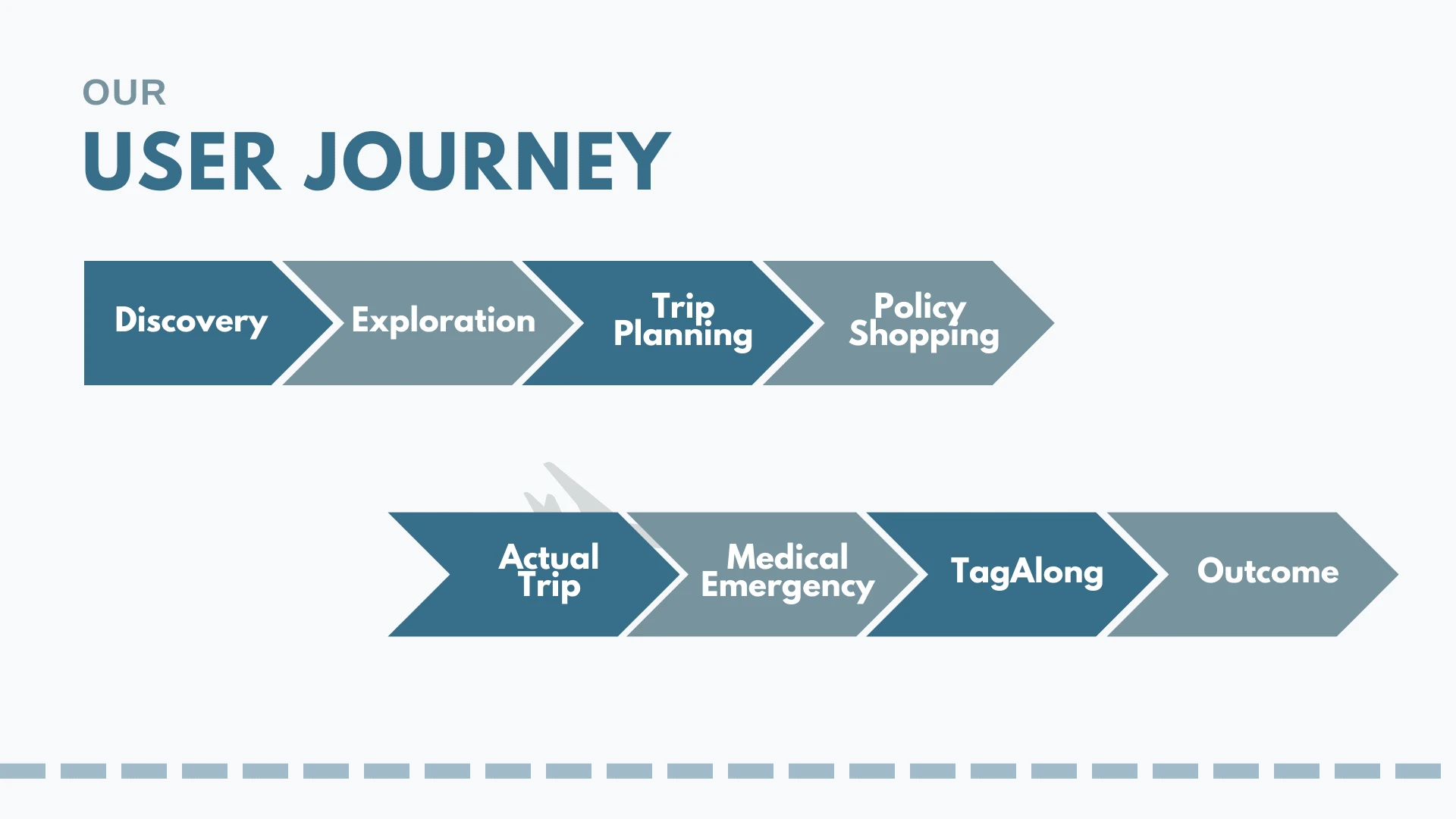
The design process initially began with deciding which features best-fit users' needs and wants. Prioritizing through a Moscow Prioritization matrix allowed the group to bounce ideas off one another and see if there was any overlap. From figuring out which ideas were "Must-Haves" and "Should-Haves" it was onto understanding and creating a user journey. Next was when designing finally came into play.
Version 0
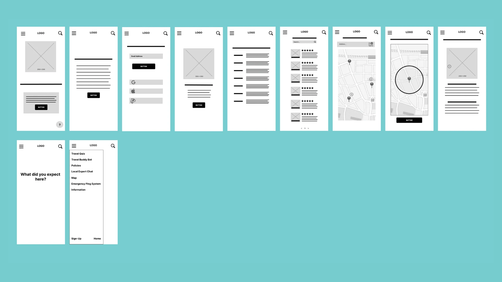
Version 1
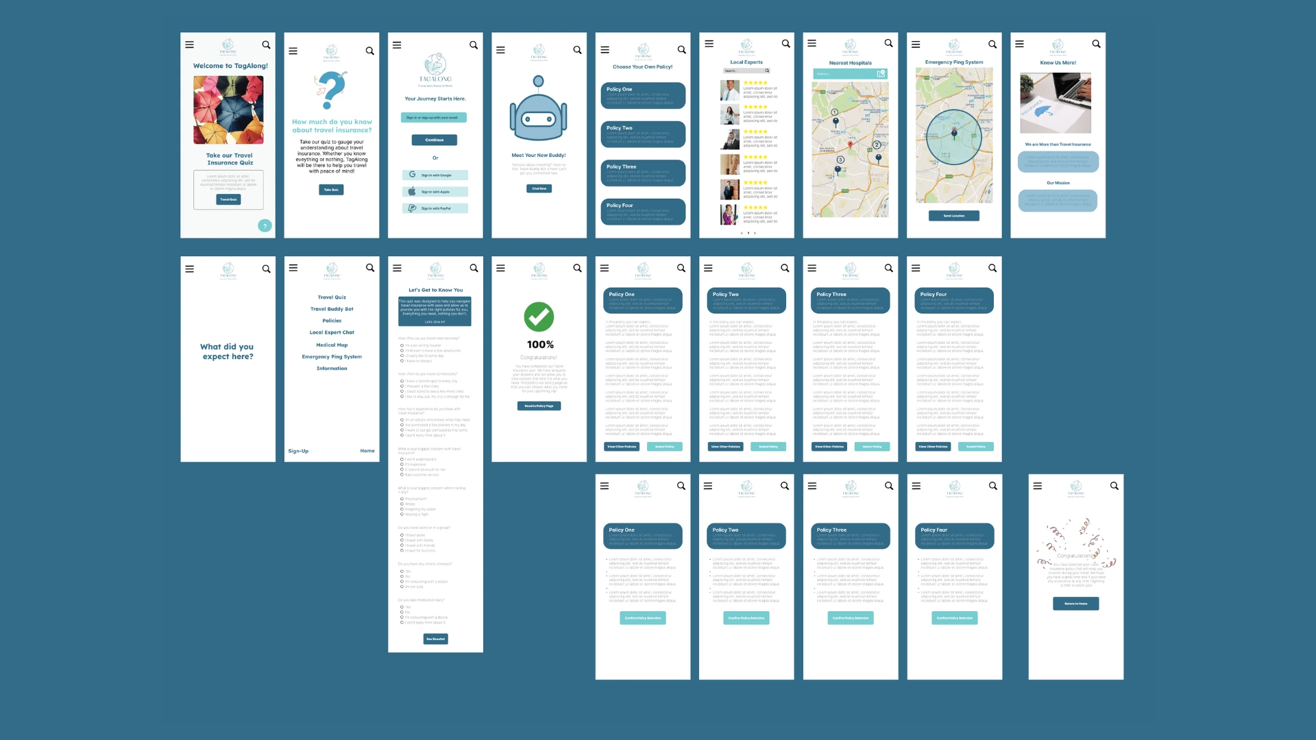
Findings
Users were able to navigate and proceed through the travel insurance quiz to the final policy confirmation page.
We found that some features may be redundant.
We learned that the quiz makes people feel more trusting of the app, but needs to have a heavy focus on being inclusive of many, many experiences.
We found that the ping system may hold little to no value with users and feels tacked on.
We found that our navigation is one of the strongest elements of our design and should be one major focus point going forward.
Recommendations & Next Steps
Redefine the use of the Travel Buddy Bot
Configure and reorganize policy setup
Figure out how to connect the travel experts to the app
Focus more on the design and details of icon placements and page flow
Redesign information page to include contact information is something to look into
Reflection
I enjoyed the initial concept and design very much, but I still felt that there was more that I would do to improve it. So I thought "How can I make a great project better?" and I think I did so with my quick redesign of the initial landing and home page. It made more sense to try and make the virtual space comfortable for users, as through the research they all felt a sense of worry about things that could go wrong on their trip and not knowing how to navigate it in a place away from home. Through the initial project, I got a great idea of how to properly navigate when dealing with a wicked problem and the choice of a redesign made me realize what I was comfortable with and what I could work on to become a better designer. And with that, I will continue to take on projects and opportunities to help me improve and hone in on my skills (and maybe take the chance to learn new things while I am at it)!
Like this project
Posted Aug 1, 2023
Tag-Along, a travel app there with you throughout all of your explorations!
Likes
0
Views
3

