ORIN | Logo Design
Phong Huynh
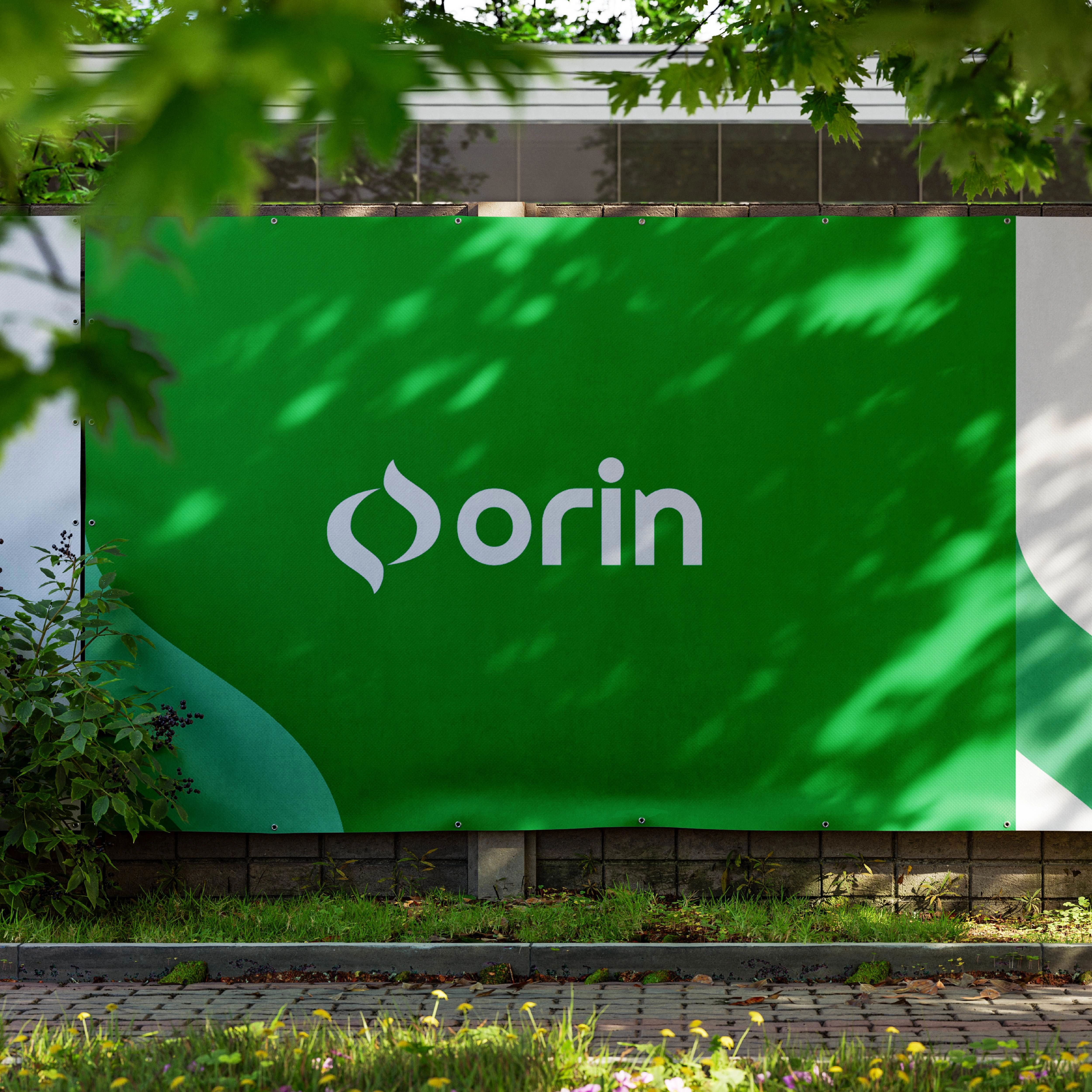
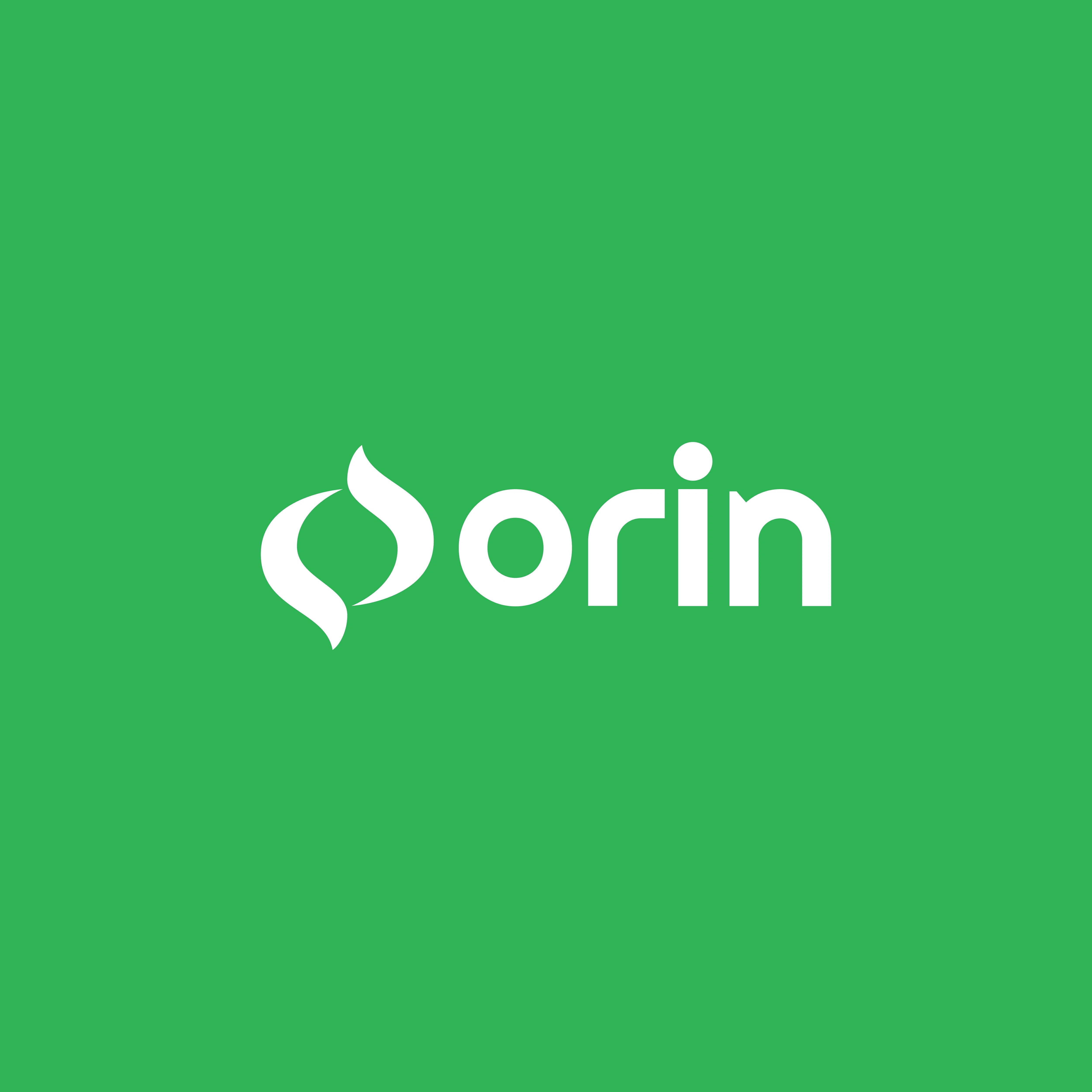
A brand specializing in herbal tea. The solution involved creating a unique icon where two petals form the letter "O," symbolizing natural ingredients and purity. The clean and modern font enhances readability and brand recognition, while the green color palette reinforces the brand's connection to nature and health. This logo effectively captures the essence of Orin, making it visually appealing and reflective of its herbal focus. It establishes a strong brand identity that stands out in the herbal tea market, appealing to consumers seeking natural and healthy beverage options.


Like this project
Posted Aug 7, 2024
Orin is a herbal tea brand with a logo featuring a unique icon where two petals form the letter "O," symbolizing natural ingredients and purity.