This project was built with:
Improvability AI - Blog restructure
0
Web Designer
Frontend Engineer
Framer Developer

Figma

Framer

Collaborating with Improvability AI, a groundbreaking business platform leveraging generative AI to enhance environmental impact, I've been tasked with streamlining their website launch. My responsibilities include troubleshooting minor bugs on their Framer website, implementing brand-aligned changes for a more representative online presence, and executing a comprehensive blog restructure.
This project aims to elevate Improvability AI's digital footprint, ensuring a seamless and engaging user experience while aligning with their environmental mission.
Blog Restructure
The client wanted to improve the UI/UX for the blog by increasing readability, adding interactivity via a filter/blog nav bar, and adding social links to make sharing seamless.
Readability
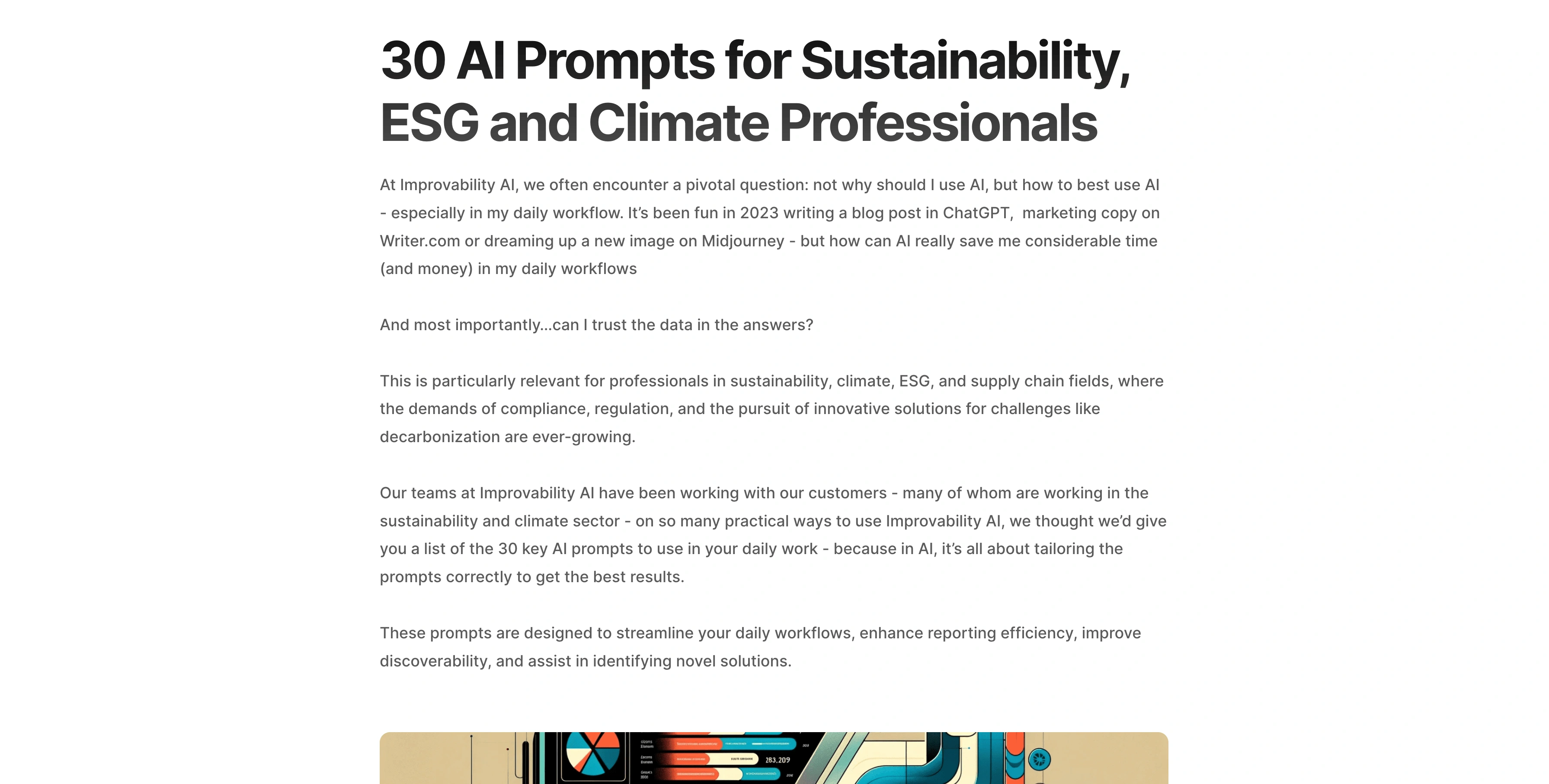
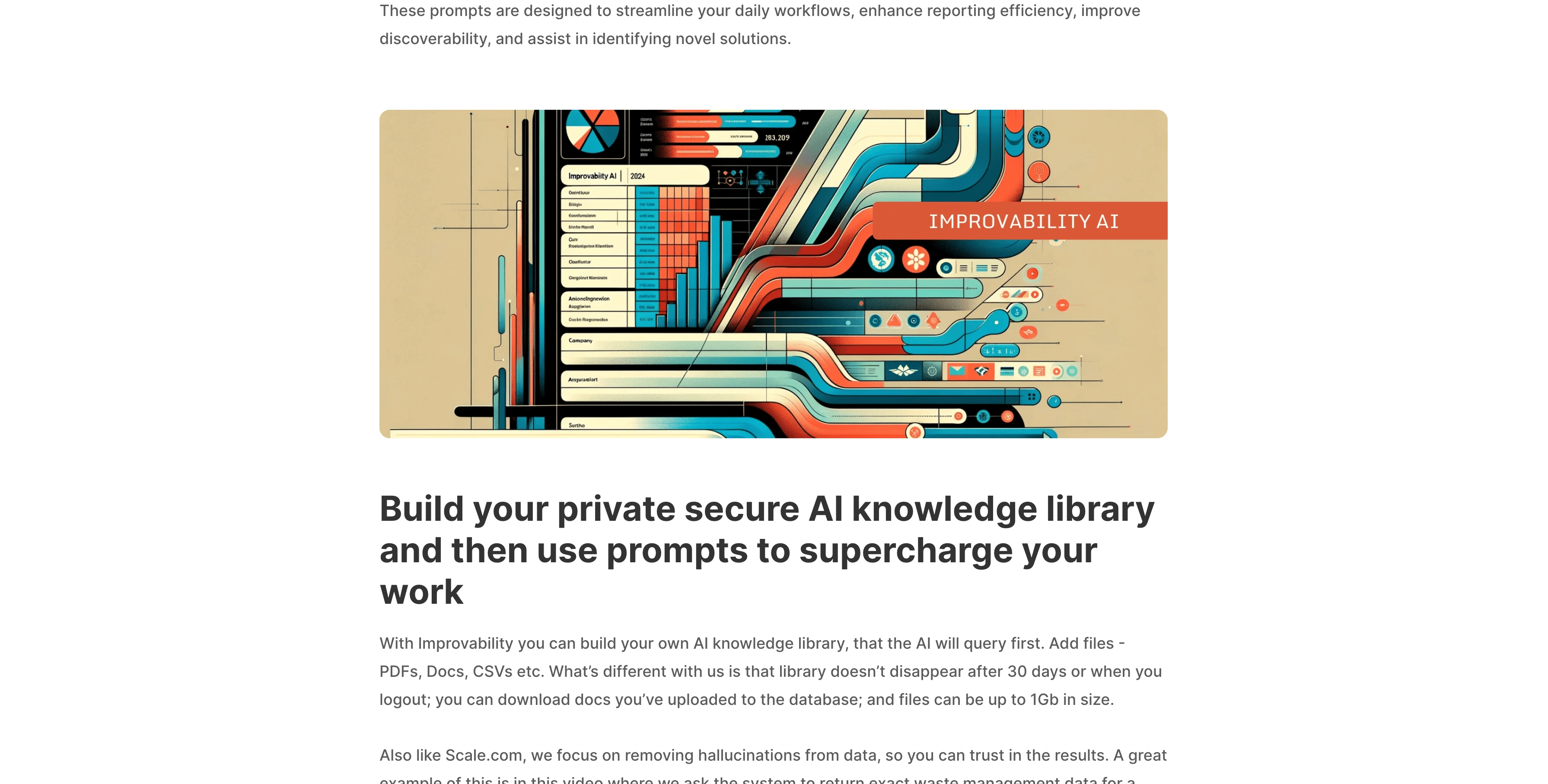
To increase the readability for the blog entries, changes were made to the overall text, tracking, font size, font weight, and padding. To ensure that the changes were consistent across all pages and future blog entries, fields were added to the CMS structure to create greater contrast between sections and within sections.

Image of Improvability AI blog post

Image of Improvability AI blog post
Blog Filter
A separate blog nav component was created to introduce opportunities for engagement with the blog. The filter includes a navigation to switch between categories and a search bar that connects to the blog CMS.


Social Media Share Links
One last feature that was added was the ability to quickly share the post on social media. Framer does not have this feature built-in for CMS pages. As a workaround, I added custom react code to create the share buttons and logic to share via Linkedin, X, and Facebook.

Image of social media share links
Blog card components
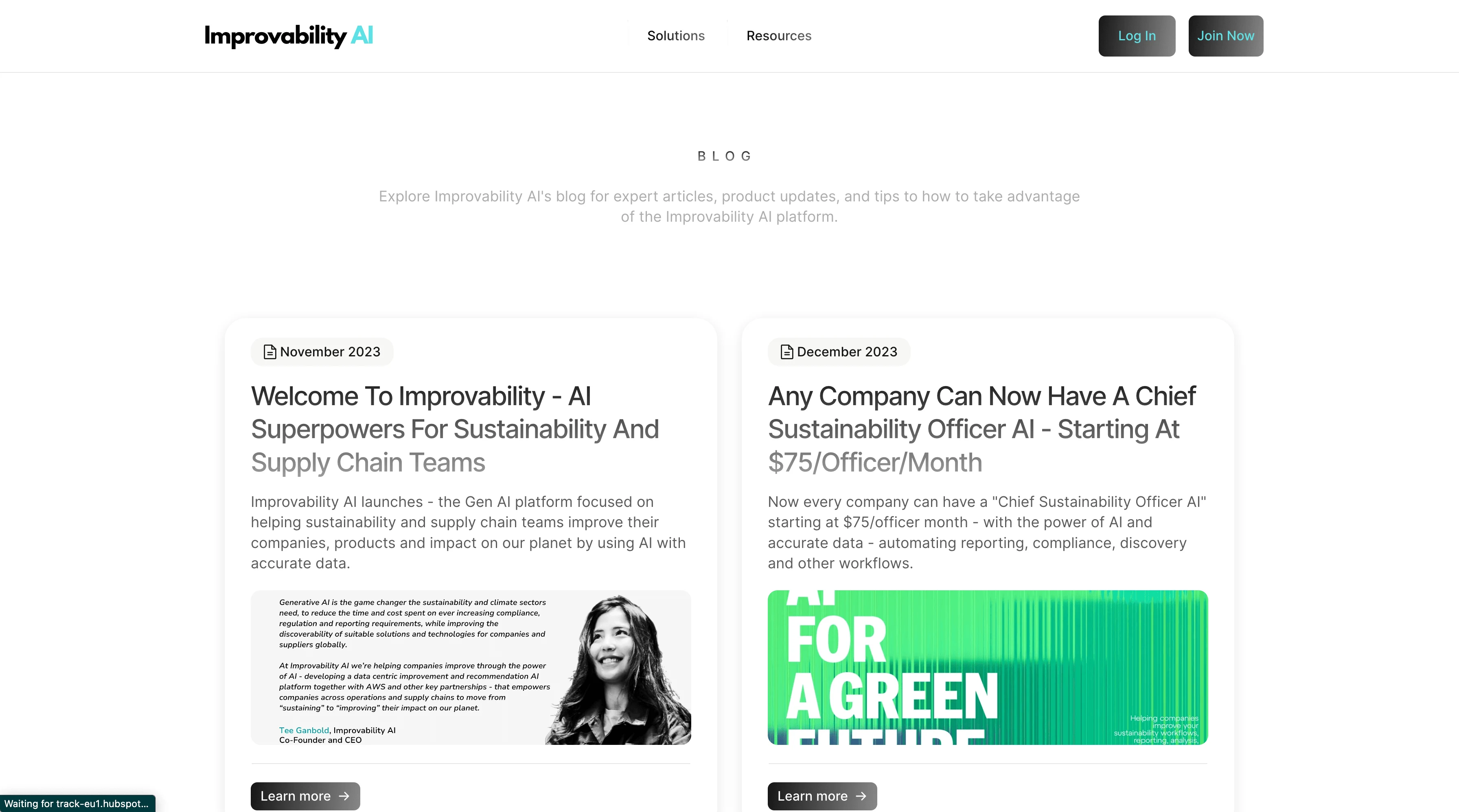
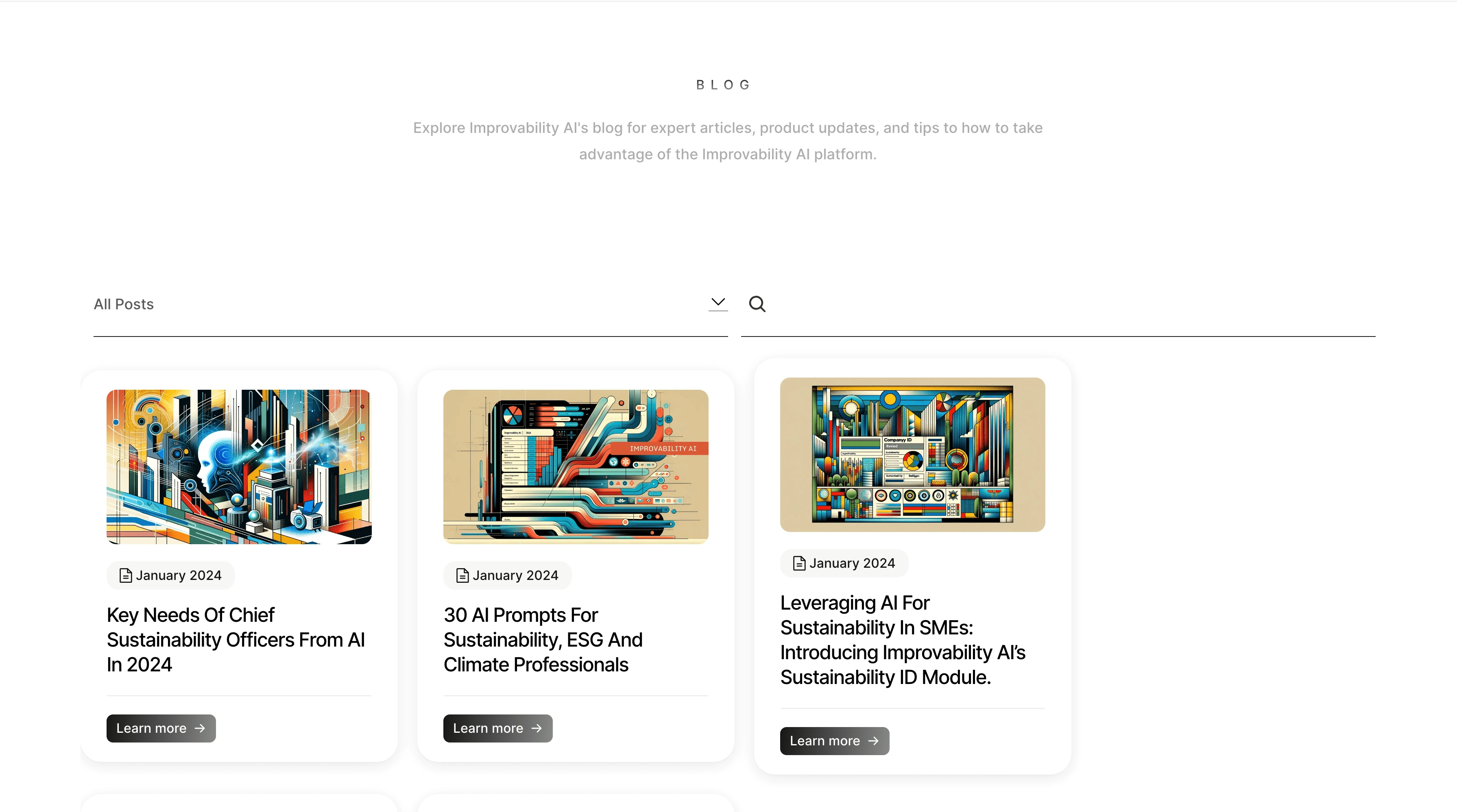
The blog cards were restructured to aid in readability by decreasing the font, taking away the descriptions, and leaving only the date, title, and cta for each card.
Outcome
Before

After

Like this project
0
Posted Jan 19, 2024
Blog restructure on Framer for Improvability AI
Likes
0
Views
42
Clients

Improvability AI
Tags

Web Designer
Frontend Engineer
Framer Developer

Figma

Framer


