Madrid Concept Font

Wesley Gulitts


OVERVIEW
An experimental typography and visual identity design project dedicated to Vini Jr. and his journey at Real Madrid. The proposal combines contemporary geometric typeface design with original illustration, creating a cohesive visual system that celebrates the player through a modern and sophisticated language.
OBJECTIVE & CONTEXT
The project emerged as a personal creative exploration, seeking to:
• Create a unique typeface that reflected the energy and modernity of contemporary football
• Develop an integrated visual system combining typography + illustration + Real Madrid identity
• Demonstrate depth in sports design and typographic design for portfolio
• Explore the visual narrative of an iconic player through graphic and conceptual elements
The context: Vini Jr. is one of the greatest talents in world football at Real Madrid. The proposal was to create a visual language that captured his essence — dynamism, talent, character — in an original typeface and graphic system.

CREATIVE PROCESS
RESEARCH & CONCEPTUALIZATION (Days 1-3)
Reference Analysis:
• Modern sports typography (Nike, Adidas, uniform design)
• Identities of football teams and players (analysis of graphic systems)
• Contemporary geometric and display typefaces
• T-shirt design and player numbering
Visual Direction Definition:
• Typographic style: Geometric, modern, sans-serif
• Key characteristics: Clean lines, structured proportions, versatility
• Color palette: Black, white, gold (reference to Real Madrid prestige)
• Mood: Sports elegance, sophistication, contained energy
TYPOGRAPHIC DEVELOPMENT
Font Structure:
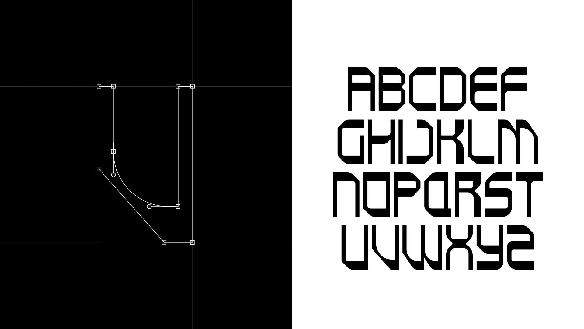
• Character design based on geometric grid
• Focus on legibility without sacrificing personality
• Modular construction, allowing weight variations
• Subtle details (terminals, junctions) ensuring consistency
Specific Characteristics:
• Straight and angular letters with strategic curved touches
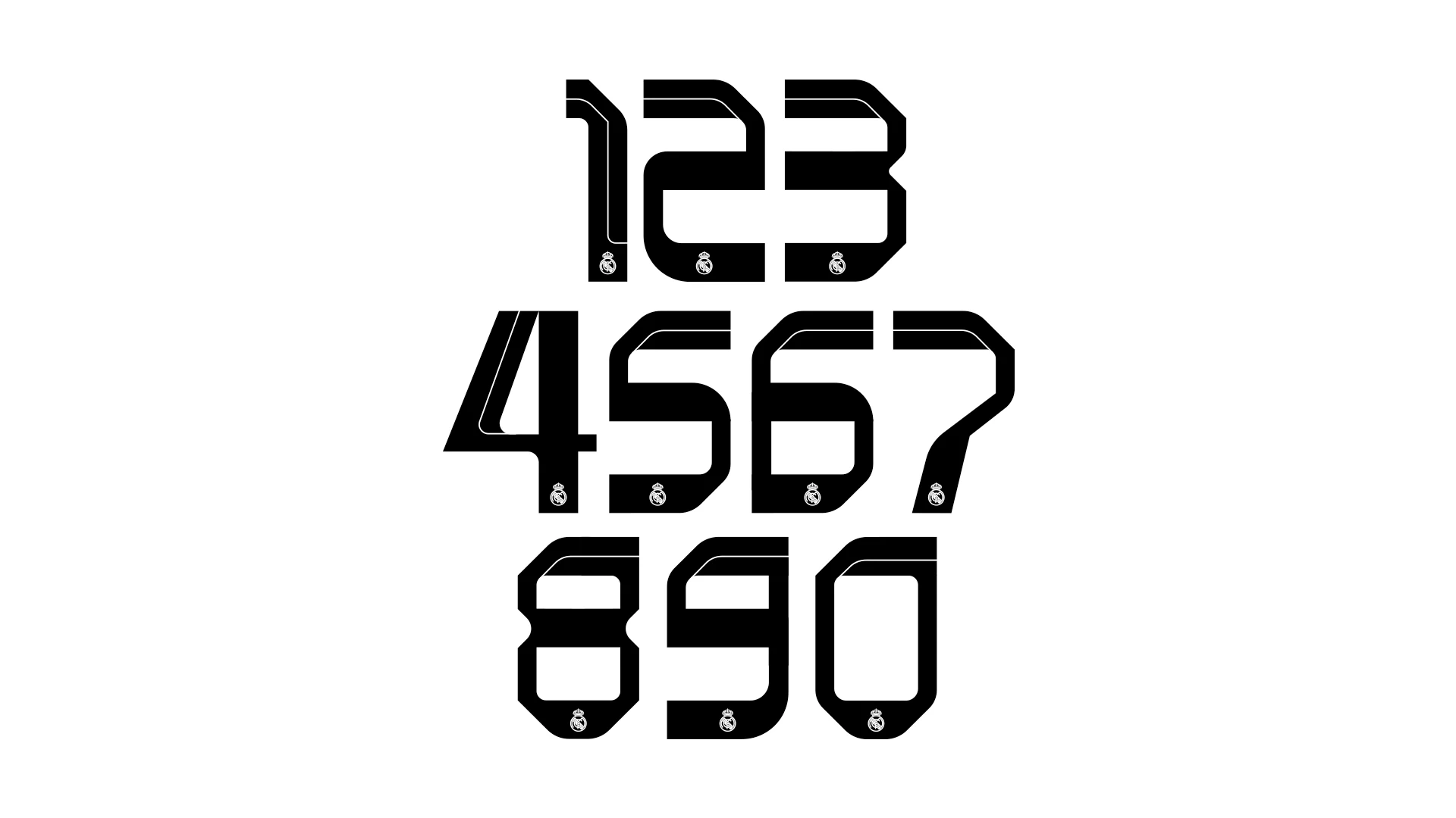
• Robust numbers with strong visual presence (essential for sports data)
• Visual weight variation that favors impact in large sizes
• Suitable for both display (posters, titles) and editorial use
Application Testing:
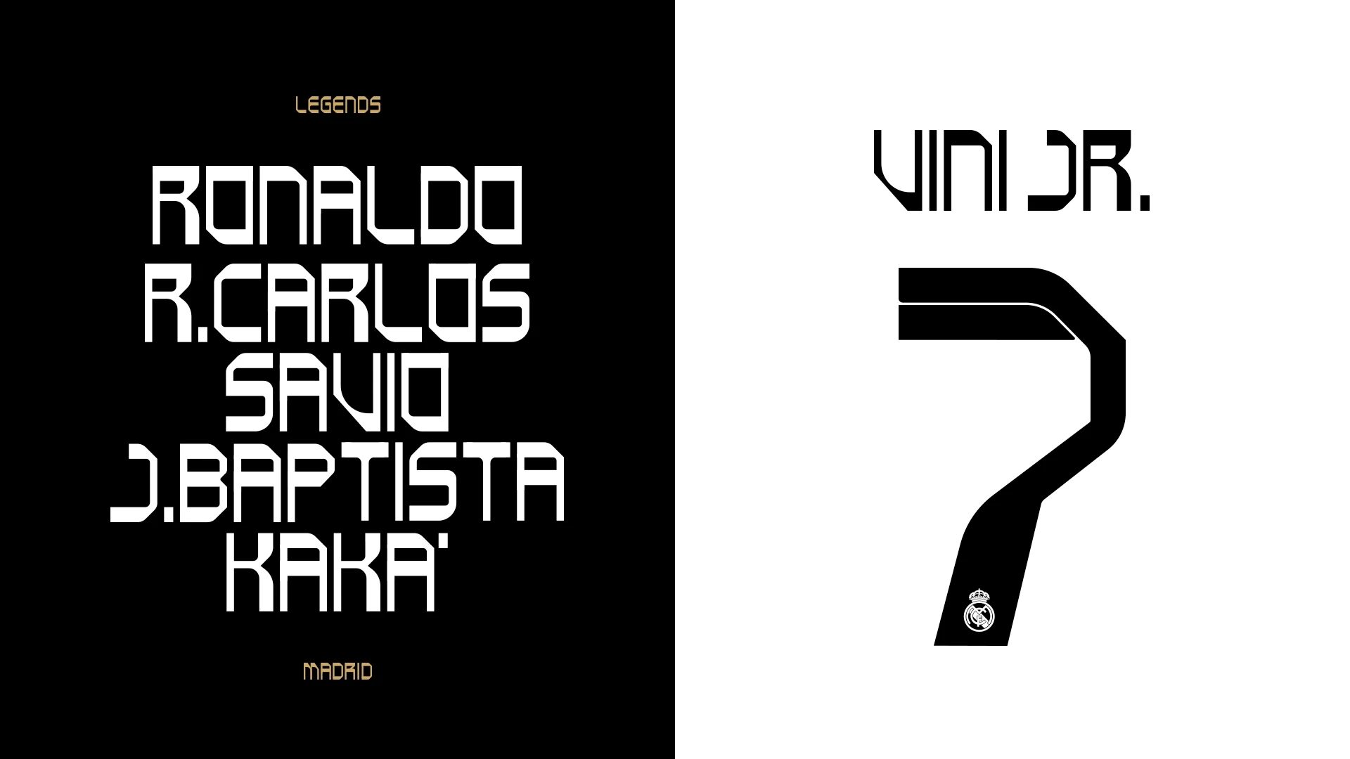
• Rendering in different contexts (legendary player names)
• Validation with numbers (123, 457, 890)
• Composition testing ("VINI JR.", body text)
ILLUSTRATION DEVELOPMENT
Visual Concept:
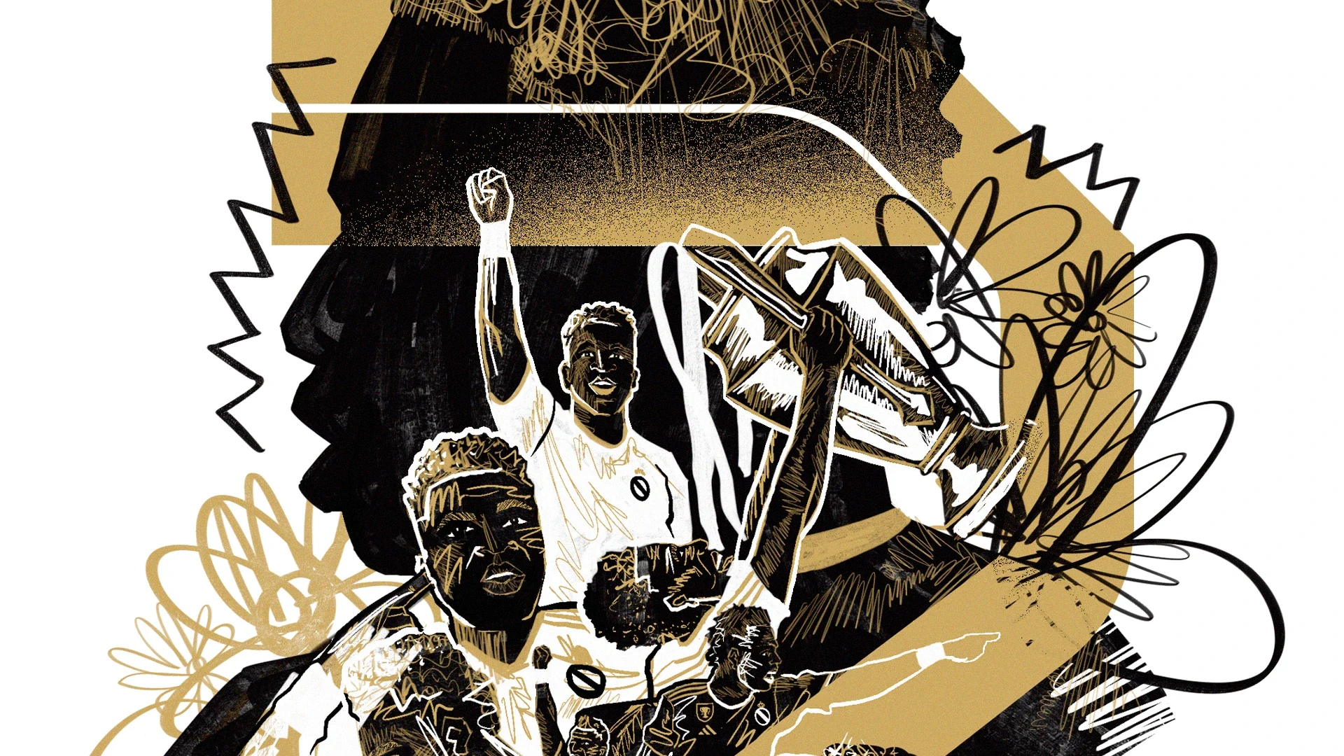
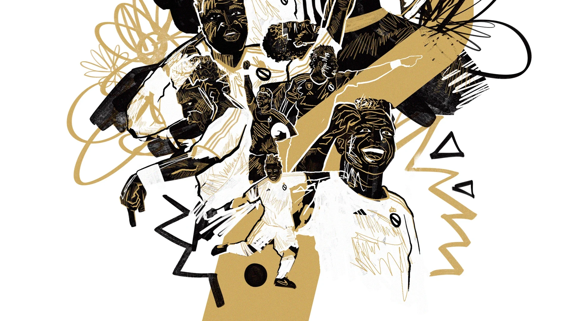
The central illustration is a multilayer composition celebrating Vini Jr.'s talent:
• Player silhouette in the foreground
• Illustrative elements (stylized leaves, dynamic lines) surrounding the composition
• References to key moments and emotions (celebration, focus, confidence)
• Integration of legendary Real Madrid player names
Technique & Style:
• Vector illustration + digital sketch
• Expressive lines combined with solid fills
• Restricted palette (black, white, gold) for visual cohesion
• Textures added (patterns, hatching) for depth
Contextualizations:
Heroic illustration: Vini Jr. in central focus with Real Madrid icon legends
Application in numbers: Jersey numbers (7, 123, 457, 890) integrated with identity
Typographic legends: Using the typeface with player names to demonstrate versatility
DESIGN DECISIONS
Typography Specifications
• Classification: Geometric sans-serif
Reasoning: Modernity, clarity, visual strength
• Proportion: Slightly condensed
Reasoning: Maximum impact in limited spaces
• Terminals: Straight with curved touches
Reasoning: Balance between geometric rigor and humanity
• Numbers: Robust tabular proportion
Reasoning: Essential for sports data/numbering
• X-height: High
Reasoning: Legibility at all sizes
Illustration Specifications
• Main Silhouette: Sketch + refined vector
Purpose: Immediate subject recognition
• Decorative Elements: Dynamic leaves/lines
Purpose: Movement, energy, sophistication
• Palette: Black/white/gold
Purpose: Real Madrid reference, elegance
• Texturization: Hatching, patterns
Purpose: Depth, visual interest
• Composition: Asymmetric multilayer
Purpose: Dynamism, visual sophistication
Visual Hierarchy
• Black as dominant element: Power, focus
• White as structural contrast: Clarity, separation
• Gold as prestige accent: Real Madrid, excellence
RESULTS & APPLICATIONS
Typography Applications
The typeface demonstrates viability across multiple contexts:
• Headlines & Titles: "MADRID", "VINI JR." in large scale
• Body Text: Complete alphabet (A-Z) with excellent legibility
• Numbering: 0-9 with proper presence and proportionality
• Variations: Application with legendary names (Ronaldo, R. Carlos, Raúl, etc.)
Integrated Visual System
The project demonstrates how typography + illustration + identity can work together:
• Cohesion between typographic and illustrative elements
• Application versatility (displays, prints, digital)
• Strong recognizability and personal branding
Visual Results
Heroic composition: High emotional impact, celebration of the athlete
Numbers in context: Demonstrate typeface robustness
Identity integration: Real Madrid logo, proportions, negative space
CHALLENGES & SOLUTIONS
• Challenge: Create a unique typeface without sacrificing legibility
Solution: Balanced geometric approach with humanized details
• Challenge: Harmonize illustration with corporate visual identity (Real Madrid)
Solution: Strategic use of gold/black/white palette
• Challenge: Make the typeface work in both display and text
Solution: Modular grid with elevated x-height
• Challenge: Illustrative composition without appearing cluttered
Solution: Well-defined elements, clear visual hierarchy
LEARNINGS & REFLECTION
Experimental Typography
This project reinforced that sports typefaces need to balance:
• Personality (differentiation, visual impact)
• Functionality (legibility, versatility)
• Context (usage environment — stadium, prints, digital)
Sports Design
Working with the theme of an athlete/team requires:
• Research into existing corporate visual identity
• Respect for narrative (Vini Jr., Real Madrid)
• Sophistication — avoiding sports design clichés
Typography + Illustration Integration
The project's strength lies in how both elements converse:
• Typography establishes structure and modernity
• Illustration adds humanity and narrative
• Together, they create a memorable visual identity
IMPACT & FUTURE APPLICATIONS
This project is a powerful portfolio tool demonstrating:
✓ Typographic Design Competency
Creation of original typeface with purpose
✓ Sports Design Expertise
Understanding of team and athlete identities
✓ Systemic Thinking
Integration of multiple elements in visual cohesion
✓ Conceptual Execution
From abstract concept to polished visual realization
Potential Applications:
• Identities for smaller teams/leagues
• Athlete celebration projects
• Typographic systems for sports
• Sports brand campaigns
CONCLUSION
Vini Jr. Concept Font is more than a typographic exercise — it's a cohesive visual system combining experimental typography, original illustration, and identity design to create a unique and memorable visual language. The project demonstrates creative maturity, technical mastery, and the ability to think visually holistically.
Execution in 1-2 weeks reflects efficiency without compromising quality, and the final result is a portfolio piece that speaks to both designers and a broader audience of sports design admirers and football fans.
Like this project
Posted Aug 6, 2026
The project is more than a typographic exercise, a cohesive visual system combining experimental typography, original illustration, and brand identity design.