Logo Design for Frigate – Digital Marketing Agency
Nikola Divic
Verified
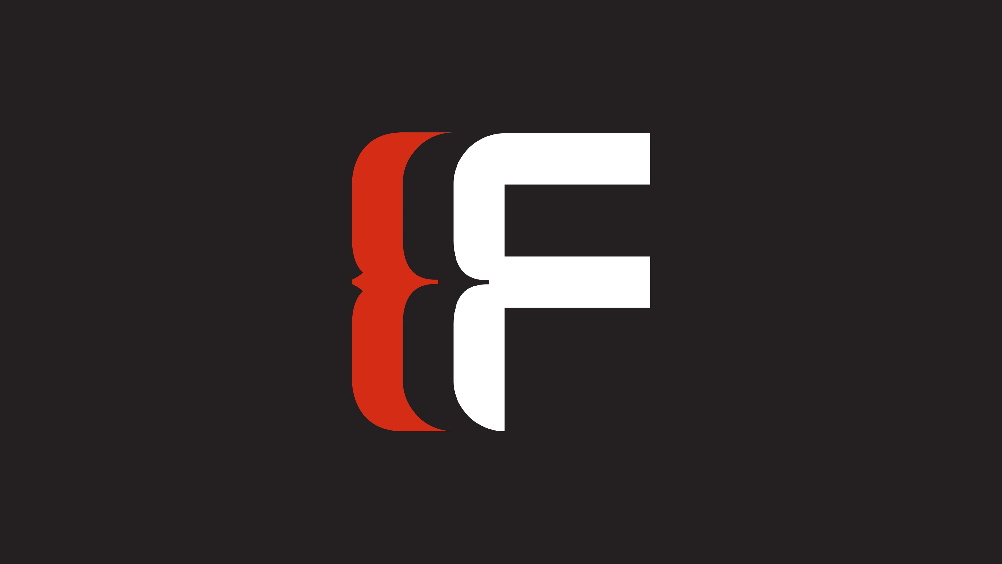
Frigate Digital - Logo Design
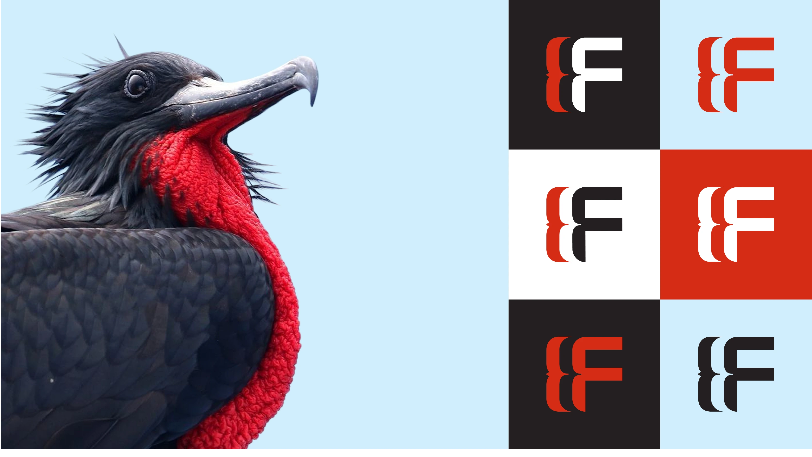
The logo was developed for Frigate Digital, inspired by the symbolism of the frigate bird - a strong, agile, and elegant bird that has accompanied sailing ships on their journeys for centuries.
It represents course stability, strength, safety, and reliability, values that are directly reflected in the brand: agility, trust, and innovation. The combination of the bird symbol and the letter F gives the logo distinctiveness and a modern character, making it stable and impactful across all applications.
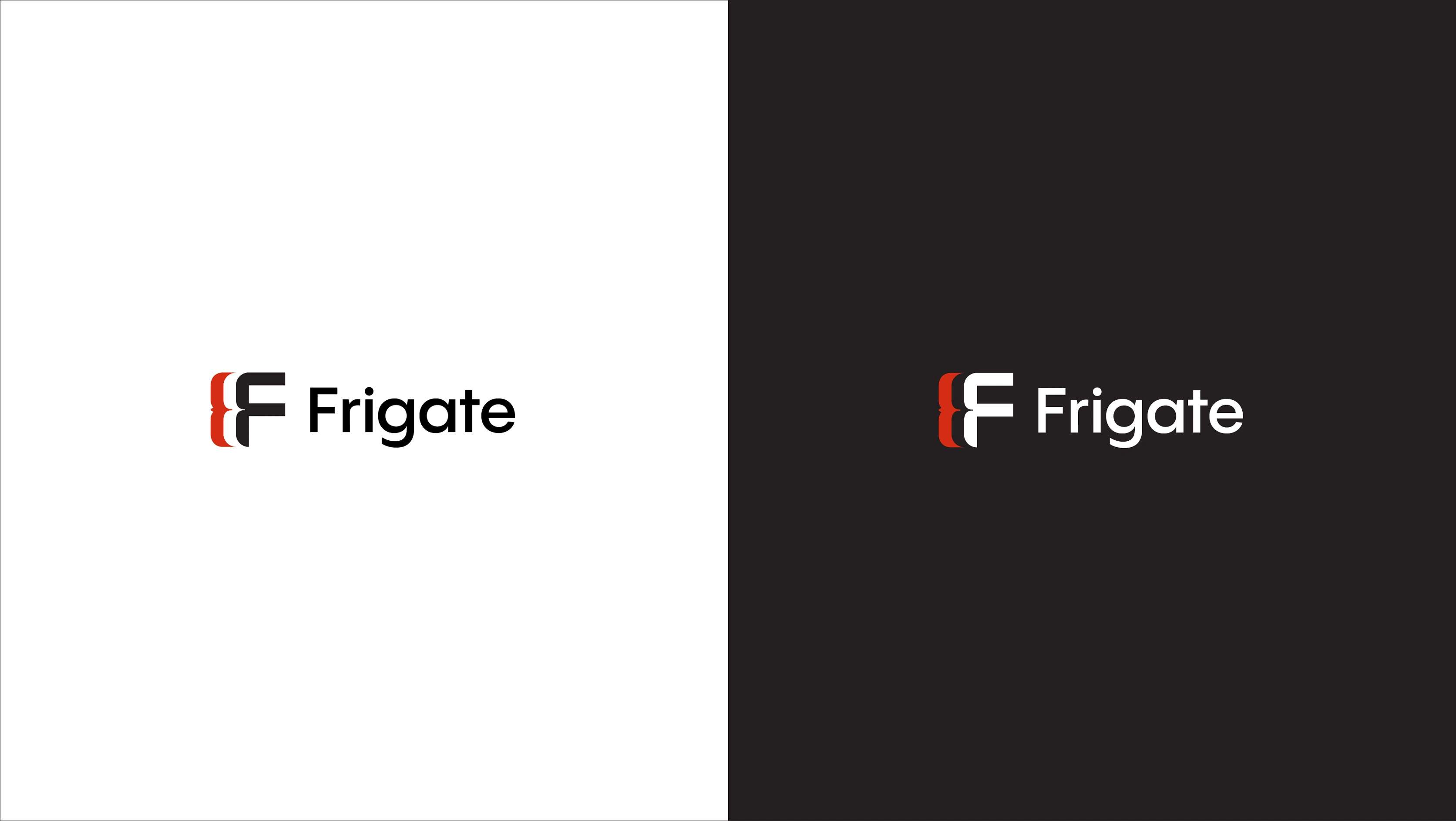
In the visual identity of Frigate Digital, the symbol and typography work as complementary elements.
The graphic mark (F + bird shape) carries the brand’s symbolism of strength, agility, and stability, while the clean sans - serif font ensures clarity and readability.
Together, they create a balanced and professional impression, allowing the logo to function both as a complete unit and as a standalone mark, ensuring flexibility across different applications.
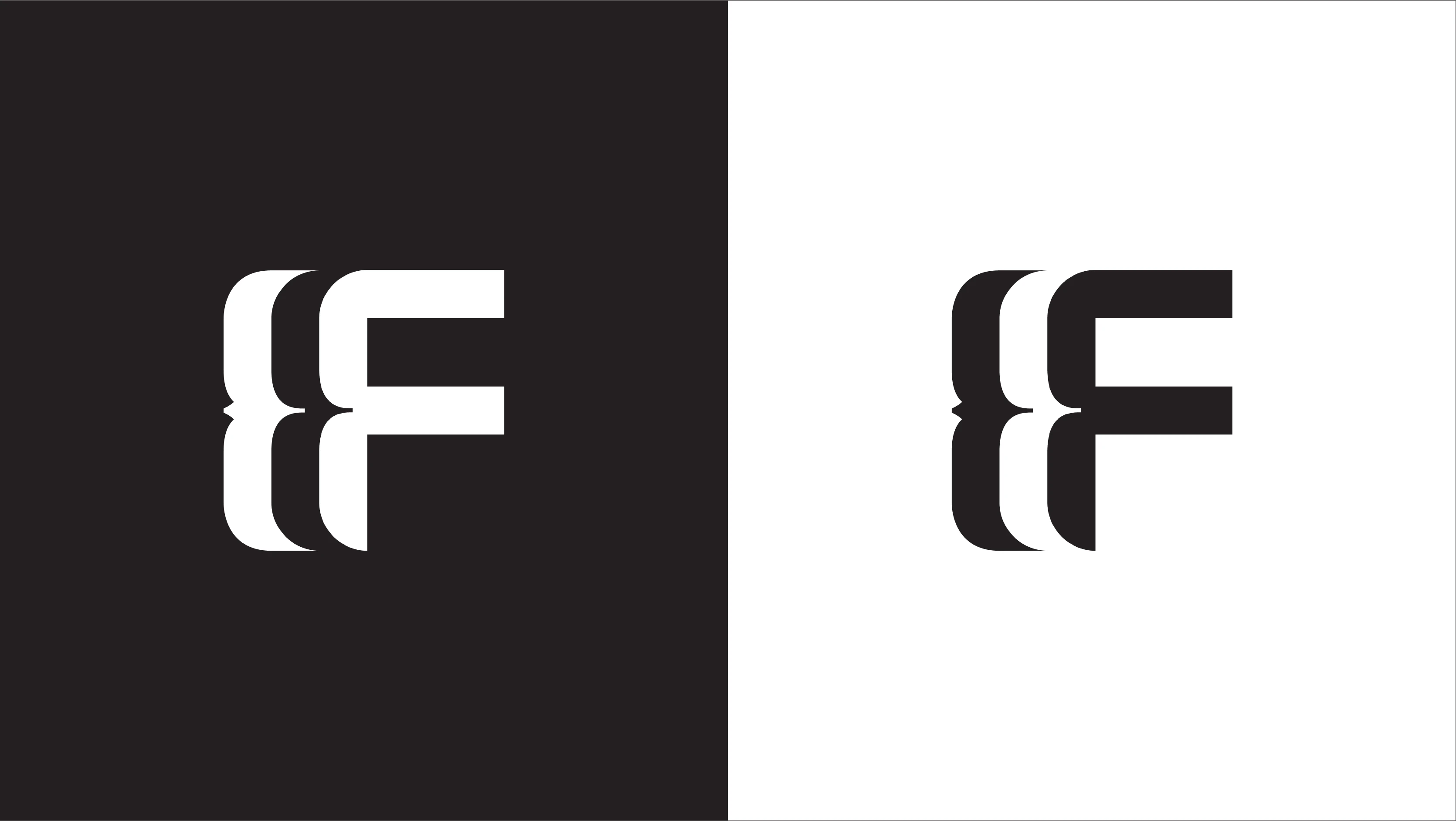
The black-and-white version of the logo represents the purest and most minimal form of the visual identity. It emphasizes the core structure and balance between the symbol and negative space, without relying on color.
Like this project
What the client had to say
Nikola did a thorough job researching our brand and came up with a unique concept that really hit the mark. The logo design and brand identity were executed better than I imagined and I am very satisfied with the way everything came out.
Ivan Torlaković, Frigate Digital
Sep 5, 2025, Client
Posted Sep 9, 2025
The project focuses on designing a modern, minimalist visual identity that reflects the brand’s professionalism, recognizability, and consistency.
Likes
0
Views
12
Timeline
Aug 30, 2025 - Sep 5, 2025
Clients
Frigate Digital