UX Design case study - Anghami App

Younes Annaki


Introduction.
Anghami is the first legal music streaming platform and digital distribution company in the Arab world.
It launched in November 2012, providing unlimited Arabic and international music to stream and download for offline mode.
It is designed for the Middle East and North Africa to provide the largest music catalog of licensed content from the major Arabic labels such as Melody, Mazzika, Platinum Records, and many other independent labels, in addition to international majors labels such as EMI, Sony, Universal and Warner Music Group. - Wikipedia
Company.
Anghami (non-official project)
About the project.
This specific project was mainly about the user experience of the Anghami app making it more emphatic to the user with less friction mostly for a streaming platform that we may find ourselves using every day.
Being myself a daily user of the actual app, I just took a step forward into reworking the UX of some areas, mostly areas that cause frustration to the user with the risk of dropping the task and leaving.
Secondly, always under the UX optimization, comes a safer way to use the app on “Car Mode” while driving since the actual one isn’t that road-friendly in my personal opinion, and by that I mean to achieve a specific task (playing a song for example) you need a lot of attention and precision to do so and this may be dangerous behind the wheel (more details below).
It’s also worth mentioning that this is not a real project yet a realistic one that I took very seriously while being respectful to the actual app creators having the only intent to try and make things a little better.
My role.
UX/UI Designer
Year. 2020
Type.
Redesign (independent)
The Challenges.
- Define missing UX fundamentals;
- Correct exciting UX issues;
- Car mode user flow & design;
- UI design improvement.
Challenge #1
Define missing UX fundamentals
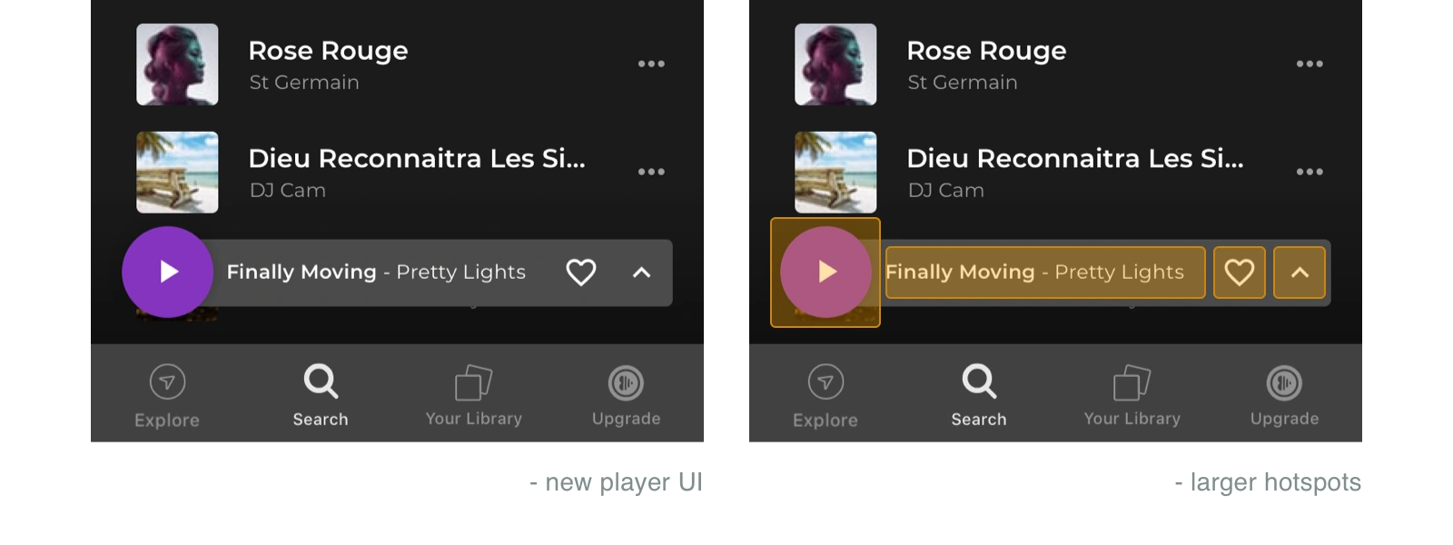
1. Tappable areas, hotspots, and ease of use
One of the missing UX fundamentals that I noticed after working with the app for a while is the ease of touch (tap) across all the features. There is a clear absence of hotspots (invisible tappable areas around buttons) making the user put so much effort and precision into each task.
2. The features hierarchy
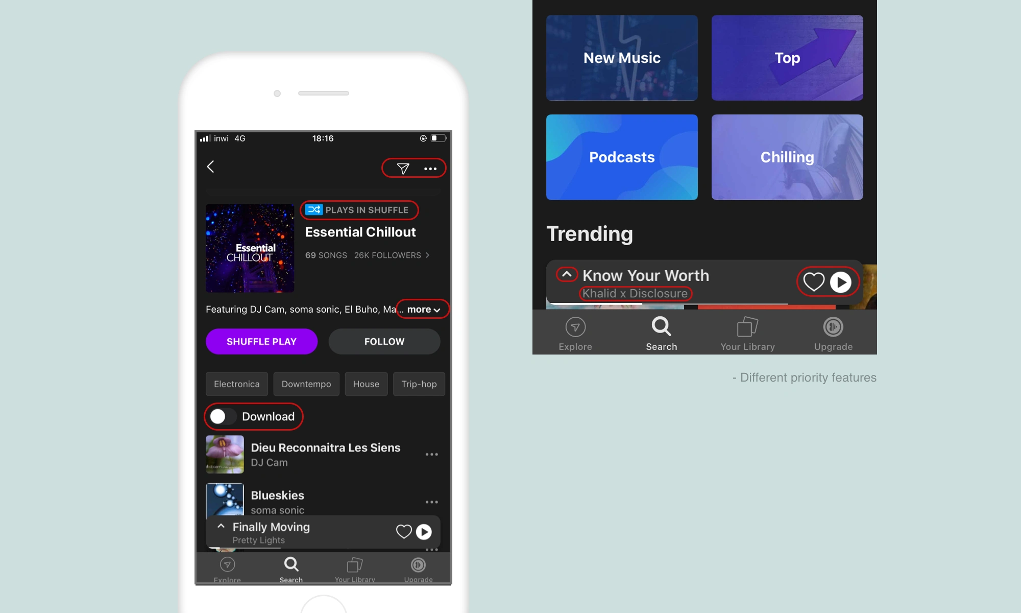
The features hierarchy in some areas of the app is not evident, causing a little friction. I have noticed features that are not on the same level of priority put next to each other and sometimes interfere, making the highest priority ones hard to interact with.
The “Player” floating widget can make a great example of this situation. The “play button” (having the ability to play or pause a track) put so close and on the same level (same size, weight, and color) as “favorite” that is clearly not on the same level of priority.
The solutions.
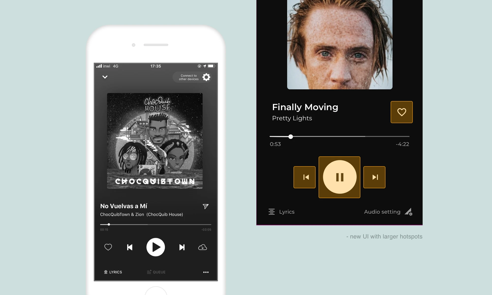
1. Hotspots (tappable areas)
Create larger hotspots whenever it is possible to do so without interfering with other features. I found a lot of room for that and here are some of the examples I came up with.
2. Features hierarchy
There are many ways to break the importance of features into different levels. Some of them being:
- Size;
- Weight (Filled icons, outlines, ...);
- Color contrast;
- Sub-levels (3 dots, see more, …).
Challenge #2
Correct exciting UX issues
1. The play button
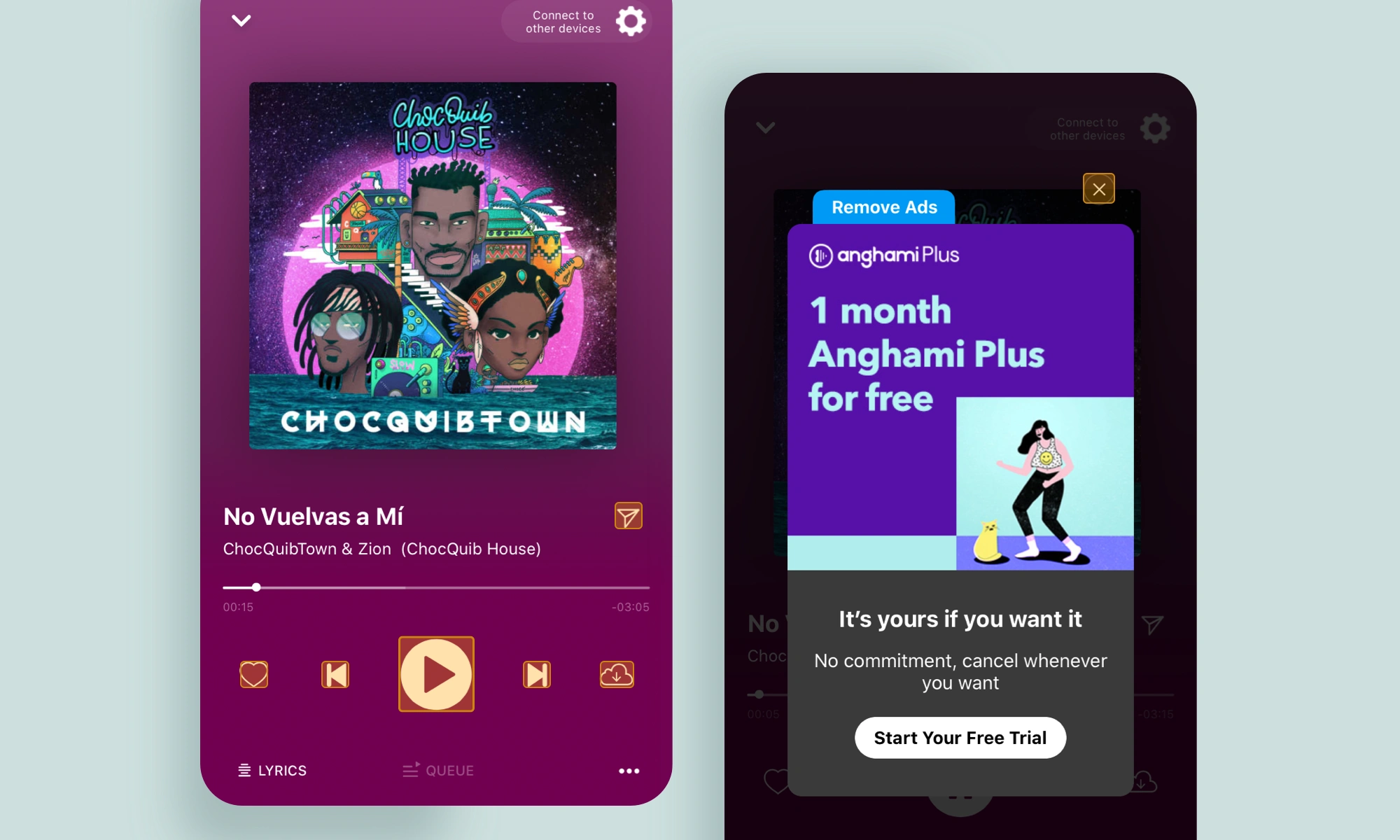
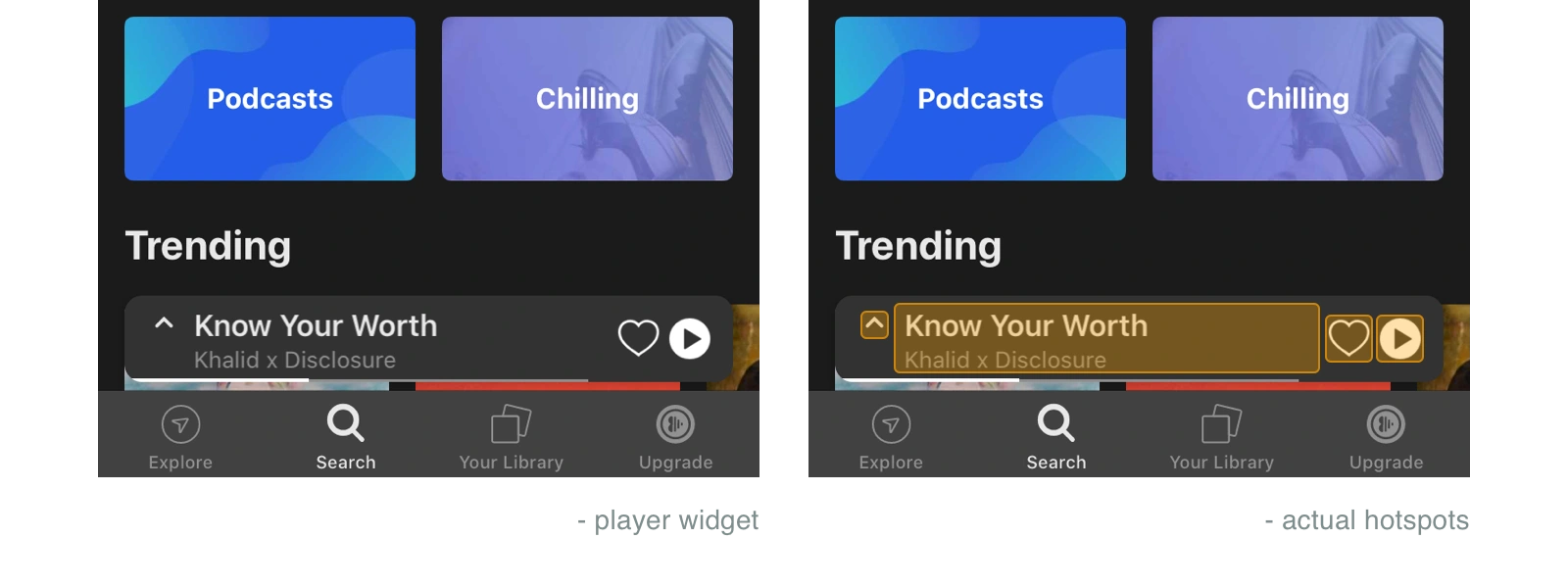
The play/pause button is one of the most important features on a music streaming app was presented as a floating widget alongside the song title, artist name, and the ability to “like/favorite”.
The idea of a floating sticky widget was interesting but its structure wasn’t the most flattering causing some difficulties, combining that to the lack of hotspots, this was considered an issue and it needed to be addressed as well.
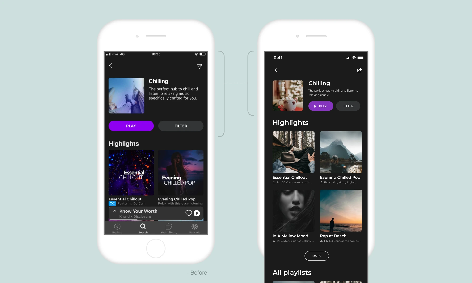
2. Playlists screen
The playlist screen is one of the most important screens of the app since this latter is encouraging listening to music by themes (Chilling, Cooking, Driving, ...).
While the content on this screen was interesting, the structure had some room for improvement mostly to keep the user engaged with the app.
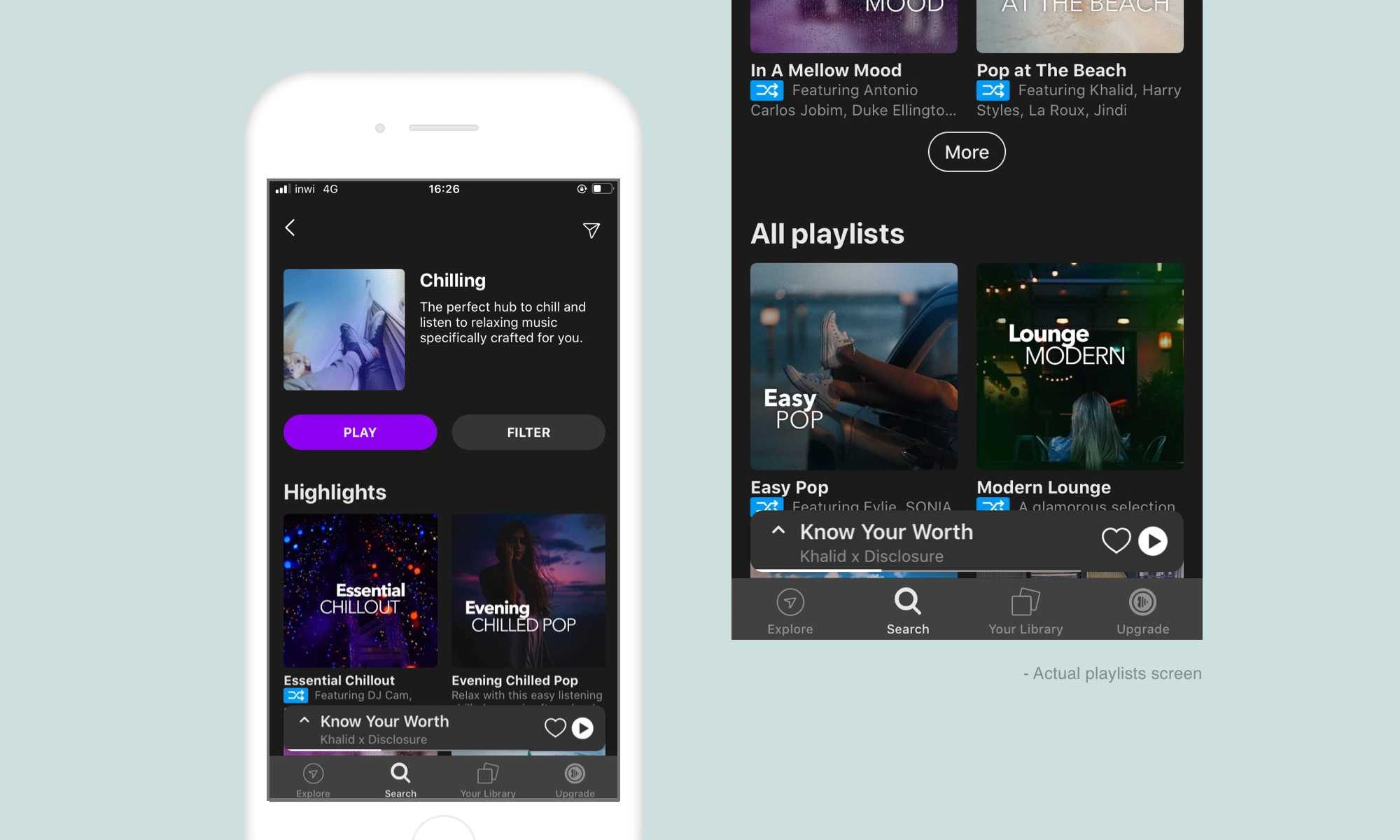
The most important task on this screen is to choose a playlist to listen to, so the more playlists that are displayed to you at the same time the easier it is to make a choice faster (less friction).
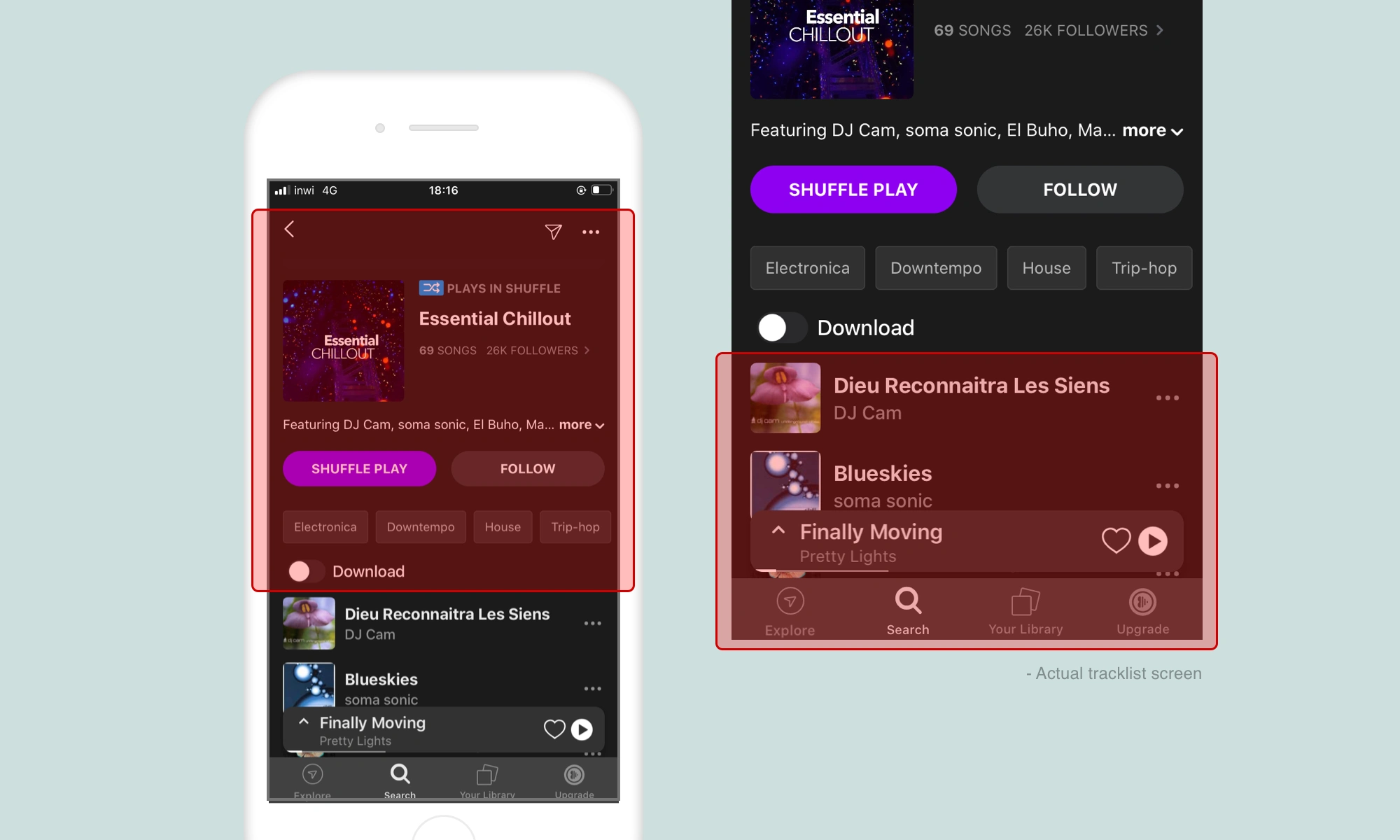
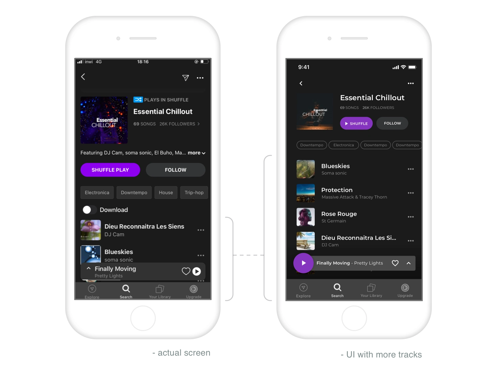
3. Tracklists screen
A user once he made it to this screen will surely be interested in 2 top priority features being:
- The ability to shuffle play the whole playlist;
- Navigate through the tracks on the list.
So those two needed some higher spots on the pedestal making them pop more to the eyes.
The shuffle button was doing the job very well, it just needed a supporting icon to make it easier to digest but the tracklist on the other hand needed more attention since the first thing I noticed when I landed into this page is the top elements (cover photo, description, tags and, buttons) are covering more than 50% of the screen leaving the second half to be shared between the list, the floating widget and the bottom navigation menu. Needless to say that this is not so flattering for the tracklist.
The solutions.
1. The play button
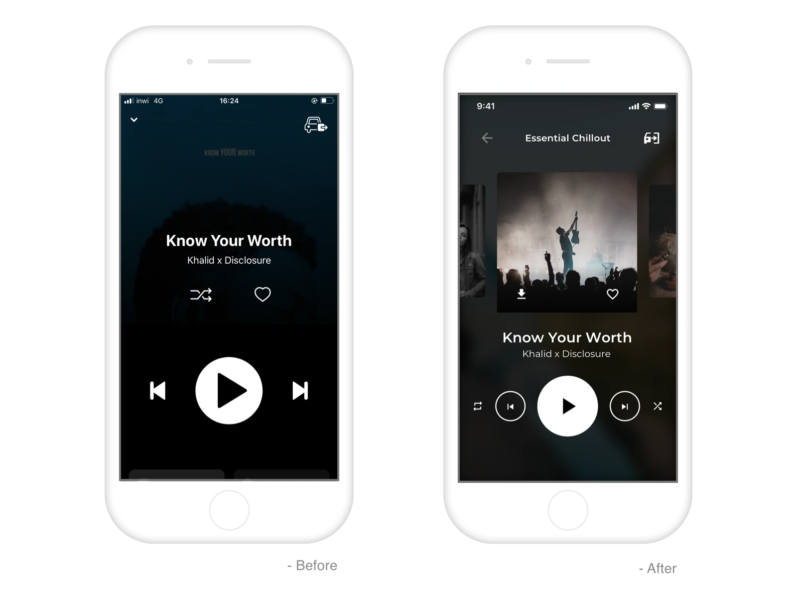
The play button kept almost all its features (floating, sticky, ...) but at the same time, it did get a facelift.
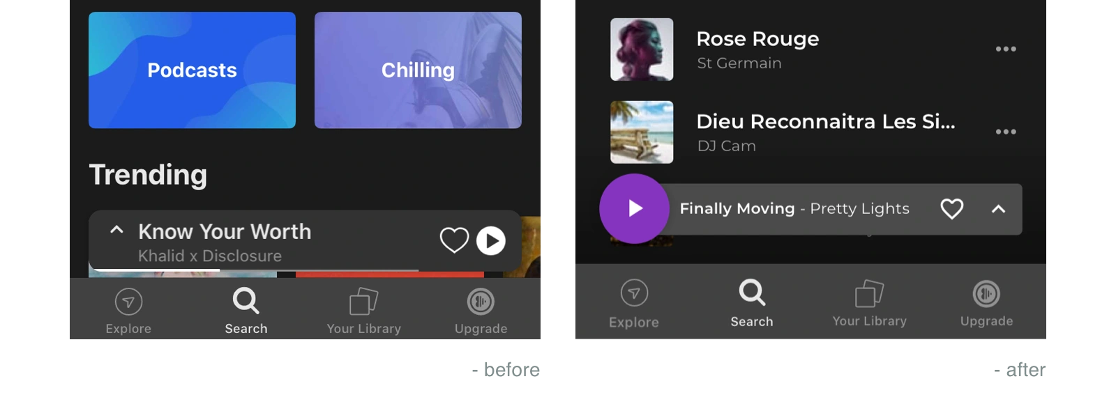
The solution was first to redesign the play button making it a top priority as well as its hotspot (more dominant). Secondly came the song title, artist name, favorite, and the expand icon, this was just a matter of structure and hierarchy.
2. Playlists screen
This was possible to achieve by swapping and squeezing some elements making us
able to sneak into a new row (other playlist choices).
3. Tracks list screen
Since this screen is a sub-level one of the “Playlist screen” discussed above, this will inherit the same benefits as well as some other specific actions like hiding the less important features (Download, Send, ...) and highlight the ones that require more attention (Shuffle, Tracklist and the player widget).
Challenge #3
Car mode User flow & UX design
Following the path of the UX optimization of the Anghami App project for a friendlier day to day use and human-centric design, the “Car Mode” is the biggest part of the project and the one that required so much attention.
I have always found this mode hard to operate (based on daily use) and it also only starts on the final track screen (which is kind of less promising if it is only to pause and play the music).
The challenge was first to define a clear persona (the person behind the wheel) his needs while driving and how much attention he can put into each task. Following that was to go some steps back into the user flow and create car mode screens on earlier stages than the actual.
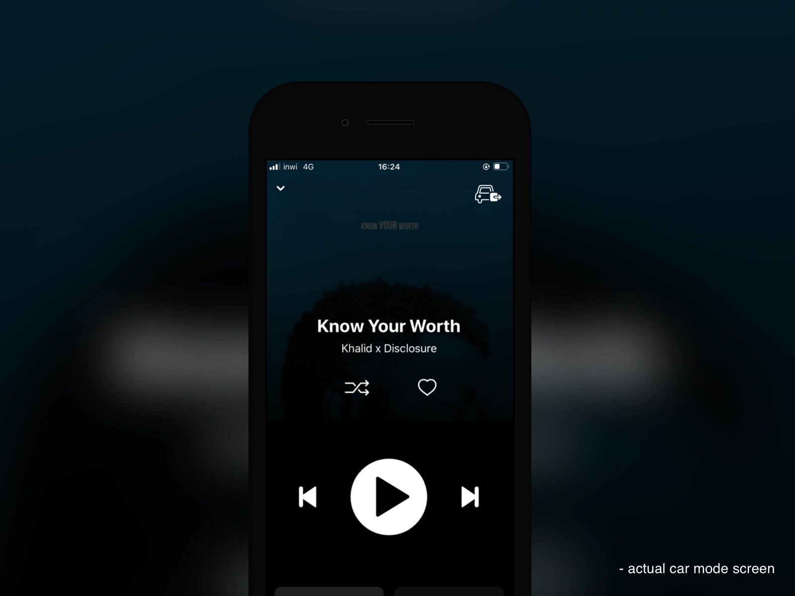
Finally, the challenge was to create the UI design of the non-existing car mode screens and rework some of the features on the actual “Single track”, always with the intention of easier tasks, minimum effort, and intuitiveness.
Solutions.
1.Define the persona
Defining the persona was mandatory on this specific part since creating a car mode is a huge commitment involving some potential risk and almost no room for frustration since the driver needs to be focused on the road all the time while interacting with the app.
So our user persona was clear and easy to define:
- Less attentive (focused on driving);
- Imprecise screen touch;
- One hand interactions;
- Limited sight
- No time to process.
2. Rethink the user flow
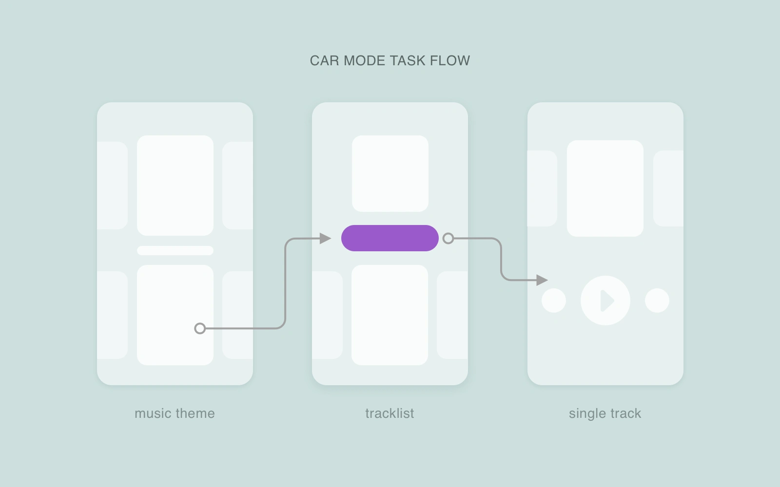
The user flow for the car mode was taking place very late in the chain making it hard for the driver to operate the required task since the car mode friendly screen was prompted until the final screen (music player).
The solution was obviously to take some steps backward and create screens at earlier stages so the whole event (opening the app and choosing a piece of music to listen to) would be completely road-friendly.
The car mode task flow would become:
3. UI Design of the Car mode & prototype
While the user experience design was the main focus, the user interface also needed some improvement since our need once driving changes and the screens needed to adapt.
I went for a multi-gesture UI design that is very familiar and easy to handle with one finger and also with huge room for imperfection (this is what we need when driving). The mode had two scrolling directions, the horizontal offered playlists within the same theme and the vertical makes you discover other related themes and of course, we can tap to make a choice and go into the next step on our user flow and finally when we land on the single track screen the buttons are big and contrasty (and their hotspot even more significant) making the usability very friendly to play/pause the music or move from a track to another.
Challenge #4
UI design improvement
This section was not truly a challenge as the title shows, this was just an improvement to make some features easier to digest while obviously making the user experience better.
It was mainly about iconography and hiding some low priority options.
Solutions.
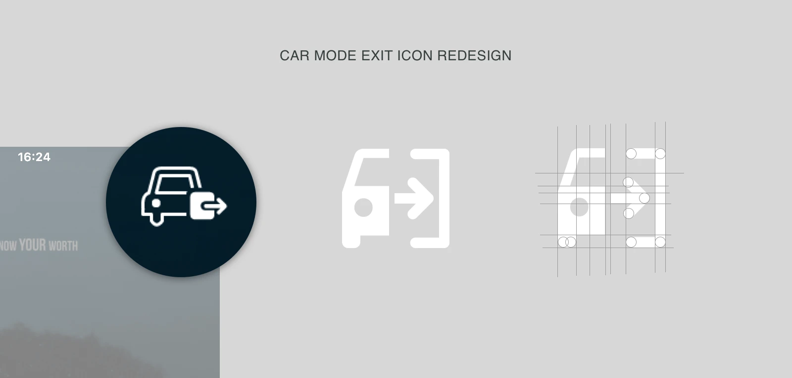
I have swapped the icons for the “Material design icon set” since it is internationally recognized and it makes the icons very supportive and quickly understandable.
Then the share button needed a repurpose since it was symbolized with a paper plane (icon) which is common for “send” but the limitation with send is that we directly think about “send to someone “ while share can be for example “Share on Facebook”, “Share on Twitter” and also “Share WITH a friend or a colleague” so obviously the icon deserved to be substituted to a more recognized share icon (icon).
Finally, I have hidden some low priority features and repositioned the actual icons for better usability, again, while driving.
Notable work.
Process.
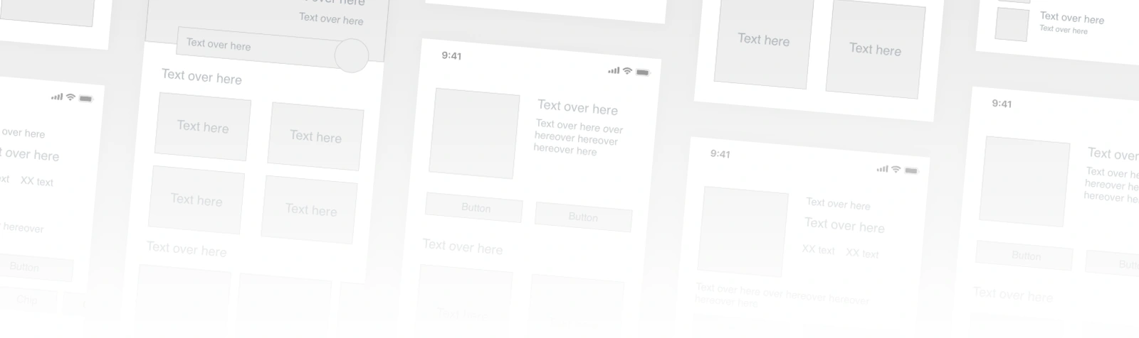
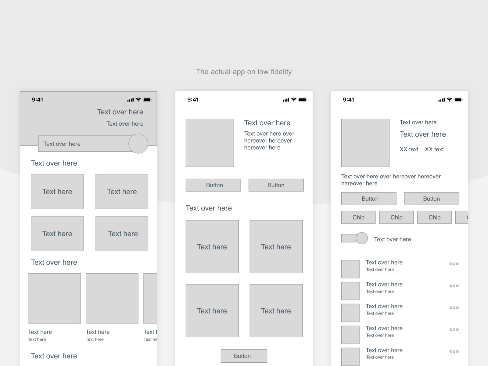
For the design process, I have taken a different path by reverse-engineering the actual app going from a mockup to a low fidelity wireframe so I can be aware of all the important features while not being biased by colors and imagery.
The app would then look like that, not much but was very significant for this specific situation:
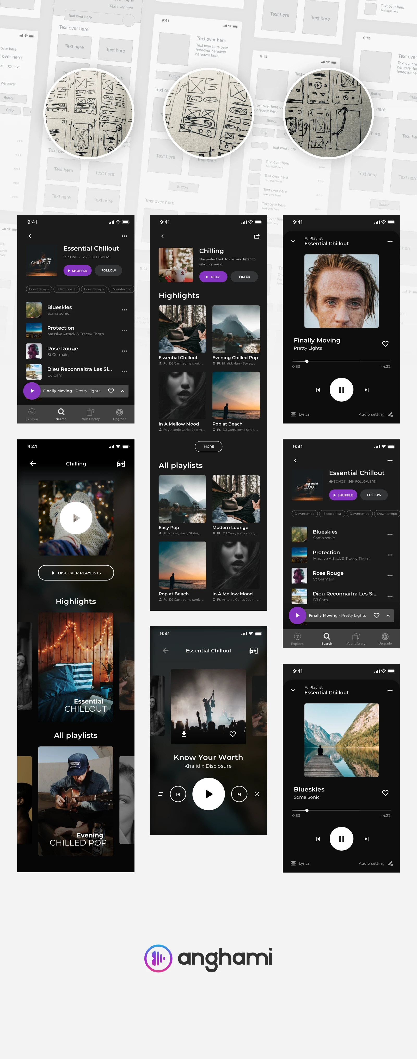
Then, fast forward into the usual design pipeline: Sketches > Wireframes > Mockups
Outcome.
Design mockups and interactive prototype of the following:
- Themes playlist screen;
- Tracklist screen;
- Single track screen;
- Car mode for all the above.
Take away.
After such a long case study and by the way, thank you for reading all the way down, let’s then make the take away as short and significant as possible.
This project taught me that the user experience and human-centric design is the core of any day to day app and sometimes just few adjustments with the same content, same features and effort already put can make a product friendlier, empathic and most importantly engaging.
Let’s talk if you have thoughts, feedback or suggestions.
Like this project
Posted Sep 21, 2026
UX Design case study - Anghami App