My Portfolio website

Irrenium Des


How I designed and developed my portfolio
Most portfolios are built to showcase the work. I wanted mine to be part of the work.
Instead of treating it as a collection of projects inside a polished template, I approached the portfolio as a product of its own: defining the experience, building a visual system, designing interactions, and developing everything around one question:
How can the experience of browsing my portfolio communicate how I think before someone even opens a case study?
The answer became a portfolio built around restraint, personality, and intentional detail.
Designing an atmosphere, not just an interface
I wanted the first impression to feel cinematic, calm, and precise.
The visual system is deliberately stripped back: a near-black canvas, oversized typography, generous whitespace, and a restrained blue accent. Glass, glow, texture, and motion appear selectively rather than becoming the aesthetic themselves.
That restraint creates hierarchy. When very little is competing for attention, a shift in scale, a moving element, or a subtle glow suddenly carries weight.
A faint layer of film grain sits across the interface to give the dark surfaces texture and depth. The goal was to make black feel like a material rather than empty space.
Typography then does most of the heavy lifting. Large display type establishes character, while smaller uppercase labels and tightly controlled spacing create rhythm throughout the experience.
The result is a system where hierarchy comes primarily from composition, scale, and contrast rather than decoration.
Two themes, one design language
Dark mode defines the initial experience, but I did not want light mode to feel like an inverted version of it.
I treated both as expressions of the same design system.
The dark palette is cinematic and atmospheric. The light palette is sharper, quieter, and more editorial. Colors, borders, surfaces, and the accent blue were adjusted individually so that hierarchy and contrast remained consistent across both environments.
The objective was simple: switching themes should change the atmosphere, not the quality of the experience.
Giving the hero a personality
The hero needed to do more than introduce my name and title.
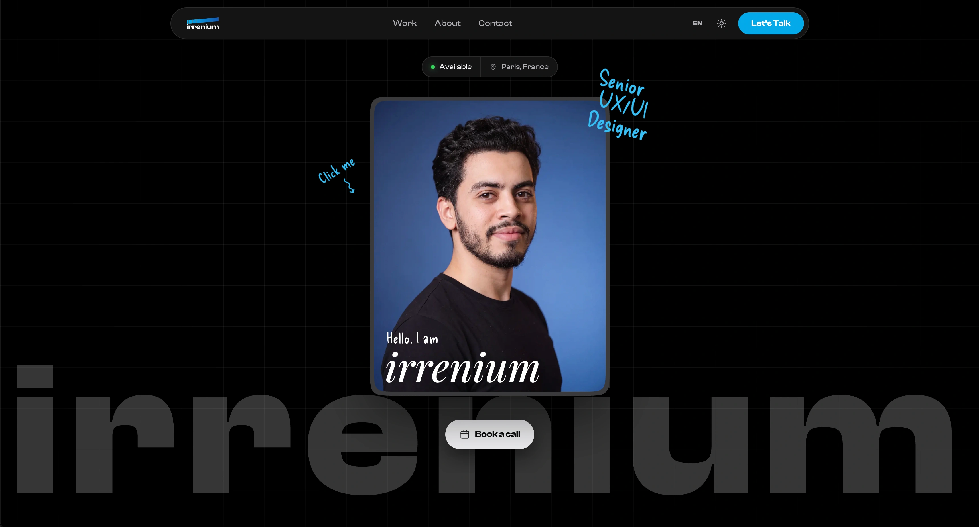
At its center is an interactive scrapbook-inspired card built around my portrait. It sits over an oversized ghost wordmark, floats subtly in space, reacts to the cursor, and flips when clicked.
The front introduces me visually. The back reveals experience and tools through a more informal, handwritten composition.
Small annotations surrounding the card reinforce the scrapbook language without overwhelming the interface.
It turns what could have been a conventional portfolio introduction into a small moment of discovery.
Before someone reads about how I design, they have already interacted with it.
Motion that earns its place
Motion became another layer of the visual system.
Cards respond to the cursor. Project covers shift as you scroll. Statistics count into place. Content reveals progressively as sections enter the viewport.
But I gave myself one constraint:
If an animation does not communicate something, guide attention, or make the interaction feel more physical, it does not belong.
That kept motion from becoming spectacle for its own sake.
The underlying experience also remains readable and understandable without animation. Motion enhances the interface; it never carries information the interface depends on.
Turning case studies into stories
One of the biggest challenges was deciding how the projects themselves should be presented.
I did not want a sequence of screenshots with paragraphs underneath them. A screenshot can show the result, but rarely explains the thinking that produced it.
So each case study became its own visual narrative.
Product screens are mixed with purpose-built diagrams, system breakdowns, identity construction, color logic, interface architecture, and contextual visuals. Different projects can have their own atmosphere while still belonging to the same portfolio system.
The objective is not simply to show what I made.
It is to make the reasoning behind it visible.
By the end of a project, someone should understand the problem, the decisions, the system, and the final experience.
Designing the details people feel before they notice
Some of the decisions I spent the most time on are also the easiest to overlook.
Spacing between a label and its heading. How quickly an element follows the cursor. The opacity of a border. Where an animation starts. How a project transitions into the next one. How much contrast survives when the interface moves from black to white.
Individually, these details are small.
Together, they determine whether an interface feels intentional.
That became one of the core ideas behind the portfolio: users do not need to consciously notice every design decision to experience its effect.
The portfolio became the final case study
Building this portfolio ultimately became an exercise in proving the principles I use in my work.
Systems over isolated screens.
Clarity before decoration.
Motion with purpose.
Personality without sacrificing usability.
Details that earn their place.
The finished site is not simply a container for my projects.
It is another project.
One designed to communicate not only what I make, but how I think when I make it.
Home page
Like this project
Posted Jul 30, 2026
A portfolio designed as a product, blending cinematic minimalism, purposeful motion, and thoughtful interactions to showcase both my work and how I think.
Likes
0
Views
5