Vitagen Supplement Campaign Visual Direction

Nze Ojiyi


CHALLENGE
The challenge was to develop a visual direction for Vitagen, a women-focused supplement brand, that communicated its purpose while standing out in a visually saturated wellness market.
We began by exploring the category, studying existing supplement campaigns, visual trends, product presentation, and the expectations of the target audience. This research helped us identify opportunities to move beyond conventional wellness advertising and establish a more distinctive visual language.
The goal was to create static ads that balanced product communication, audience relevance, and visual appeal — transforming essential product information into a cohesive and engaging brand experience.
DESIGN EXECUTION
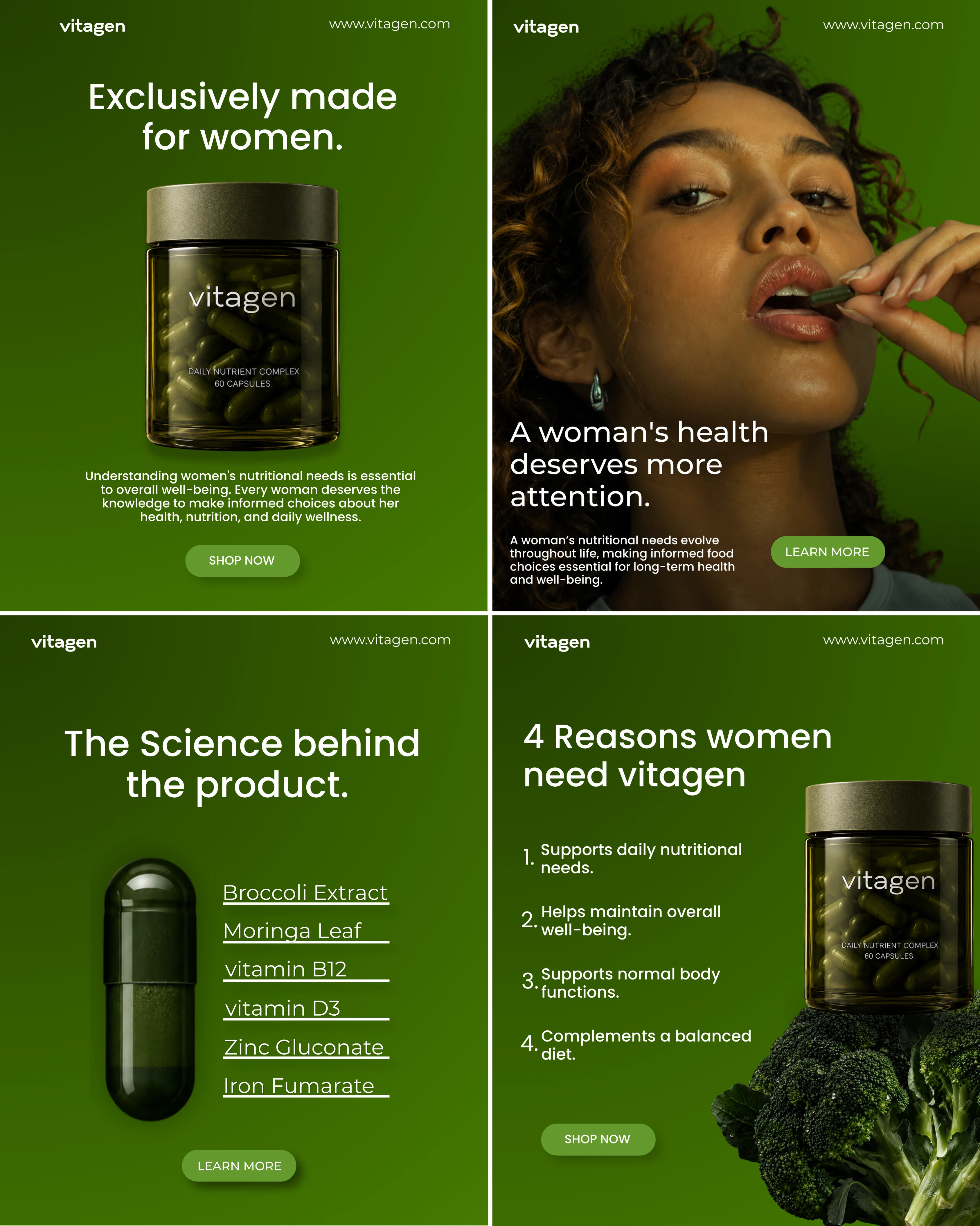
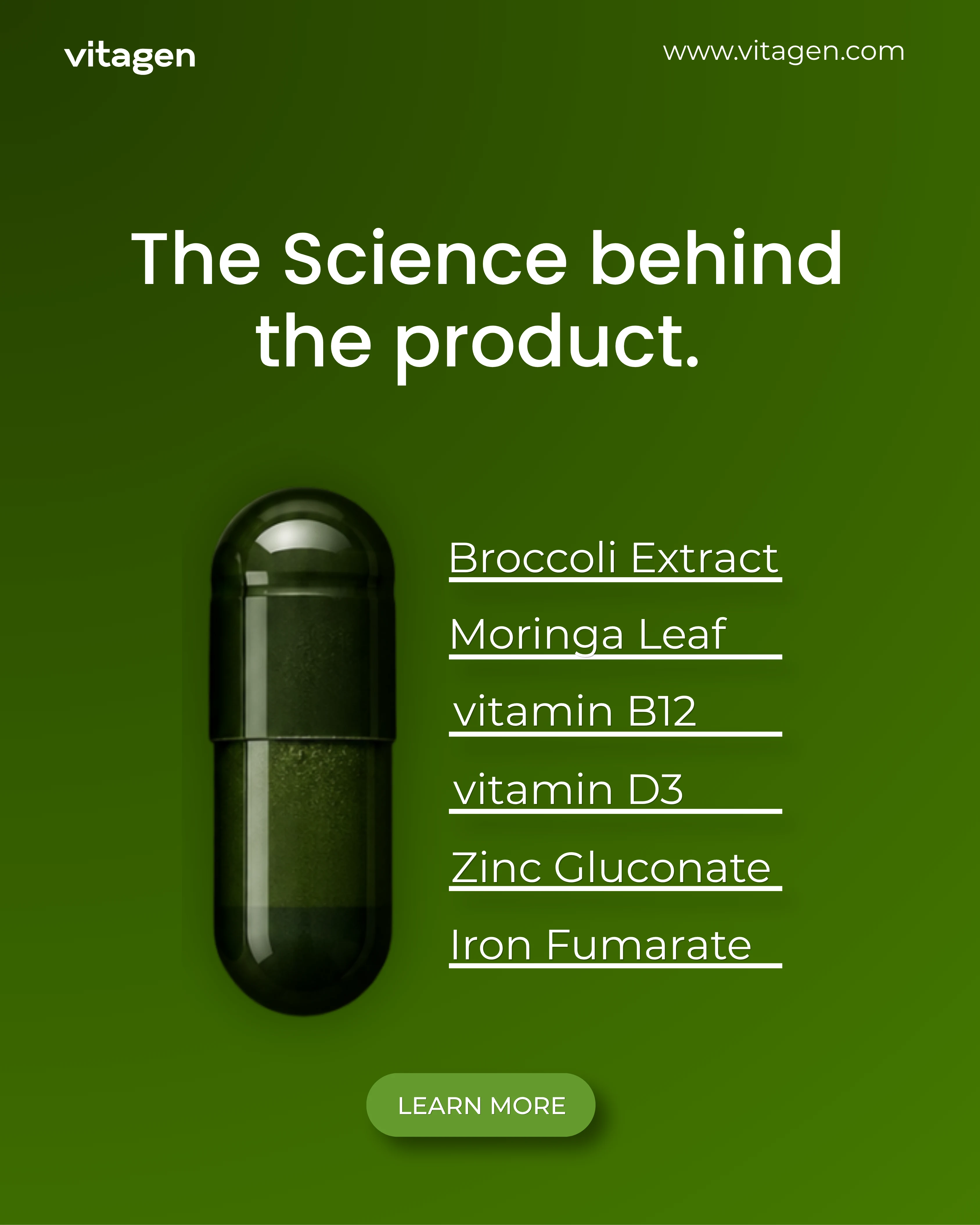
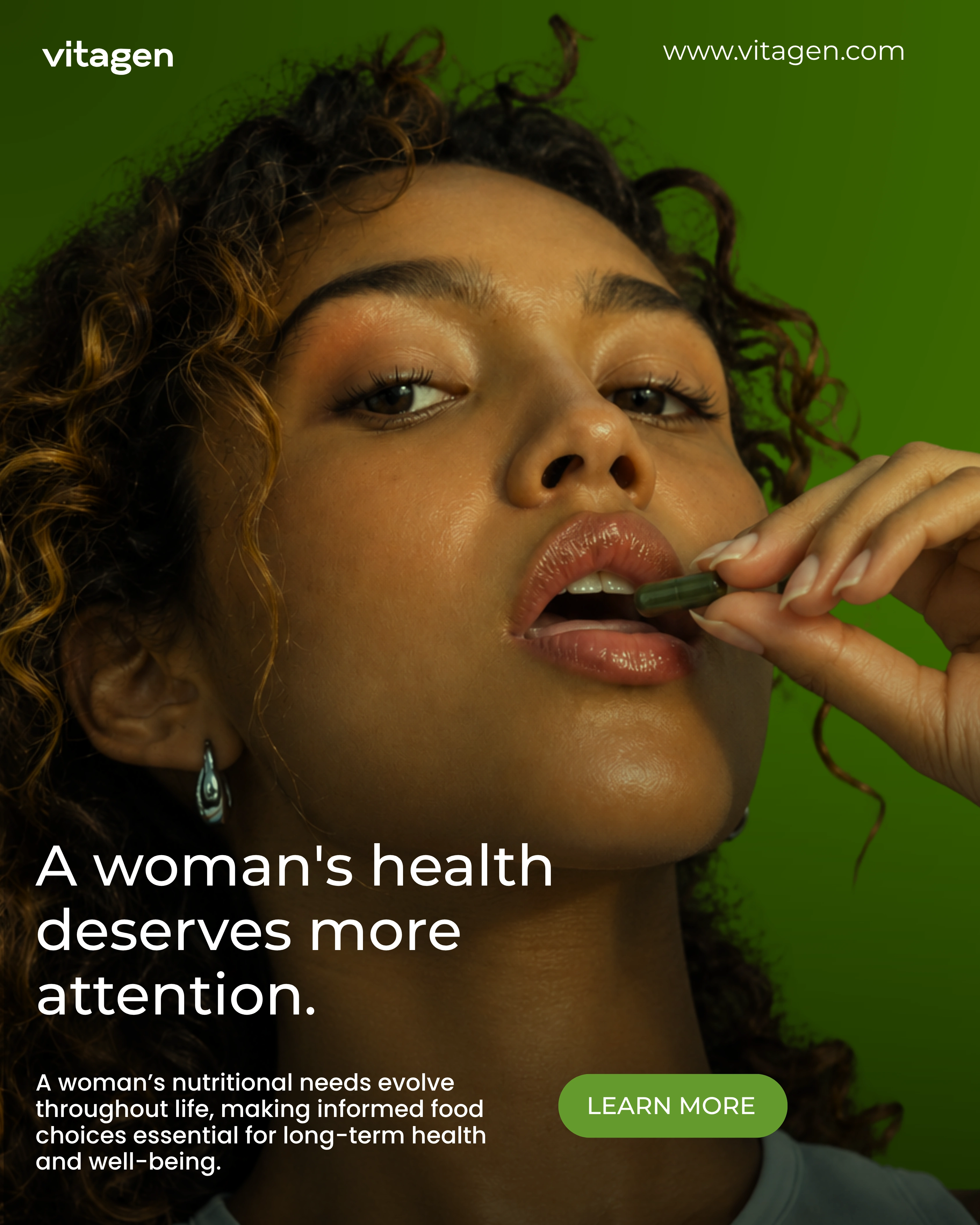
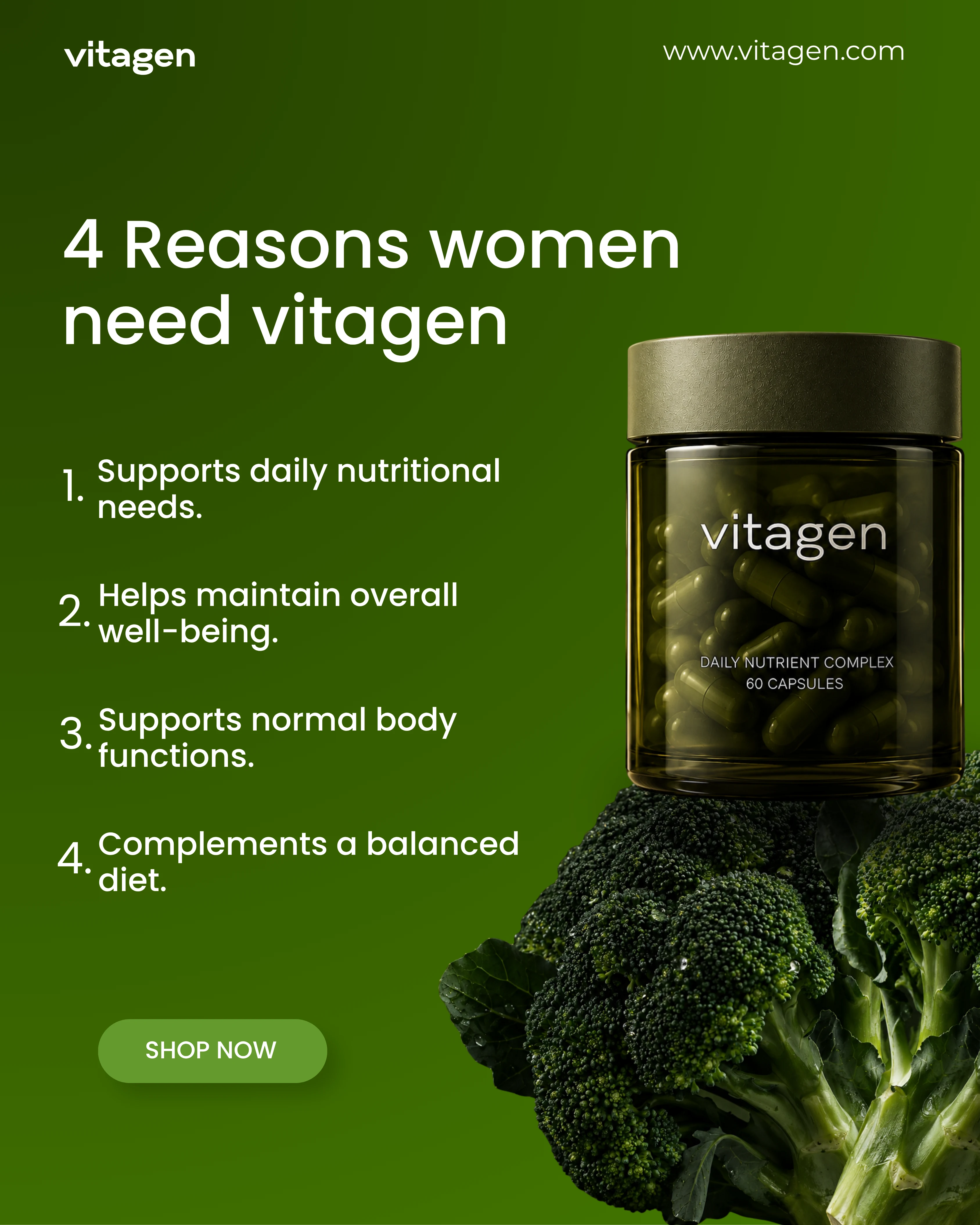
Our approach was rooted in intentional art direction, visual consistency, and strategic communication. We explored how imagery, typography, colour, composition, and product presentation could work together to communicate Vitagen’s identity and connect with its intended audience.
A botanical-inspired colour direction, carefully considered image treatments, and bold yet restrained layouts helped establish a visual identity that felt contemporary, premium, and recognisable. Each composition was developed with attention to hierarchy, ensuring that the key message, product, and supporting information worked together without overwhelming the viewer.
Beyond aesthetics, every design decision was made to serve a purpose. From the selection of imagery to the placement of copy and supporting details, the execution focused on creating static ads that were visually compelling, informative, and consistent across the campaign.
The result is a considered exploration of how strategic design can turn product advertising into a more distinctive and cohesive visual experience.
SOCIAL MEDIA APPLICATION
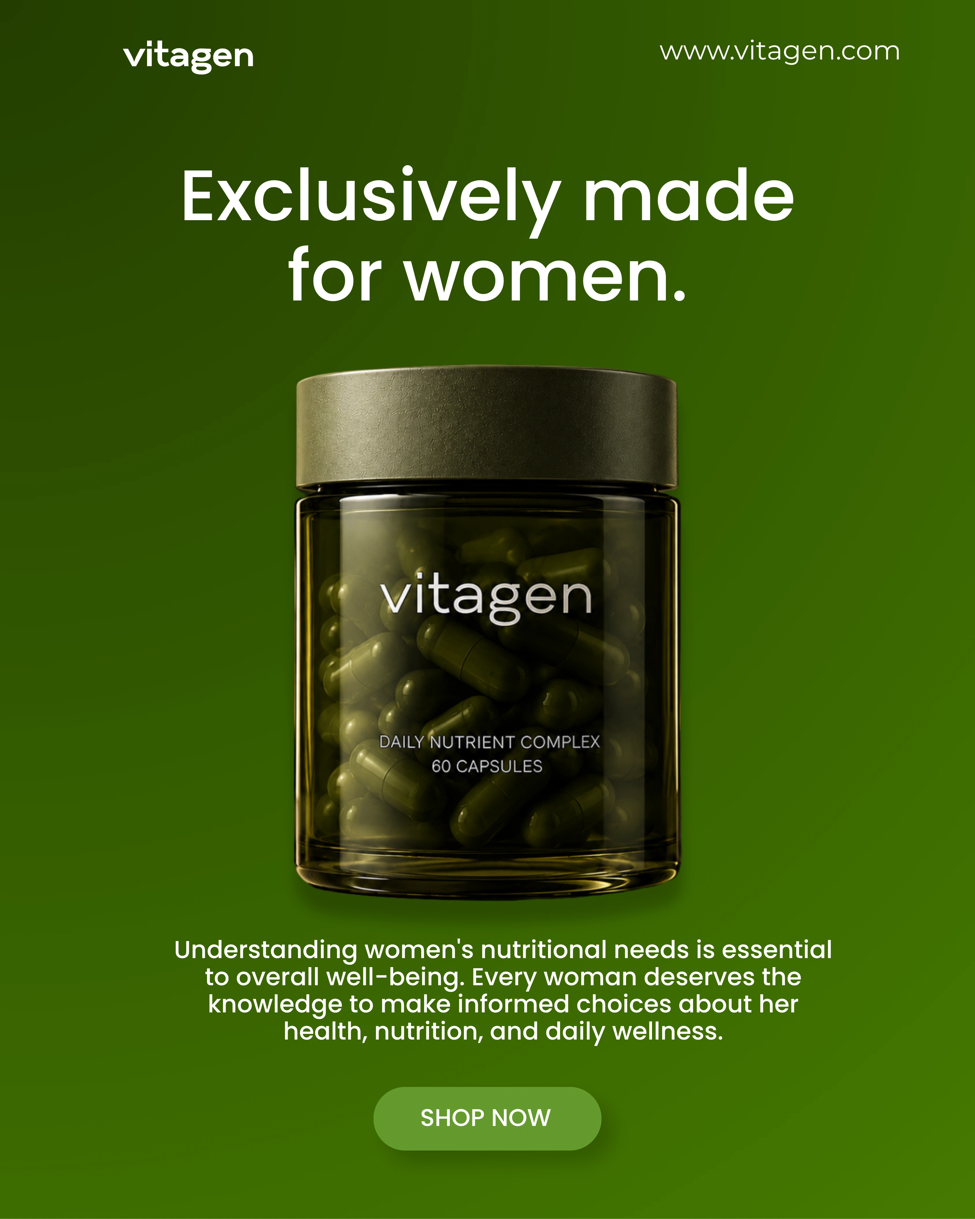
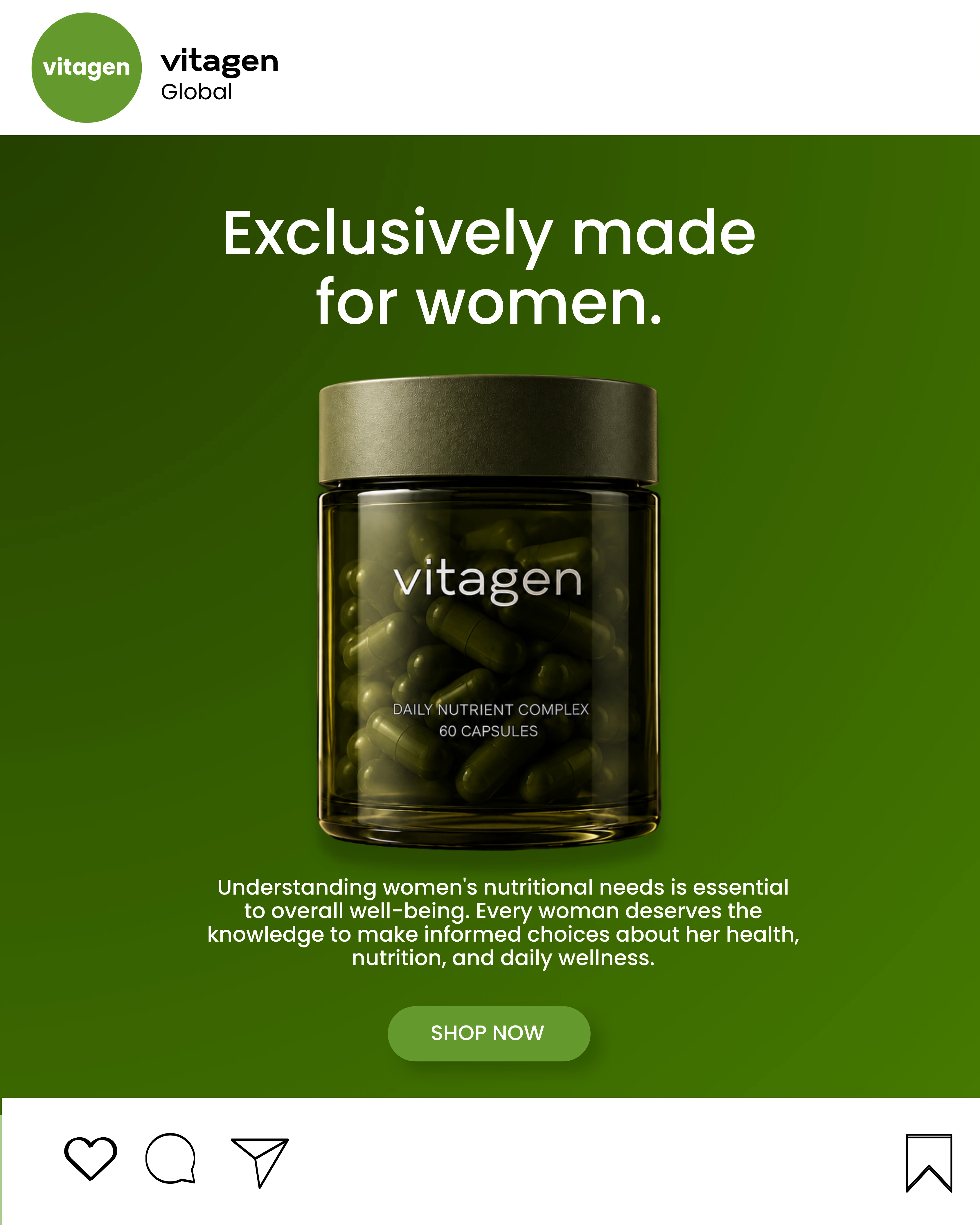
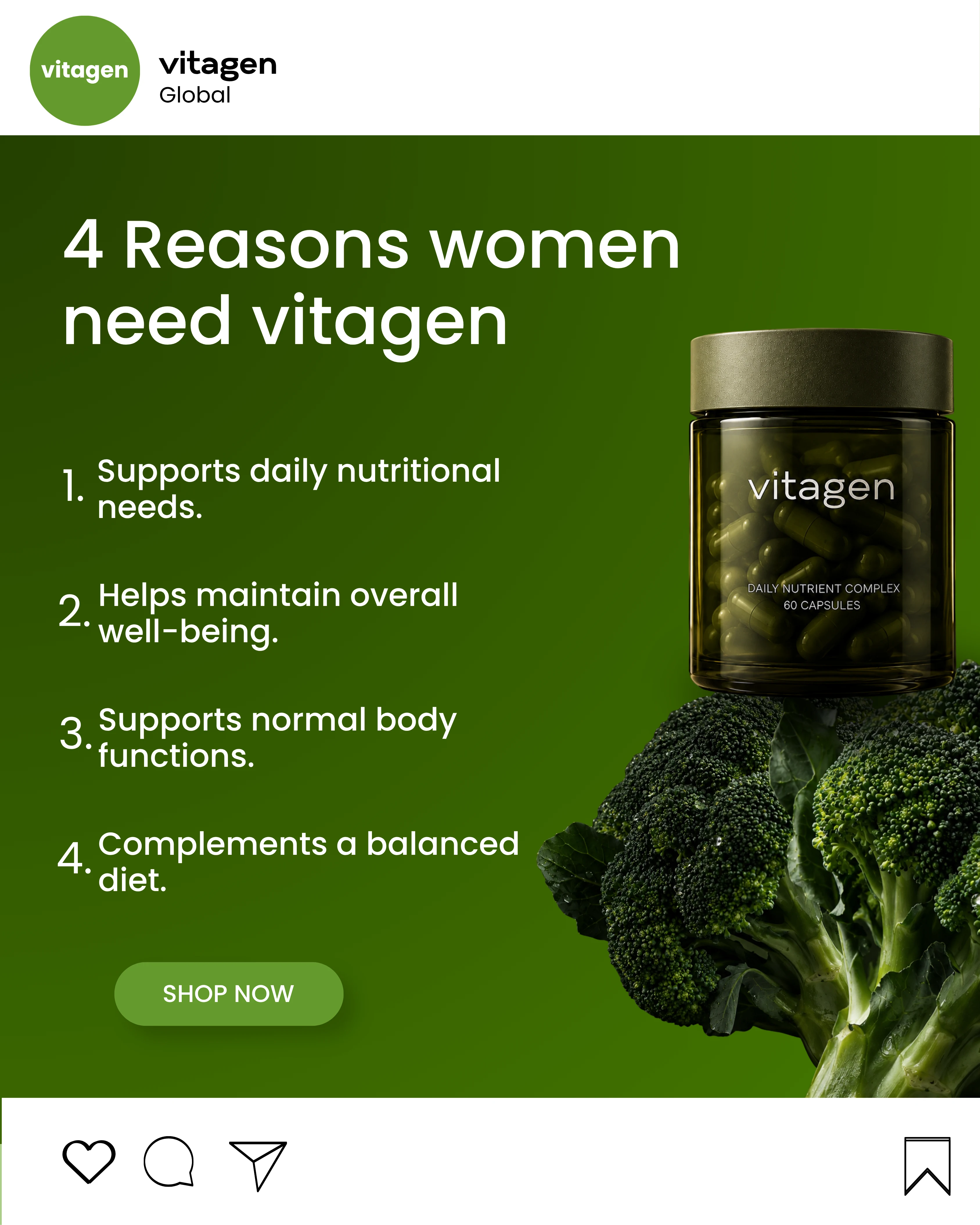
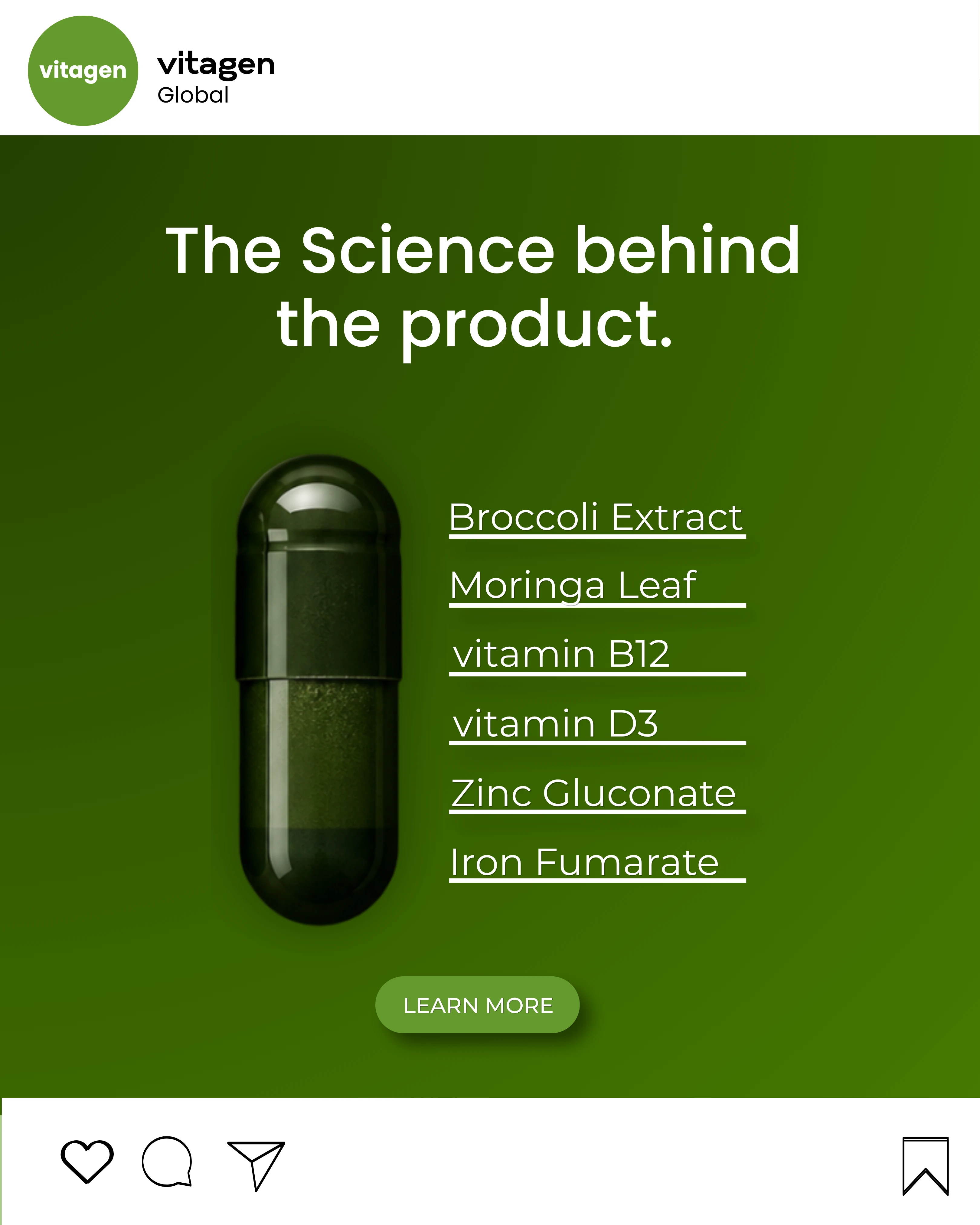
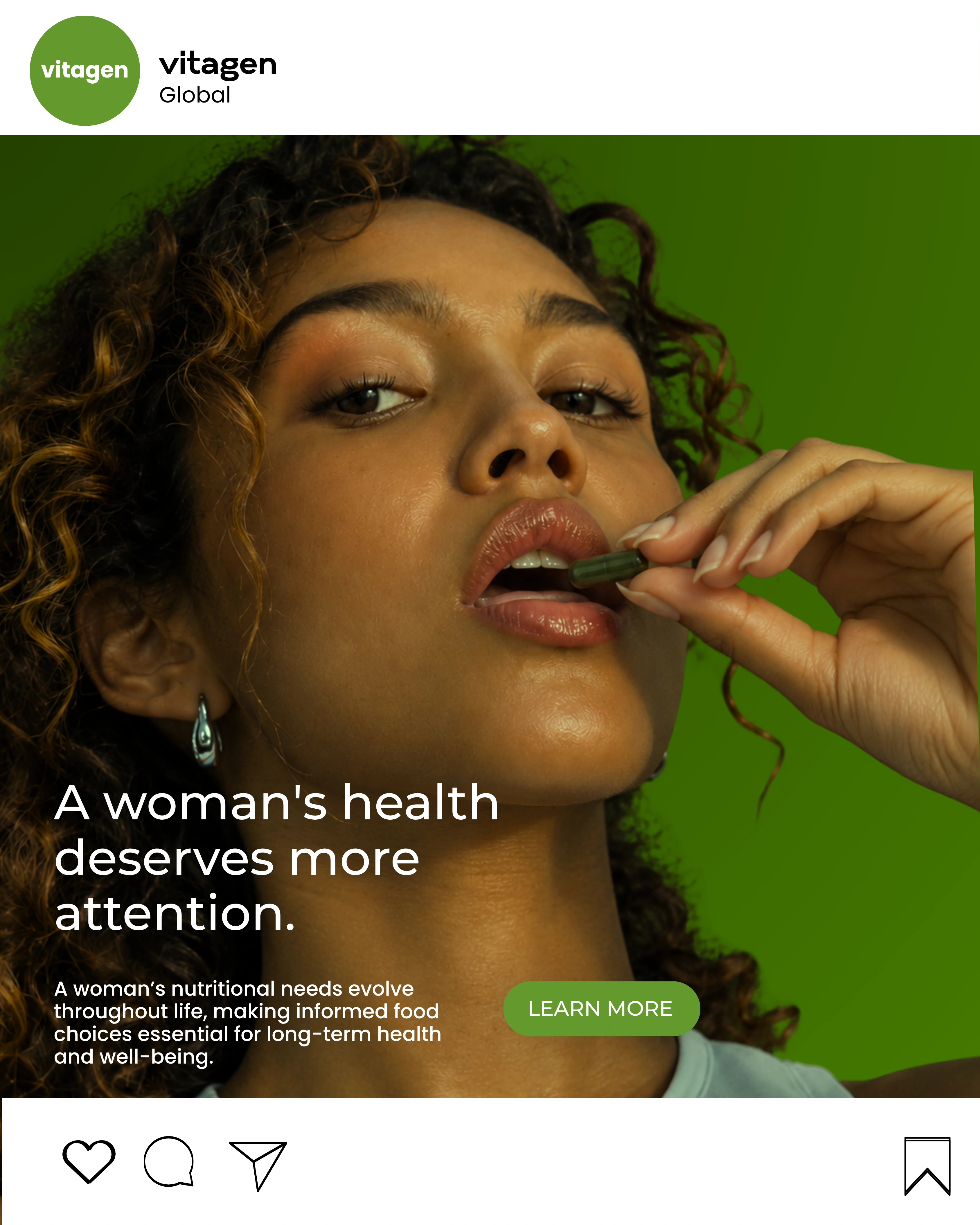
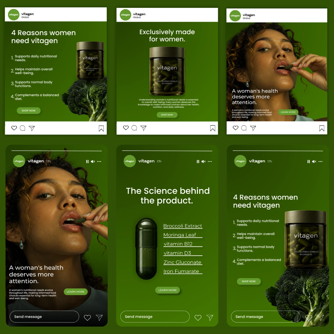
The visual direction was adapted for Instagram feed placements and Stories, ensuring the campaign maintained a consistent identity across different formats while respecting the way audiences interact with each placement.
For the feed ads, we focused on strong visual compositions, clear messaging, and deliberate information hierarchy. Each design was structured to capture attention within a crowded feed while communicating the product’s message in a concise and visually engaging way.
The Instagram Stories explored a more immersive, full-screen approach. We used the available space to create focused compositions that brought the product, imagery, and messaging together without compromising clarity. The layouts were designed to feel natural to the platform while preserving the campaign’s distinctive visual language.
Across both formats, consistency remained central to the execution. Colour, typography, imagery, and art direction worked together to ensure that every asset felt like part of the same campaign, regardless of placement.
THANKS FOR VIEWING.
Like this project
Posted Oct 22, 2026
Developed a unique visual direction for Vitagen's supplement ads.
Likes
1
Views
1