Pavise

0
Graphic Designer

Adobe Illustrator

Adobe Premiere Pro
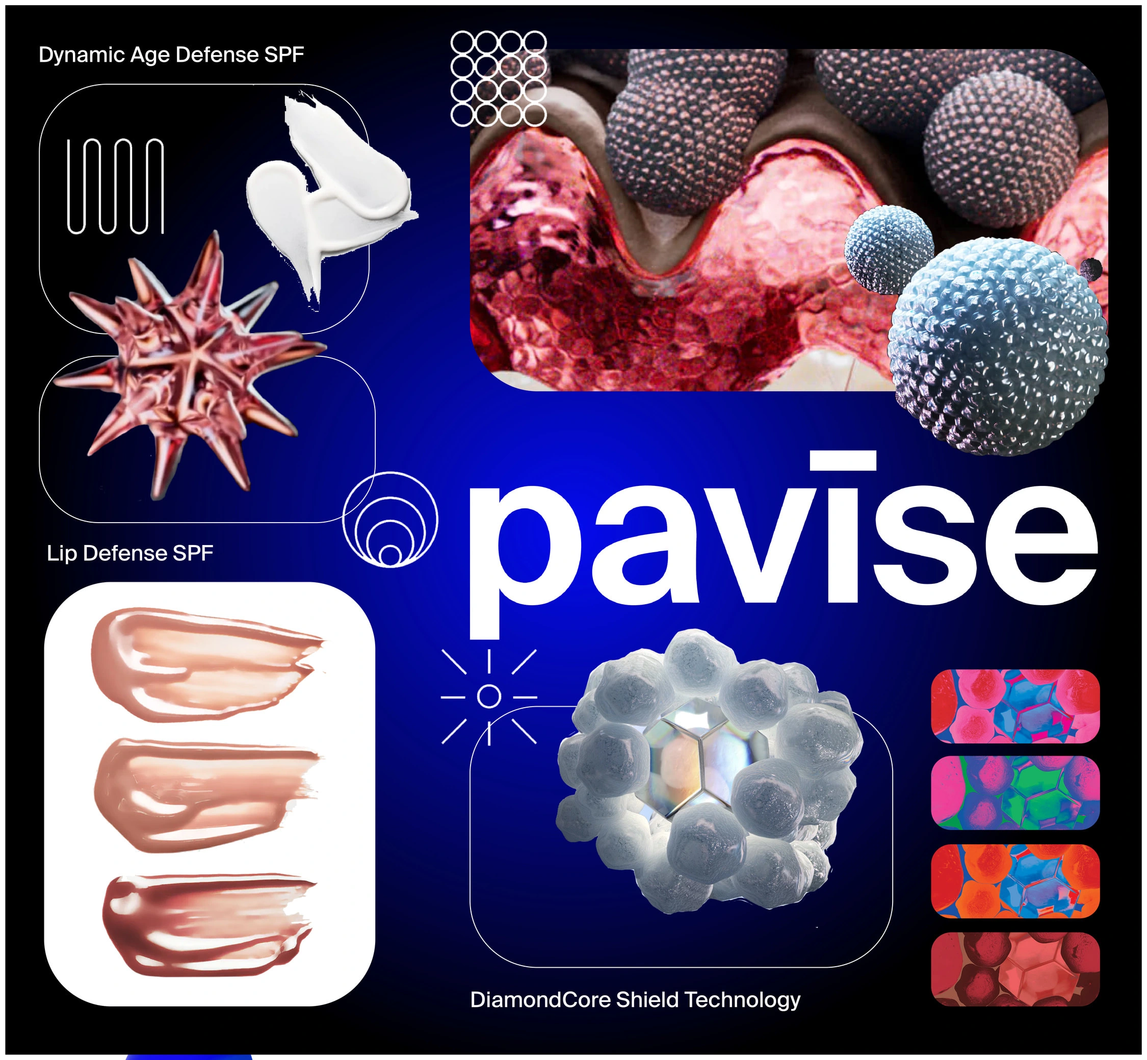
The objective behind the graphics was to inform the public about Pavise, a suncare and skincare brand. In my design process, I initiated by creating a moodboard, jotting down keywords, and studying competitors within the industry. My research was centered on discovering how Pavise could establish a distinctive presence. One notable aspect was Pavise's utilization of vibrant neon colors, in stark contrast to competitors like Tacha, who opted for softer pastel hues.
One key lesson I derived from this design experience was the importance of striking a balance between visuals and text. Throughout the process, I sought feedback from my peers.
Reflecting on the project, if I were to approach it differently, I would place a greater emphasis on ensuring legibility. The use of the font "DirtyLine 360DaysofType 2022" posed readability challenges, especially when combined with the neon color palette.
Like this project
0
Posted Nov 30, 2023
The objective behind the graphics was to inform the public about Pavise, a suncare and skincare brand.
Likes
0
Views
6
Tags
Graphic Designer
Adobe Illustrator
Adobe Premiere Pro


OUI The People

HP Inc.