Personalized Mobile App Experience for Gap Inc.
Asuka Cherie Gettel
Project Overview
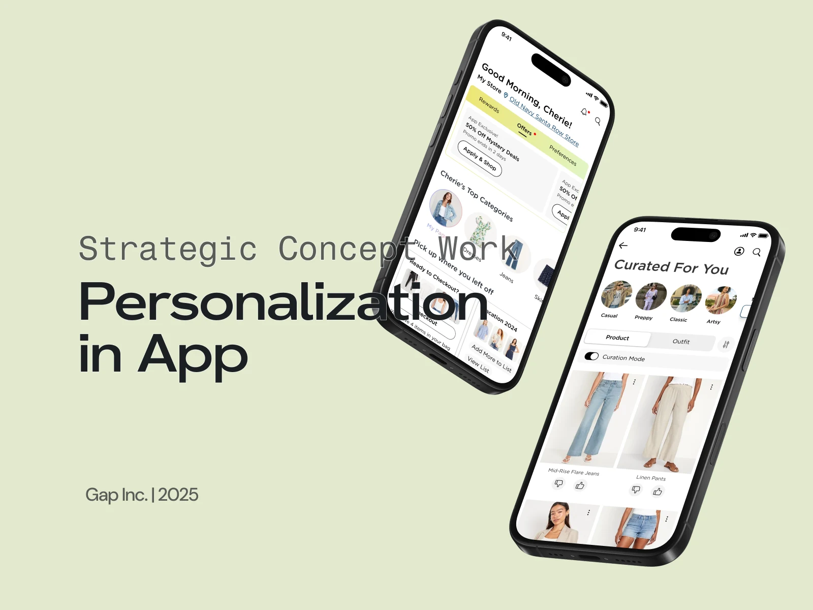
This project was one part of a three-pronged personalization strategy for Gap Inc.’s mobile apps. Each concept was scoped into a two-week sprint to explore, design, and prototype, enabling the research team to run quick user tests. I focused on personalization, with primary attention on the home screen, category page, and wishlists, using Old Navy as the test brand.
Video Recording
Features
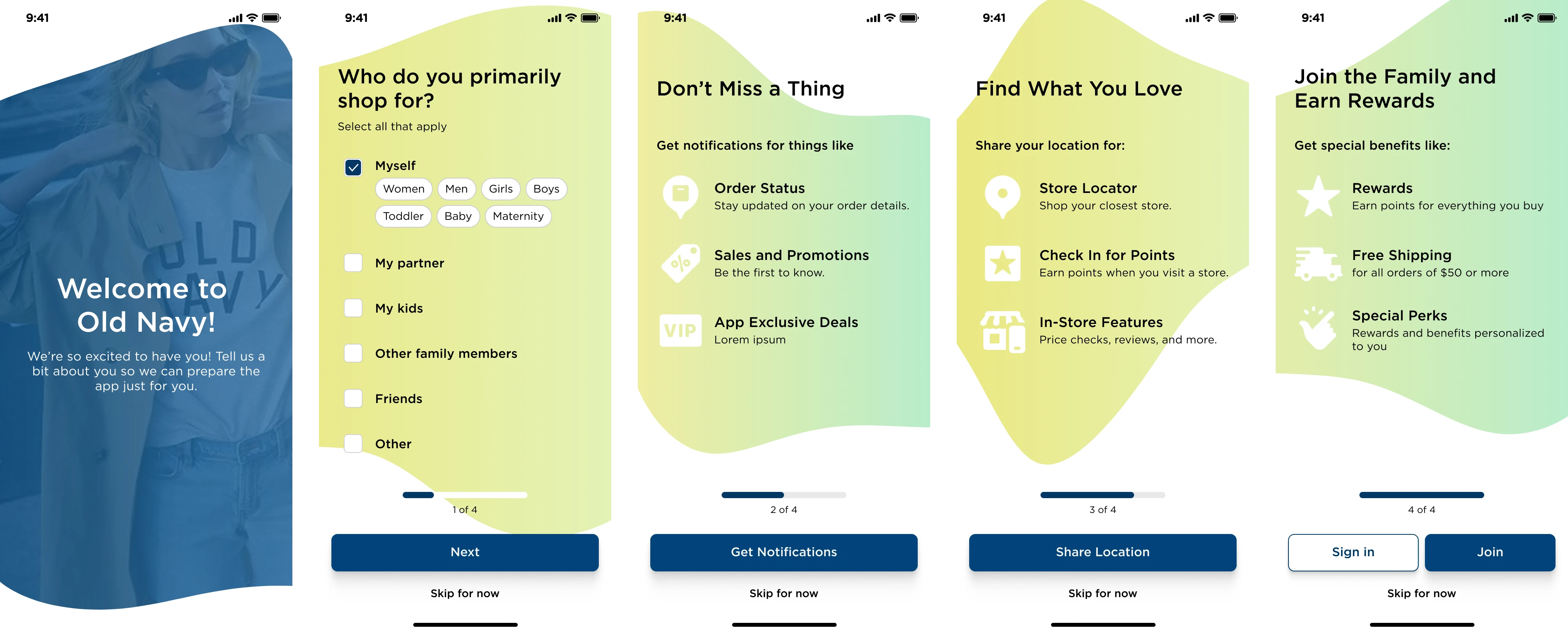
Onboarding
The flow begins at first-time app launch. I included a streamlined onboarding that captured key personalization inputs (e.g. who you shop for, departments of interest) while offering optional account creation—an intentional contrast to competitors that force sign-up. Skipping was also allowed to avoid bounce risk, based on prior user feedback around friction at this stage.
Personalized Home
The home screen was designed to feel personal, dynamic, and useful from the start:
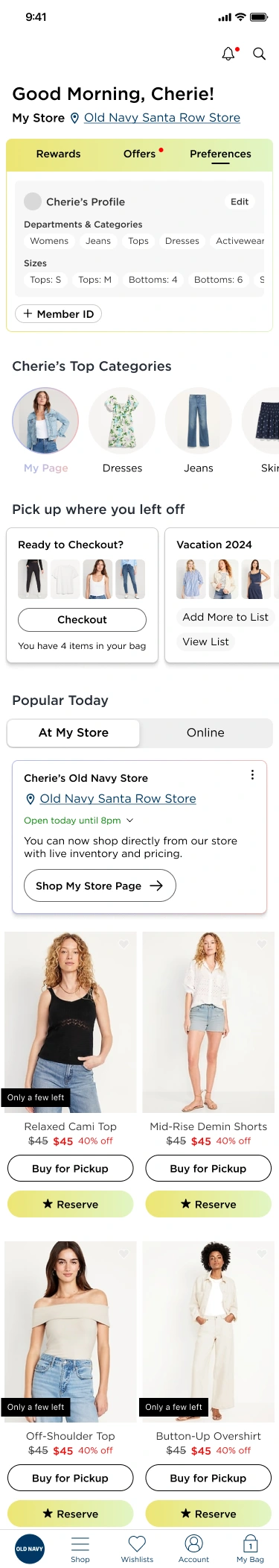
Top Widget: Rewards, Offers, Preferences
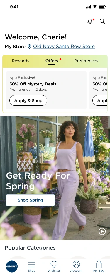
A single module surfaces rewards (quick access to scanable member ID), current promos, and user preferences like saved sizes or departments. Users can also toggle between multiple shopper profiles (e.g. for their kids).
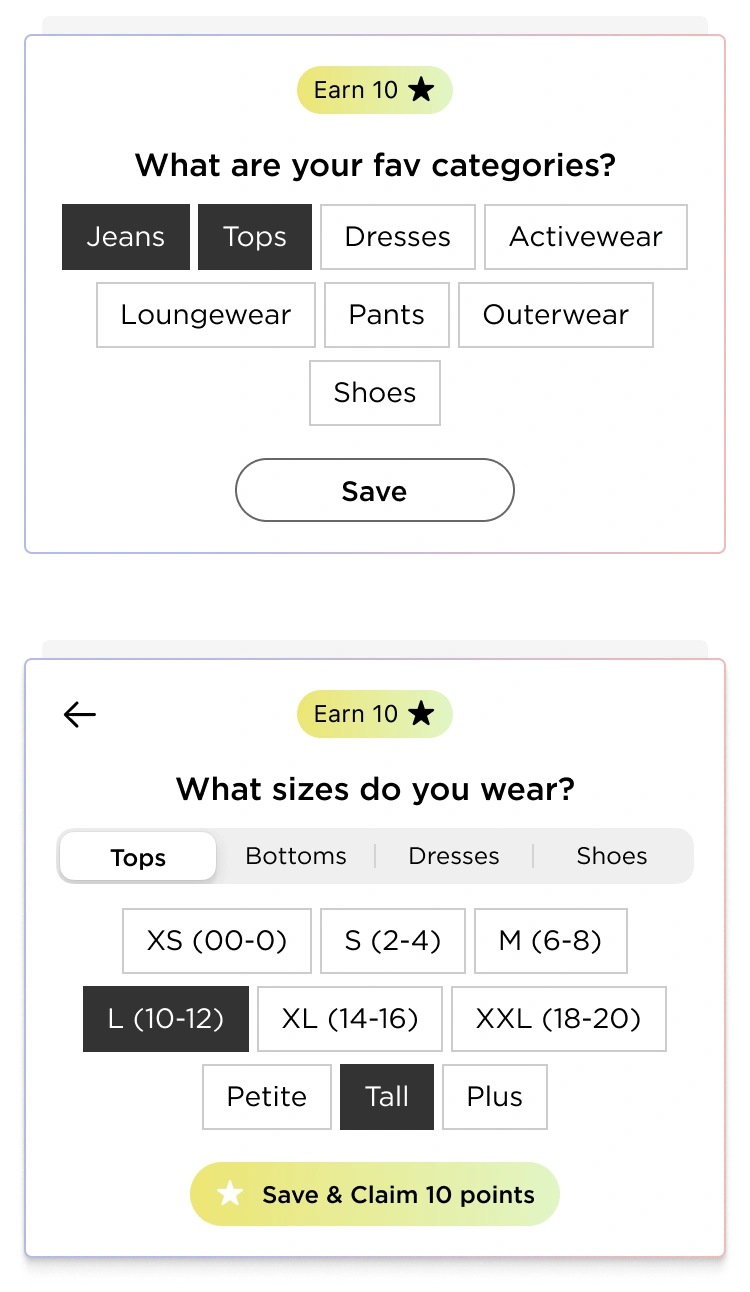
Personalization Prompts
Lightweight prompts ask users for info like size or category interests, rewarding participation with loyalty points to drive engagement and data collection.
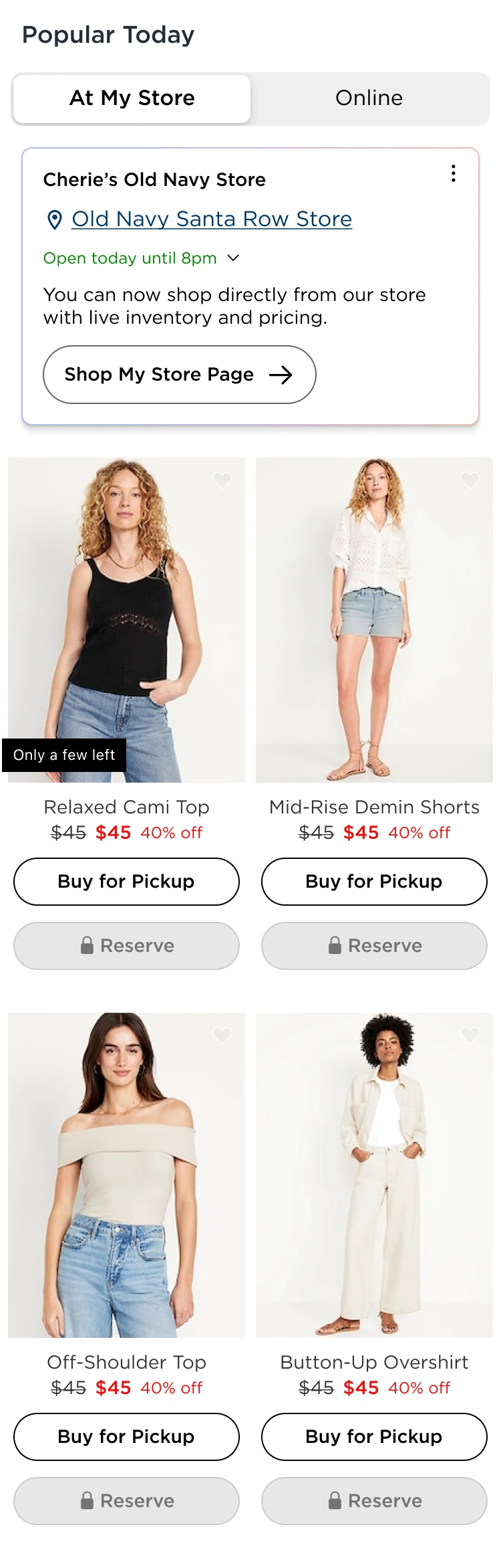
Store-Aware Inventory + Reservation Perk
A geo-tied module highlights inventory from the nearest store. I introduced an exclusive Reserve in Store feature that’s unlockable with points—framing it like a “fast-pass” to drive interest and FOMO. Locked buttons still invite taps, which trigger informative tooltips.
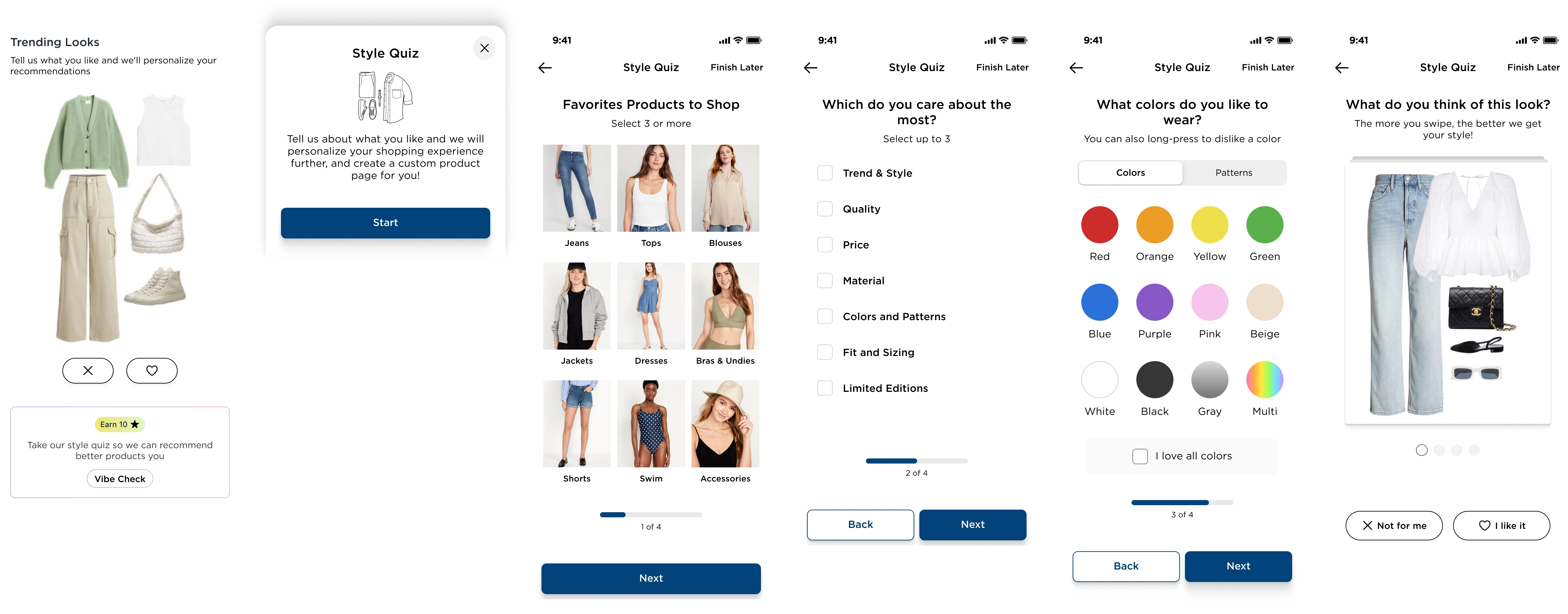
Outfits & Style Quiz
Users can vote on outfit styles (like/dislike) to influence future product recommendations. A deeper Style Quiz experience unlocks a fully personalized category page ("For You" style), using reward points to incentivize completion. The quiz is visual, quick, and fun—focusing on swipeable cards.
Curated for You’ Category Page
The post-quiz category page adapts fully to the user and introduces multiple new interaction models
Two View Types
The personalized category page offers two distinct views, giving users flexibility in how they shop and explore.
Product Grid View
This mode mimics traditional eCommerce grids but is tailored to the user’s preferences.

In standard mode, each tile includes an “Add to Bag” button to streamline the purchase flow. Because the grid is already filtered for relevance, users can confidently make quick decisions—minimizing friction from over-choice.
In Curation Mode, the “Add to Bag” button is replaced with Thumbs Up/Down icons, enabling users to directly influence the algorithm by expressing preferences. This explicit feedback loop improves future recommendations.
Outfit View
This mode transforms the page into a scrollable series of styled outfits generated from the user’s quiz results and engagement history.
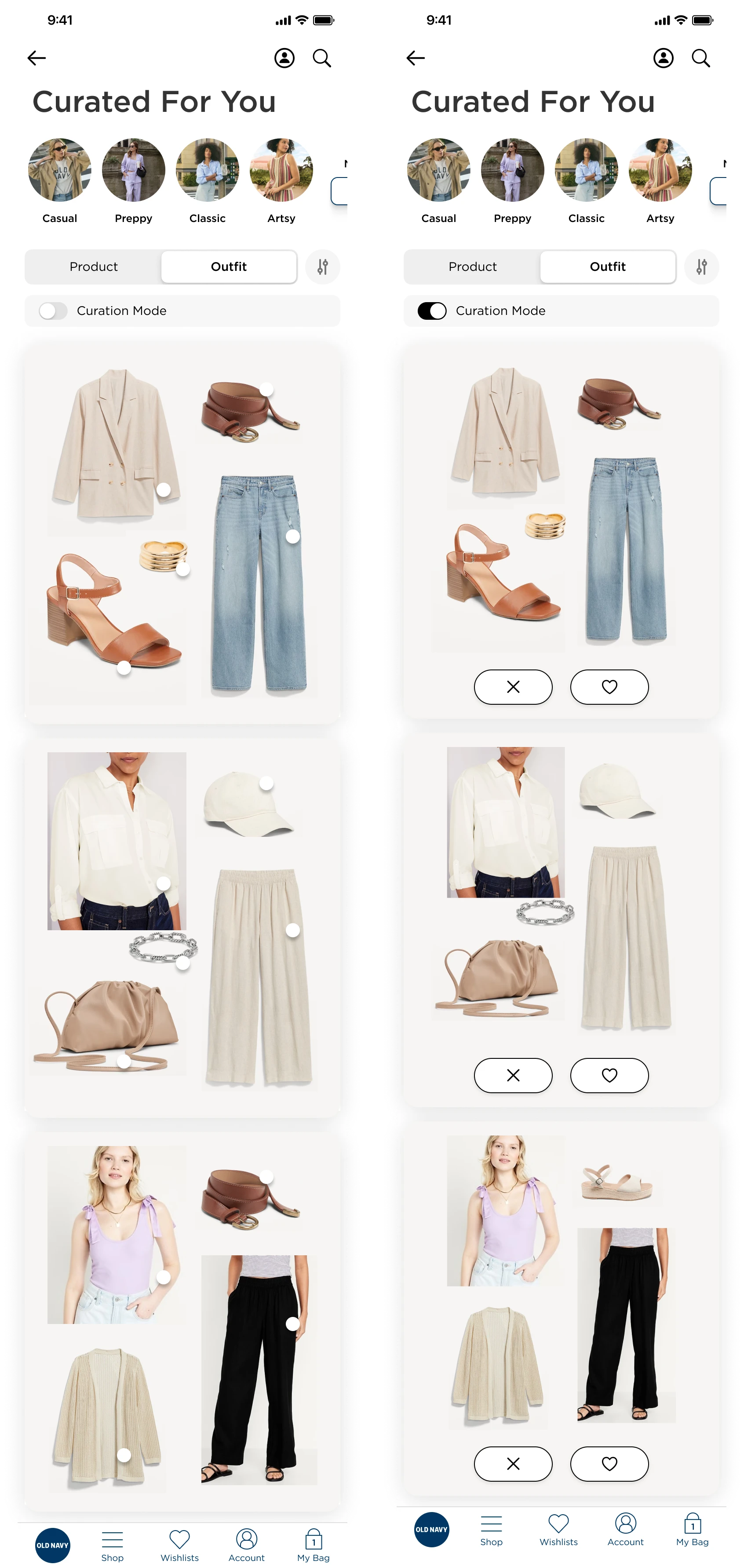
Each outfit is shown as a cohesive look, designed to inspire and emulate personal styling.
Users can tap on hotspots within the outfit image to navigate directly to individual product pages.
Outfits update dynamically as the user interacts with more content, making this a continuously evolving reflection of their style.
Unique Long-press interactions
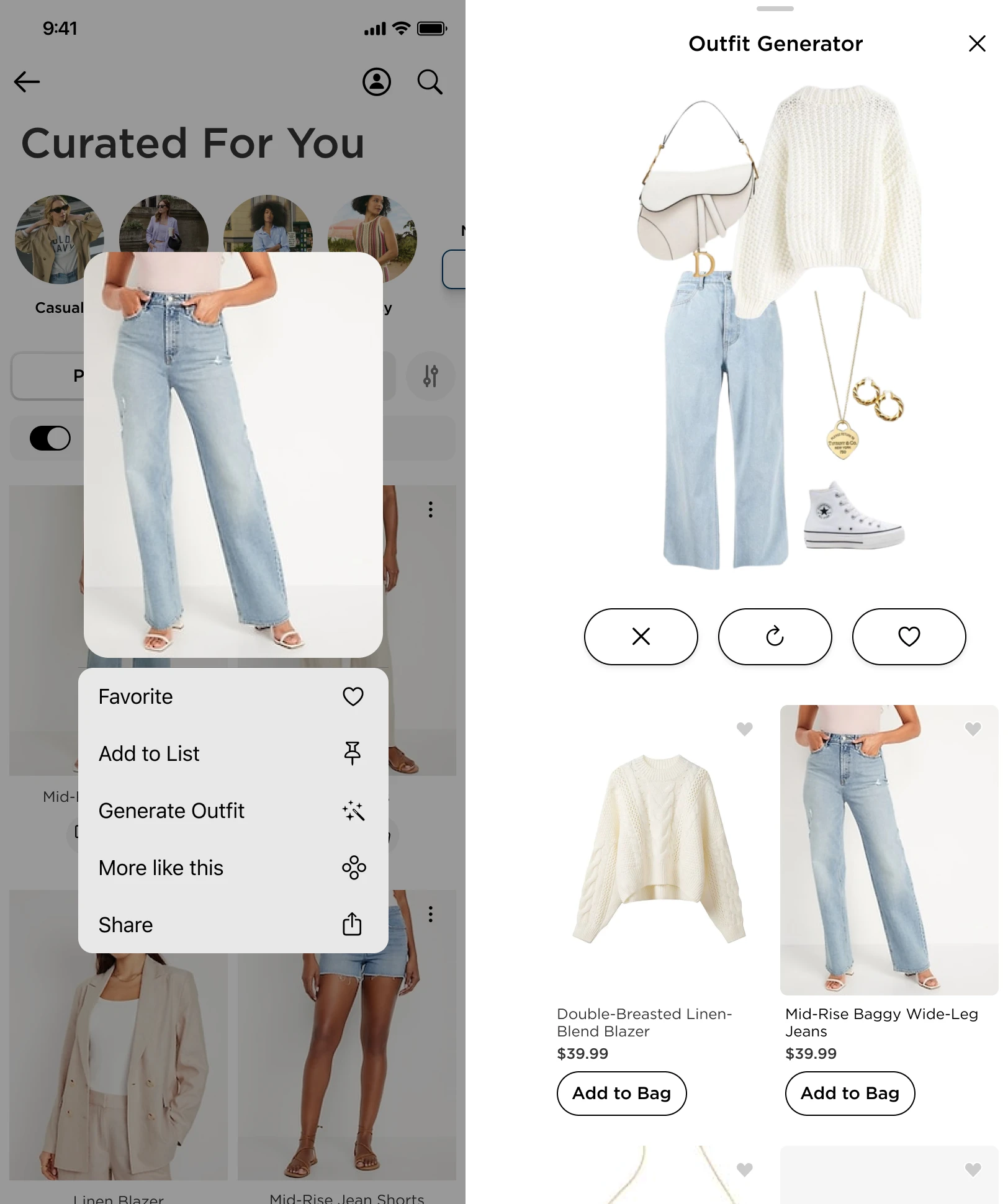
Long-pressing on items reveal a custom context menu, offering deeper actions like “More Like This” or “Outfit Generator,” which creates a look based on the selected item and allows easy add-to-bag for the full outfit.
These two views work together to support both intent-based shopping (fast, focused) and inspiration-driven browsing (exploratory, mood-based), capturing the full spectrum of user behavior.
Optimized PDP
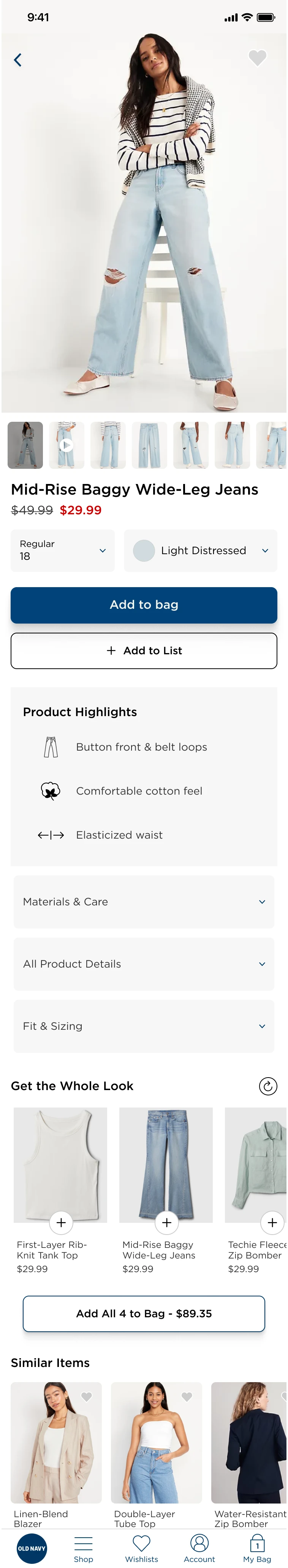
To reduce friction and support high-intent shopping, I designed a truncated PDP tailored for users arriving from personalized experiences like the outfit generator or style quiz.
Auto-filled size: If a user has provided sizing info, it’s pre-selected to minimize effort and speed up the path to checkout.
Simplified layout: The page prioritizes large product imagery, trims excess content, and collapses variant options (like color swatches) into dropdowns—assuming the featured item already aligns with the user's preferences.
Add to List CTA: Instead of only pushing for purchase, the PDP includes an “Add to List” button, encouraging users to save items for later. This supports casual browsing and builds long-term intent while feeding personalization data.
Bundle purchasing widget: When users land here from an outfit, a module offers to add the entire look to bag in one tap—helping users shop complete outfits quickly and seamlessly.
This PDP acts more like a quick-buy sheet—focused, visual, and tailored to mobile behavior.
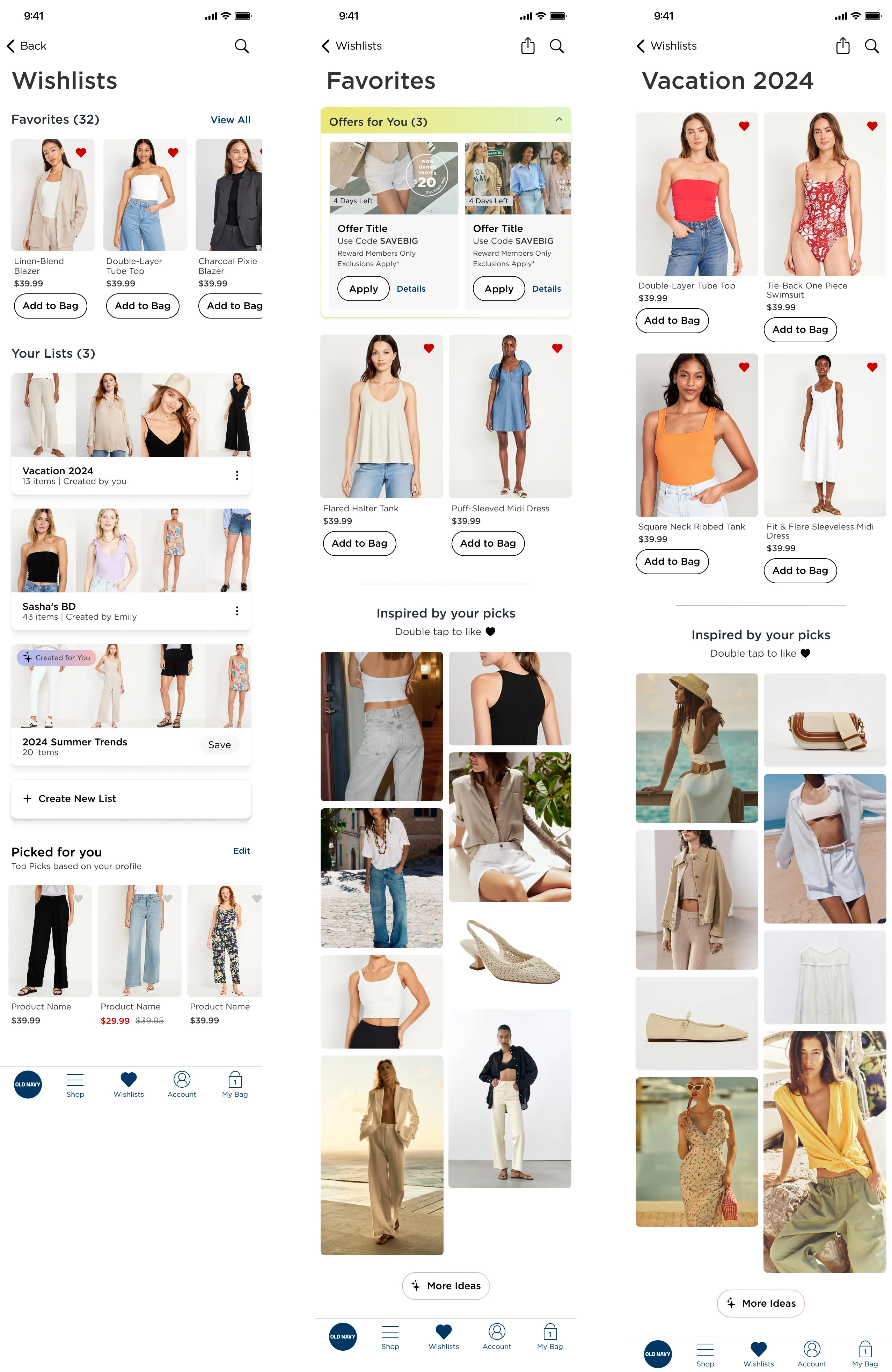
List Features & Engagement Loops
Lists were designed to go beyond basic favoriting, offering a richer, more personalized shopping experience that encourages ongoing interaction.
Custom Lists: Users can create themed lists—like “Birthday Wishlist” or “Vacation Fits”—giving them space to plan, organize, and revisit products around real-life needs or moods.
AI-Curated Starter Lists: To eliminate the friction of starting from scratch, users are offered pre-filled seasonal or trend-based lists they can build on, encouraging faster engagement and minimizing decision fatigue.
Relevant Promotions Widget: Within the Favorites view, users see a dynamic widget that highlights any active promos tied to their saved products. This drives urgency and nudges conversion by surfacing timely incentives without users needing to hunt for them.
Inspired by Your Picks: Every list includes a section that recommends items visually aligned with what’s already saved. This encourages discovery based on style and mood, rather than filters or categories.
Social-Style Microinteractions: The list UI feels visual and lightweight, with features like double-tap to like, mimicking familiar social behavior. Likes are saved directly to the list and also used as soft signals to refine recommendations elsewhere in the app.
Full mockups of the Wishlists and Favorites screens
Fully Personalized Home (Post-Engagement)
Once users engage with key features—like providing preferences, taking the style quiz, or saving items—the homepage transforms into a highly customized hub designed for retention and continued exploration.
Preferences Panel: Their previously entered sizes, categories, and shopper profiles now populate the preferences section, making the app feel more tailored and intelligent with every use.
Pinned Personalized Category Page (PCP): Their “For You” category is now a permanent fixture in the top navigation carousel, ensuring quick access to their most relevant products and outfits.
Re-Engagement Module: The “Pick Up Where You Left Off” feature becomes a default module, consistently pulling them back into active shopping tasks or lists they’ve started.
More Info
To support real user behavior—especially short, fragmented mobile sessions—I designed a dynamic re-engagement module that surfaces contextually relevant CTAs to bring users back into their shopping flow.
Smart Reminders: If a user has items in their bag, the module prompts them to return to checkout. If they’ve started a list, it offers a quick link to resume. It can also guide users back to previously browsed categories or products they lingered on.
Session Continuity: Rather than forcing users to navigate back through menus or rely on memory, this module prioritizes recognition over recall, offering shortcuts based on past activity.
Context-Aware Behavior: The content of this widget adapts in real time depending on user behavior, creating a homepage that evolves with them—not a static experience. This keeps the interface feeling responsive and personalized without overwhelming the user.
Reserve-In-Store Unlocks: If they’ve accrued enough points, the once-locked “Reserve in Store” button is now accessible—highlighting exclusivity and reward for engagement.
Closing Thoughts

*Illustration made via Figma AI feature.*
User testing showed strong interest in the value prop and all the ways personalization shaped the experience. While this was a blue-sky concept, it helped spark cross-functional conversations around how we could collect more data and tailor app experiences.
The strategy covered a wide spectrum—from low-effort data collection prompts to high-complexity features like outfit generators—providing clear levers to test and scale. Many of these touchpoints are easily measurable, making them ideal candidates for phased rollout and impact tracking. Ideally, the preferences would persist across web and app for a unified cross-platform experience.
Like this project
Posted Jul 22, 2025
Designed a personalized mobile app experience for Gap Inc., focusing on user engagement and data collection.