E-commerce Wireframes
Mezzanine Creative
Case Study: E-commerce Wireframes
Project Overview
This case study outlines the foundational wireframes for a new e-commerce brand specializing in contemporary apparel and accessories. The primary goal of this project was to create a clean, intuitive, and user-friendly online storefront that reflects the brand's minimalist aesthetic.
Problem Statement
The challenge was to design a digital experience that allows customers to effortlessly browse, discover, and purchase products. The solution needed to prioritize a clear user flow and a scalable framework that can easily accommodate new collections and product categories without compromising usability or brand identity.
Goals
The design was guided by three core objectives:
Enhance Usability: Create a seamless and logical user journey from product discovery to a completed purchase.
Focus on Product: Use a content-first approach with a minimalist layout that allows products to be the central focus.
Ensure Scalability: Build a flexible framework that can easily adapt to future growth and changes in the product catalog.
Target Audience
The target audience is young adults (18-35) who are digitally savvy, appreciate contemporary design, and seek a straightforward online shopping experience. This audience values clarity and a streamlined process, which informed the design decisions.
Design Process & Rationale
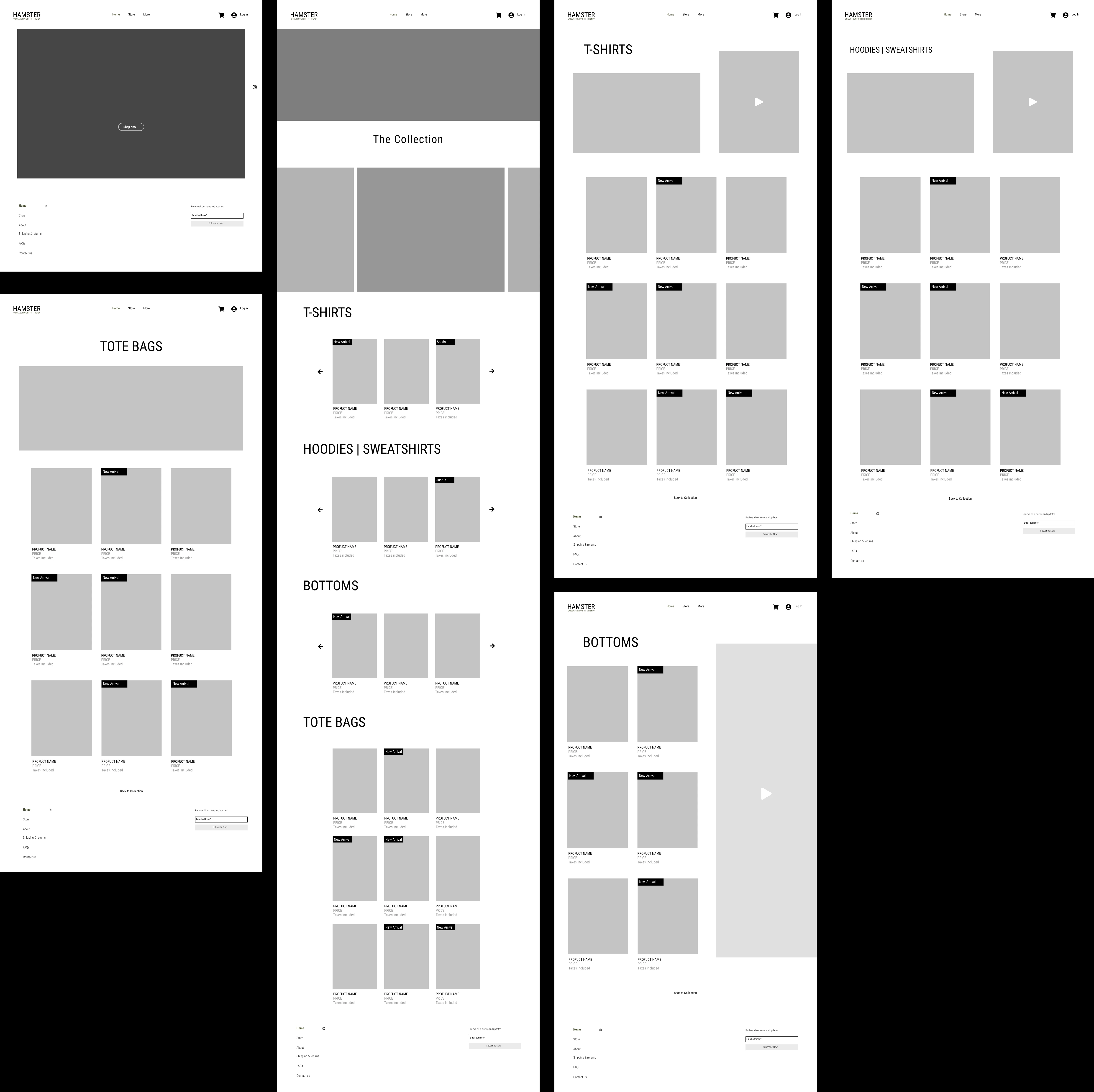
The wireframes were developed with a mobile-first mindset, ensuring that the layout and navigation would be functional and effective on smaller screens before scaling up to a desktop view. The design philosophy centered on clarity and simplicity, opting for a minimalist layout with minimal distractions.
A robust grid-based system was used to organize product listings consistently across all pages, making the content easy to scan and digest. The global navigation is kept simple, with a persistent header featuring the brand logo, a menu toggle, and essential icons for search and the shopping cart.
Large, high-impact image placeholders were intentionally used to emphasize a product-centric approach, ensuring that visual content would be the key driver of engagement. Dedicated category pages (e.g., T-SHIRTS, HOODIES | SWEATSHIRTS) were designed to prevent overwhelming users and to simplify browsing.
Key Features of the Wireframes
Clean Navigation: A consistent top-bar navigation provides clear access to all major sections of the site.
Modular Product Grid: The flexible grid system allows for a visually appealing and organized display of products.
Dedicated Category Pages: Each product type has its own page, allowing users to quickly filter and find what they are looking for.
Structured Layouts: The layouts for the homepage, collection pages, and specific product categories are clearly defined to create a predictable and comfortable browsing experience.
Outcome
These wireframes serve as a solid structural blueprint for the HAMSTER website. They establish a clear, user-centric foundation that prioritizes a seamless shopping experience. The minimalist design ensures brand consistency while the logical flow guides users effortlessly through the site, laying the groundwork for a successful e-commerce platform.
Next Steps
The next phase involves transitioning from these gray-scale wireframes to high-fidelity mockups by incorporating brand colors, typography, and actual imagery. This will be followed by usability testing to validate the design and make any necessary refinements before the development phase.
Like this project
Posted Aug 25, 2025
Developed foundational wireframes for minimalist e-commerce site.
Likes
1
Views
4