Injecting Visual Identity

Luka Ivanovic


Introduction
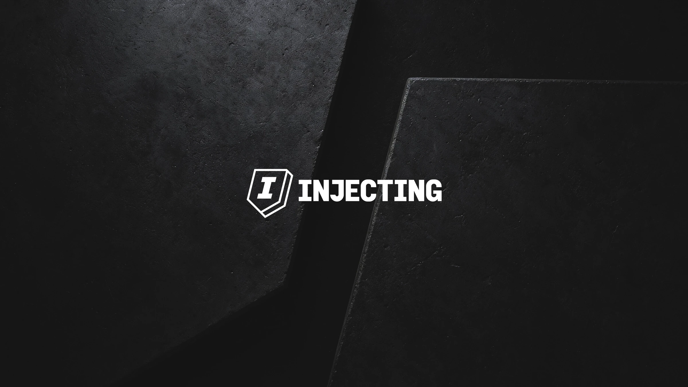
Injecting is a company specialized in permanent solutions for water ingress and concrete rehabilitation. The project focused on creating a new visual identity that reflects the company’s technical expertise, precision and highly specialized approach, while establishing a strong foundation for future growth.
Challenge
Injecting operates in situations where standard construction procedures are no longer sufficient and there is little room for error. The identity needed to communicate technical competence and reliability while moving away from the generic visual language commonly associated with the construction industry.
Solution
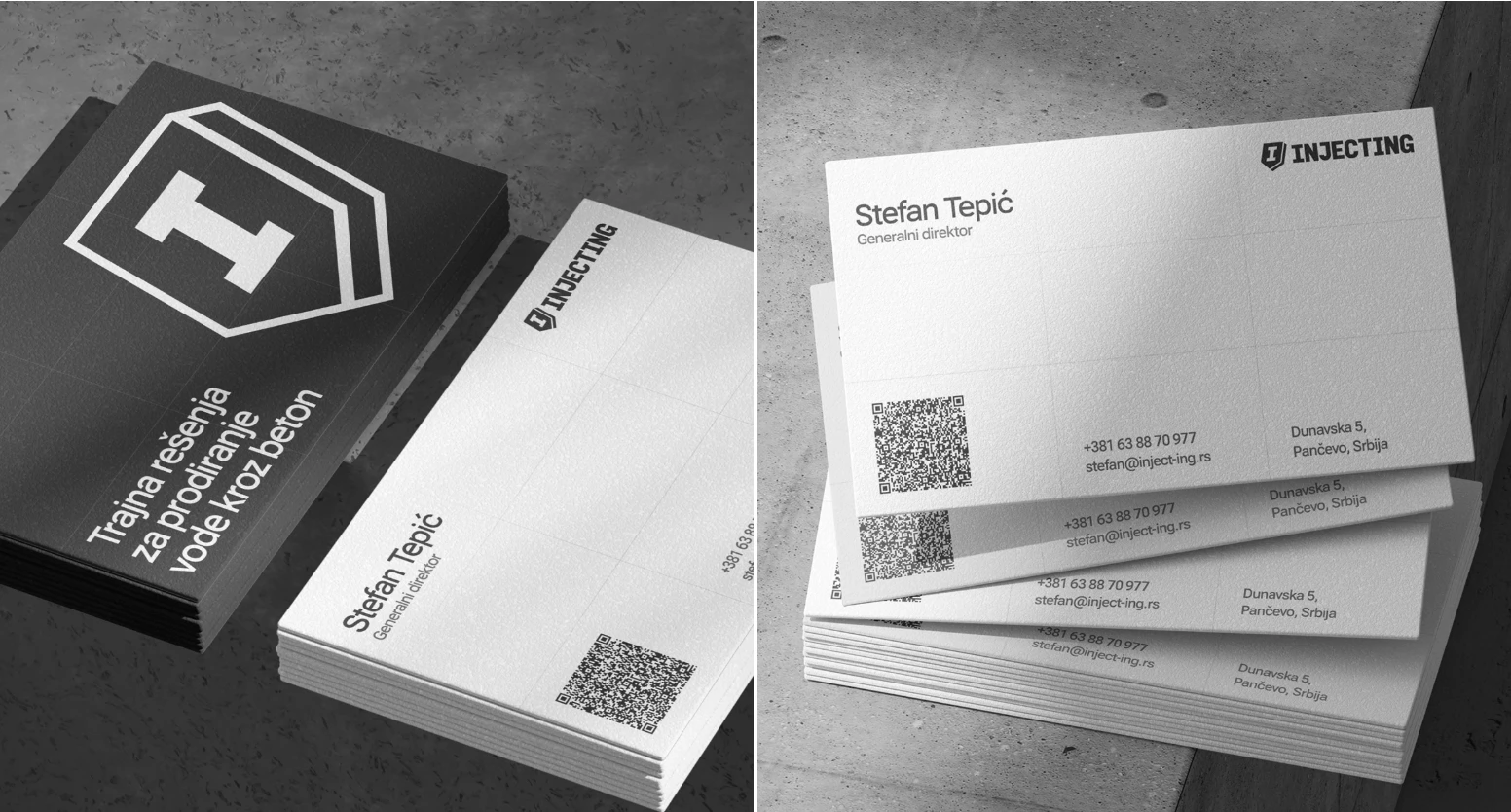
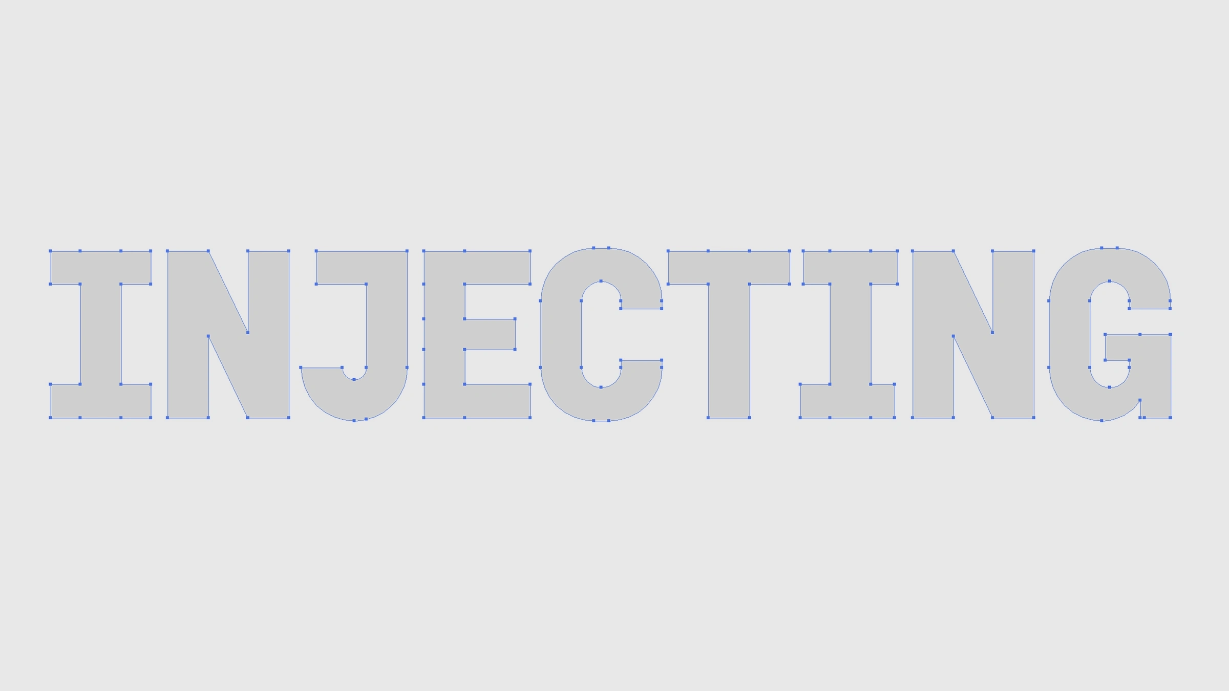
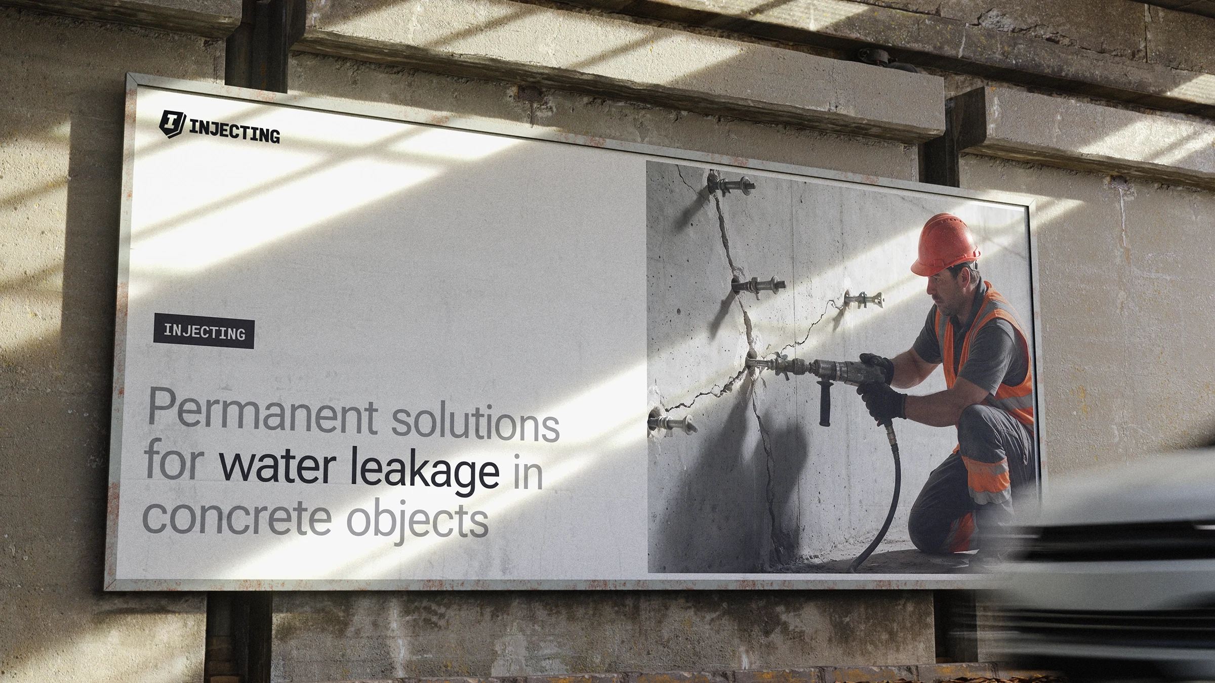
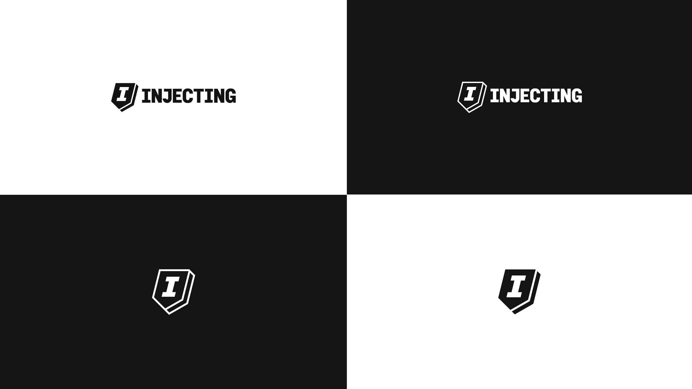
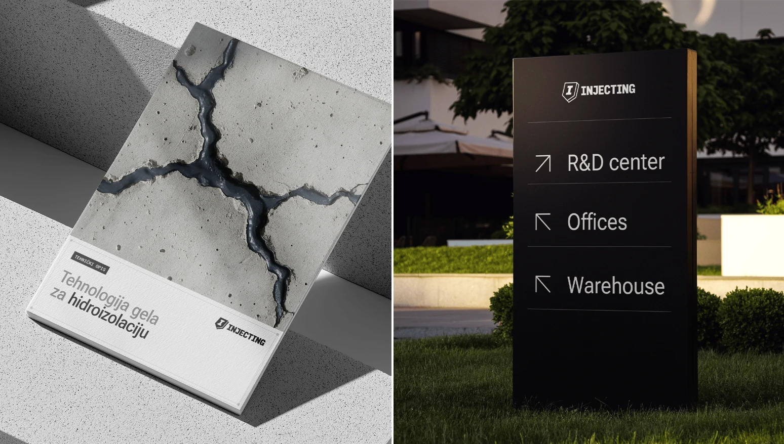
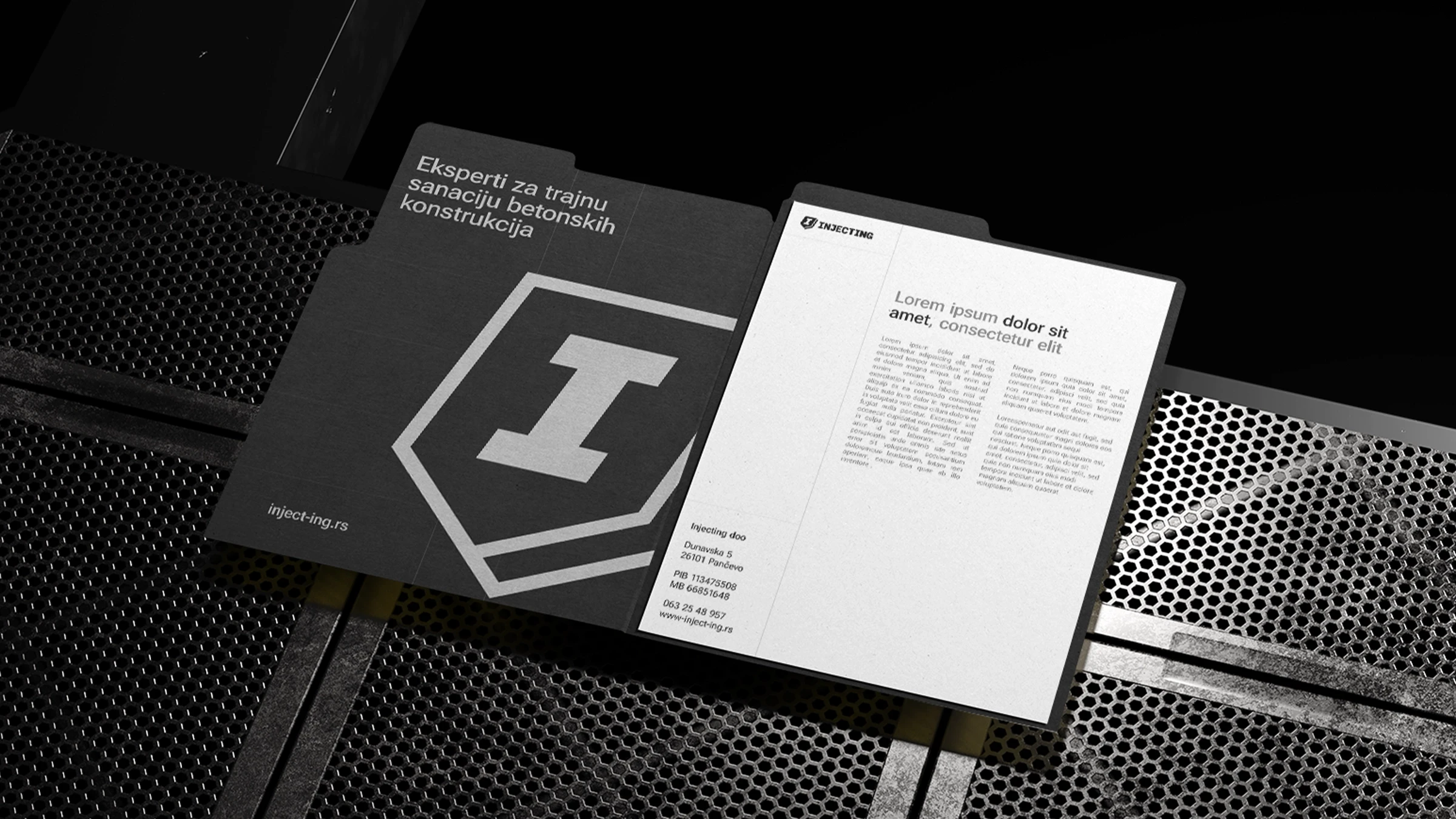
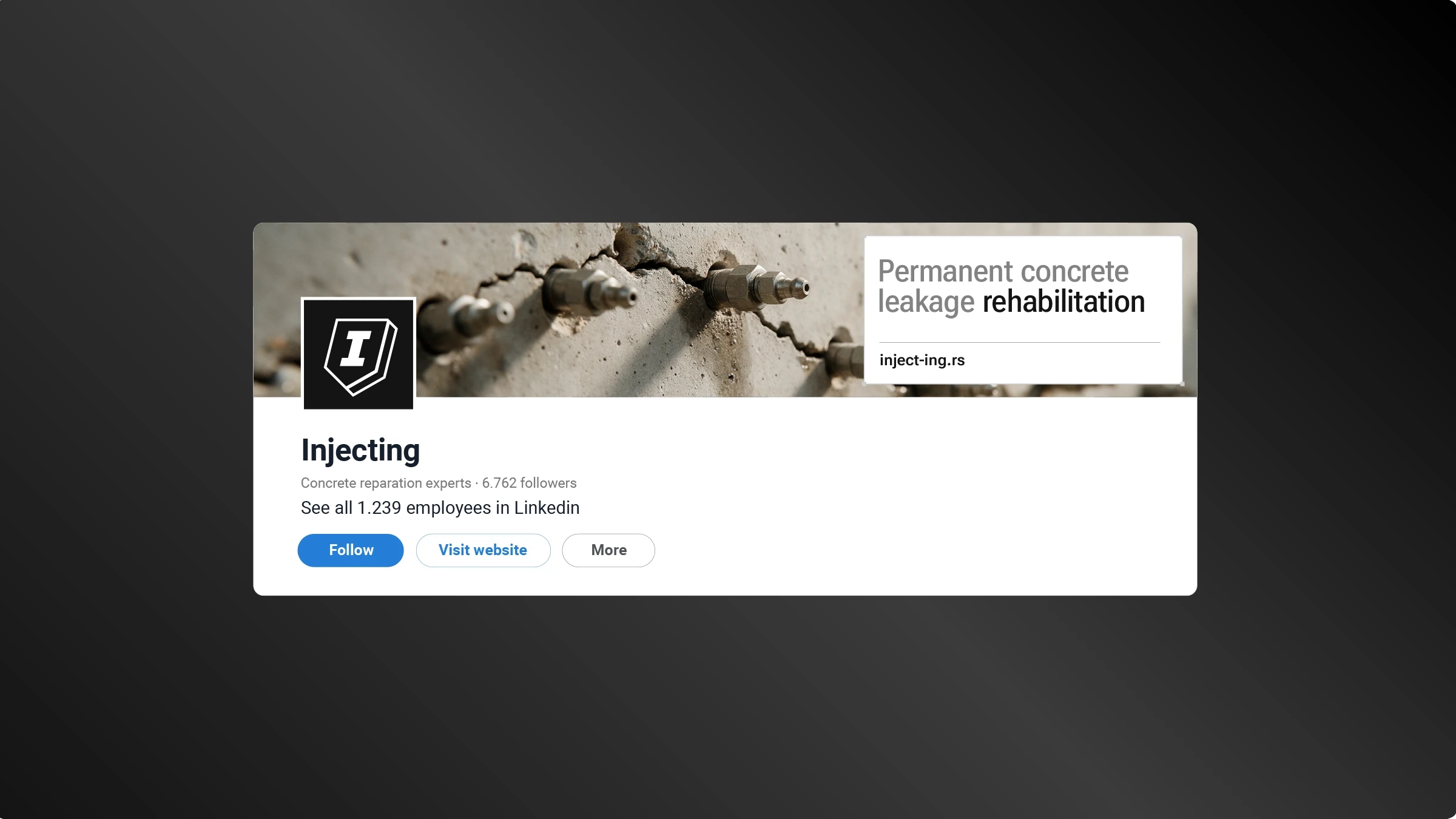
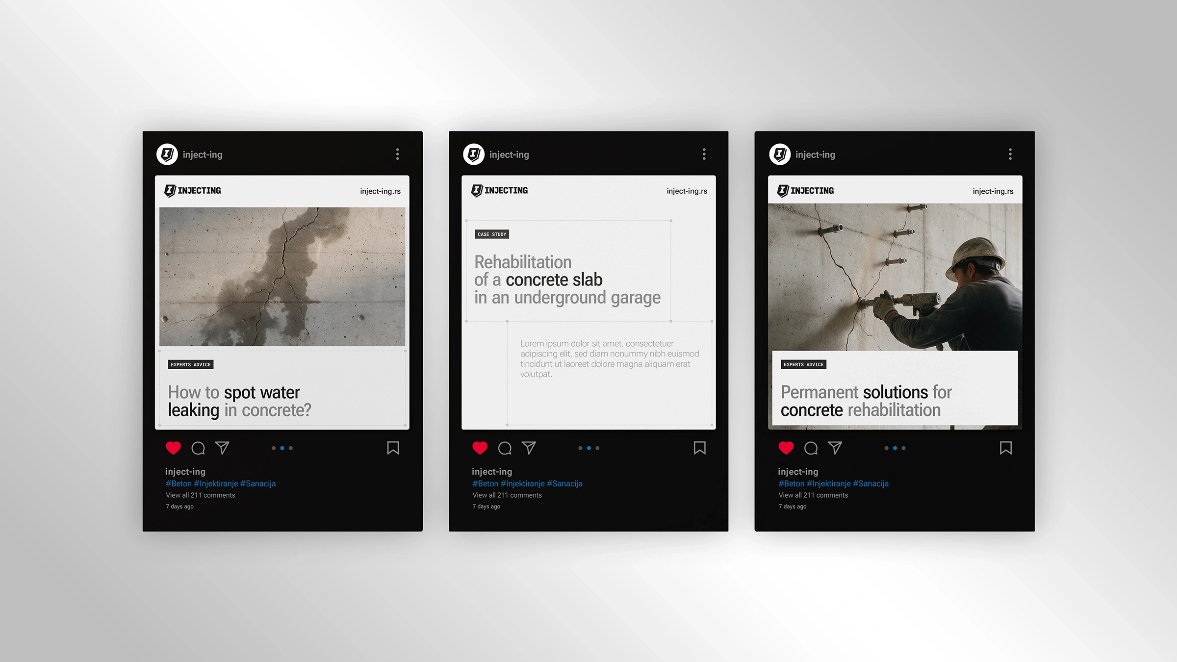
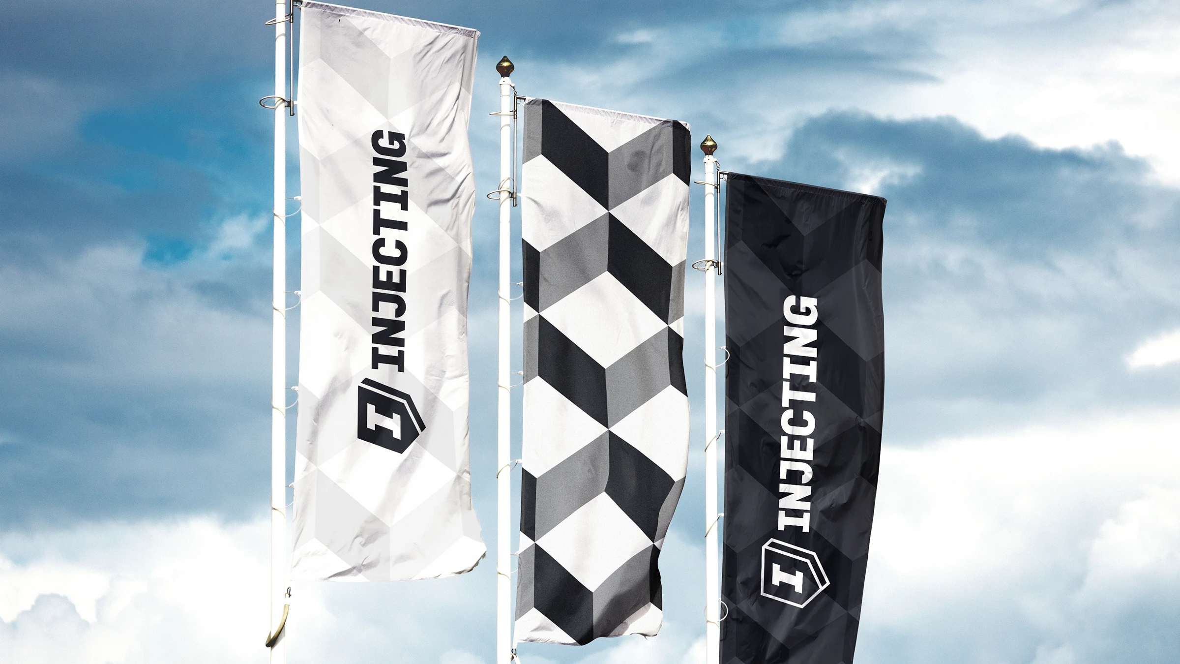
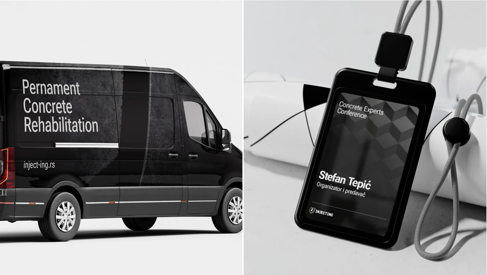
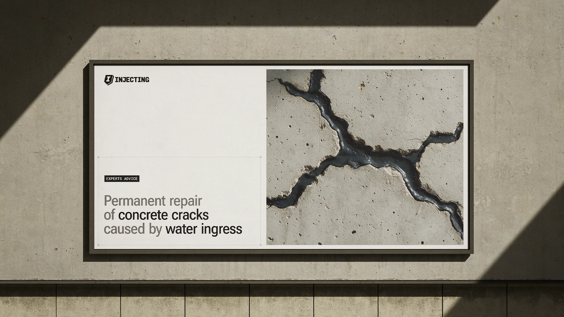
The new identity is built around a bold custom wordmark and geometric symbol, creating a strong and recognizable presence. A monochrome palette, structured layouts, technical typography and a modular graphic pattern reinforce the brand’s precision and engineering character. Together, these elements create a consistent system across digital, print, signage and on-site applications, positioning Injecting as a specialized expert in concrete rehabilitation.
Like this project
Posted Oct 23, 2026
Logo and visual identity design for a construction company specialized in concrete rehabilitation.