FlyUX Project
Overview 🔎
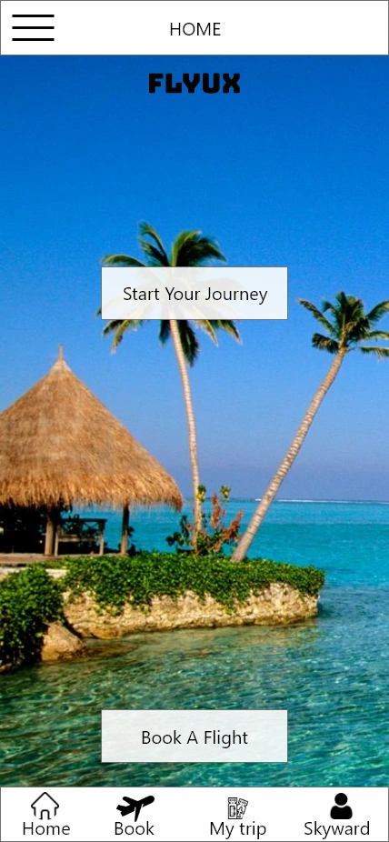
The project was part of the UX Design Institute and Glasgow Caledonian University certification. FlyUX is a startup airline, and looking for an intuitive, fast, and easy experience.
Problem & Solution 🤝
Problems - An airline was chosen as a case study, since the industry is packed with not so user-friendly designs. Users complaining about font sizes too small to read, not knowing that they should click on the inbound and outbound on the same calendar, and showing flights that are not available anymore.
Solution - Discovered user pain points, and solutions to their problem by making the user flow faster, and simplifying the user journey process.
Process 🛣
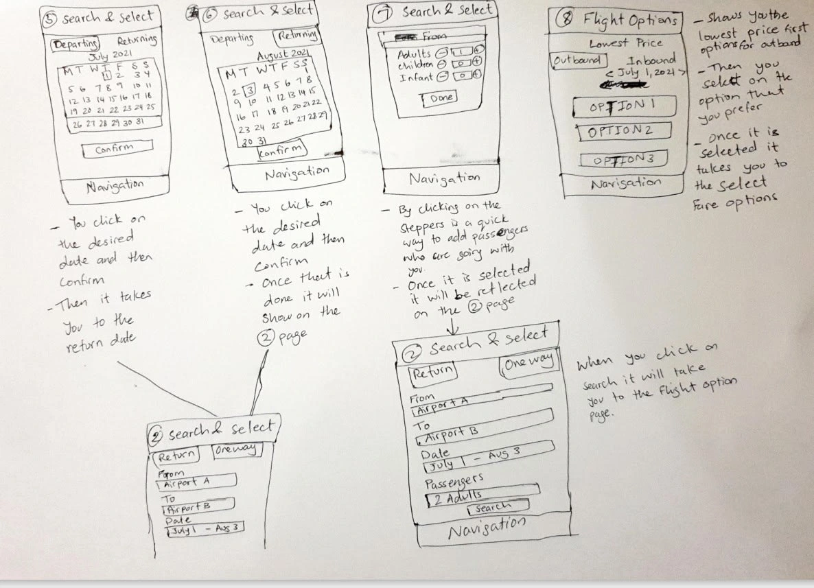
Started researching on airline companies and looking into their apps to pinpoint the user pain points and how to fix them by conducting surveys, usability tests, note taking, affinity diagram, customer journey map, flow diagram, wireframes, and prototypes.
Results 🎁
Great work on your prototype, you've built it to a nice level of fidelity here. The prototype contains enough detail and interactivity to test the high level flow, the screen layouts and basic interactions. Nice work.
Emily Jacquier
UX Design Institute
Takeaways 📣
I learned through compiling detailed research, and asking possible users about their struggle while using airline apps you would achieve the best solutions to your potential customers.
Like this project
Posted Apr 7, 2023
FlyUX is a startup airline, and looking for an intuitive, fast, and easy experience.
Likes
0
Views
40


