Case Study: Medical Departures / Dental Departures

Kenneth Madukwe
Visual Designer
UX Designer
Product Designer
Figma
Medical Departures
Dental Departures
Introduction:
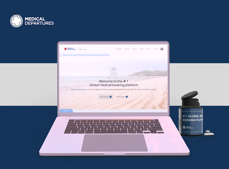
In December 2022, I applied for the product design position at Medical Departures. Following my application, Medical Departures contacted me via LinkedIn to invite me to an interview. As a part of my interview process, I created a redesign proposal for Medical Departures' website, which resulted in significant improvements in the user experience.
Challenge:
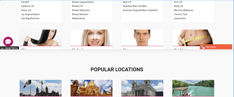
The Medical Departures website had a hero section that was overwhelming for the users, and the popular locations/treatments section caused choice overload, making it challenging for users to find what they were looking for. Additionally, the presentation of the features section needed improvement.
Provided services
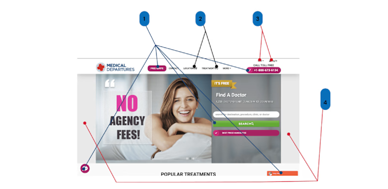
Hero Section Audit
Solution:
I conducted thorough research and analysis and created a redesign proposal that would make the website more user-friendly, visually appealing, and functional. I recommended reducing the number of CTA buttons, redesigning icons for consistency, and combining the popular locations/treatments section with the hero section. I also proposed using smaller icons and consistent design for the features section.
Results:
The redesign of the Medical Departures website could result in significant improvements in the user experience. The redesigned hero section immediately grabs the user's attention and guides their decision-making, resulting in increased user engagement. The popular locations/treatments section is now cleverly combined with the hero section, making it easier for users to find what they're looking for. The features section is now more visually appealing and user-friendly, making it easier for users to understand the product.
Conclusion:
Redesigning the Medical Departures portfolio website resulted in significant improvements in the user experience. The proposed redesign made the website more user-friendly, visually appealing, and functional. Implementing the recommendations resulted in increased user engagement and a more competitive brand image. I provided a comprehensive redesign proposal that enhanced the website's user experience and was met with success. My redesign proposal is a testament to my ability to conduct thorough research and analysis, provide solutions that meet the needs of the business, and successfully implement them to achieve positive outcomes.
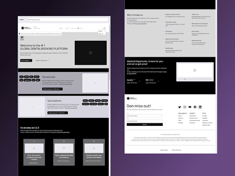
Low fidelity Wireframe

Redesigned Landing Page


