Built with Framer
Framer Landing Page Design and Build
Florence .
Comfort | Landing Page Design and Framer Build
The Brief
Comfort needed a simple digital platform that brings everyday online services into one clean space. The goal was to design a site that feels light, trustworthy, and easy to move through. No clutter, no confusion. Just a smooth way to access things like eSIM services, bill payments, and other essential tools.
They wanted a site that feels modern and effortless while still carrying a friendly brand personality. My task was to design the full experience on Figma and build the live version in Framer.
The Direction
The visual direction centered on clarity and ease of use. The layout was structured to guide users through each section with zero friction.
Here is how the core sections influenced the design
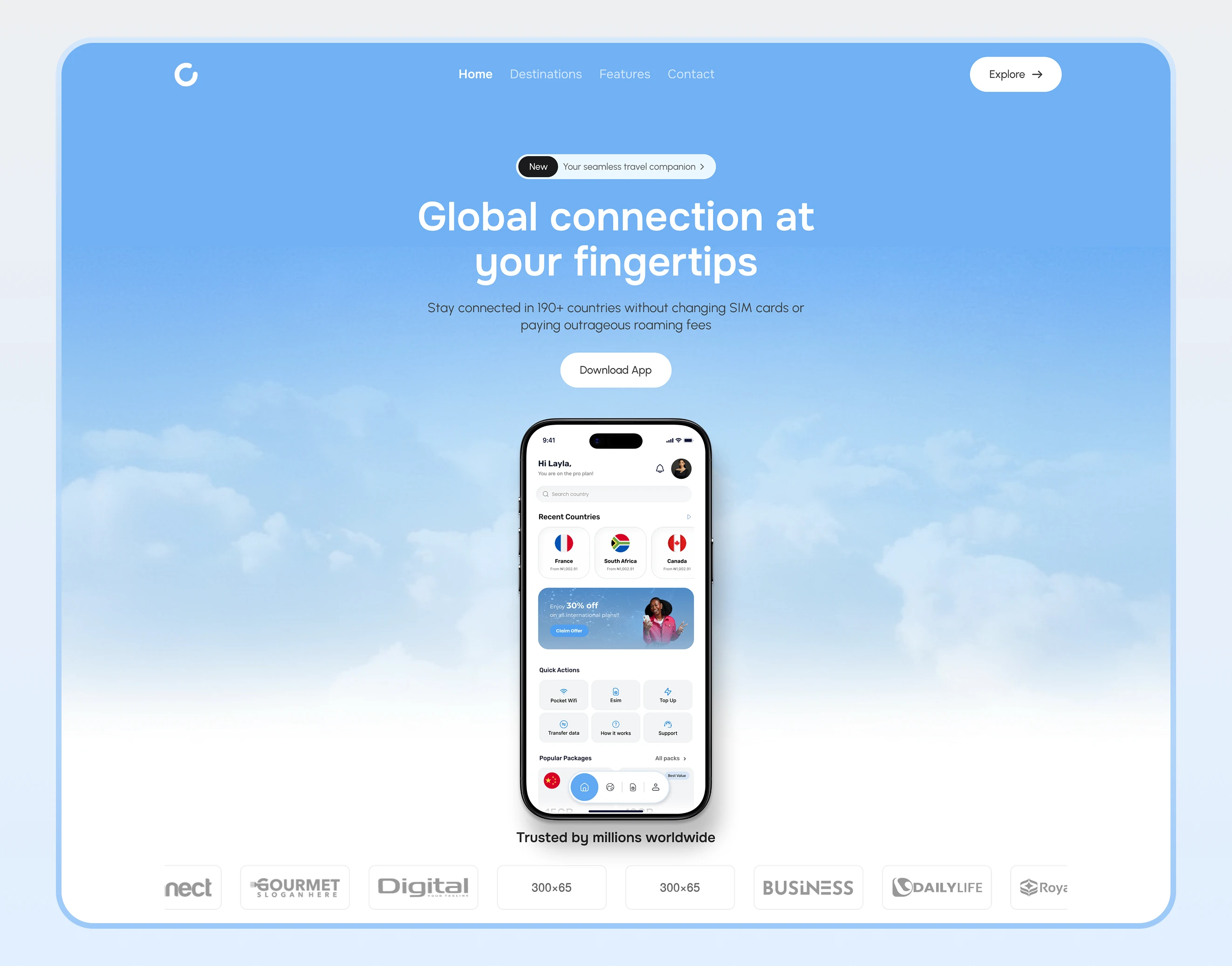
Destinations
This section needed to feel inviting. I designed it as a soft showcase that highlights the places Comfort supports. Each card has a warm visual style, clear labeling, and balanced spacing for quick scanning.
Choose a destination and gain access to an esim
How It Works
The How It Works section was designed to remove uncertainty and guide users through the Comfort experience in a simple, step by step flow.
Instead of long explanations, I broke the process into clear actions that users can understand at a glance.
• Choose a destination or service
• Select a plan or option that fits your needs
• Complete payment securely
• Get instant access and start using the service
Each step is supported by short copy, friendly icons, and generous spacing. The layout keeps users moving forward without overwhelming them, especially on mobile.
This section plays a key role in building confidence. Users know exactly what to expect before taking action, which helps reduce drop off and improves
Features
These were arranged to communicate usefulness at a glance. Icons, short descriptions, and clean grouping help users understand what the platform can do without reading long paragraphs.
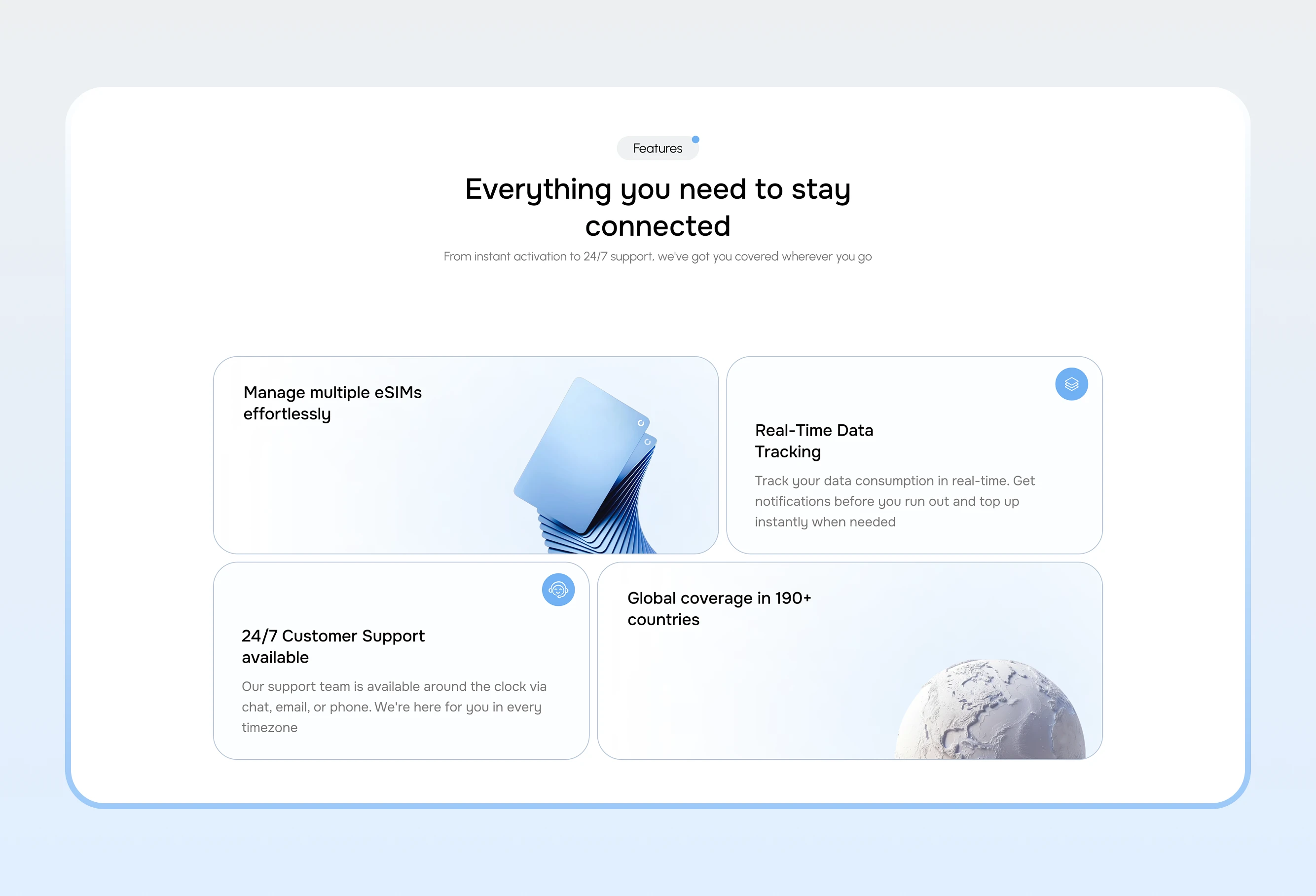
Features Section
Services
The services section was built to feel direct. Each service card is simple, purposeful, and arranged in a way that supports fast navigation.
Why use Comfort?
FAQ
Since users often need clarity before taking action, the FAQ was designed with readable spacing and a calm accordion style. It helps users get answers quickly and builds trust.
FAQ section
Across the whole site, I used structured grids, open white space, and clear typography to keep the experience smooth and breathable.
The Build
The site was built from scratch in Framer in 3 days. Every section was created as a modular block so the client can expand or update easily. The build includes:
• Responsive layouts across all screen sizes
• Soft scroll interactions
• Clean transitions
• A consistent spacing system
• A clear hierarchy for Destinations, Features, Services, and FAQ
Everything was tested for clarity, mobile comfort, and visual harmony.
The Impact
The final website gives Comfort a clear and modern digital presence. Users can:
• Explore destinations with ease
• Understand platform features instantly
• View services without confusion
• Get answers quickly through the FAQ
The experience feels simple, trustworthy, and intuitive. The page acts as a strong entry point for anyone interacting with the Comfort brand.
Summary
Comfort now has a complete landing page that feels purposeful, modern, and friendly. It reflects their mission to make digital services easy to access while keeping the user experience calm and straightforward.
Landing Page Design
Like this project
Posted Dec 13, 2025
Designed and built Comfort's modern landing page in Figma and Framer.