Banner Design Kittle Project

Anush N
Social Content Design
Graphic Designer
Adobe Illustrator
Kittl
Case Study: Twitter Profile Cover Image Banner for a Creator's Account
Project Overview
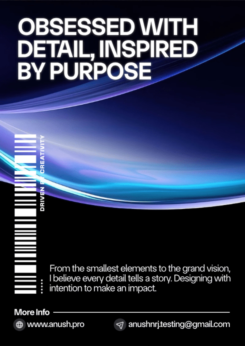
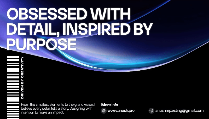
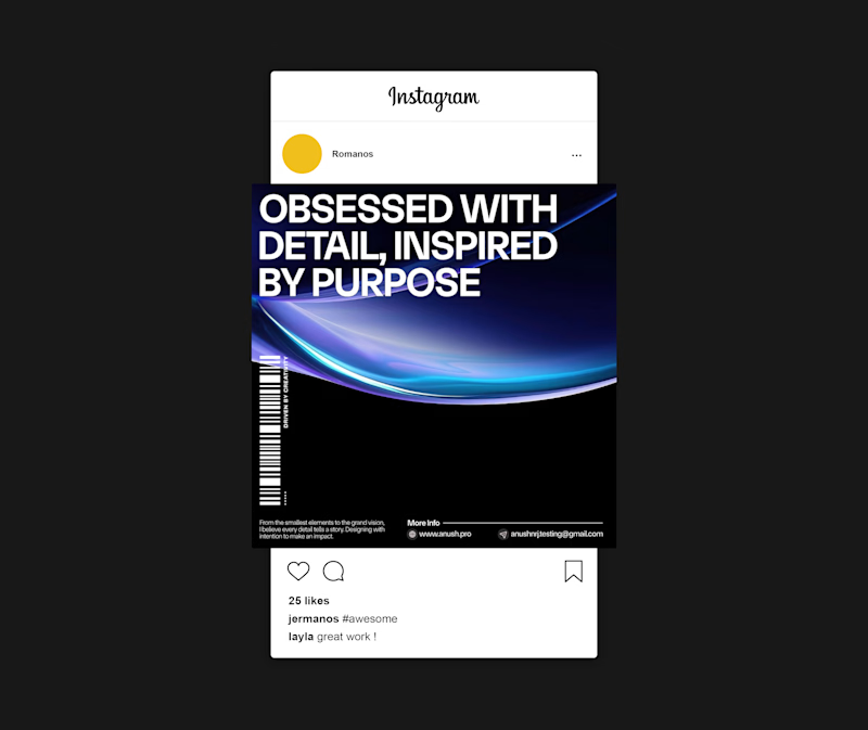
For this project, I designed a Twitter profile cover image banner for a creator's account using Kittle, focusing on creating a visually striking design using gradients, 3D elements, and bold typography. The goal was to create a modern and eye-catching banner that reflected the creator’s creative energy and brand without relying on imagery, instead emphasizing clean design, impactful text, and dynamic visuals.
Objective
To showcase my ability to craft creative, minimalist social media banners for creators, using advanced design elements like gradients, 3D shapes, and typography to create a cohesive and engaging profile presence on Twitter.
1. Project Goals
The key goals were:
- To design a sleek, modern Twitter banner that conveyed the creator's personality and brand through abstract design elements.
- To use gradients, 3D elements, and custom typography to build a cohesive visual identity for the creator’s Twitter profile.
- To highlight my expertise in using Kittle’s design tools to create polished, on-brand designs that stand out.
Portrait Size
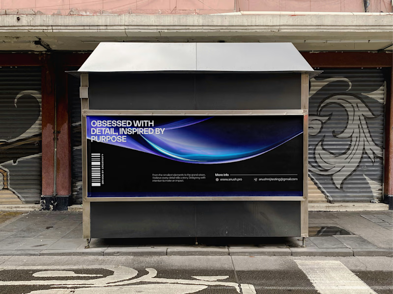
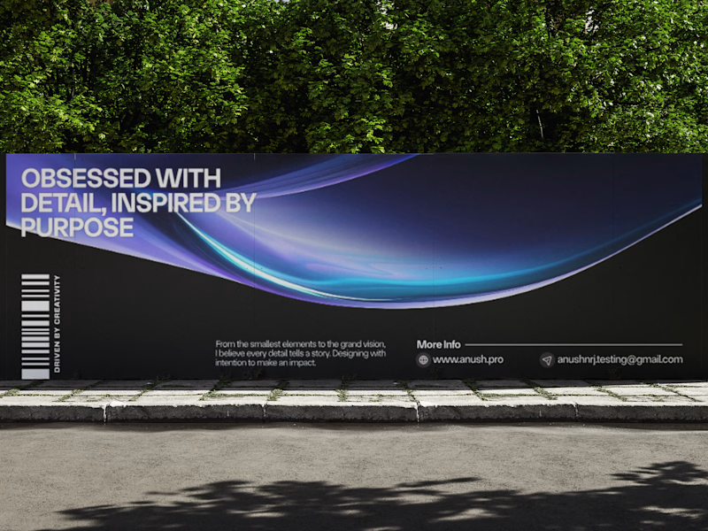
Social Media Banner

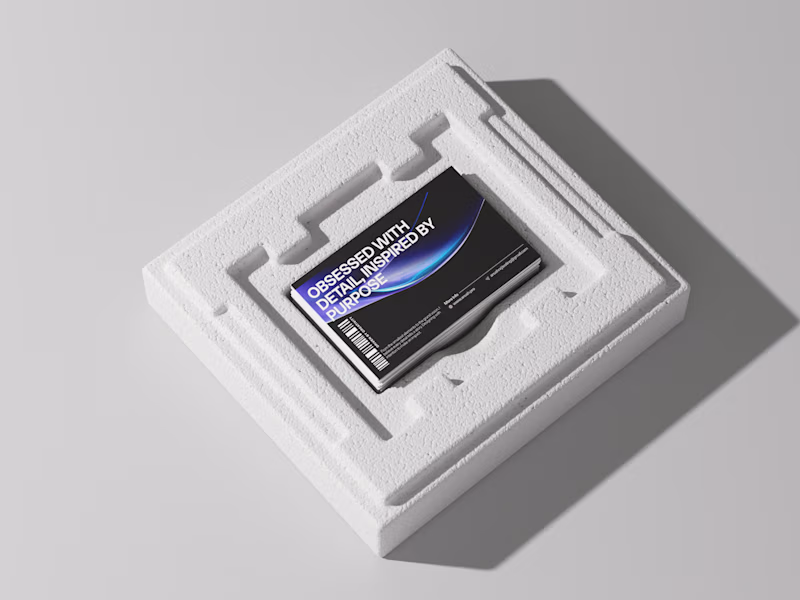
Business Card
2. Design Process
Step 1: Concept Development
I started by discussing the creator’s style, the type of content they produce, and the mood they wanted to convey. Based on these insights, I chose a clean, abstract approach, emphasizing modern design elements to reflect the creator’s dynamic and forward-thinking brand.
Step 2: Gradient and 3D Element Integration
I utilized Kittle’s gradient tools to create a smooth, visually engaging backdrop with vibrant colors that complemented the creator's personal style. 3D elements were incorporated to add depth and dimension to the design, giving the banner a sense of movement without using traditional imagery.
Step 3: Typography and Iconography
The typography was carefully selected to align with the creator’s tone and aesthetic—bold, modern, and clean. I also incorporated custom iconography that represented aspects of the creator’s work or interests. These elements were strategically placed to enhance the design’s flow and complement the gradients and 3D visuals.
Step 4: Layout and Optimization
The layout was structured to ensure the design worked perfectly with Twitter’s profile image placement. I ensured that the design was visually balanced while keeping key elements clear and uncluttered, making sure it displayed beautifully across both desktop and mobile views.
3. Challenges and Solutions
Challenge: Ensuring the design was striking and professional without using traditional imagery.
- Solution: I leveraged bold gradients, 3D shapes, and thoughtful typography to create a visually rich and compelling design that still felt personal and aligned with the creator's brand.
4. Final Outcome
The final banner design featured:
- Gradient Background: Smooth gradient transitions that set an energetic, contemporary tone for the creator’s profile.
- 3D Elements: Subtle 3D shapes and shadows that added depth, creating a dynamic and visually engaging look.
- Custom Typography & Iconography: Bold, creative text and icons that conveyed the creator’s unique style and added a personal touch to the design.
The banner perfectly captured the creator’s aesthetic and brand identity while providing a striking, professional presence on their Twitter profile.
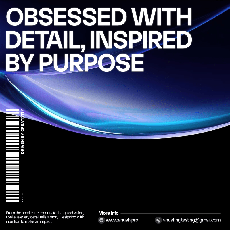
Square Post
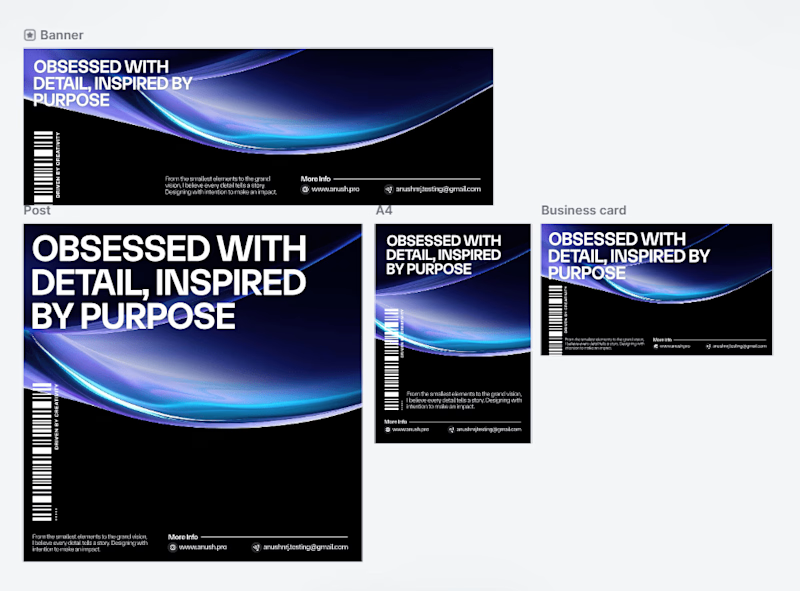
All Design
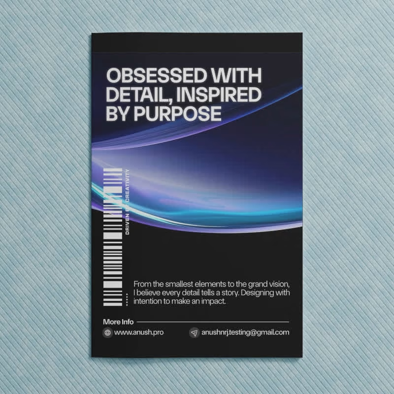
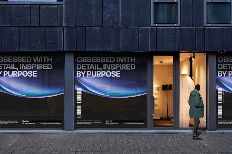
Mockups
5. Key Takeaways
- This project honed my ability to use gradients, 3D elements, and typography to create a cohesive social media design that stands out.
- It reinforced the importance of balancing creativity with platform requirements to ensure a polished and professional final design.
- The project showcased my ability to design minimalist yet impactful social media banners that reflect a creator’s unique brand and personality.


