Built with Framer
Apollo 11 Interactive: Relive Humanity’s First Steps on the Moon
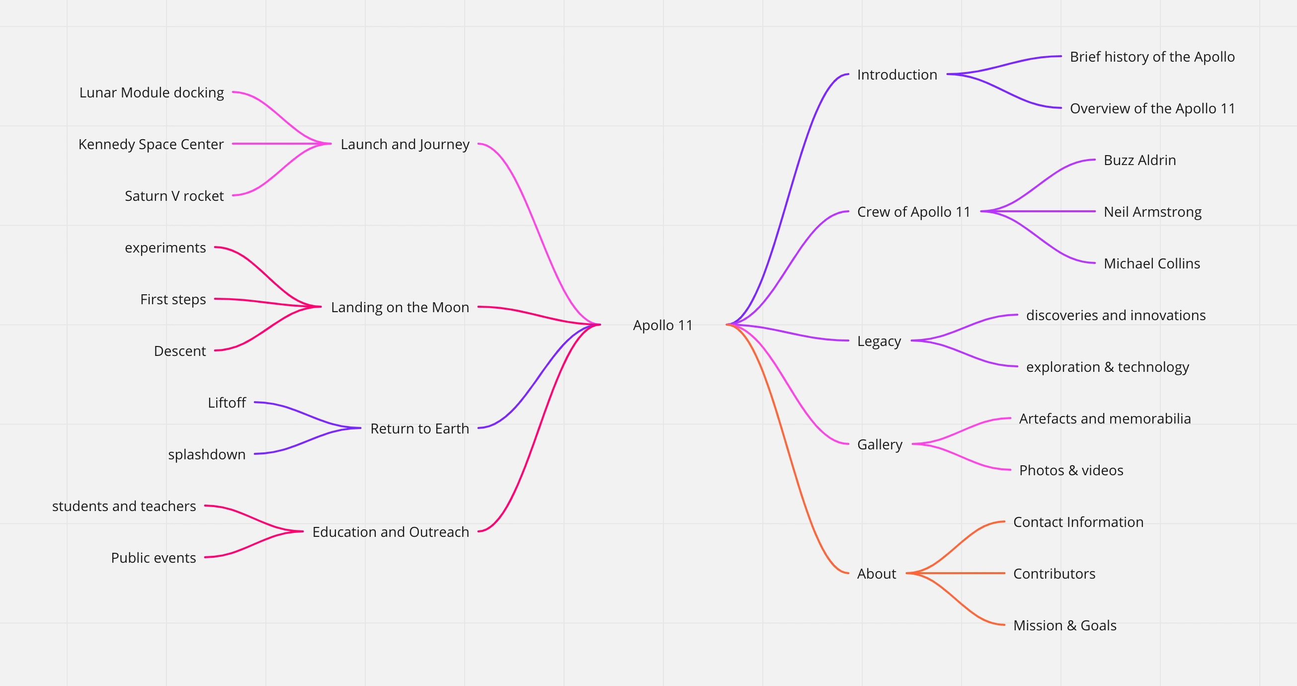
I created a mind map as it is a great tool to organize and visualize ideas. I used it for brainstorming ideas and project planning. The different branches of the map can represent different categories or topics, and the sub-branches can be used to break down those categories even further. Overall, mind maps are a versatile tool that can be used for a wide range of applications. They provide a visual and creative approach to problem-solving, planning, and organizing, making them an essential tool for anyone looking to improve their productivity and creativity.
Apollo 11
United States Spaceflight
Apollo 11, U.S. spaceflight during which commander Neil Armstrong and lunar module pilot Edwin (“Buzz”) Aldrin, Jr., on July 20, 1969, became the first people to land on the Moon and walk the lunar surface. Apollo 11 was the culmination of the Apollo program and a massive national commitment by the United States to beat the Soviet Union in putting people on the Moon.
Take off
From the time of its launch on July 16, 1969, until the return splashdown on July 24, almost every major aspect of the flight of Apollo 11 was witnessed via television by hundreds of millions of people in nearly every part of the globe. The pulse of humanity rose with the giant, 111-metre- (363-foot-) high, 3,038,500-kg (6,698,700-pound) Saturn V launch vehicle as it made its flawless flight from Pad 39A at Cape Kennedy (now Cape Canaveral), Florida, before hundreds of thousands of spectators. So accurate was the translunar insertion that three of the en route trajectory corrections planned were not necessary. Aboard Apollo 11 were Armstrong, Aldrin, and command module pilot Michael Collins. Their enthusiasm was evident from the beginning, as Armstrong exclaimed, “This Saturn gave us a magnificent ride.…It was beautiful!”
This Saturn gave us a magnificent ride.…It was beautiful!
The third stage of the Saturn then fired to start the crew on their 376,400-km (234,000-mile) journey to the Moon. The three astronauts conducted their transposition and docking maneuvers, first turning the command module, Columbia, and its attached service module around and then extracting the lunar module from its resting place above the Saturn’s third stage. On their arrival the astronauts slowed the spacecraft so that it would go into lunar orbit. Apollo 11 entered first an elliptical orbit 114 by 313 km (71 by 194 miles) and then a nearly circular orbit between 100 and 122 km (62 and 76 miles) above the surface of the Moon.
Descent
On the morning of July 20, Armstrong and Aldrin crawled from the command module through an interconnecting tunnel into the lunar module, Eagle. Toward the end of the 12th lunar orbit, the Apollo 11 spacecraft became two separate spacecraft: Columbia, piloted by Collins, and Eagle, occupied by Armstrong and Aldrin.
By firing Eagle’s propulsion system, the two astronauts changed from their nearly circular orbit to an elliptical course whose closest approach to the Moon was only 15,000 metres (50,000 feet). At this low point they again fired their engine, this time to undergo the powered descent initiation manoeuvre. Five times during the descent, the guidance computer triggered an alarm (called “1202” or “1201”) that its memory was full, but NASA simulations before the mission showed that a landing could still happen despite the alarm, and thus Mission Control told the astronauts to continue the descent. At about 150 metres (500 feet) above the surface, Armstrong began manoeuvring the craft manually (although the main engine continued under automatic control) to avoid landing in a rock-strewn crater.
Touchdown
For about a minute and a half, Armstrong hovered Eagle, moving it laterally with the reaction control system until he found a clear area on which to descend. Then the contact light went on inside the cockpit, as the 172-cm (68-inch) probes dangling below Eagle’s footpads signaled contact with the ground. One second later the descent rocket engine was cut off, as the astronauts gazed down onto a sheet of lunar soil blown radially in all directions. Armstrong then radioed at 4:17 PM U.S. Eastern Daylight Time (EDT), “Houston, Tranquility Base here. The Eagle has landed.” Eagle had touched down in the Sea of Tranquility, an area selected for its level and smooth terrain.
Houston, Tranquility Base here. The Eagle has landed.
Thats one small step
At 10:56 PM EDT on July 20, Armstrong stepped out onto the lunar soil with the words, “That’s one small step for [a] man, one giant leap for mankind.” (In the excitement of the moment, Armstrong skipped the “a” in the statement that he had prepared.) He immediately described the surface as “fine and powdery” and said that there was no difficulty moving about. Aldrin joined his companion about 20 minutes later.
That’s one small step for man, one giant leap for mankind.
During their moonwalk of more than two hours, Armstrong and Aldrin set up a device to measure the composition of the solar wind reaching the Moon, a device to receive laser beams from astronomical observatories on Earth to determine the exact distance of the two bodies from one another, and a passive seismometer to measure moonquakes and meteor impacts long after the astronauts had returned home. They also took about 23 kg (50 pounds) of rock and soil samples, took many photographs, and maintained constant communication with mission control in Houston, Texas. After 21 hours 38 minutes on the Moon’s surface, the astronauts used Eagle’s ascent stage to launch it back into lunar orbit. After various maneuvers, Eagle once again docked with Collins in Columbia, and the trip back to Earth began soon afterward.
Splashdown
Splashdown of Apollo 11 occurred in the Pacific Ocean about 1,400 km (900 miles) west of Hawaii on July 24. The astronauts were immediately placed in quarantine in a van on the recovery ship. From there they were flown to the Manned Spacecraft Center in Houston, where they were transferred into the large, 58-room Lunar Receiving Laboratory. The quarantine lasted 21 days from the time Eagle took off from the Moon; during that period the astronauts were checked for any diseases they might have picked up on the Moon, and the lunar samples were subjected to preliminary analysis.
Mood Board
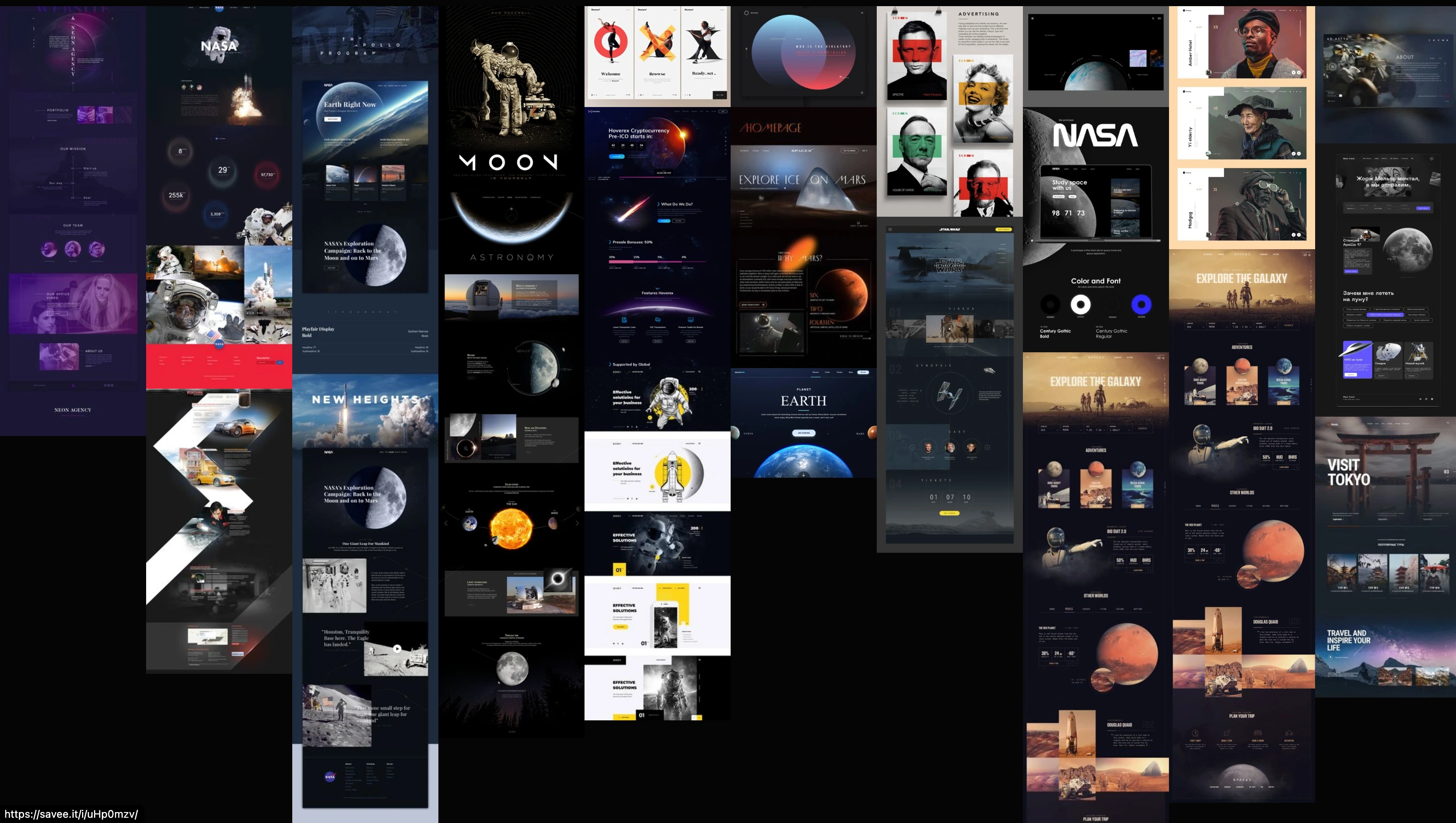
I gathered a mood board from different websites such has Pinterest, dribbble, behance and muzli blog Just to get inspiration for the website. I then separate my mood board in terms of the colour I will be considering for the website./
FONTS

I created a mood board of different fronts I could possibly use for the Apollo 11 website project included a variety of fonts that I think capture the spirit of the time period while still maintaining a modern feel. Some of my top choices include Futura, Helvetica, and Times New Roman. Ultimately, the font choice will depend on the overall design direction and aesthetic of the website.
Micro and Macro Interaction
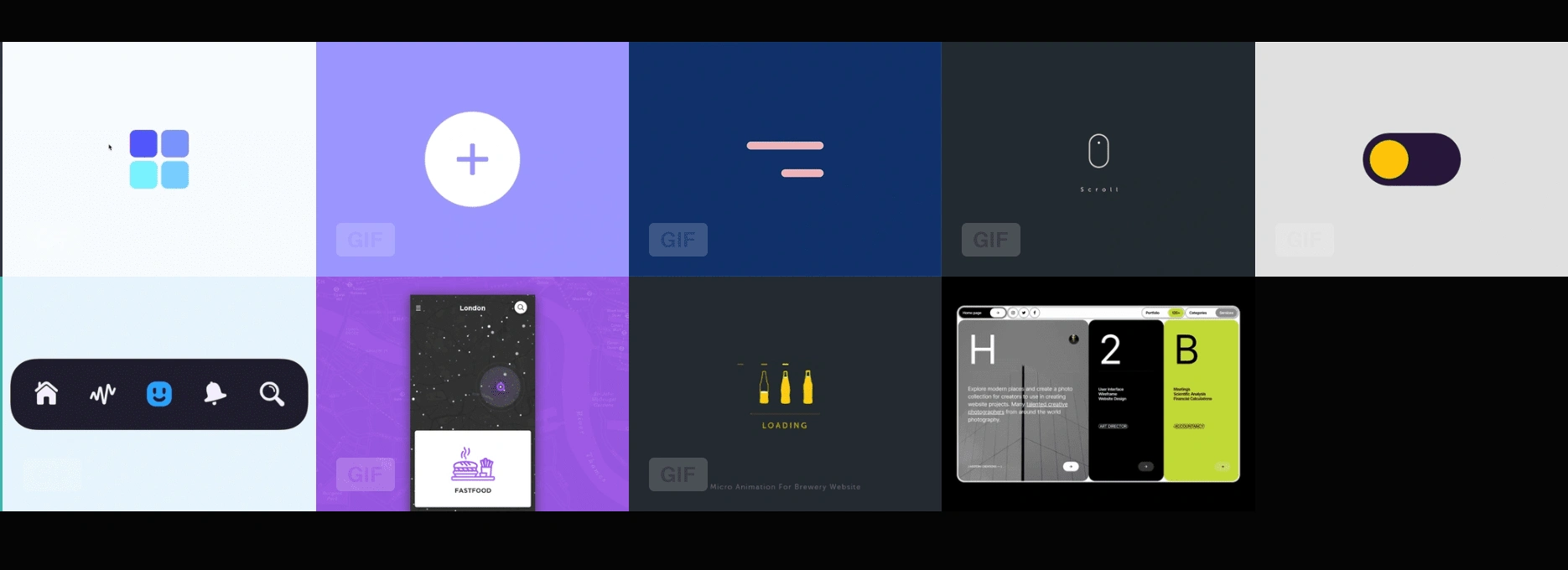
The board features various examples of macro animation and mirco intercations I gathered for my apollo 11 website project, I was looking forward to learn new interactions because of this project and not only use them for the Apollo 11 project but should come in handy when I need to use them for future projects which is characterized by its use of large and bold shapes and colors to create dynamic and visually striking movement. The examples on this board range from simple and minimalistic to complex and intricate, showcasing the versatility and creativity of macro animation as a design tool.
Colour Palette

I created a mood board based on my selected colours which should give me Ideas on what I plan the site to look like
Exploring Fonts
I created a mood board of different fronts I could possibly use for the Apollo 11 website project included a variety of fonts that I think capture the spirit of the time period while still maintaining a modern feel. Some of my top choices include Futura, Helvetica, and Times New Roman. Ultimately, the font choice will depend on the overall design direction and aesthetic of the website.
I ended up not using any of the ones above after trying them and comparing them. For my inspiration, I watched some space movies 🍿 to see if i could get Ideas from there
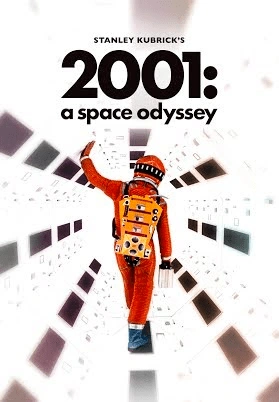
The movie explores themes of technology, human evolution, artificial intelligence, and existentialism, and is known for its visual effects, classical music soundtrack, and enigmatic storytelling.
I ended up using the font used in the Star Wars movie has my heading text for each section of my website RESTORE. This font was chosen because it captures the futuristic and adventurous spirit of space exploration while still maintaining a classic and timeless feel. The font choice contributes to the website's overall aesthetic and helps create a cohesive design. Restore" is a typeface designed by Czech graphic designer Tomáš Brousil. The font was created to preserve and revive the aesthetics of vintage printing techniques from the early 20th century. The typeface features a unique blend of sharp angles and curves, with an elegant and timeless retro feel. "Restore" is versatile enough to be used for a variety of design projects, including branding, packaging, editorial design, and signage. Its popularity has grown rapidly among designers and typographers who appreciate its vintage charm and versatility.

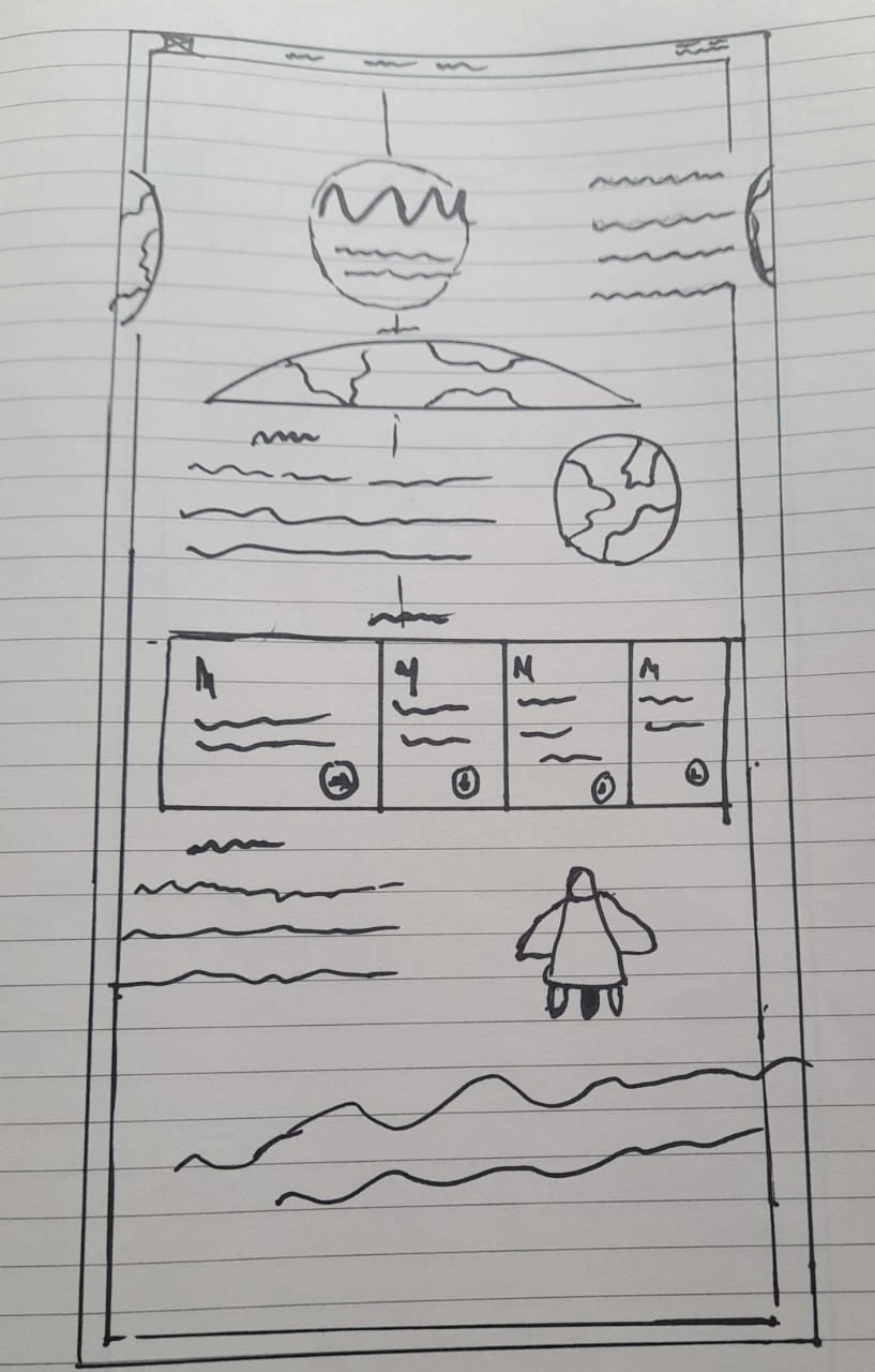
I Sketched some wireframes so as to explore and iterate on ideas in the early stages of my design process. Sketching helped me to generate and communicate my ideas, visualize user flows and interactions, and create rough drafts of the potential interfaces of the website. It also allowed me to experiment with different layouts and design elements, without investing too much time or resources.
Paper prototyping is another valuable tool for early-stage design exploration. It involves creating low-fidelity prototypes using paper, cardboard, or other inexpensive materials to test and refine design concepts. This technique is useful for identifying usability issues, user needs, and design flaws in a low-risk and cost-effective way.
I got from my mood board and looking for ways to arrange the content for the websites and also trying to figure out where to place different elements and components I plan on using. I thought of creating a component that shows different temperatures of different planets changing in intervals it could be 10 seconds. Also navigation by the side to get to different sections of the content, a bio section that shows the pictures of Buzz Aldrin, Neil Armstrong, and Michael Collins with a hovering effect that shows little information about them.
After the previous sketch, I did a better sketch I decided to work on a clearer sketch to give me a clear picture of my imagination, and my previous sketch and explore other ways to set the content.
I considered other forms my design might take by sketching each section differently while I thought about the interaction I would be considering as well
For the spaceflight section, a hovering effect on all pilots to reveal their bio details on the spaceflight section
For the take a space rocket moves across the screen from the bottom of the takeoff section to the top and then disappears before revealing the content of the section.
For the touchdown down the Apollo 11 Lunar Module (LM) "Eagle” keeps trying to land on the moon while the content slides in from the left.
In the one small step section I plan on showing images of a camera, a conical flask, and a rock then the content slides in from the left
Like this project
Posted Aug 16, 2023
Explore the iconic Apollo 11 mission through an immersive, interactive experience that recreates humanity’s first steps on the Moon. Built-in Framer, this digit

