Soda Can Packaging Design – Fruit Series Concept
Alden Chia
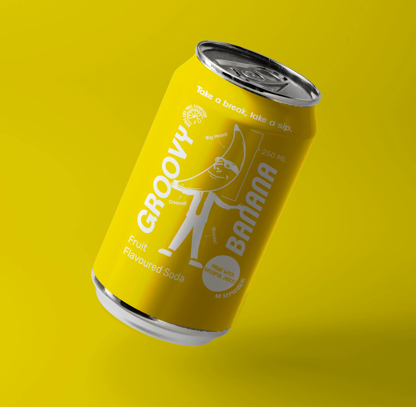
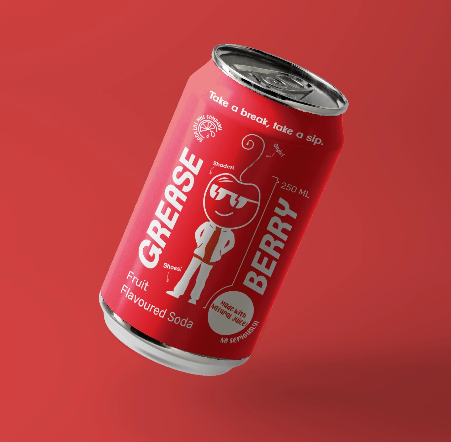
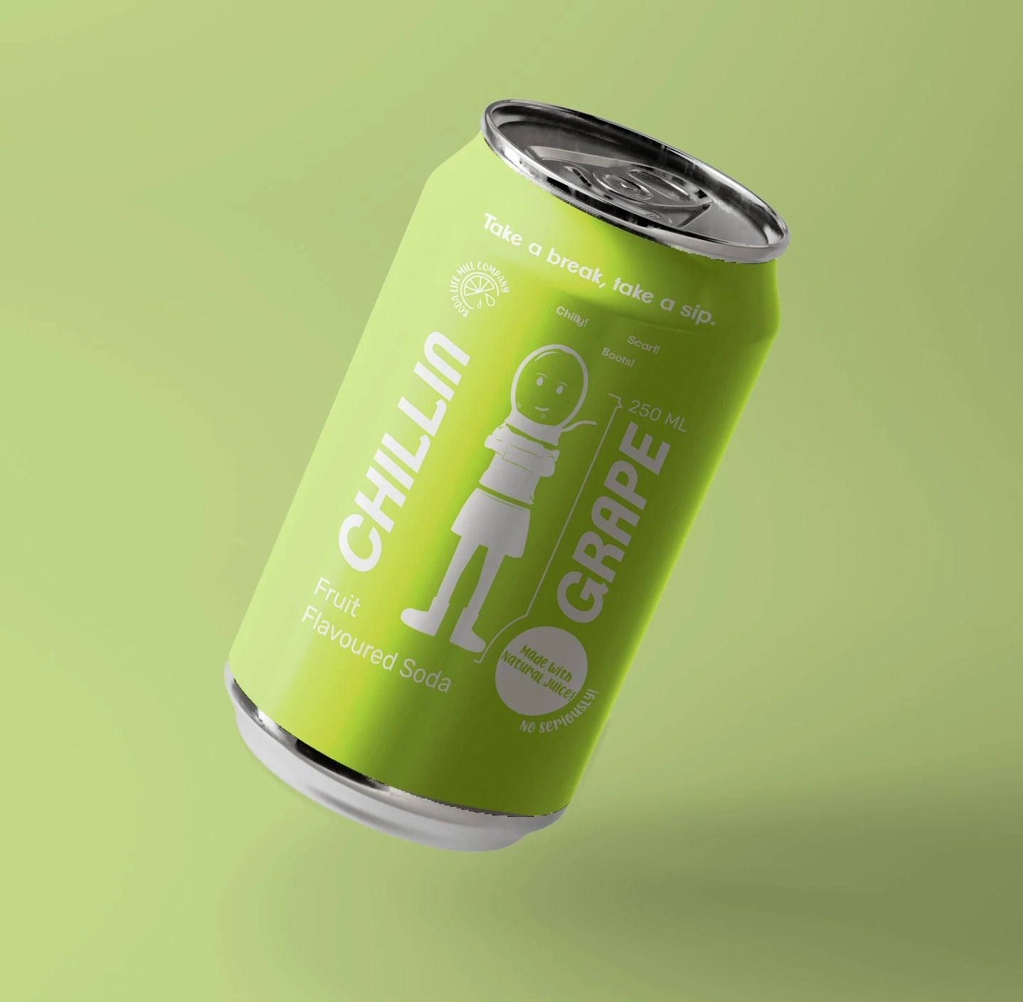
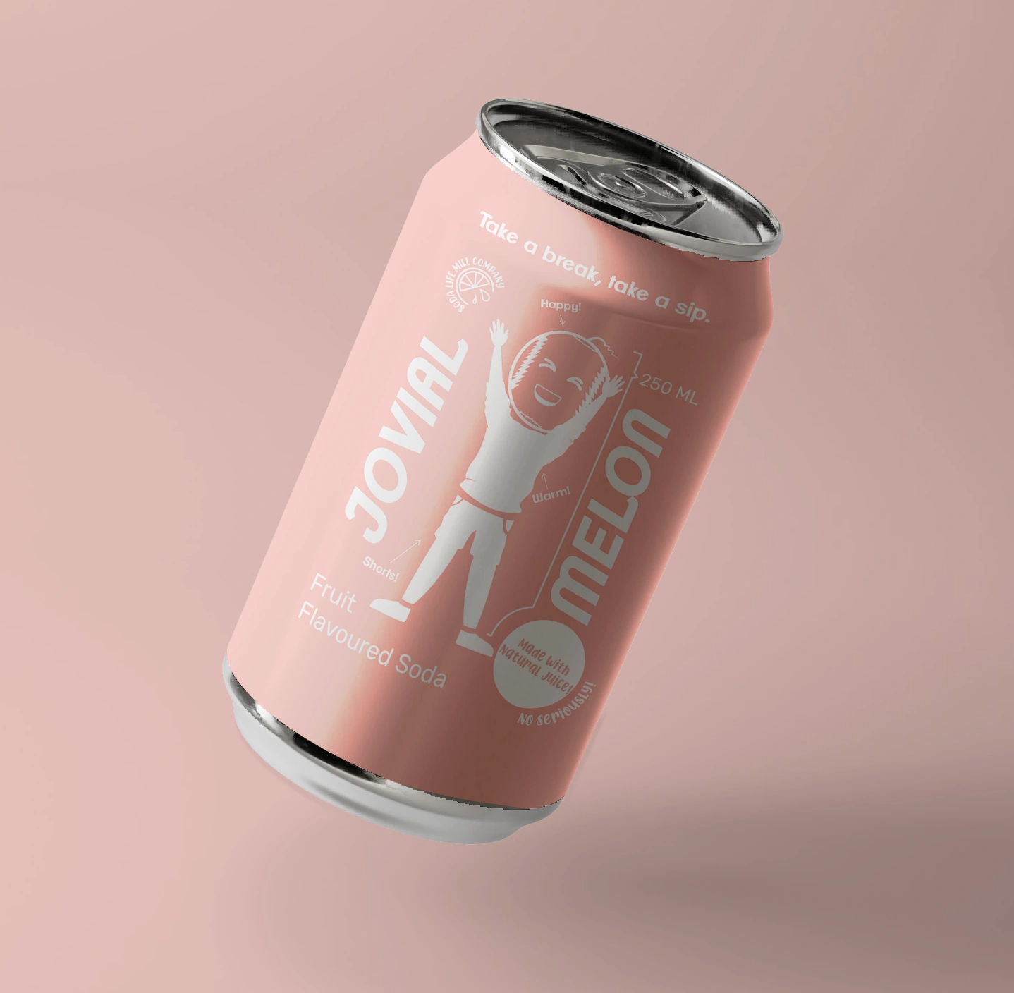
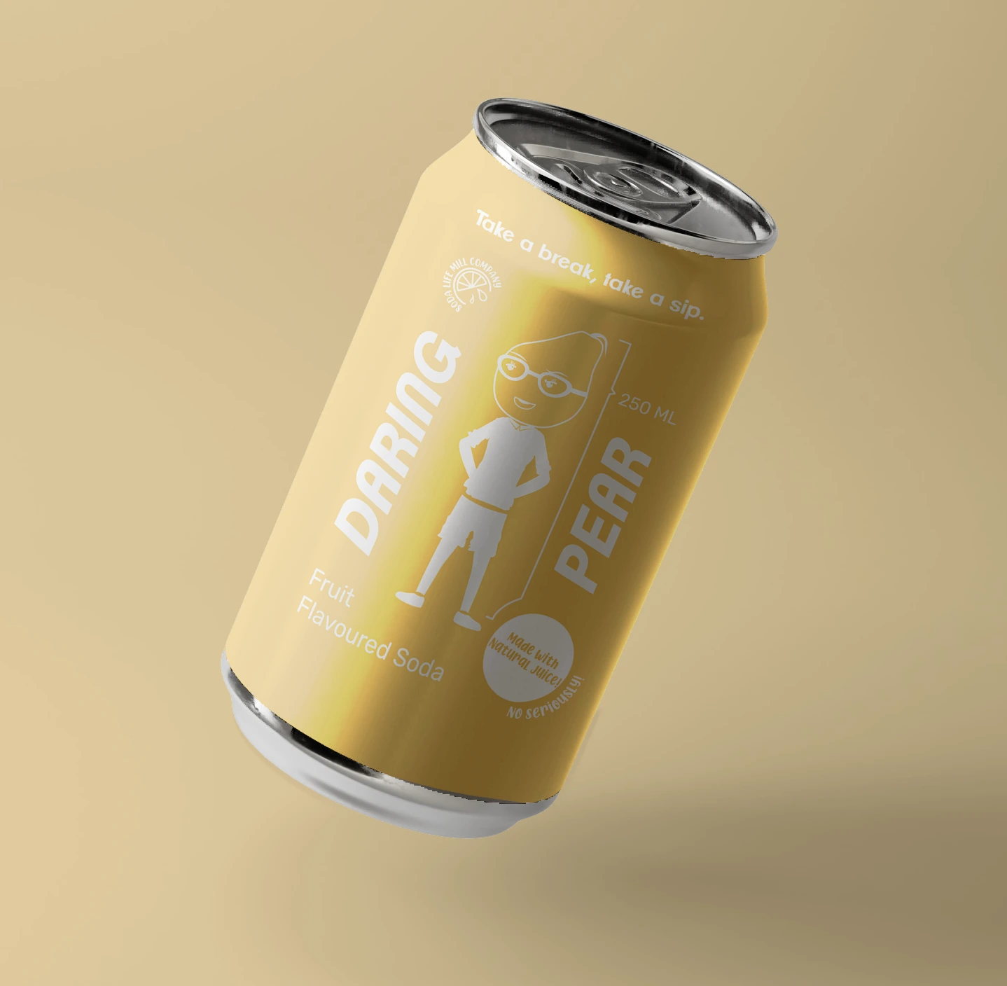
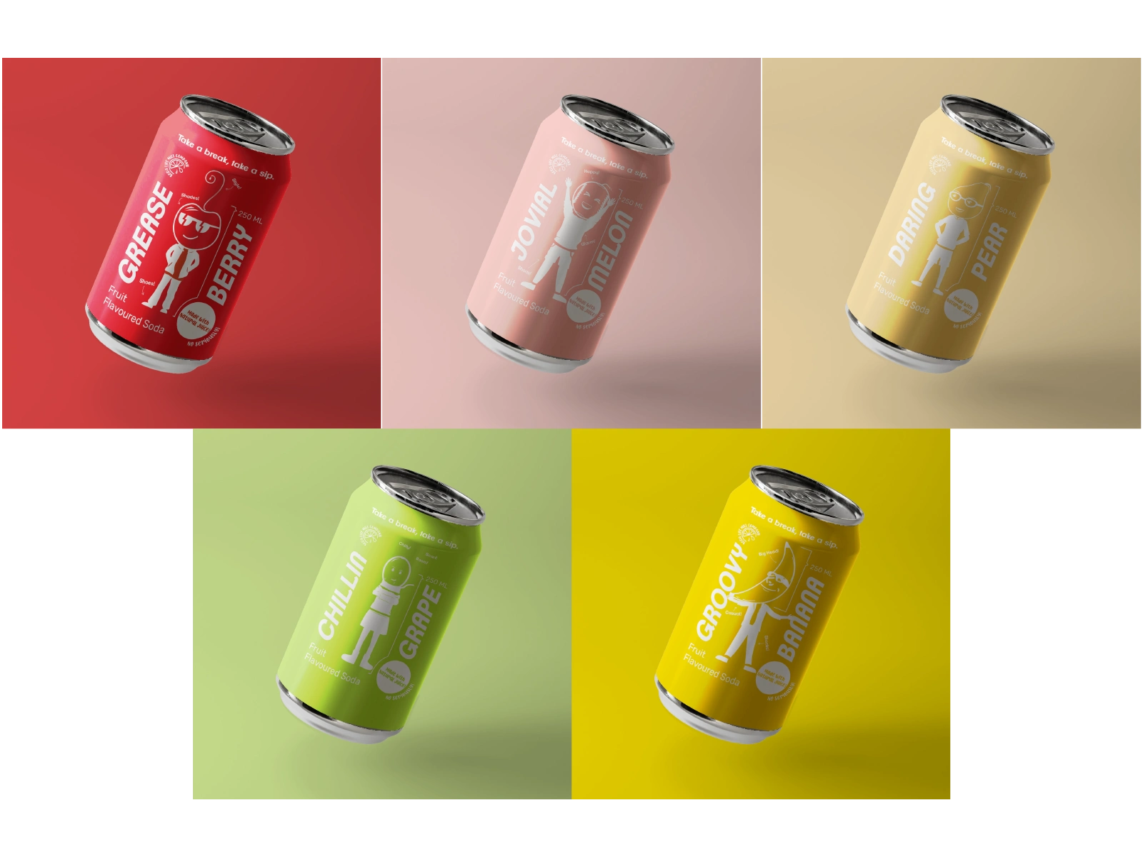
A soda can concept series combining illustrated fruit mascots and bold type. Each character reflects the personality of the flavor, from playful to bold.
Overview
Conceptual packaging design for a consumer product brand, with focus on shelf appeal and clarity.
Tools
Adobe Illustrator & Photoshop
I gave each character a playful personality that reflects its corresponding fruit, using more dynamic poses for the bolder, "crazier" flavors. White was chosen as the neutral base to ensure the characters stand out clearly against any can background color.
Thank you for your time!
Like this project
Posted Jul 1, 2025
Character-driven soda can designs with bold colors and mascots, blending playful illustration with retail ready layout.
Likes
0
Views
3
Timeline
Jun 1, 2023 - Jun 4, 2023