Moosyc App Video Teaser
Harun Aji
Initial Concept Overview
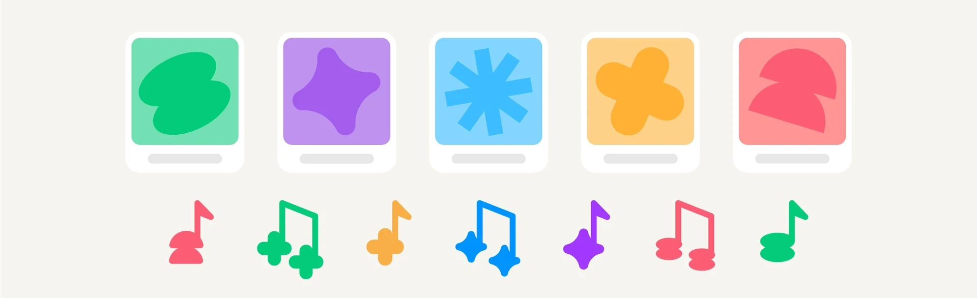
The video teaser for the Moosyc app represents an early concept before the client decided to change their logo and color tone. Personally, I really like this initial visual identity, so I wanted to share it here. At this stage, the visual direction was intended to be more relevant to users with an artistic background while still avoiding a futuristic feel. That’s why I played a lot with vibrant colors and explored shapes that give the visuals a more expressive character.
Main Elements
These shapes were designed to represent the app’s focus on music distribution while also reflecting the target audience it aims to reach.
Animations
The animation approach was designed to illustrate the fast distribution process through eye-catching abstract visuals. Each feature is presented dynamically and straight to the point, allowing users to understand its function without unnecessary distractions.
Credit
Creative direction - Harun Sangaji
Illustrator & Motion Designer - Harun Sangaji
Sound Design - Harun Sangaji
Music - Music Balloon Planet "Let’s Win This"
Like this project
Posted Nov 10, 2025
Creating a playful, clean, and modern teaser for Moosyc to showcase key features in a fresh, engaging way that stays relevant to its target audience.