Redesigning the world’s First Online Chess Trivia platform

Hamza Abdul
Web Designer
Product Designer
UI Designer
KeenChess is an online chess p2e (play to earn) platform. It fosters learning and earning along the way, making the efforts and experience worthwhile.
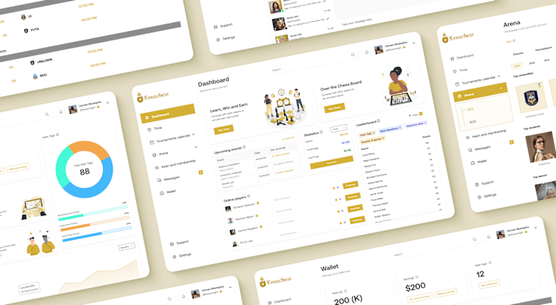
I joined the keenchess team at the beginning of their rebrand as the lead designer. I worked along the founders and developers to come up with the new direction to follow in terms of visuals, strategy and implementation. I was tasked with creating a new style guide, component and managing the entire redesign process.
I adopted a user-centered design approach by conducting research to see the complaints and feedback from current customers of the platform. With the gathered insights, I redesigned keenchess, prioritising meeting the needs of users to ensure all the issues they encountered were well catered for.
Overview
KeenChess is an online chess p2e (play to earn) platform. It fosters learning the chess game by giving real rewards as users answer chess questions correctly. At its core, Keenchess is a nexus for chess aficionados to challenge their understanding of the game, compete in various trivia formats, and earn cash rewards.
Players can engage in four distinct trivia modes—each offering a different level of competition and community interaction. Despite chess being a timeless game of strategy and intellect, there exists a gap between casual players and professional, competitive engagement.
However, the current website and web App has poor and rudimentary design, with bad colour combination as well as an unfriendly layout and login/register section which all culminates into bad user experience which clearly reflects on the business profits.
Concept & approach
Traditional chess platforms focus on gameplay, leaving limited space for those looking to deepen their knowledge or engage with the community beyond the board. The idea is to give the platform a new look, make it more appealing and usable to enable users have an enjoyable experience whenever they use keenchess.
We placed our focus on the branding and interface design, by focusing on the basics, color, Hierarchy and layout structure. But before we did anything, we did some research, to see what current users are saying and using the results to guide future decisions.
Putting things into perspective
Since the outbreak of COVID-19 pandemic, chess has seen massive growth, with more players than ever coming together to participate in chess events that are being increasingly held through online platforms.
Because of that there have been an influx of chess games over the years (46% increase). However, this statistics is mainly for over the board chess. One of the goals of rebranding Keenchess is to help make trivia chess become the next big thing in the chess market.
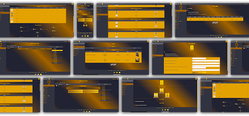
Shots from previous design
Feeding off analytics
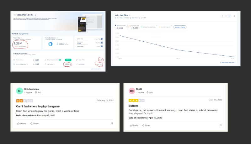
We conducted product analytics on the current website to determine how our customers were interacting with the product to give us informed decisions on how to improve the design, this included bounce rate, pages viewed per visit, time spent, and engagement over time. We also used trust to fish out more data, we found out some intriguing stuff.
Data showed that visitors on the platform had been reducing steadily over time, also feedback from trust pilot clearly indicated concerns from existing customers. This was a major concern for the stakeholders of the platform and thus the need for this redesign.
Refreshing identity
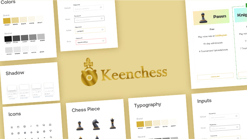
We made improvement in the colour scheme, font style, illustration and Iconograohy to be more user friendly and meet the needs of the brand voice and identity
Our approach to the rebrand was to create something familiar with the current users, visual appealing and still resonates the brand values and identity.

The design
Whitespace, colour, hierarchy and content structure were our main focus for the redesign. We made sure to highlight important details and positioned where our target users expect them to be in order to improve the conversion rate.
We kept in mind the needs of users and what we wanted them to interact with the most and nudged them towards using them which not only helped users play the game but also generate revenue for us.
The logo is a bold amalgamation of a chess piece and a coin, symbolizing the blend of strategic gameplay and economic reward.
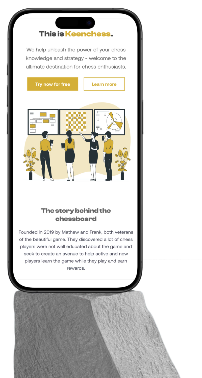
The landing page opens with a bold statement that encapsulates the platform's mission, to revolutionize how chess is learned and enjoyed.
Based on research, over 70% of users on most platforms engage them through their mobile devices, hence we made the website and web app mobile responsive.
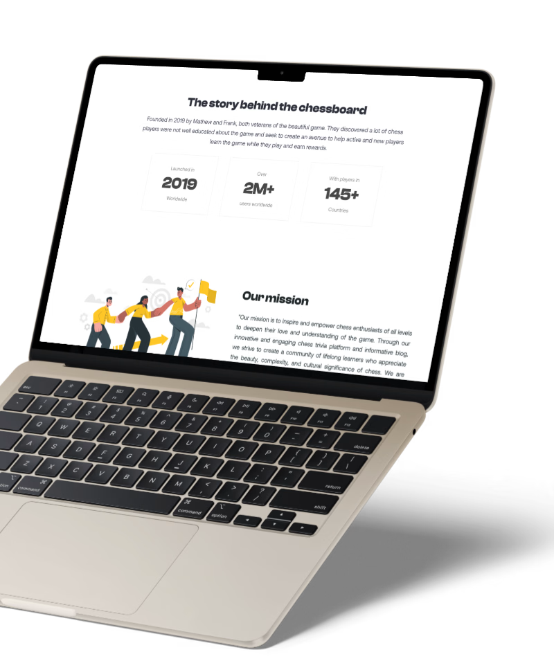
Every scroll reveals a new chapter in the Keenchess story. The use of vibrant illustrations and dynamic layouts brings the excitement of chess trivia to life, while the subtle animations and responsive elements enhance the sense of interactivity and discovery.
The website was created with focus on capturing new users into the platform by showcasing the perks of using the platform while putting the call to actions at visible places to enable them sign up.

Re-imagining the Dashboard
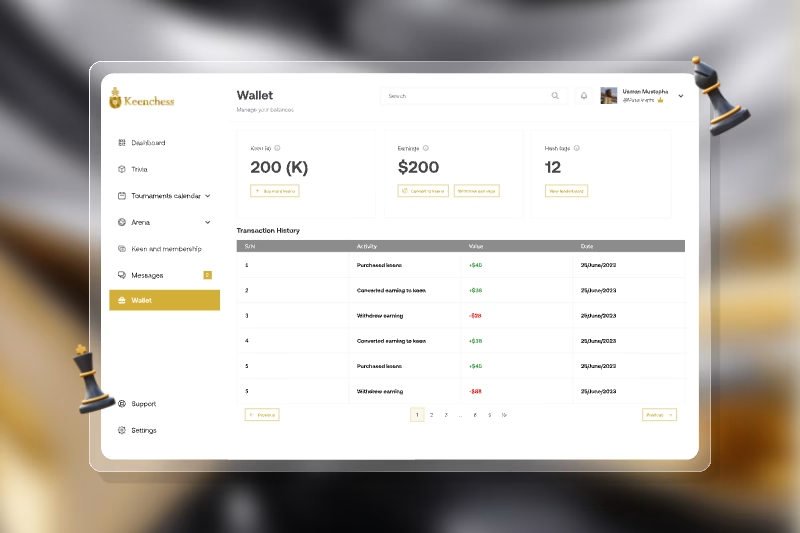
The web app is a testament to the seamless integration of knowledge and play. It's not merely an app; it's an ecosystem where users can deepen their chess knowledge through trivia while participating in a dynamic, game-like environment.
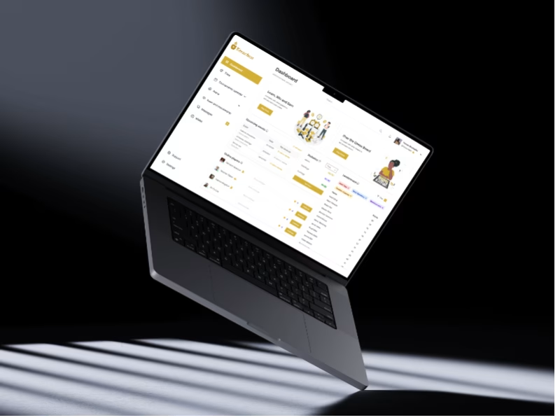
The dashboard layout is intuitive, with a clean, grid-based structure that organizes information hierarchically, prioritizing real-time activities, and user progress.
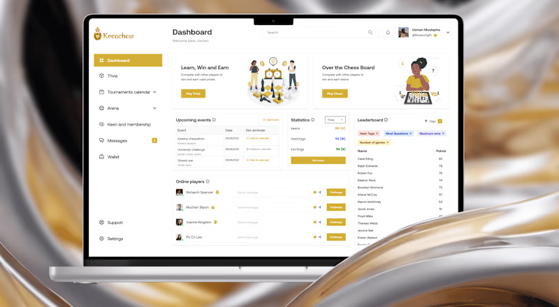
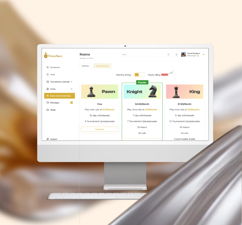
The side nav is the user’s compass, elegantly designed to guide them through the many layers of the platform.
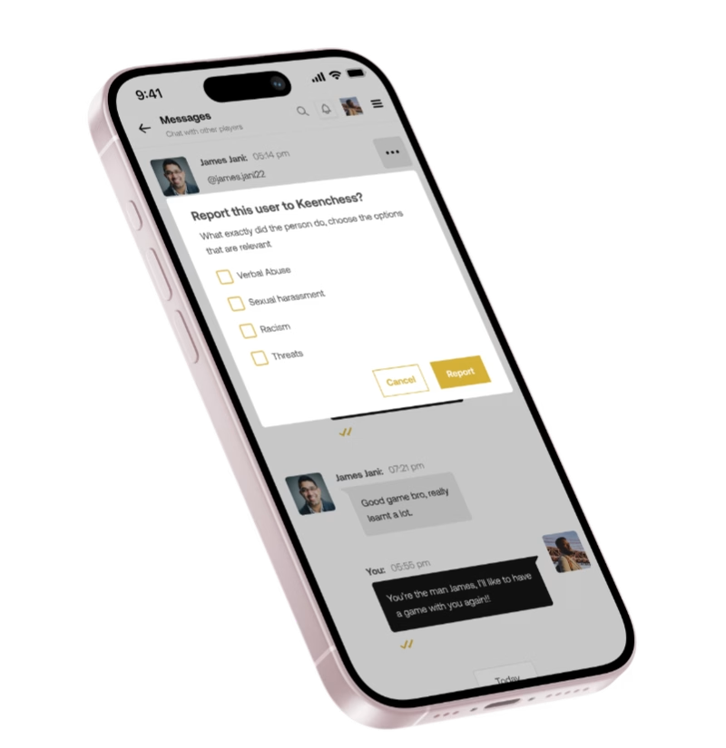
The web app's responsive design guarantees a consistent and quality experience across all devices, enabling users to engage whenever and wherever they choose.
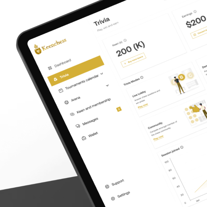
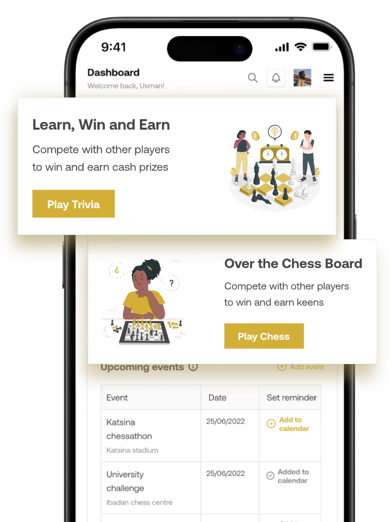
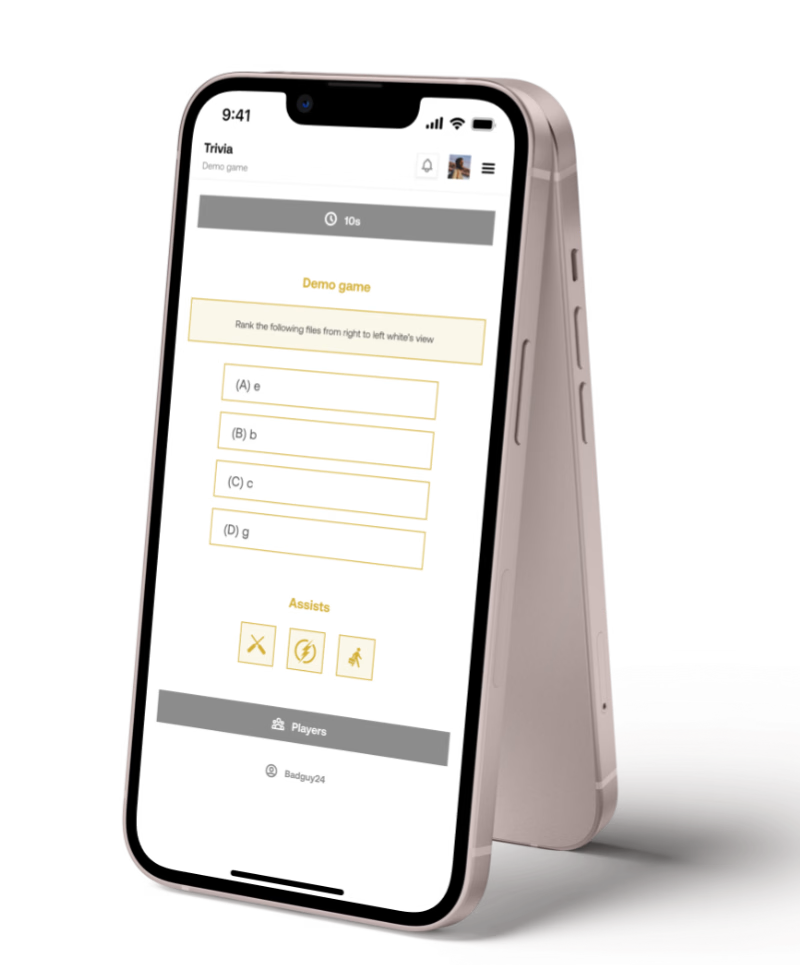
The Trivia section offers multiple modes of engagement, from the competitive scramble of Live Lobby to the casual collective challenge of Community Mode. Each mode is crafted to cater to different user preferences, ensuring a diverse and inclusive platform for all chess enthusiasts.
The trivia consists of the Live lobby, Demo, community and versus, each with its own rules and winnings.
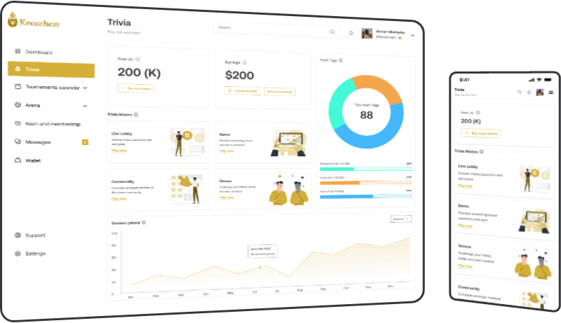
The balance between aesthetic appeal and functional design ensures that users can focus on their gameplay and learning experiences without unnecessary distractions.
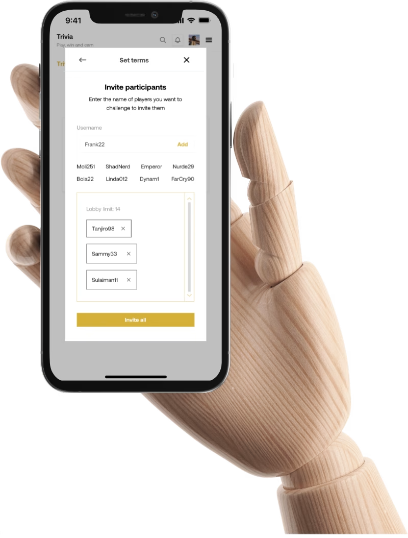
Users can connect with peers, challenge competitors, and track their progress in real-time.

Expected outcomes & takeaways
With the updated style guide, revamped website and streamlined dashboard that focus on user needs, we expect an increase in user engagement and satisfaction whenever they play the game. This will eventually translate to profit when the webapp is launched!!
Results from test reflected that the research done and solutions implemented clearly matches the needs of users as participants were able to use the prototypes to simulate the gaming experience without interference from observers.

