Darweb Logo Redesign

Dan Holdsworth

Darweb, a leading innovator in 3D CPQ Technology based in the Netherlands, is gearing up for its next phase of growth. To align with their expansion plans, they embarked on a rebranding journey, starting with a fresh, modern logo.
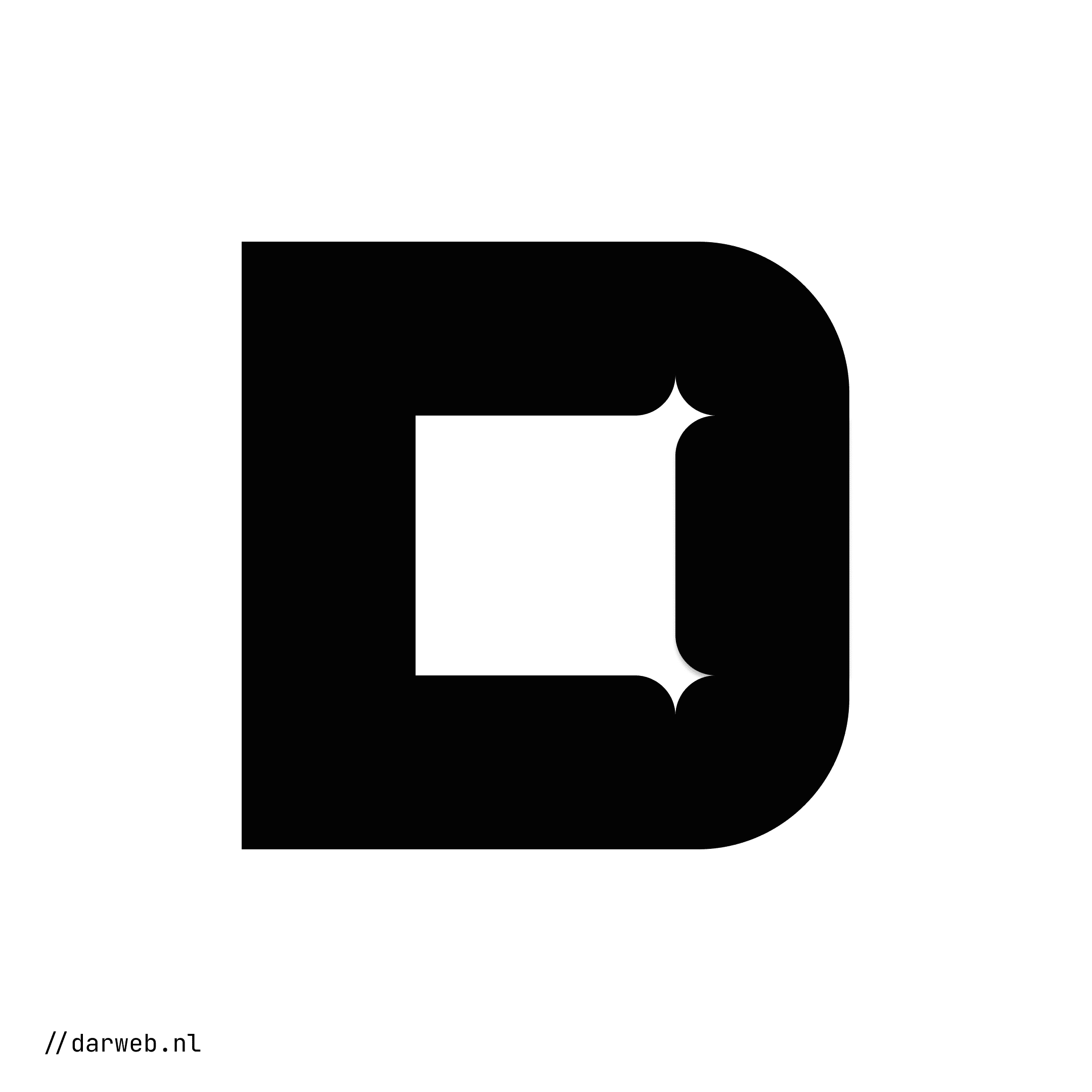
The new logo captures the essence of Darweb’s dual identity: a bold “D” split into two halves—one sharp and rigid, symbolizing precision and technical prowess, and the other fluid and dynamic, reflecting creativity and innovation. This striking visual concept bridges their commitment to both structured technology and imaginative problem-solving.
This logo redesign is part of a larger branding effort for the same client, which also includes rebranding for their associated ventures: GL Transform and Foreseer. Together, these designs create a cohesive yet distinctive visual language for their ecosystem of brands.
Discover more at darweb.nl.
Like this project
Posted Nov 17, 2024
Modern logo redesign for Darweb’s rebrand, showcasing precision and creativity as they expand operations and move into a new office location.


South Wessex Auto Sales Redsign

Self portrait

Cruise Pirate Logo

Ghosting Writing Agency Logo Concept