Poster Design

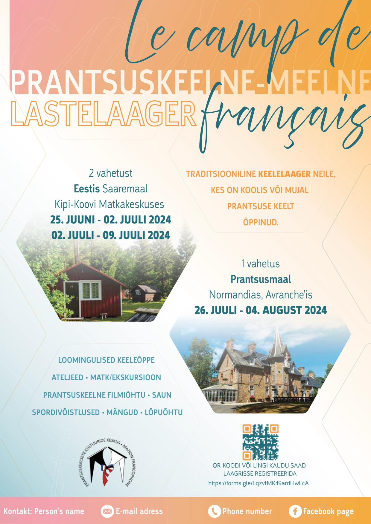
Poster for a French Camp for Kids
The eye-catching color scheme features a gradient of pink fading into oranges, complemented by light blue blending with white, creating a warm and inviting atmosphere. The poster’s title is prominently displayed in both Estonian and French, emphasizing the camp’s bilingual nature. To provide potential campers and their parents with a comprehensive overview, I incorporated a concise presentation of the various activities offered during the camp. Additionally, the poster is divided into two distinct sections, detailing the different sessions available in Estonia and France, highlighting the unique international experience this summer camp offers.
Like this project
Posted Jan 26, 2025
I designed a vibrant and engaging poster to promote a French summer camp for children.


