Built with Framer
Apporify Multi-Platform SaaS UX Design

Haider Irshad


Apporify — Designing a Multi-Platform SaaS Product from Scratch
The Brief
Apporify is a SaaS platform that lets businesses build, launch, and scale digital products across websites, mobile apps, TV apps, OTT platforms, and enterprise tools from one unified workflow.
The core design problem: how do you communicate a product that does six different things without overwhelming someone in the first 5 seconds?
Why This Was Hard
Most SaaS landing pages struggle with one value proposition. Apporify had six. Every platform (web, mobile, TV, OTT, enterprise, digital services) needed representation without turning the page into a feature encyclopedia.
I identified three tensions early:
Breadth vs. clarity — showing everything the platform does without burying the core promise
Technical depth vs. accessibility — speaking to CTOs and non-technical founders in the same breath
Premium feel vs. conversion focus — looking like an enterprise tool while still driving signups
How I Approached It
I structured the entire page around a single narrative arc: Problem → Solution → Benefits → Features → Conversion. No sidebar navigation, no feature matrix above the fold. Just a story.
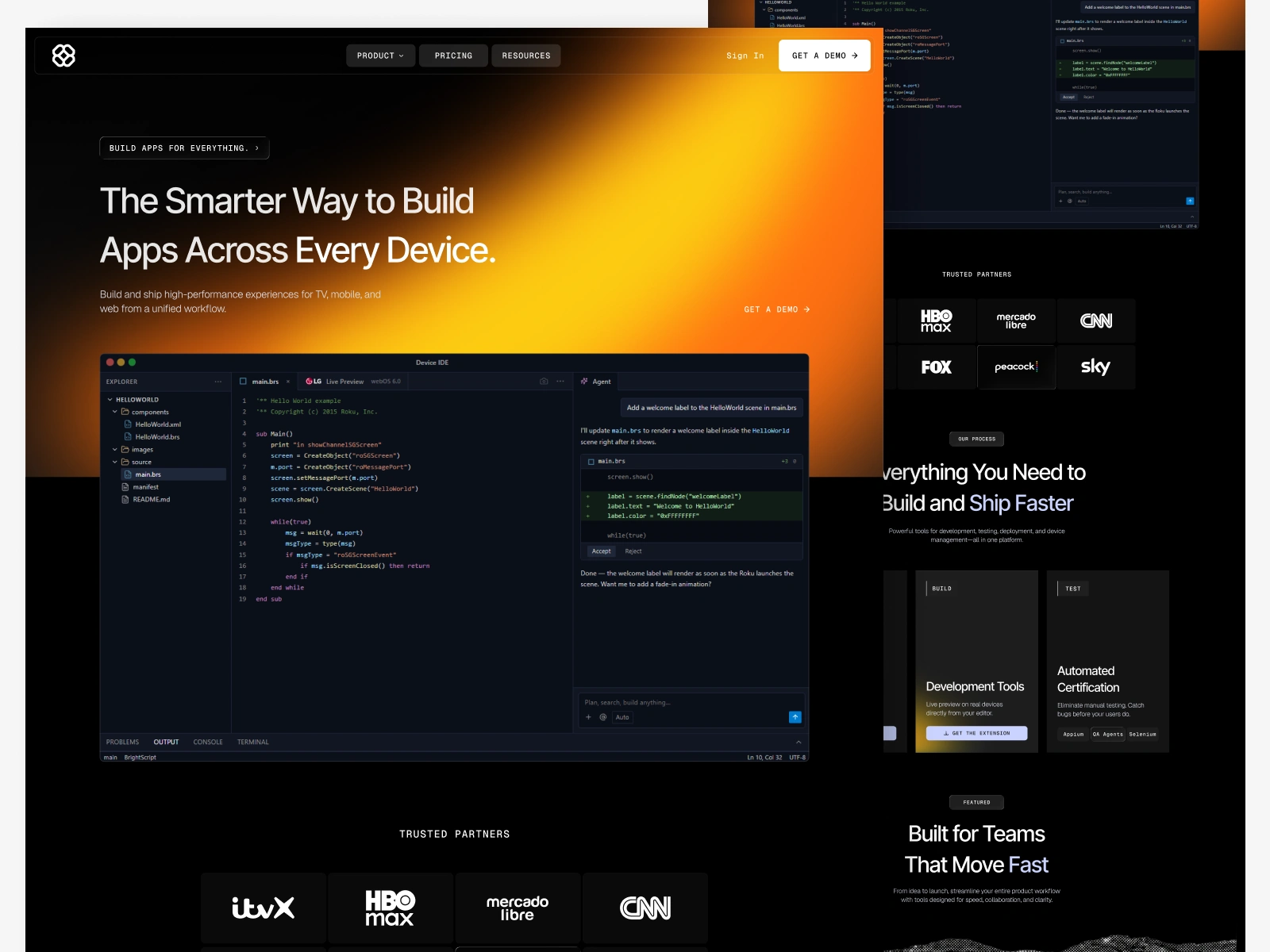
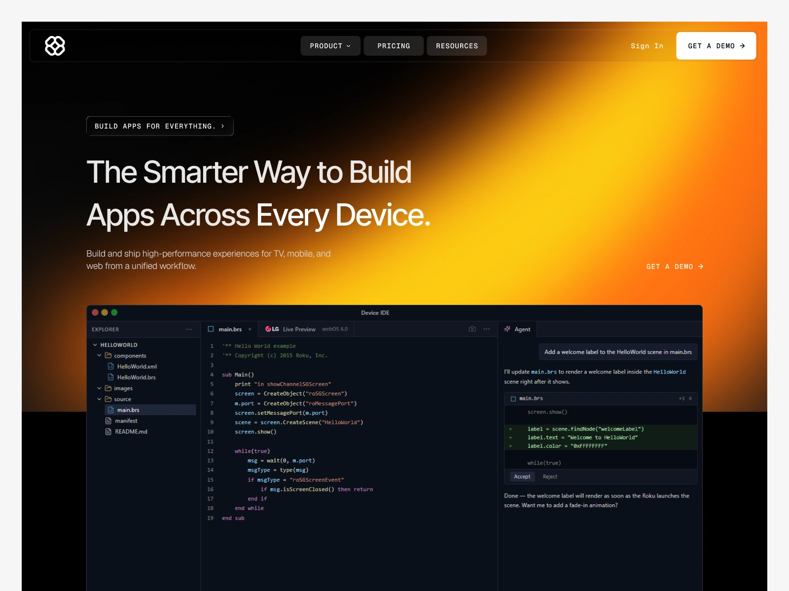
The hero section carries one message: Build smarter. Launch everywhere. I deliberately avoided listing platforms in the headline. The specifics come later, after the visitor already understands the value.
For the platform breakdown sections, I used a card-based layout where each product type (web, mobile, TV, etc.) gets equal visual weight but collapses into a scannable grid. This solved the breadth problem: visitors can see the full scope at a glance without reading six paragraphs.
Visual Direction
I went with a bold orange-to-black gradient system. Most SaaS sites in this space default to blue or purple. The warm gradient creates immediate differentiation and communicates energy and momentum.
Typography is oversized and confident. Section headers run large enough to be scannable from a distance, which matters for users who scroll fast and read slow (most of them).
Spacing is generous throughout. For a product this complex, whitespace isn't decoration; it's the thing that keeps the page from feeling overwhelming.
Apporify Banner
Key Design Decisions
Minimal navigation: I stripped the nav down to essentials. For a conversion-focused landing page, fewer exit points means more completed journeys.
Outcome-first copy: Every section leads with what the user gets, not what the platform does. "Launch on every device" instead of "multi-platform deployment engine."
Progressive disclosure: Technical details live below the fold. The first screen sells the vision; scrolling reveals the substance.
High-contrast CTAs: Primary actions use the orange gradient against dark backgrounds. They're impossible to miss without being aggressive.
The Build
Designed in Figma, built and shipped in Framer. The live site runs at apporify.framer.website. Framer let me implement scroll-based animations and micro-interactions that reinforce the "modern platform" positioning without a separate dev handoff.
What I'd Do Differently
If I revisited this, I'd add a short product demo or interactive walkthrough above the fold. The current hero communicates the promise well, but showing the actual product interface earlier would build credibility faster, especially for technical buyers who want proof before they read further.
Takeaway
The hardest part of designing for complex products isn't making them look good. It's deciding what to leave out. Apporify taught me that the best SaaS pages aren't the ones that explain everything; they're the ones that make you want to learn more.
Apporify Banner
Like this project
Posted Jul 7, 2026
A SaaS landing page for a multi-platform product builder. I designed the UX strategy, visual direction, and built the live site in Framer — solving the core challenge of communicating six product types without overwhelming visitors.
Likes
6
Views
17
Timeline
Jun 20, 2026 - Jul 5, 2026