Banco del Libro web site
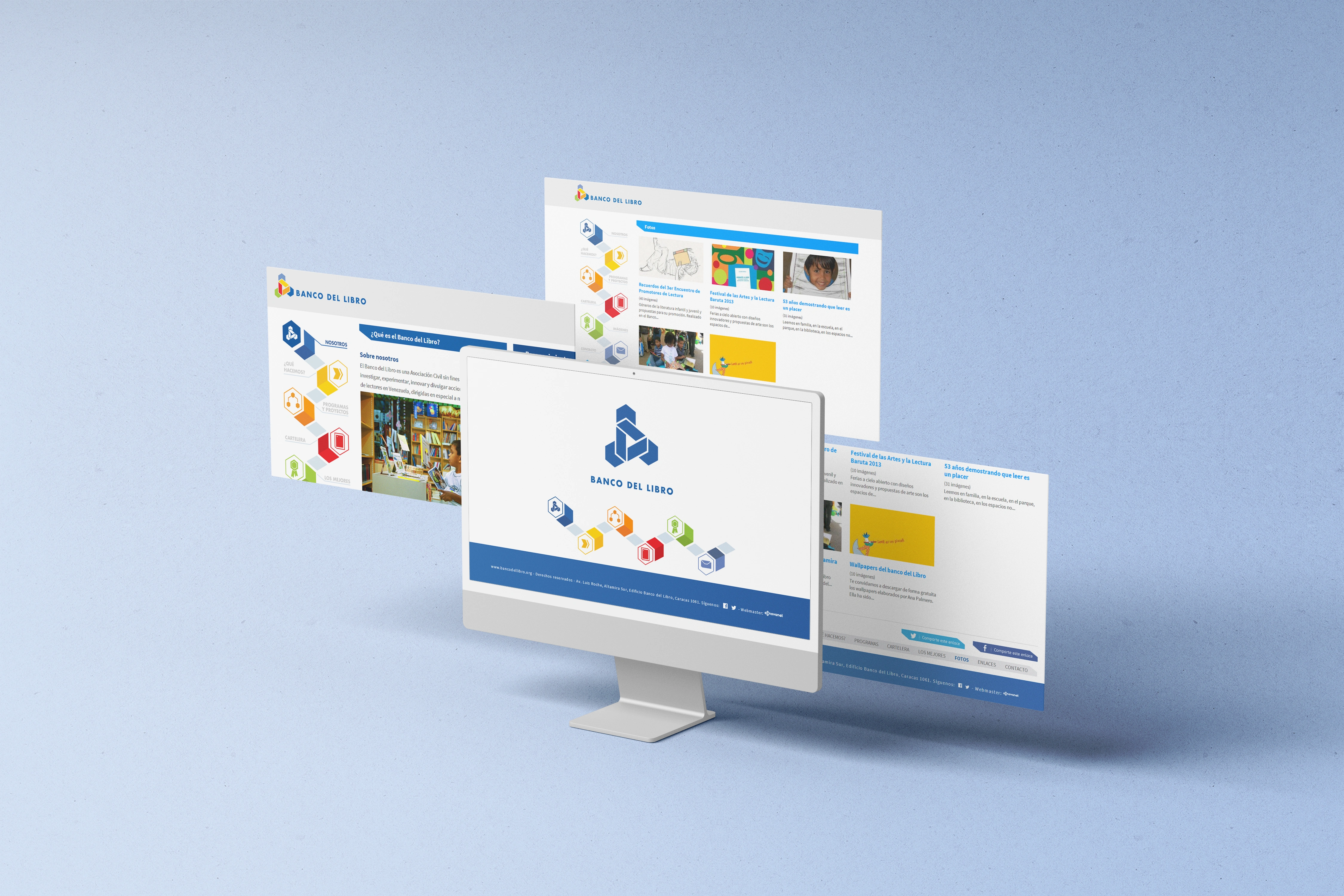
Web site layout
I applied for this project to the Ibero-American Design Biennial BID 2014 at the insistence of a great friend of mine; He already knew the website because it was my thesis to graduate as a designer. The website design system is directly related to the shapes of the Banco del Libro logo, from this the arrangement between the different elements was established. We sought to navigate the website in such a way that it invited children, young people and adults to become interested in the activities carried out by the institution.
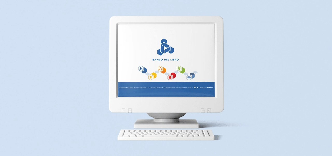
Home view
With all this in mind, an animation was designed and developed on the home page that presents the logo and a navigation bar that respond to the interaction of the page visitor. Internal links maintain the same concept of an animated menu and content generated through a content manager.
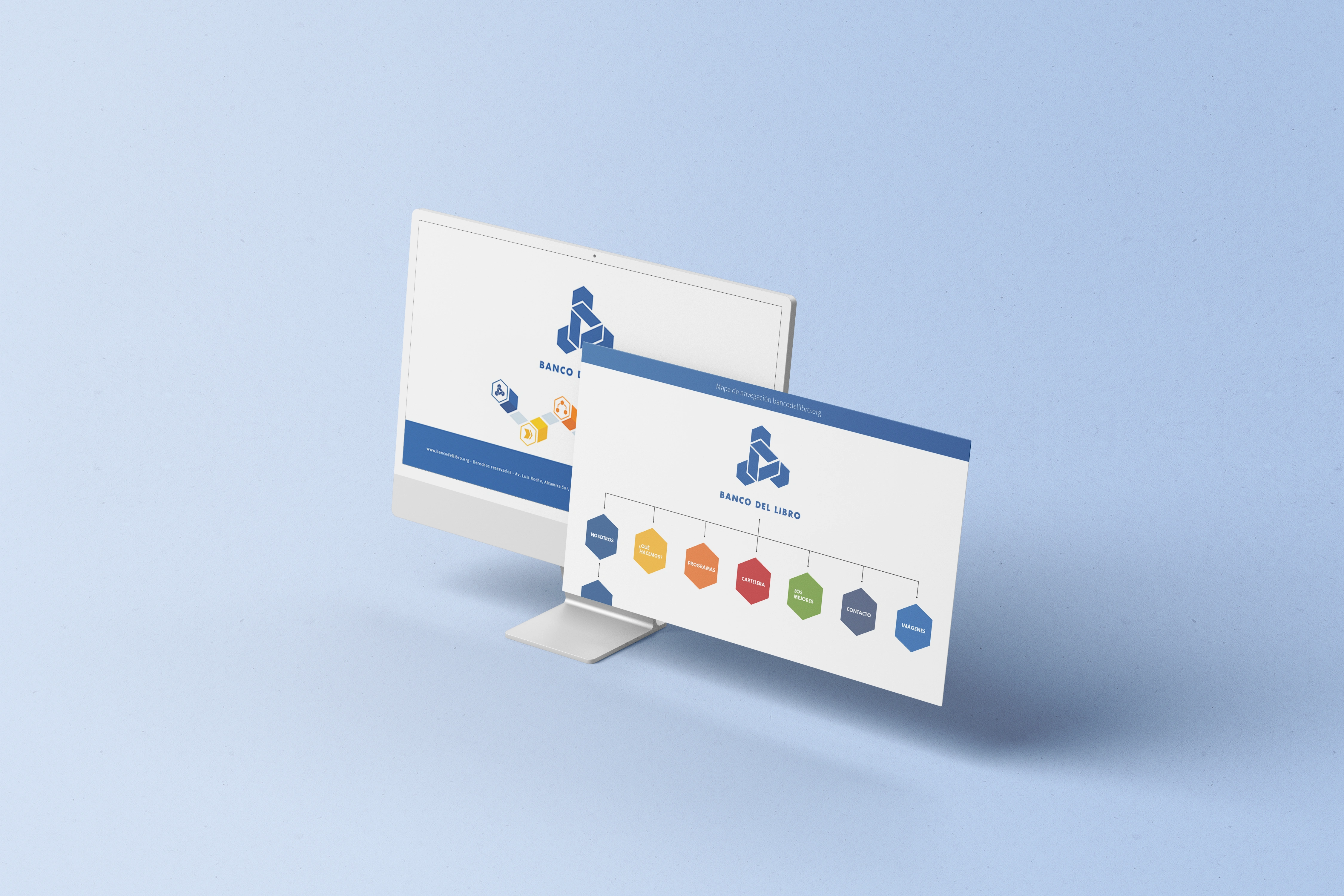
At the time in Caracas, it was not necessary to make a website to adapt to mobile devices, desktop views were the norm in those days.
The graphic implementation was carried out in html/css, animations in Flash and the open source CMS used is SilverStripe v2.4.5 (php, mysql), applied together with the installation and implementation of the news and image gallery modules.
Project selection at the Ibero-American Design Biennial BID 2014: https://galerias.bid-dimad.org/bid_14/?p=4191
Like this project
Posted Jul 1, 2024
The design system is directly related to the shapes of the Banco del Libro logo, from this the arrangement between the different elements was established

