Revamping a Company's Brand Identity


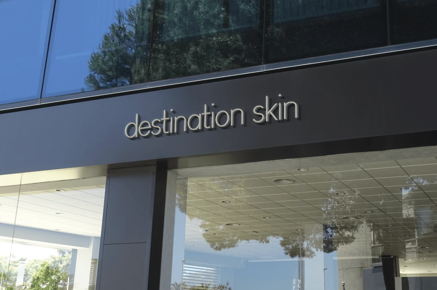
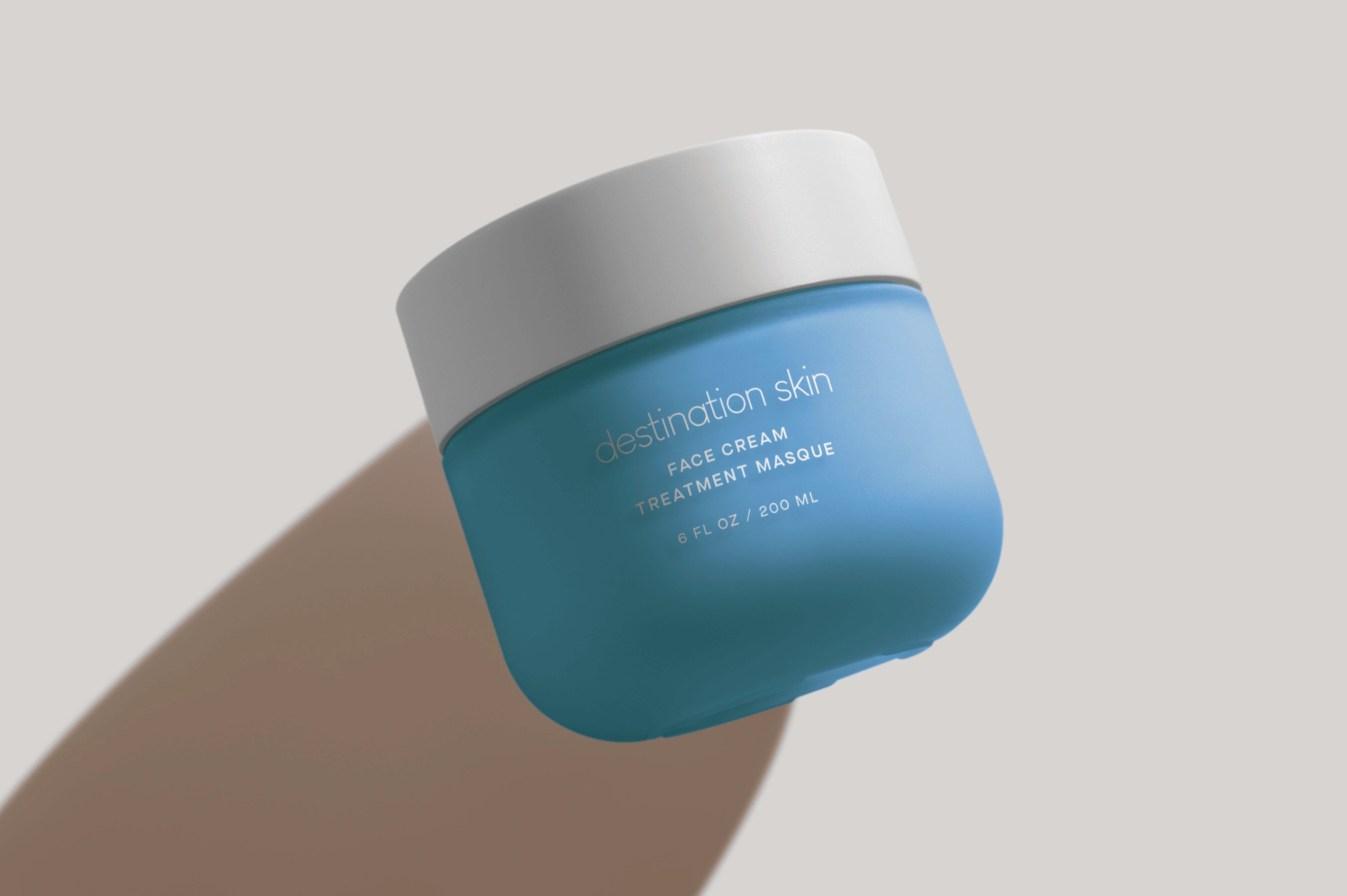
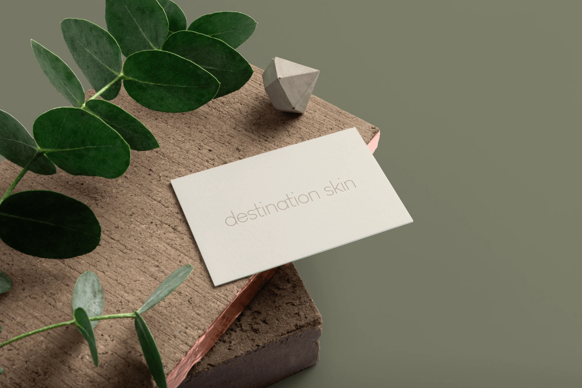
For this Branding the client had a very generic photo as their logo for their skincare brand. I decided to revamp everything. I decided to go with a simplistic font with no icons as I wanted the logo to have a pure feel as the products have no harsh chemicals in. I also went with a neutral colour palette as I feel it that the chemicals are all natural it helps emphasise the company's values. the logo design was used for business cards and signage on their offices.
Like this project
Posted Nov 20, 2023
Developed a new brand identity for a skincare company, including logo design and typography, resulting in increased brand recognition and customer engagement.
Likes
0
Views
8


