
Mastering Fluid Mobile Breakpoints
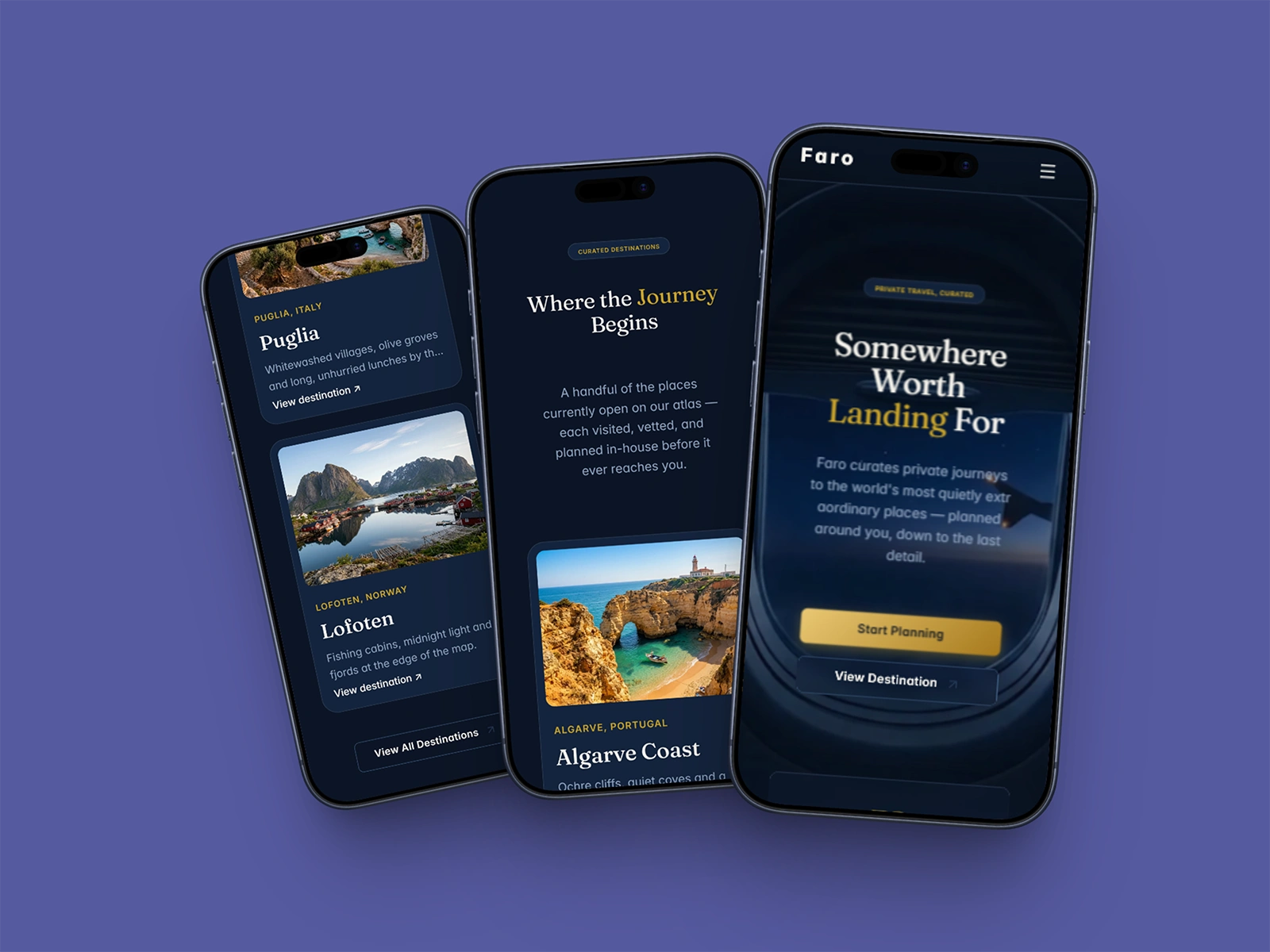
📱 Mobile Optimization: Fluid Scaling for Luxury Consumers
Over 60% of high-net-worth
clients browse custom boutique travel offerings directly from mobile viewports.
If your mobile layout relies on basic auto-stacking, you are leaking valuable
client conversions.
The Optimization:
· Built Faro with completely fluid layout rules from desktop down to mobile
viewports.
· Engineered a lightweight, beautiful custom mobile overlay menu drawer.
· Fixed font line-heights and touch-target padding to prevent chaotic layer
clipping.
Need a pristine, high-converting
mobile presentation for your digital product? Test the responsive breakpoints
live below:
🔗 Framer Marketplace: https://www.framer.com/marketplace/templates/faro/
🌐 Live
Preview: https://farotravel.framer.website/
0 likes · 1 view · Nov 6, 2026
Mastering Fluid Mobile Breakpoints 📱 Mobile Optimization: Fluid Scaling for Luxury Consumers Over 60% of high-net-worth clients browse custom boutique trave...


