Built with Framer
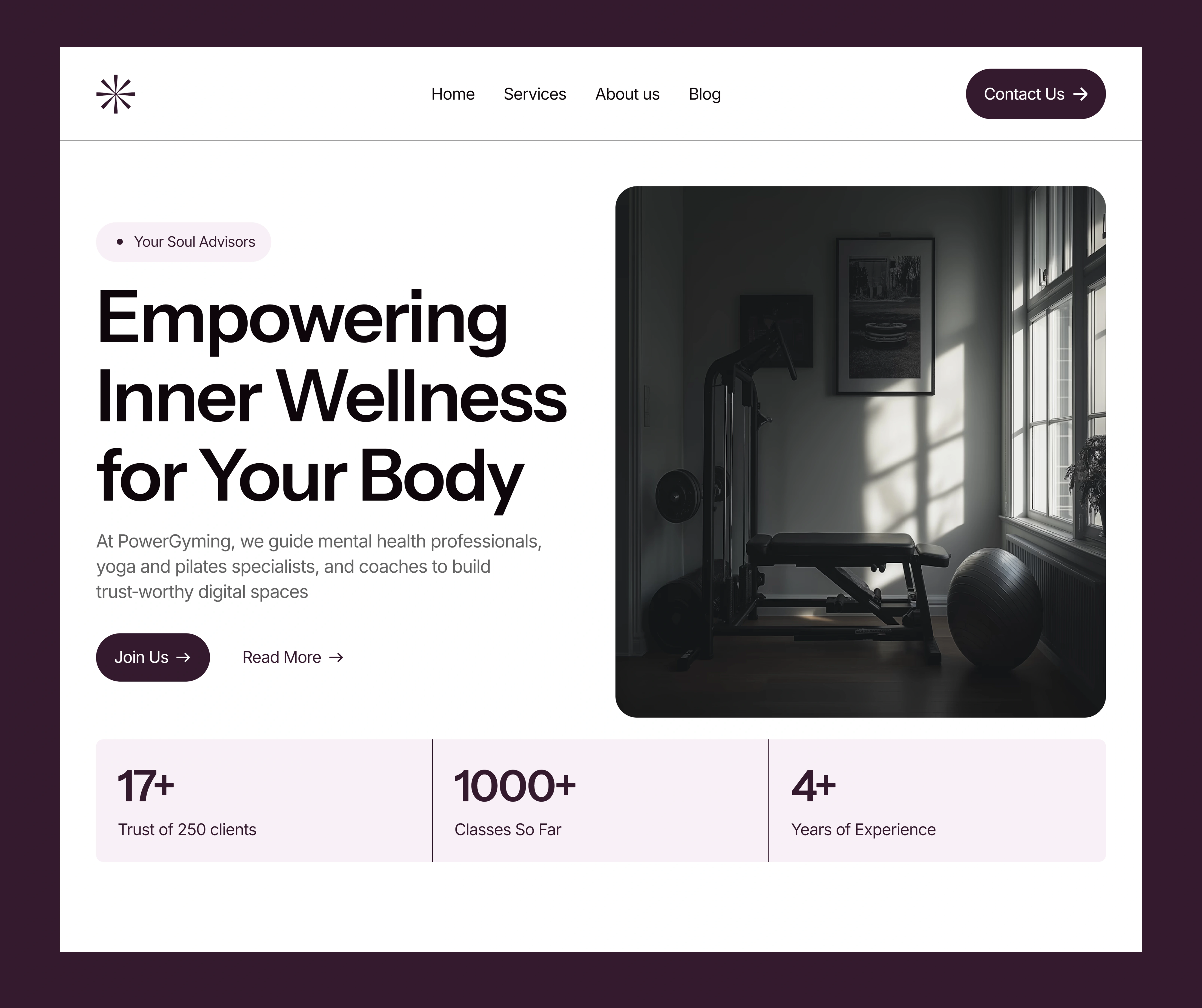
PowerGyming: Designed for Stillness, Built for Connection
Olayanju Teslim
Project Overview
PowerGyming is a modern, Framer-built website crafted specifically for mental health professionals, wellness coaches, and holistic businesses. The purpose behind the design was to create an online presence that radiates calm, clarity, and credibility qualities essential for therapists, yoga instructors, meditation coaches, and other mental well-being practitioners.
In an increasingly crowded and noisy digital space, professionals working in mental health and wellness need websites that don’t just showcase their services but also immediately build trust and convey a sense of safety, ease, and presence. The PowerGyming site was designed to fulfill this purpose—simple in structure, minimal in tone, but thoughtful in its typography, layout, and interaction.
Built entirely with Framer, the site is not only visually calming but also responsive, lightweight, and easy to customize. It’s ideal for professionals who don’t want to fuss over heavy tech stacks but still want a strong, polished, and modern web presence.
The Challenges
Designing the Bricklane website came with several key challenges:
Designing for Emotion Without Overwhelm : Wellness-focused websites often fall into two traps—either they’re cluttered with overly spiritual visuals and jargon, or they feel too clinical and cold. For this project, the goal was to find that delicate middle ground: emotional but grounded, serene but structured. The site needed to communicate warmth and professionalism in equal measure.
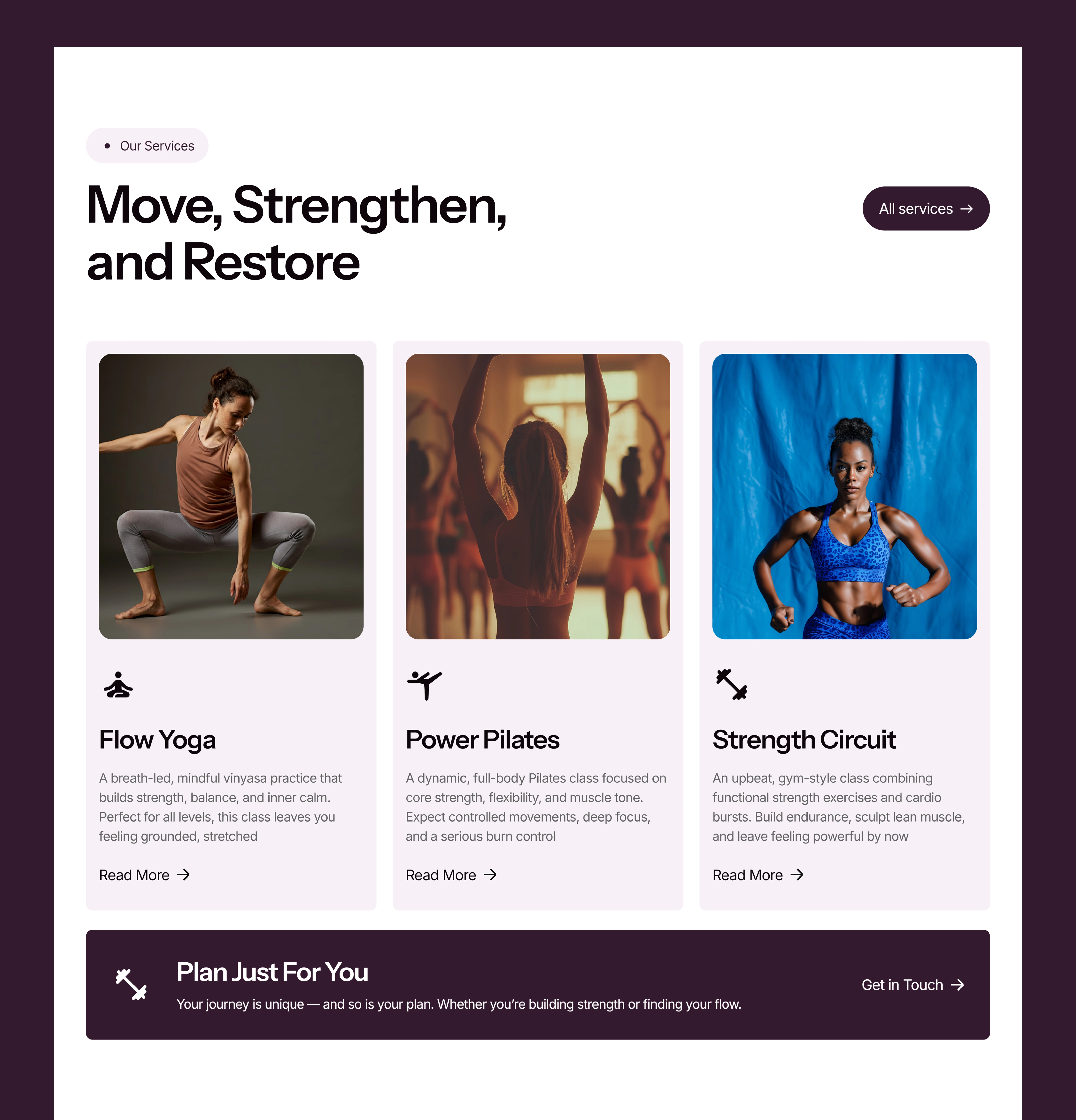
A Diverse Target Audience: While the site was meant for therapists and counselors, it also needed to work for yoga teachers, Pilates studios, wellness coaches, and even alternative health practitioners. Designing a layout and visual system that could flexibly support different use cases—without losing coherence was a challenge in itself.
Minimal Content, Maximum Credibility: Many solo practitioners in the mental health and wellness space don’t have extensive portfolios or large teams. The site had to be simple and lightweight, but still convey credibility, expertise, and depth through structure, color, and design choices.
The Approach
To meet these challenges, I leaned into a philosophy of "calm design" a design language focused on space, balance, and clarity. From visual tone to page rhythm, every element was crafted to slow the user down and gently guide them through a story of care and capability.
Visual Tone & Typography
I chose a soft, muted color palette with generous white space to immediately create a sense of openness and ease. Typography was selected for legibility and subtle elegance—sans-serif fonts that feel modern but non-aggressive. Font sizes were intentionally balanced to create a relaxed rhythm, encouraging slower reading and reflection.
Layout & Structure
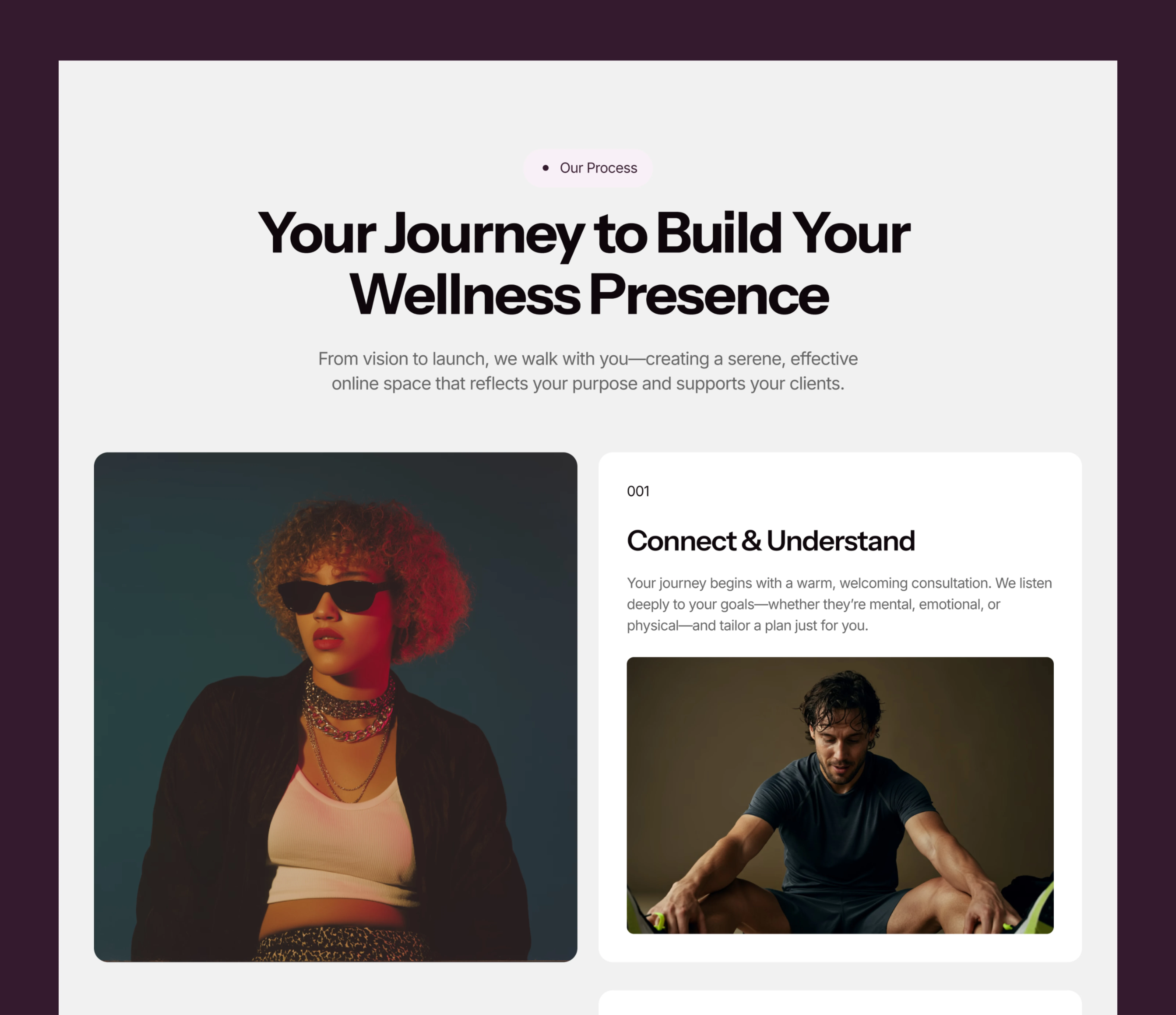
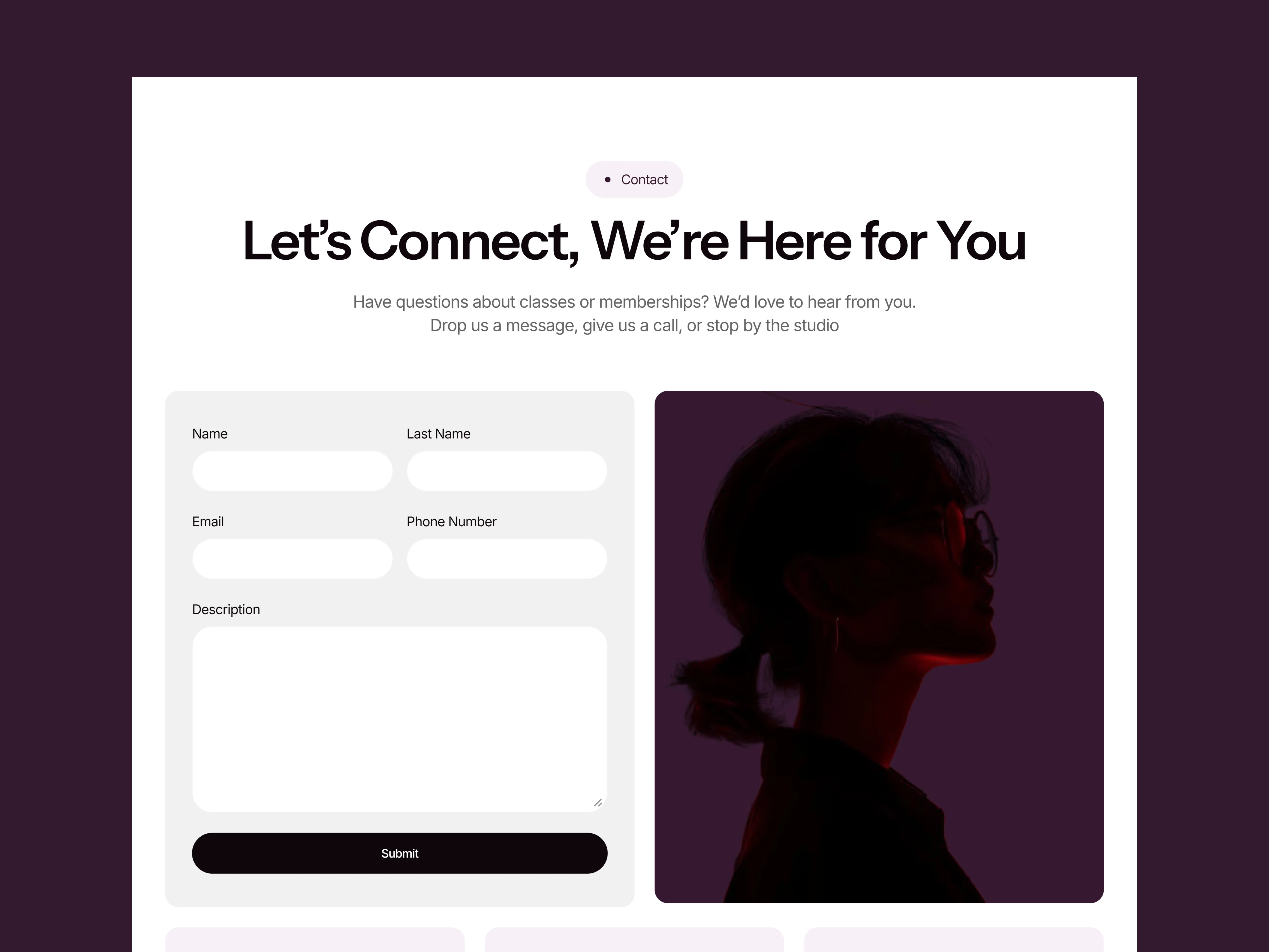
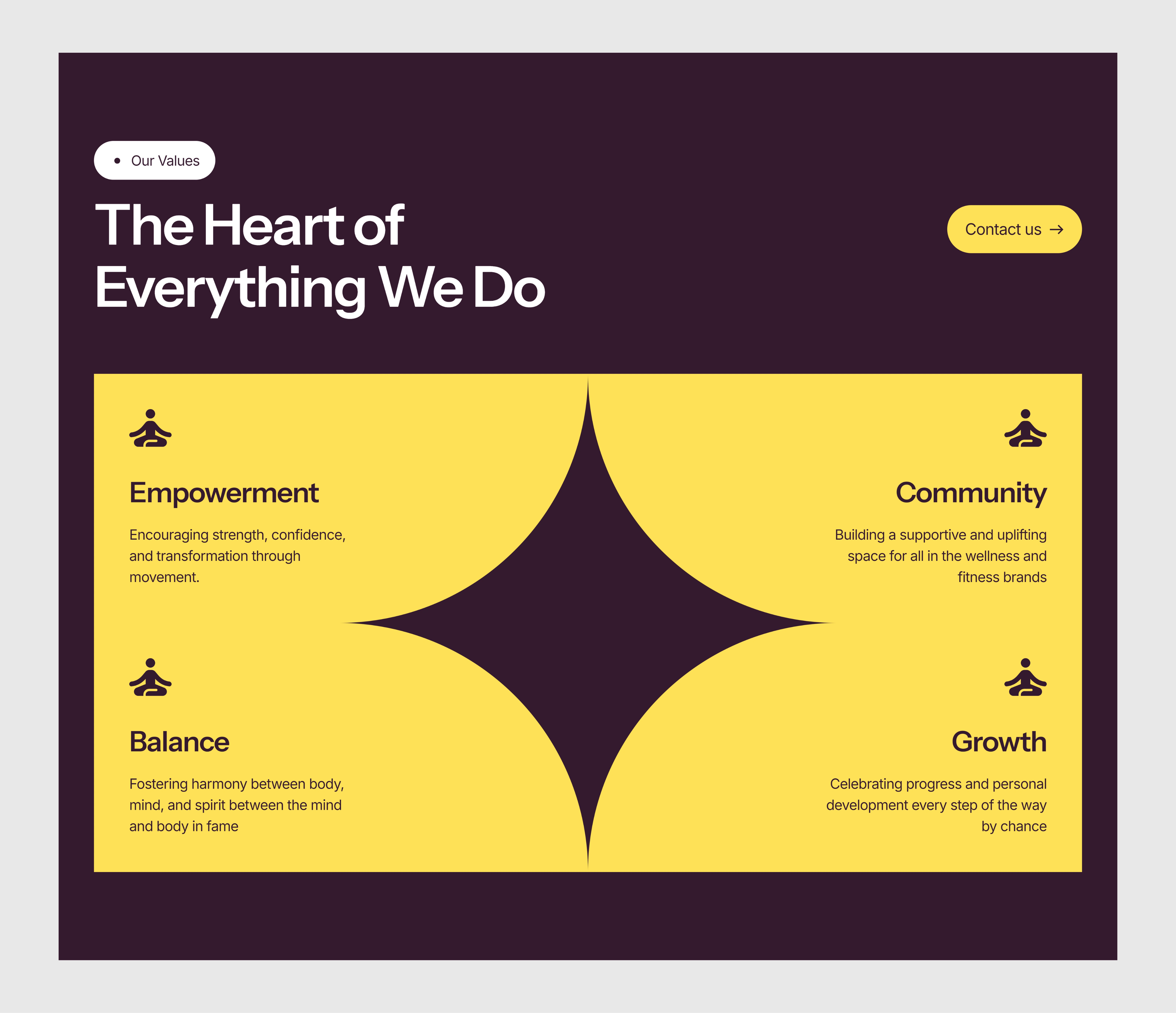
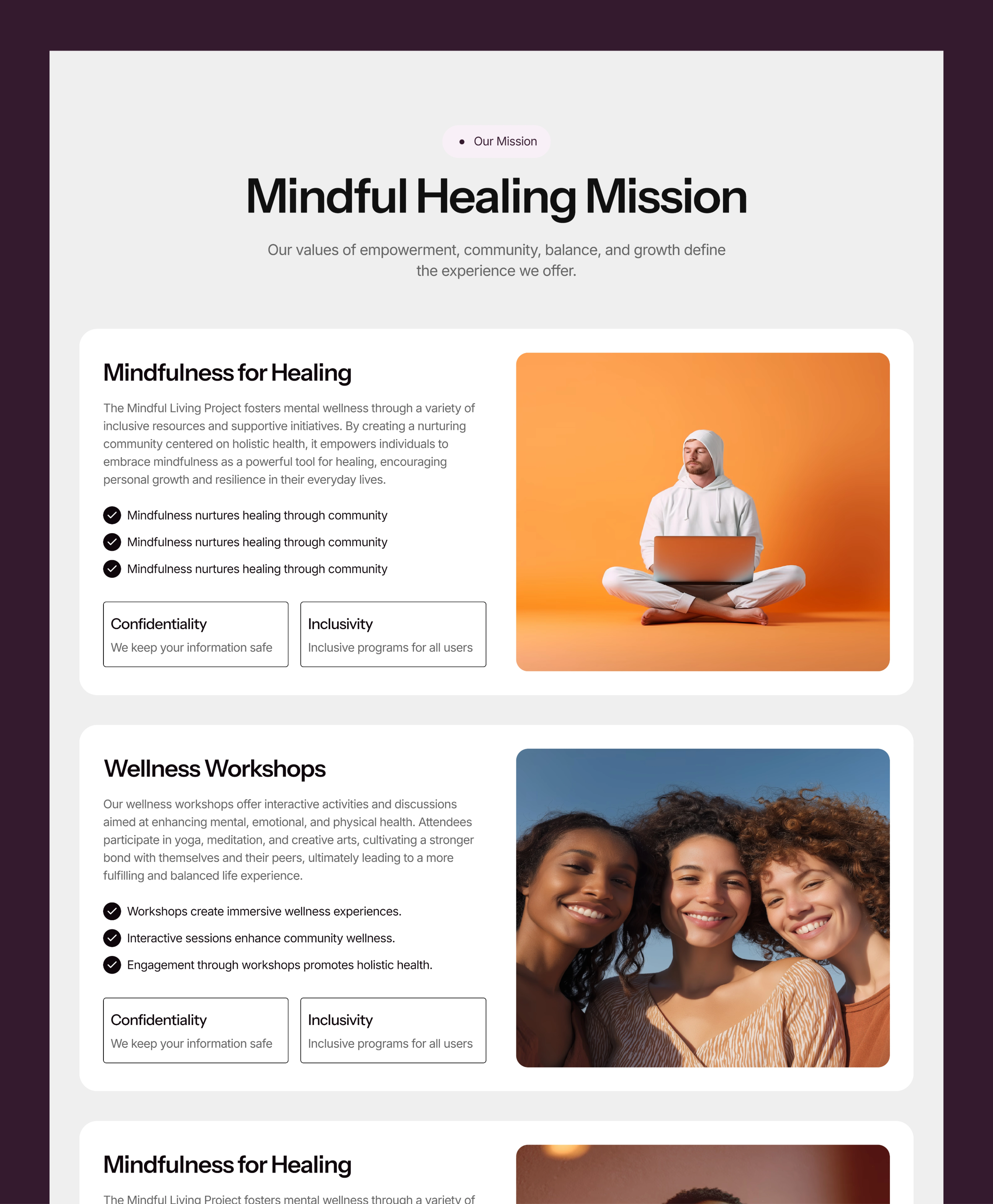
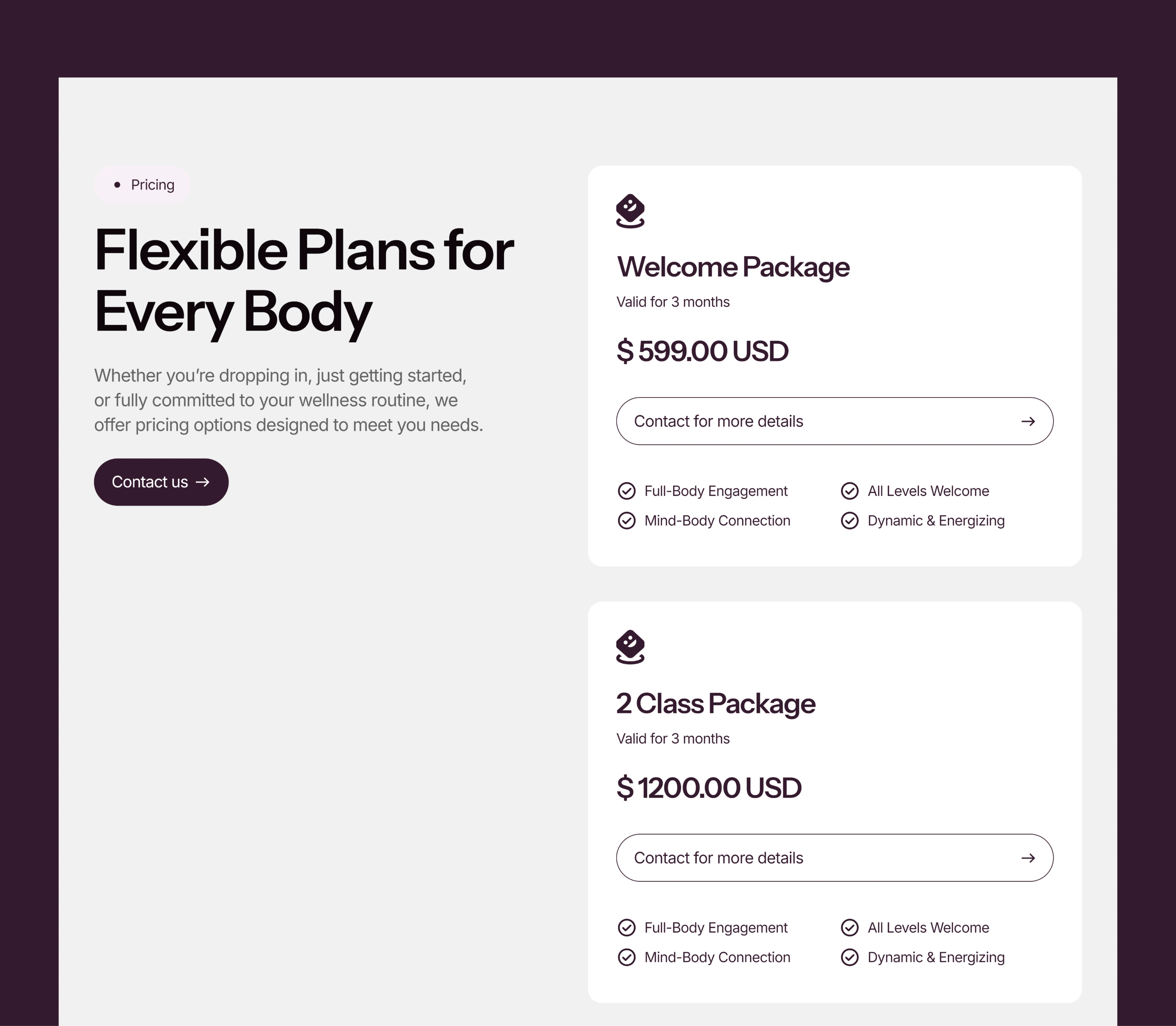
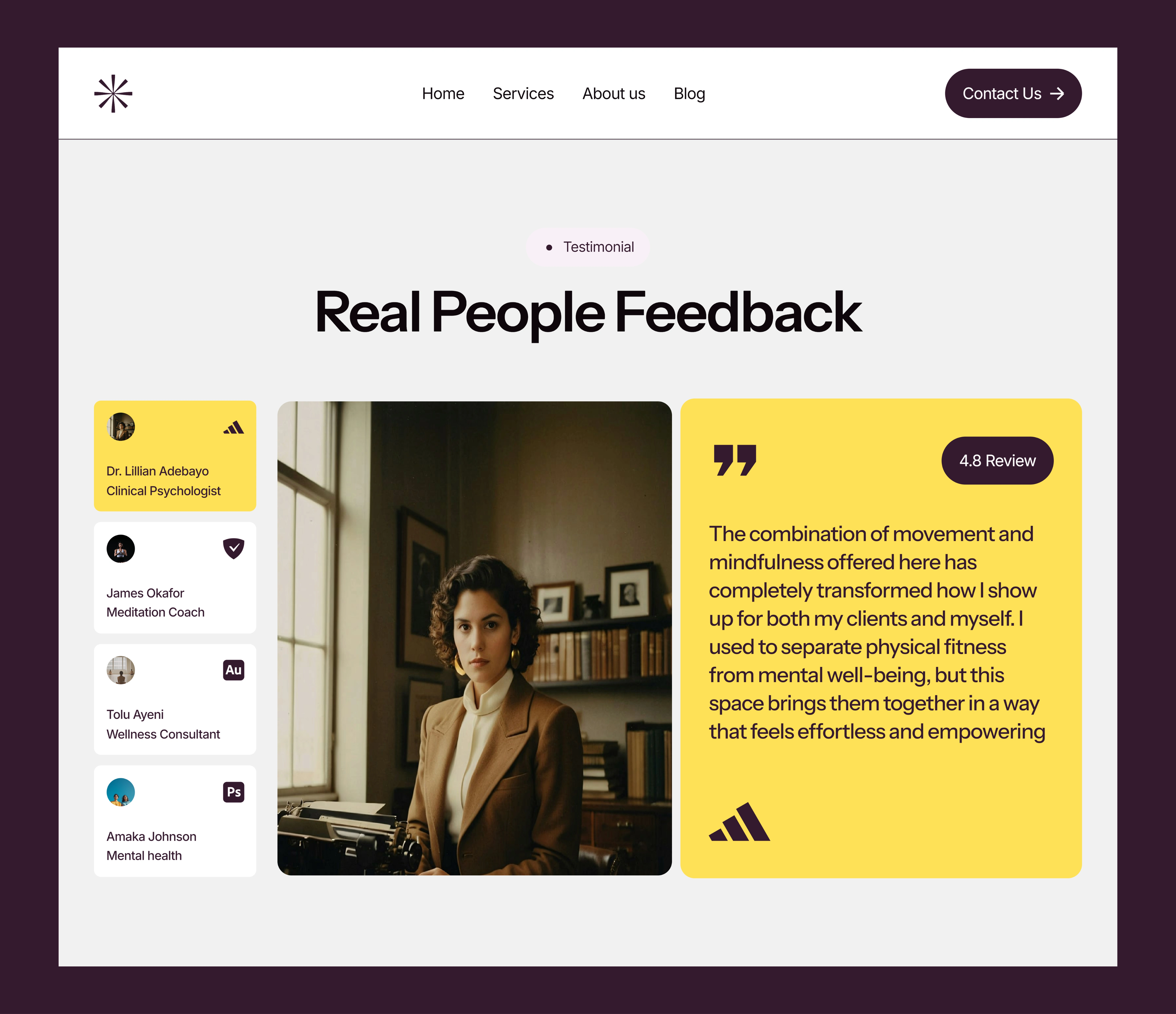
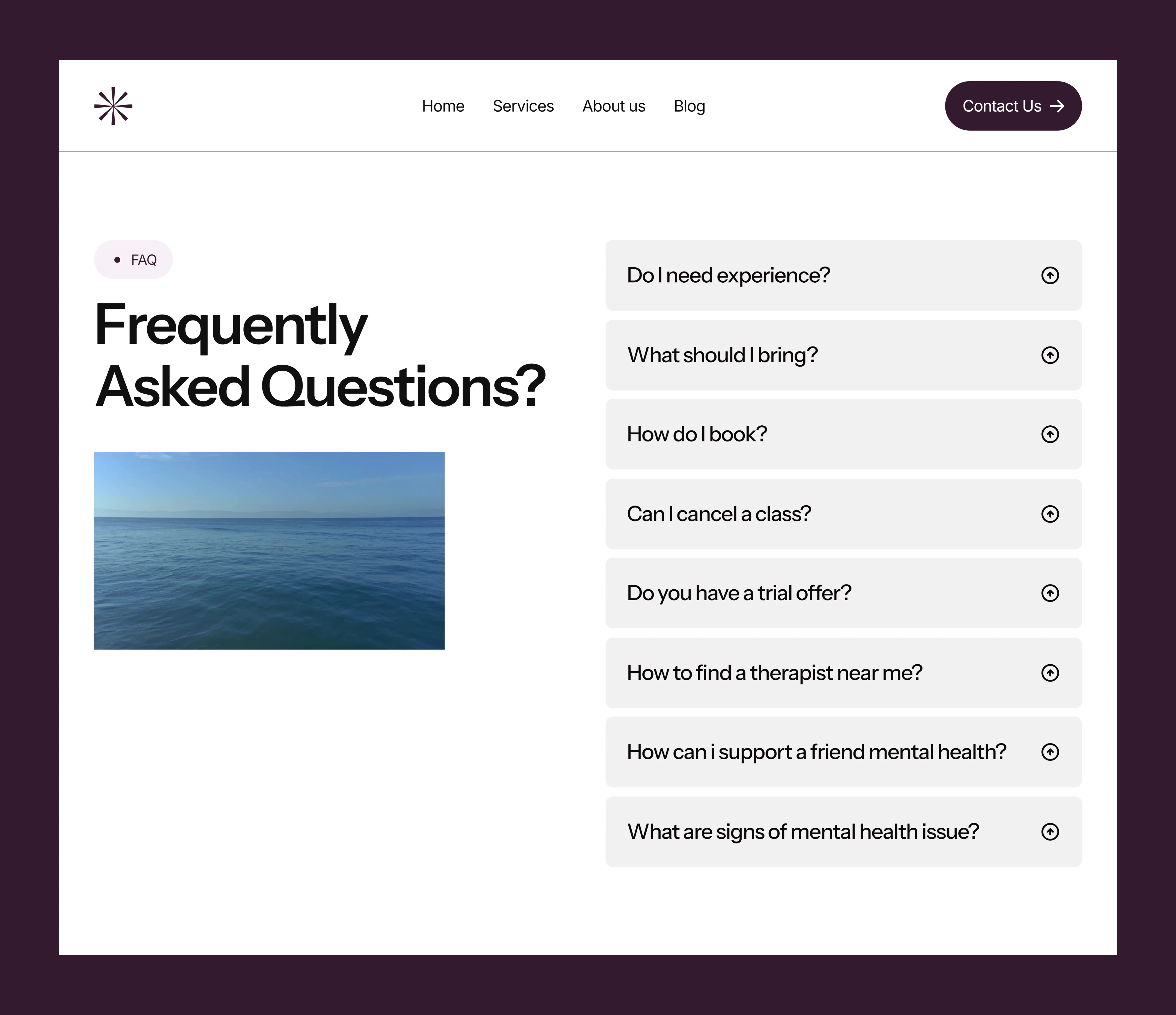
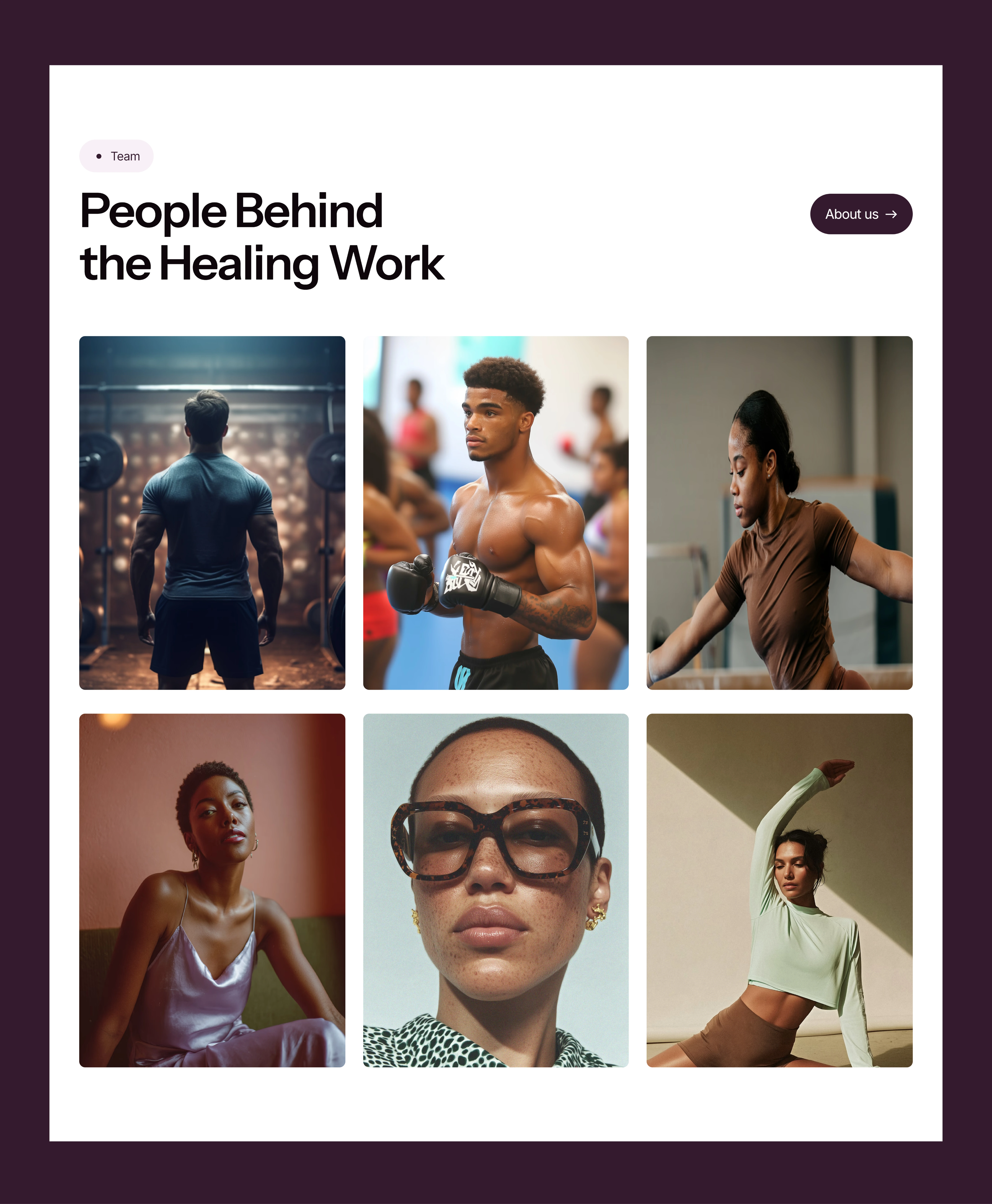
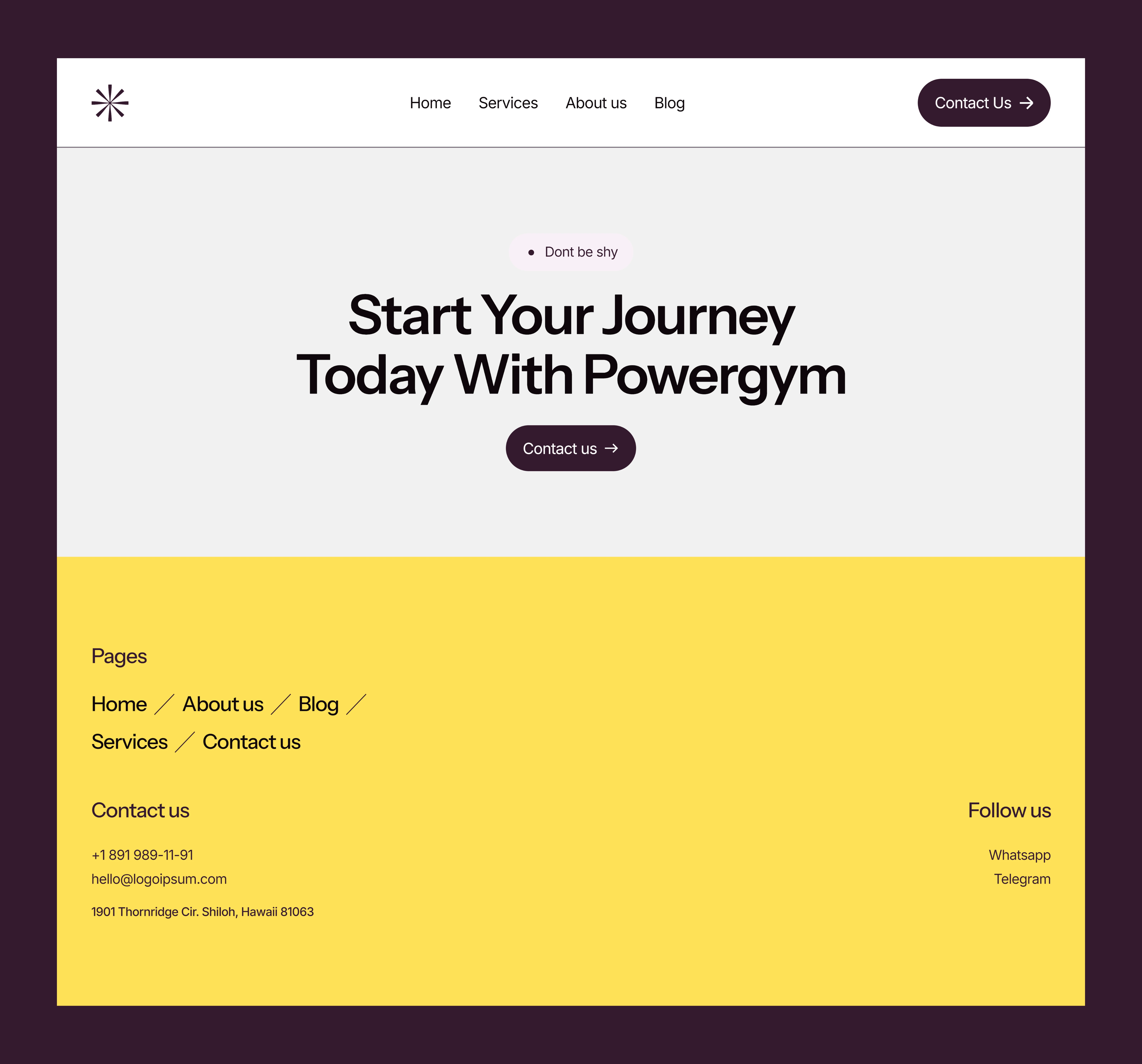
The page was structured as a clean scroll experience, with clear section breaks and minimal distractions. Key sections such as the hero, service highlights, about/mission, testimonials, and contact—were laid out to offer just enough information while leaving space for interpretation and personalization.
The layout encourages practitioners to build trust at first glance, then guide users gently into action (booking a session, reading more, or reaching out).
Framer Development
Building in Framer allowed me to bring smooth scroll transitions, subtle animations, and responsive behavior without bloating the site. Animations were deliberately restrained small fade-ins, soft movement, and cursor feedback that added depth without overwhelming the calm aesthetic.
Framer’s real-time editing also enabled a fluid design-dev process, helping me preview and refine the flow of each section with precision.
Deliverables
The final deliverable was a fully designed and deployed Framer website that is ready-to-use for therapists, coaches, or small wellness businesses. But more than just a generic design, this site is built with emotional design principles that reflect the real-world needs of its audience.
Here’s what was included in detail:
Fully Designed Framer Website
I delivered a complete single-page site design within Framer, including all interactions, layouts, and visual hierarchy. The homepage includes a hero section with a soft call-to-action, a service overview, value-driven content, testimonials, and a clear booking/contact section—all organized with intention and emotional clarity.
Responsive Design for All Devices
Special attention was given to mobile responsiveness. Since many clients visit wellness websites via mobile (especially when searching for therapists or local coaches), the mobile experience was optimized with carefully adjusted breakpoints, simplified spacing, and touch-friendly CTAs.
Subtle Interaction Design
Micro-interactions like hover states, gentle fade-ins, and scroll effects were added to give the site a dynamic but non-distracting feel. Every animation was designed to support focus not steal it.
Customizable Visual System
Although built as a template, the structure and styling allow easy customization. Business owners can easily update their colors, text, service offerings, and testimonials without breaking the design. The typography and layout system are flexible enough to adapt to various tones from clinical therapy to heart-centered coaching.
Launch-Ready and SEO Friendly
The site was deployed with essential SEO settings in place (title, meta tags, and alt text), ensuring it could be discovered and indexed properly. It loads fast, uses accessible fonts, and is free of clutter all things that support trust in wellness brands.
Results
The result is a calm, polished, and high-converting website that appeals directly to professionals who often struggle with tech and branding. PowerGyming doesn’t try to “sell hard.” Instead, it reflects the tone of a quiet, confident expert someone you’d want to trust with your health, your story, or your personal growth.
Initial feedback has praised the site for its elegance, balance, and ease of use. Visitors reported that it “feels peaceful just scrolling through it,” which was exactly the intention. Practitioners using this site are now able to present themselves with more clarity and professionalism without needing to hire a full design team or spend months on revisions.
Conclusion
PowerGyming proves that emotional design isn’t just about aesthetics, it’s about creating environments that support trust, comfort, and confidence. For solo practitioners in mental wellness, having a website that feels just as grounded as their practice is crucial. This project shows how careful layout, tone, and interactivity can turn a simple website into a safe, welcoming digital space.
Framer was the ideal tool to bring this project to life allowing for visual experimentation, thoughtful animation, and launch-readiness all in one place. More than just a website, PowerGyming is a calm digital foundation for wellness brands to grow and connect with their clients.
Like this project
Posted Jul 17, 2025
Designed a Framer-built website for mental health professionals, focusing on calm design and emotional clarity.
Likes
3
Views
45
Timeline
Jul 11, 2025 - Jul 15, 2025