
Contra Website Audit – UX Issues & Design Recommendations
🚨 Why these improvements make sense 🚨
Small friction adds up: Each extra click, layout shift, or interaction issue makes the experience feel less smooth.
Focus on user flow: These points are about making common actions faster, clearer, and more predictable.
Better overall experience: Small UX improvements can make the product feel more polished and easier to use.
1. Simplify Media Upload Flow :
Issue: Uploading media requires two clicks and an extra modal before selecting a file.
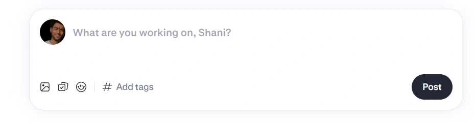
First Menu
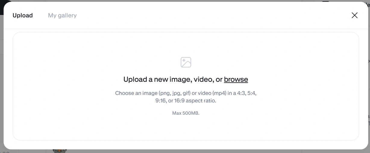
Second Menu
Fix: Let users choose Upload from device or Contra Gallery directly from the first menu.
Improvement: Reduce unnecessary steps and make media uploading faster and more intuitive.
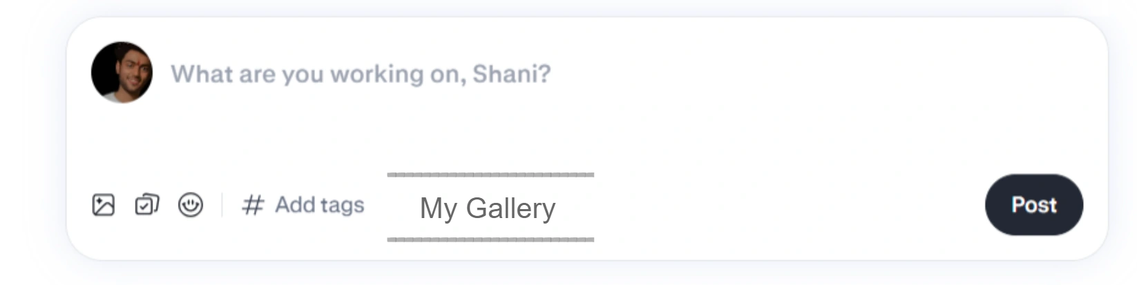
First Menu with Gallery Option, No 2nd Menu Needed.
2. Prevent Layout Shift on Follow Button :
Issue: The button text changes on hover, causing the card layout to jump and the bio to move to the next line.
Layout Shift presentation
Fix: Set a fixed/minimum width for the button or reserve enough space for both states.
Improvement: Keep the bio position stable and make the hover interaction feel smoother and more polished.
No Layout Shift
3. Improve Keyboard Navigation in Search :
Issue: Using ↑ / ↓ keys changes the active profile, but the list itself doesn’t scroll to keep the active item visible.
Manually Scroll
Fix: Automatically scroll the list as the user navigates with the keyboard.
Improvement: Provide a smoother and more accessible search experience without requiring mouse/scrollbar interaction.
Auto Scroll list on Key Presses
4. Add Feed Refresh / New Post Updates :
Issue: There’s no way to refresh only the community feed, so users must reload the entire page to see new posts.
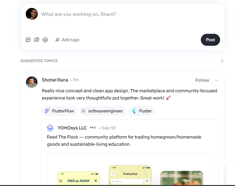
No option to reload feed or get new posts
Fix: Add a Refresh Feed action that fetches new posts without reloading the page.
Improvement: Show a small “New posts available” prompt when fresh content is detected, similar to modern social feeds.

Show Badge - when new posts available
5. Auto-Focus Reply Input :
Issue: Clicking Reply opens the post, but the reply input isn’t focused. Users need an extra click before typing.
No active input field
Fix: Automatically focus the reply input when the Reply button is clicked.
Improvement: Remove an unnecessary step and let users start typing immediately.
Auto active reply text field
Final Thoughts 🙌
Fix the small friction points: These changes are relatively small but can improve everyday interactions.
Keep interactions predictable: Buttons, keyboard navigation, feeds, and inputs should respond naturally to user actions.
Build on the existing experience: The goal isn’t to change the product drastically, but to make the existing experience smoother and more intuitive.
2 likes · 10 views · Sep 22, 2026
An UX audit for interaction and usability issues across Contra’s user experience. Reducing friction, improving interaction flow, and making actions faster.
Timeline
Sep 22, 2026 - Sep 22, 2026
