Ecommerce Website UI/UX Design & Shopify Development
Yousuf Raza


Crafting Engaging E-commerce Experiences: A Look at My UI/UX Approach
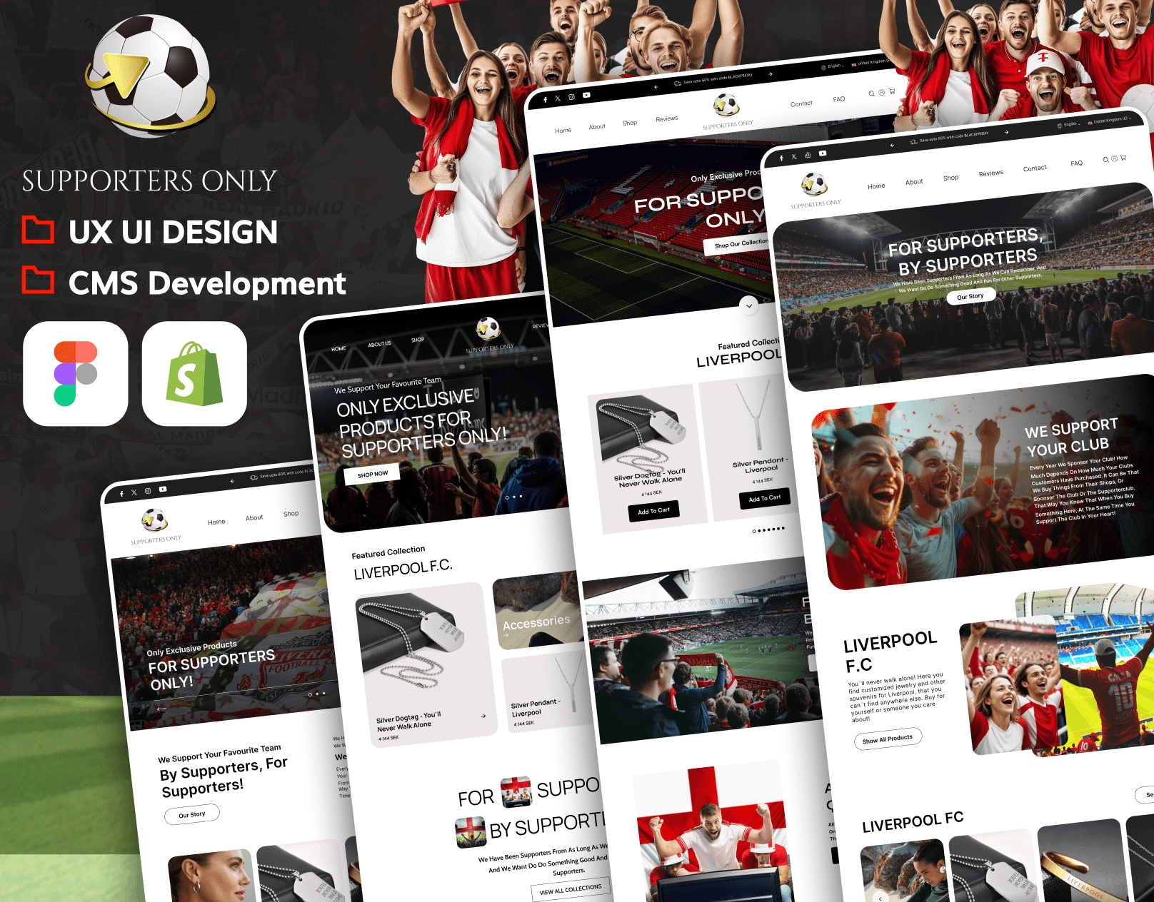
When I tackle a new project, my goal is always to create an experience, not just a website. Take this recent Shopify store design and development project, for instance. Built with Shopify and meticulously designed in Figma, this was all about creating an exclusive online space for passionate fans to discover premium merchandise and collectibles.
Understanding the User, Shaping the Experience
My process always begins with the user. For this project, it was crucial to understand what makes a "supporter" tick – their passion, their loyalty, and their desire for an intuitive and enjoyable shopping journey. This understanding guided every decision, from the initial wireframes to the final polished interface.
I focused on seamless navigation and engaging visuals because I believe a great e-commerce site should feel effortless and inspiring. The aim was to create a sleek, user-friendly online store that not only looks fantastic but also feels right, maximizing engagement and, ultimately, sales.
Bringing the Vision to Life: Design & Development in Action
Here’s how I brought that vision to life:
Modern & Exclusive UI/UX: I poured my design expertise into Figma, crafting a visually compelling interface specifically tailored for supporter-based merchandise. This wasn't just about making it pretty; it was about designing an experience that resonates with the target audience and reinforces the brand's unique identity.
Custom Shopify Development: Beyond the design, I handled the full Shopify development. This means building a fully optimized store from the ground up, ensuring a smooth Browse experience and, critically, a frictionless checkout process. Because let's face it, a beautiful site means little if users get frustrated at the last hurdle.
Mobile-First & Responsive Design: In today's world, design has to be fluid. Every project I undertake is built with a mobile-first approach, meaning the experience is optimized for smaller screens first, then scaled up. This guarantees seamless shopping across every device imaginable – desktops, tablets, and, of course, smartphones.
Brand-Driven Aesthetic: My designs aren't just generic templates. I work to understand the core of a brand and translate that into a clean and engaging aesthetic that builds loyalty and truly enhances their identity. It’s about creating a visual language that speaks directly to their audience.
Conversion-Optimized Features: Ultimately, a great e-commerce site needs to perform. I strategically implemented custom product pages, placed clear calls-to-action (CTAs) where they matter most, and refined the checkout process to be as streamlined as possible. Every element is considered with the goal of maximizing sales and achieving tangible results for my clients.
My approach to UI/UX projects and website design is deeply rooted in understanding your audience, crafting intuitive experiences, and delivering measurable results. If you're looking for someone to bring your digital vision to life with a user-centric and performance-driven approach, I'd love to chat.

Like this project
Posted May 10, 2025
Shopify store for passionate fans: exclusive premium merchandise & collectibles. Seamless, engaging shopping.