Cabinet Memmi — Created by Ema
Ema Sarfati


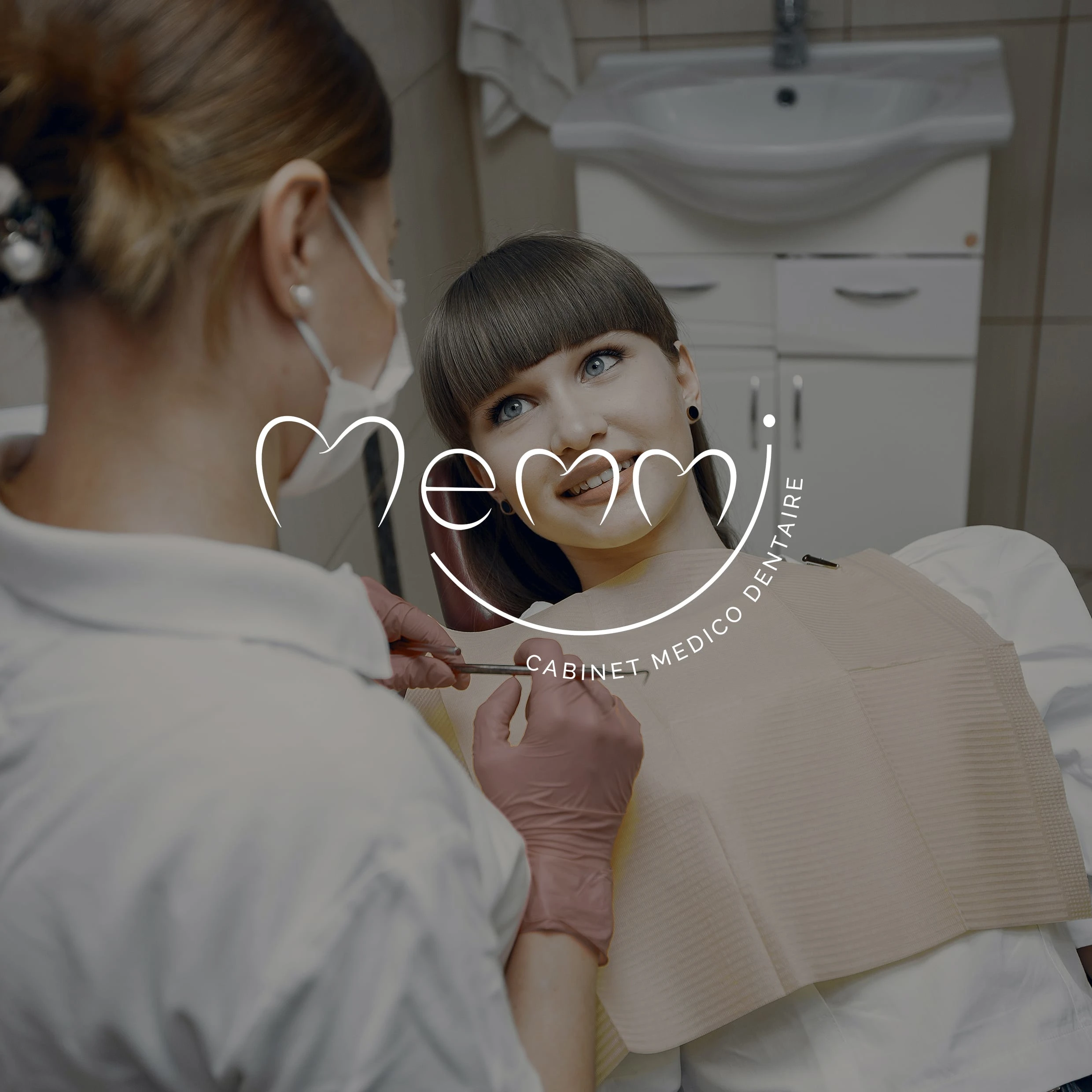
After 20 years of practice, a couple of dentists wish to develop their practice in order to welcome their son. They were looking for a fun and welcoming brand identity for their family business.
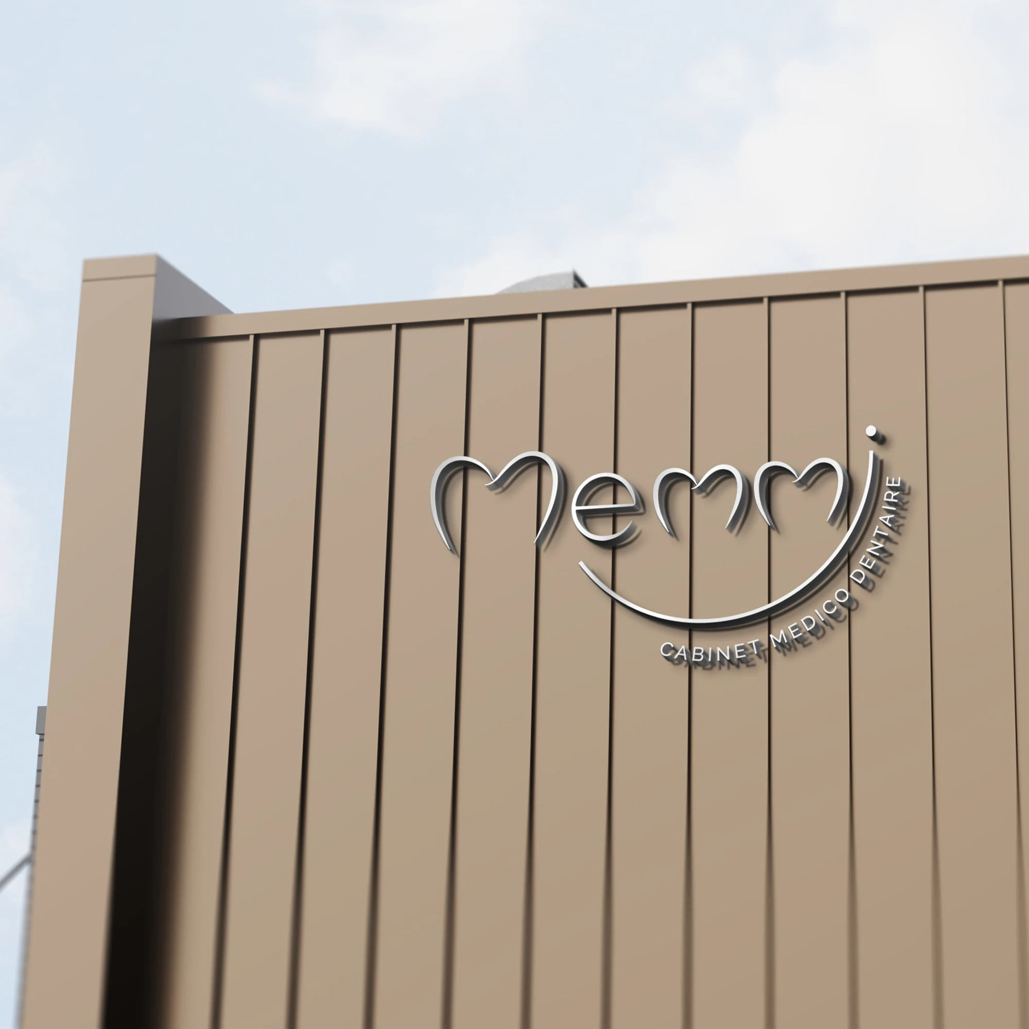
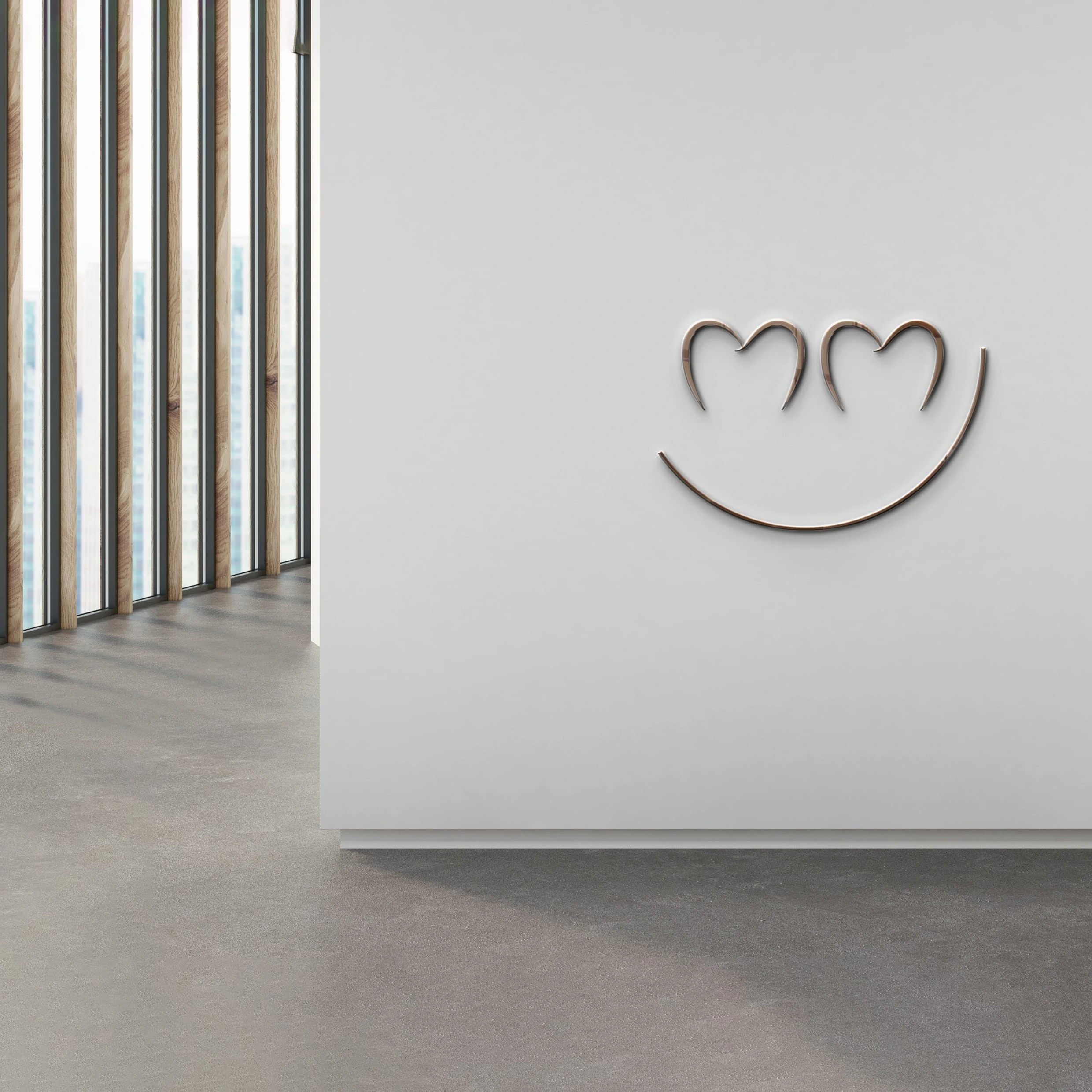
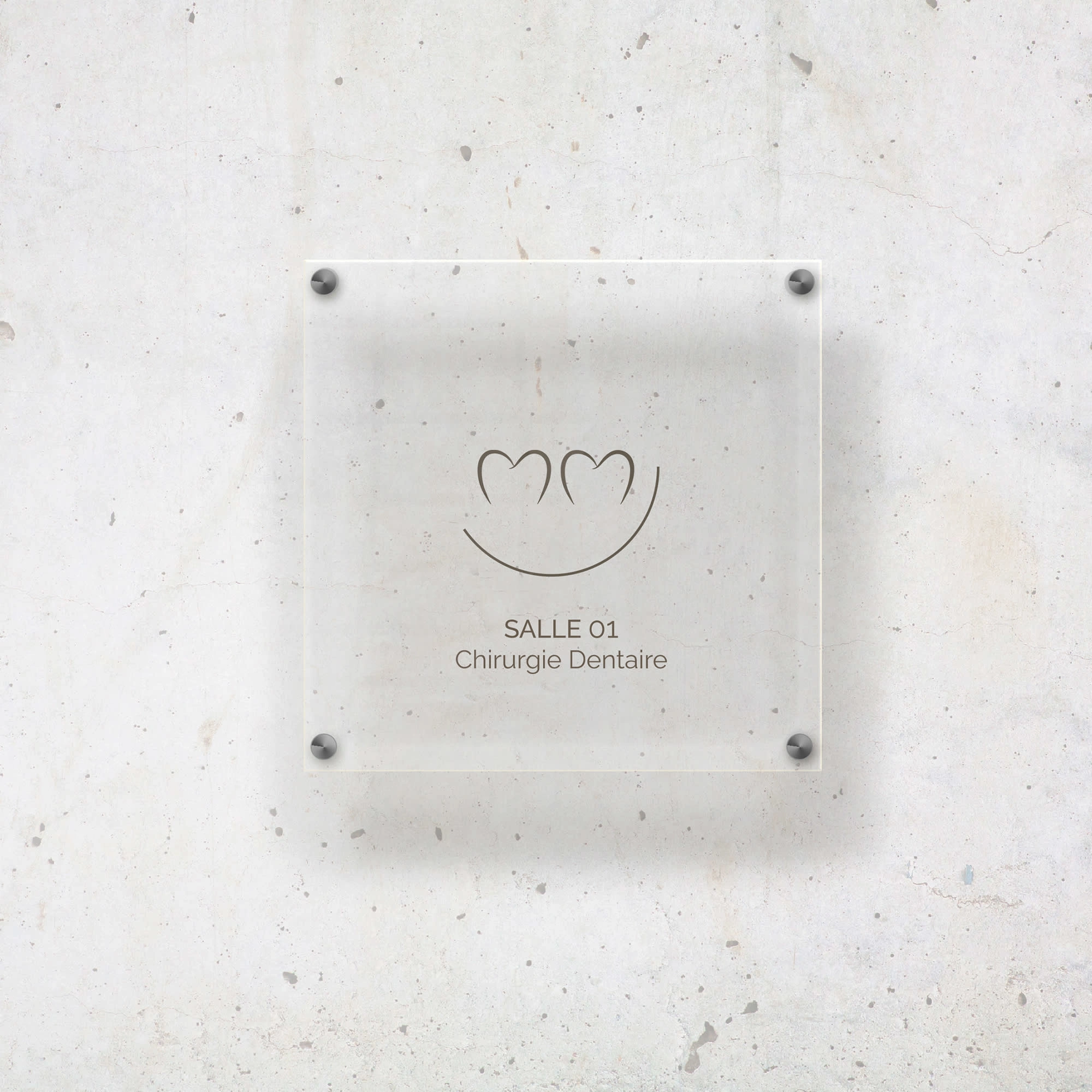
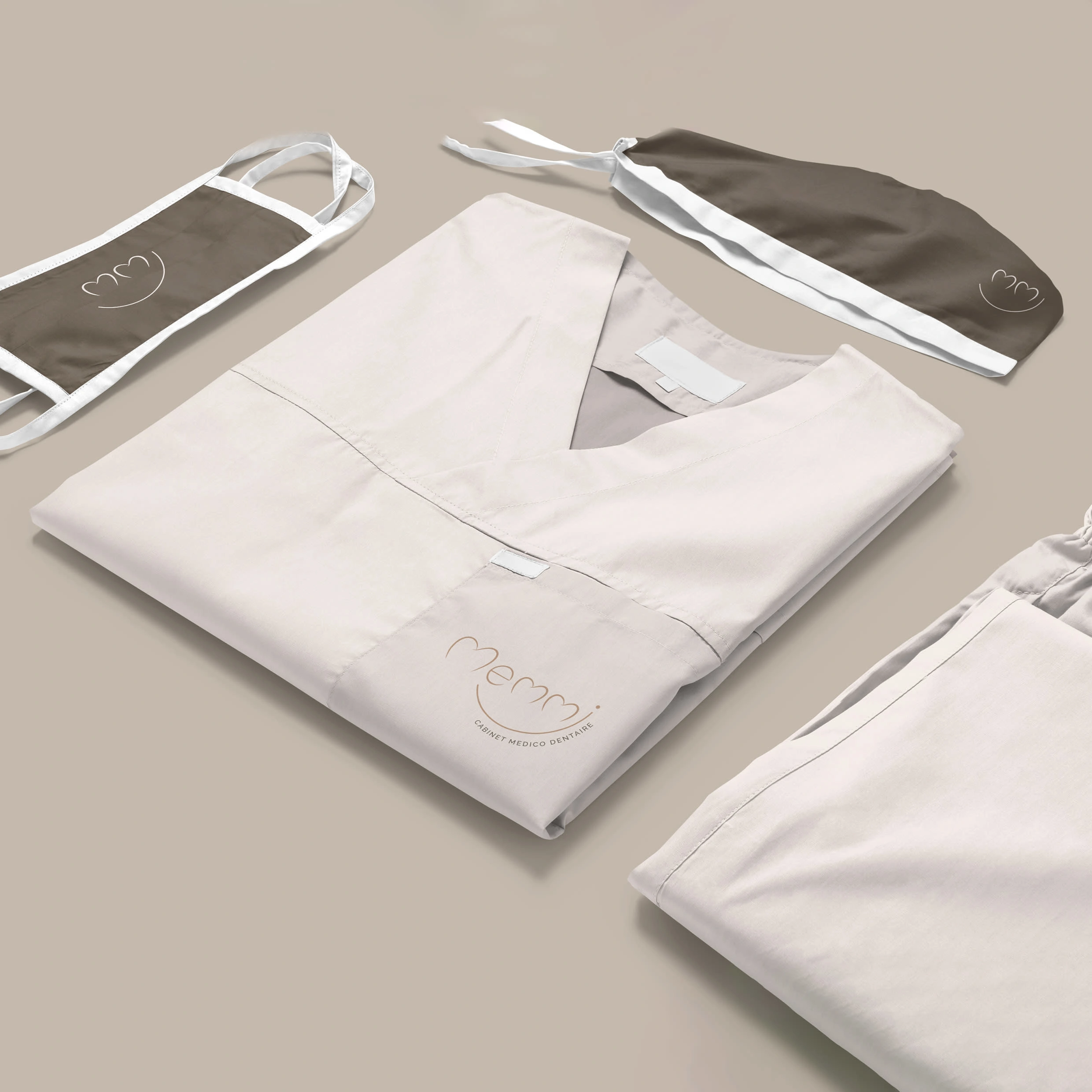
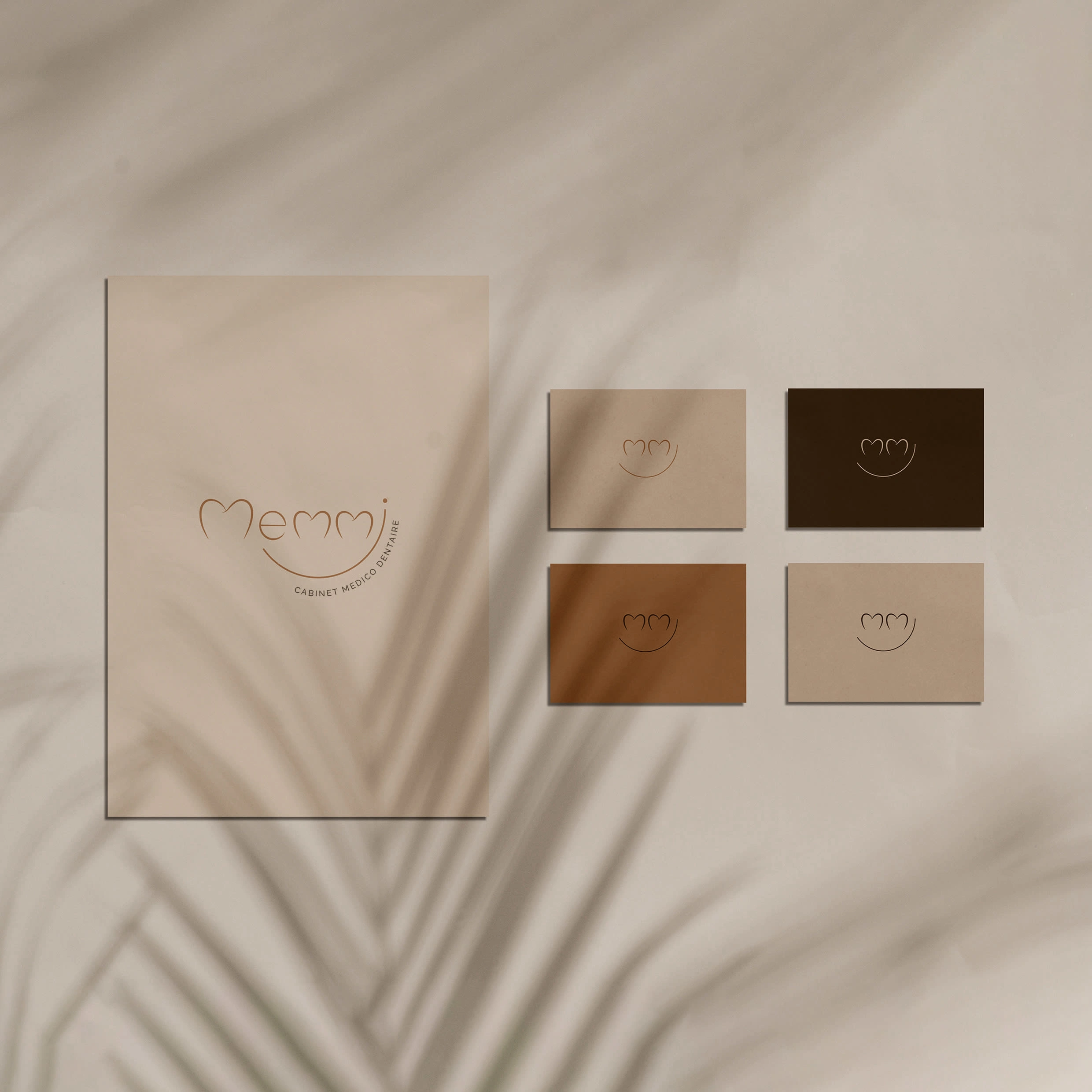
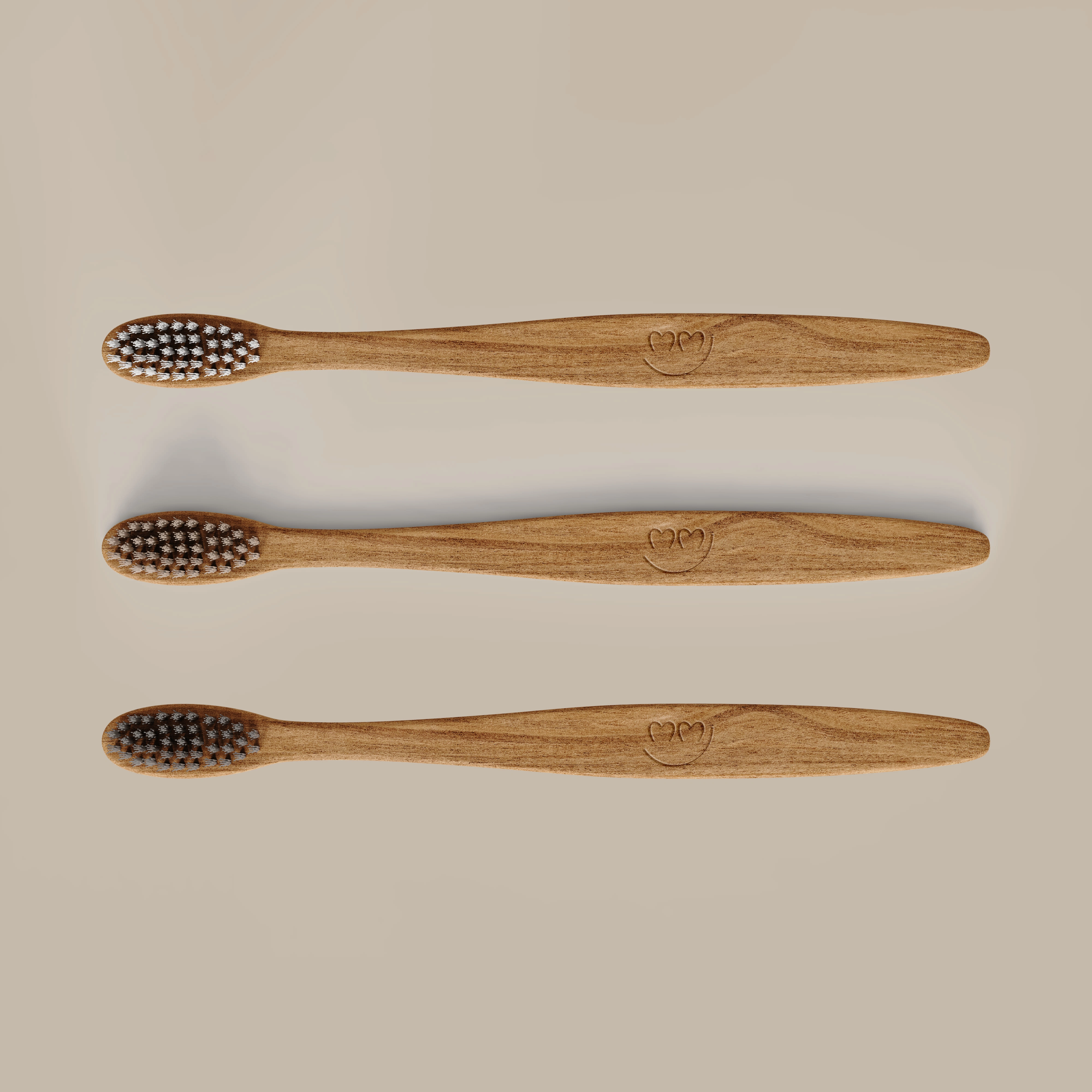
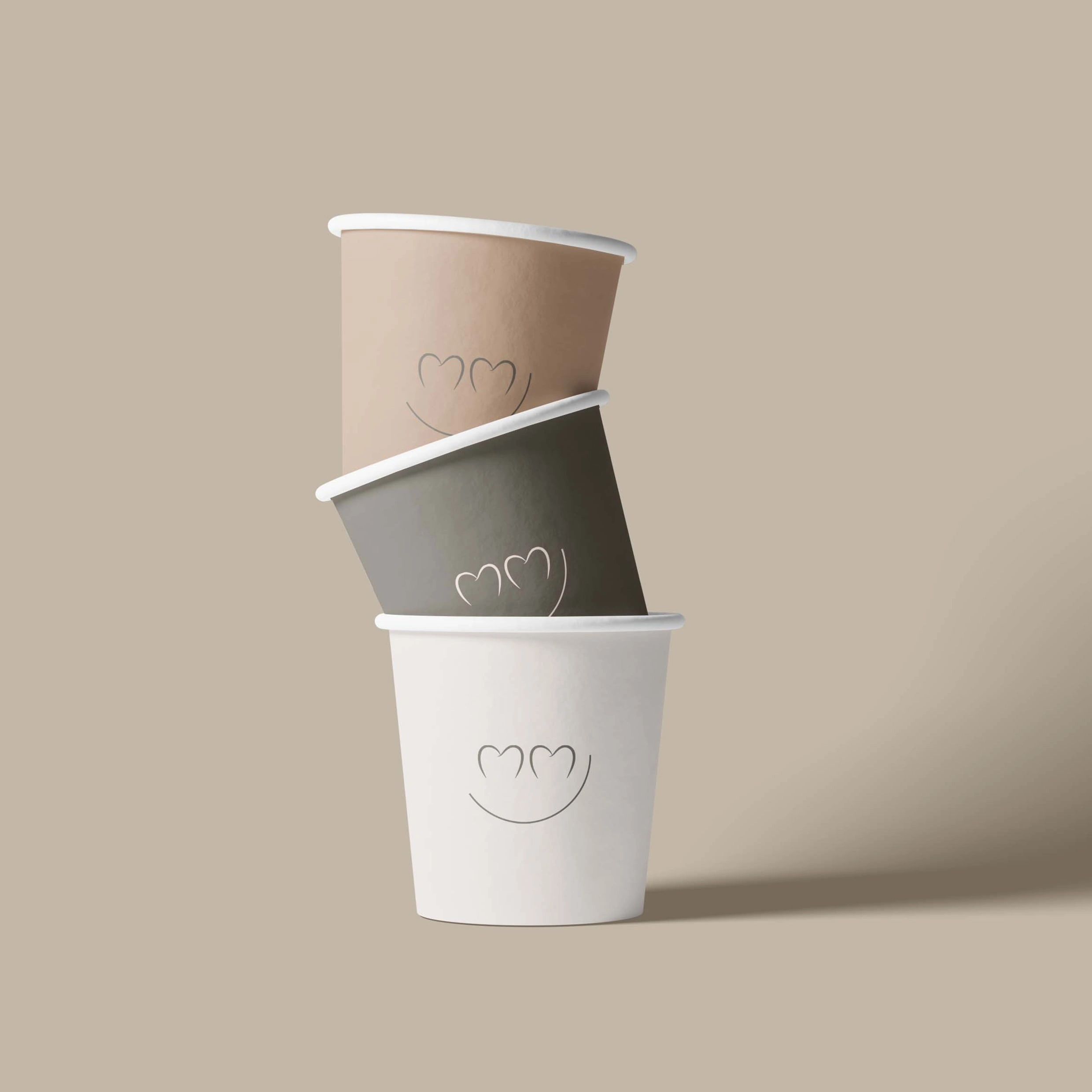
Their logo is based on their last name "Memmi" which features a typographic game to draw a smile. This smile is taken up in a secondary “smiley” logo, the initial M subtly evokes the tooth.
The overall identity is warm, welcoming and reassuring. A pleasant dental office where you want to treat yourself with a smile :)
Like this project
Posted Oct 10, 2022
Brand Identity for a dentist cabinet