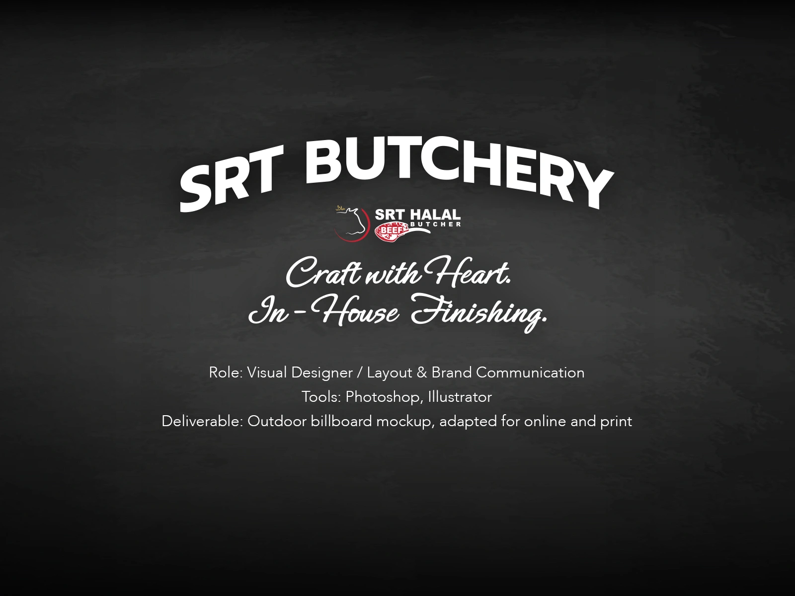
SRT Craft Butchery Visual Identity & Motion Set”

jimmy Puu Sattainwattana


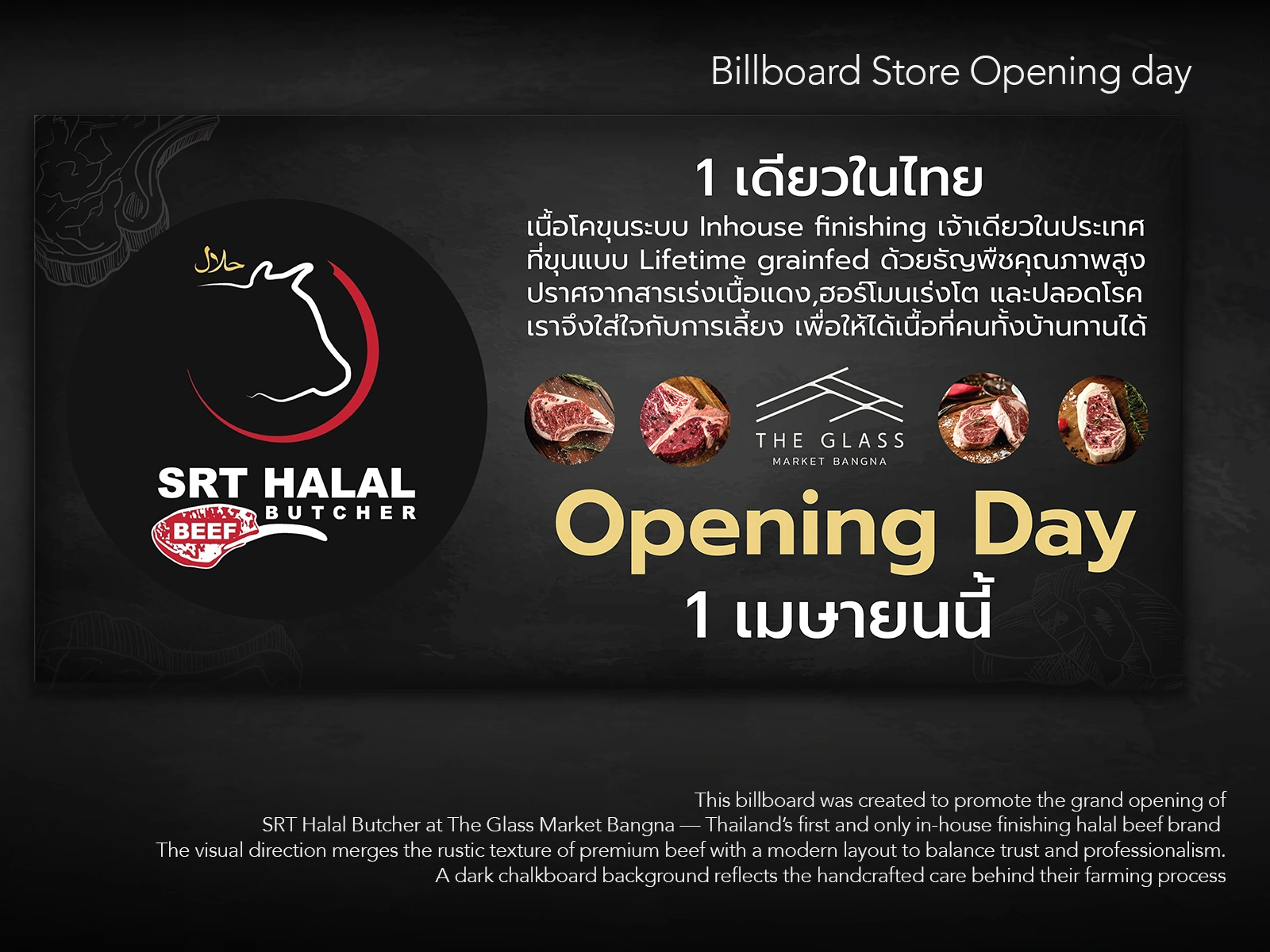
This billboard was part of the grand opening campaign for SRT Halal Butcher at The Glass Market Bangna — designed to quietly capture attention in a noisy space.
The goal was to create a bold yet trustworthy presence that could inform and invite walk-by customers within seconds — without shouting.
By merging rustic, handcrafted meat textures with a clean, editorial layout, the design bridges the warmth of traditional butchery and the clarity of modern quality.
A dark chalkboard-style background was used to echo the brand’s farming roots and ensure both typography and meat visuals stood out.
The tone strikes a calm, confident balance — a deliberate move to say:
“We don’t need to claim we’re different. Just look closer, and you’ll feel it."
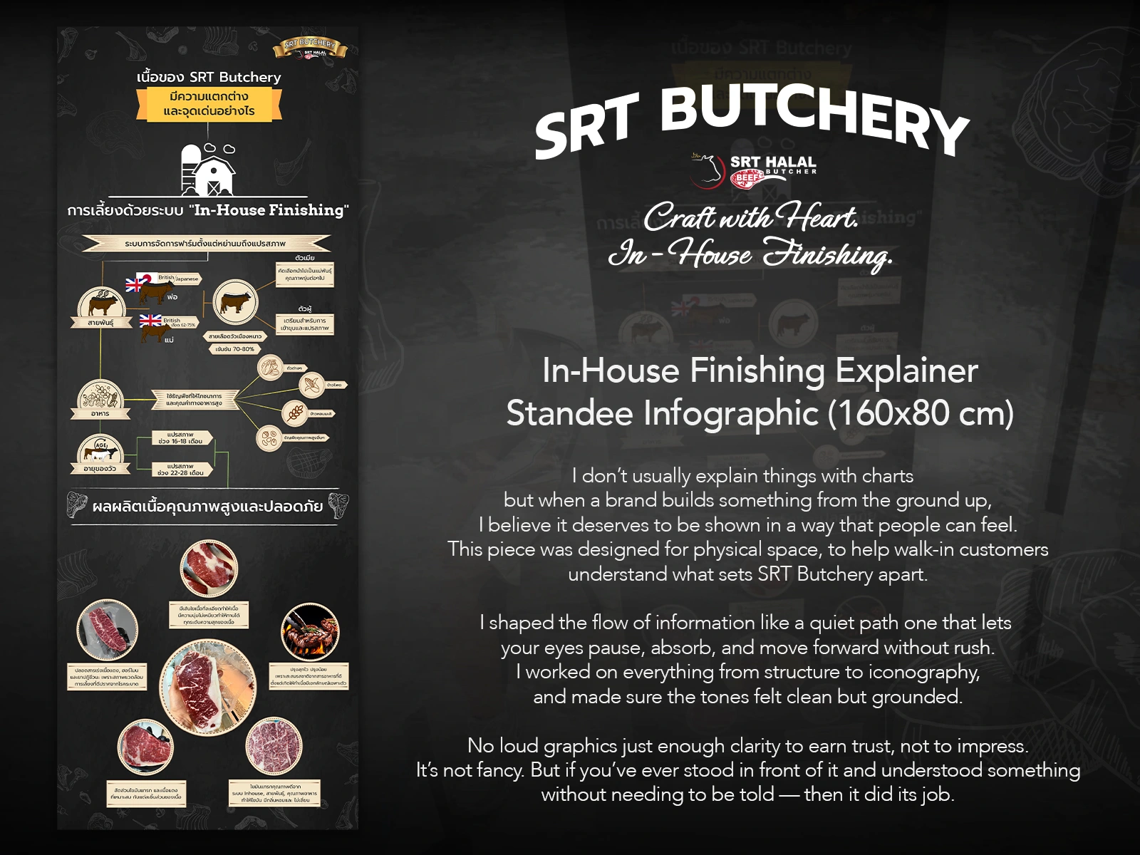
This 160x80 cm infographic was designed as a walk-by explainer for SRT Butchery’s unique in-house finishing process.
Instead of crowding it with facts, I chose to design a clean, quiet flow of information — one that lets viewers pause, feel, and move forward without being overloaded.
The layout works like a guided path, from breeding to feed to product quality, using calm tones and soft graphics that build trust instead of noise.
The goal? To earn curiosity and confidence at a glance.
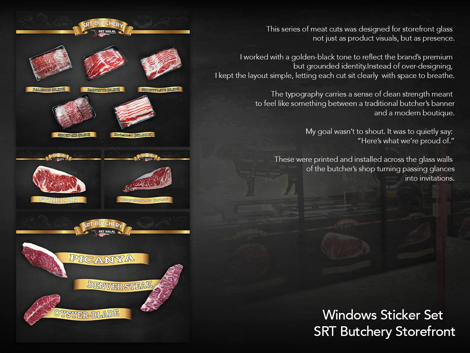
This storefront sticker series was created to build quiet confidence in SRT Butchery’s premium meat selection.
Each cut was individually styled, labeled, and placed with generous spacing to reflect care and clarity. The gold-and-black tone was chosen to balance a sense of premium craft with everyday approachability.
Typography was intentionally placed to echo traditional butcher signage — but pared down to feel like a boutique.
Rather than push product, the goal was to make the glass wall feel like an invitation:
“Here’s what we’re proud of.”
These were installed across the full length of the shopfront, designed to catch passing attention without shouting.
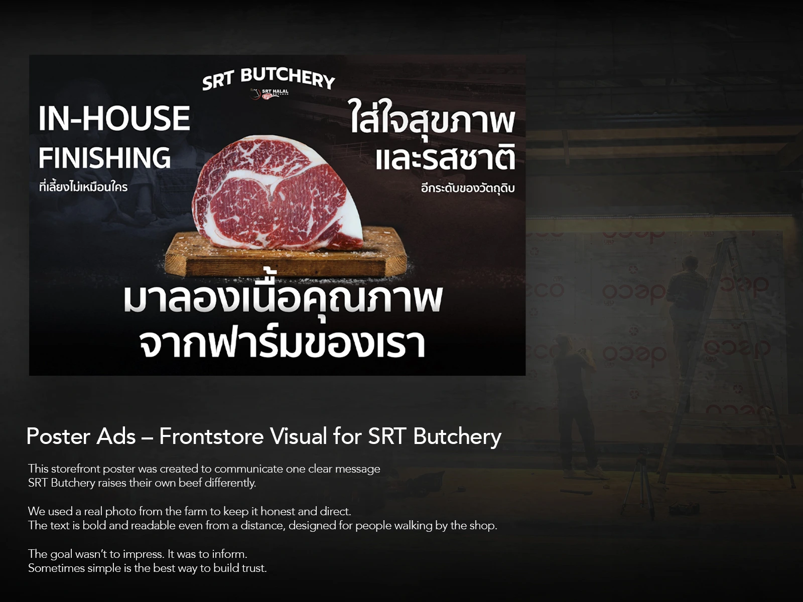
This storefront poster was designed to communicate one thing clearly:
SRT Butchery raises its own beef — differently.
The layout centers around a real photo from their farm to maintain honesty and directness.
Large, legible typography was placed to remain readable even from afar, targeting walk-by audiences in a crowded food mall.
Instead of aiming to impress with style, the goal was to inform with clarity.
A quiet presence that builds trust — not noise.
Like this project
Posted May 14, 2025
Developed motion and visual identity for SRT Butchery. Focused on trust, care, and clarity. Delivered in-store and billboard formats.
Likes
0
Views
3
Timeline
Mar 1, 2025 - Mar 28, 2025


Sunlight April
Gawr Gura Cosplay Photobook – Emotional Layout Study
A-Bit-Of-Thai-Tune
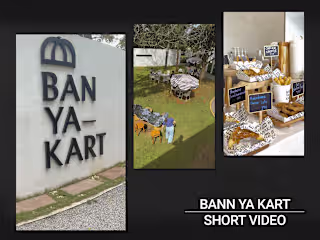
Ban Ya-Kart – A Quiet Moment at Khaoyai