logo II
Karina Cruz
A logo with a free-spirited nature.
Michèle Makepeace is in the Personal Development industry targeting people looking to make a living while also looking for flexibility and the ability to live life on their own terms. After working with her on banner ads, I was able to design a new logo for her company.
I presented the client with a few options; and although I had to adapt to a design different than my recommended design, the client was pleased with the final outcome.
Graphic Designer
Karina Cruz
Client
Michèle Makepeace
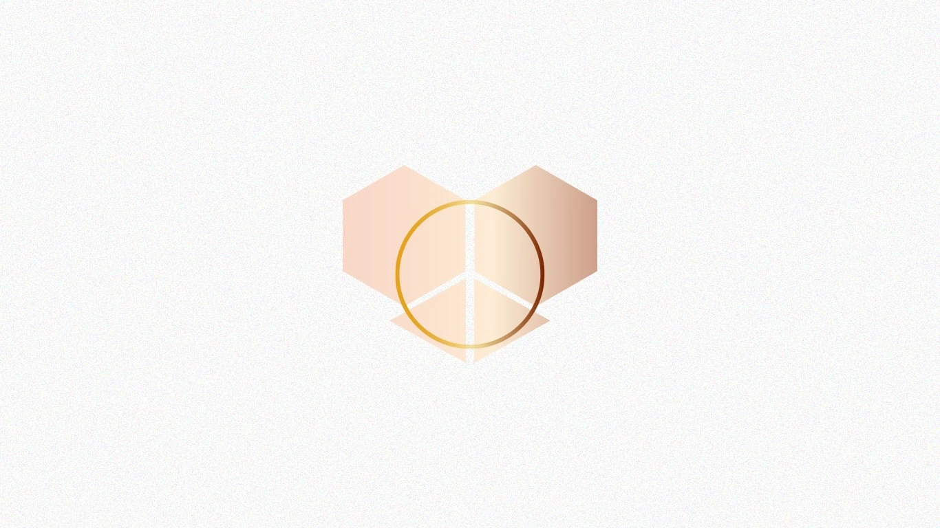
Recommended logo
This logo plays off the client’s name as well as their company’s story. This logo represents freedom in the form of a butterfly and the peace one gets from breaking away from traditional 9-5 work structures. The peace sign is a reference to the client’s name: Michele Makepeace.
Recommended Logo | Mock-Up
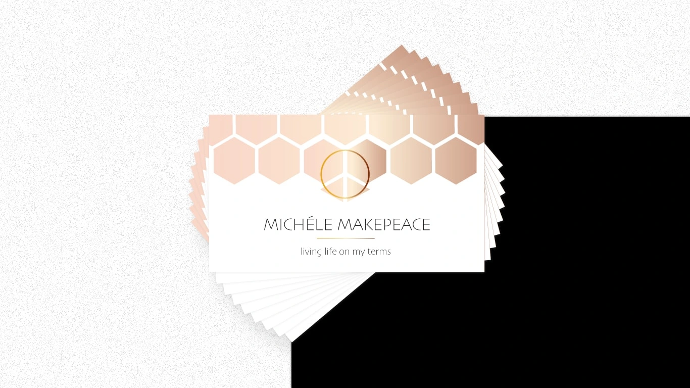
An example of the logo on a business card.
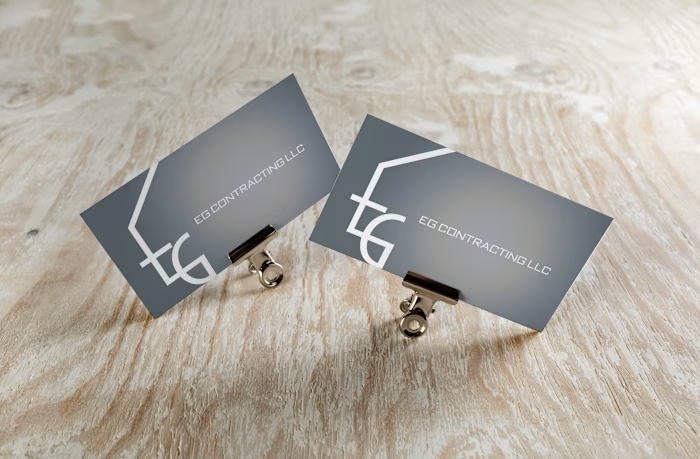
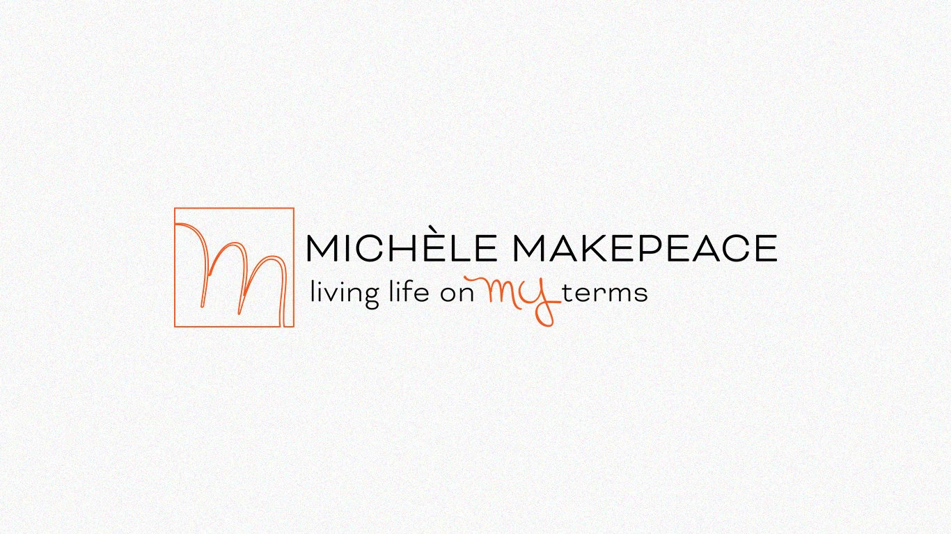
Final Logo
The client chose this versatile logo with. a simple M outline. They especially like using it with bright colors to evoke happiness.
Final Logo | Mock-Up
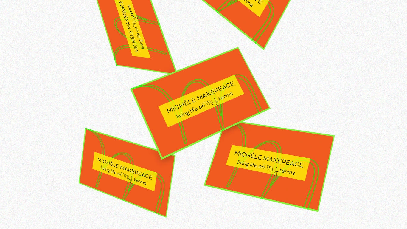
Here the logo is seen on brightly colored business cards.
Like this project
Posted Oct 5, 2023
A logo for a free-spirited brand.
Likes
0
Views
7