This section outlines the supporting
AUNG ZAW TUN
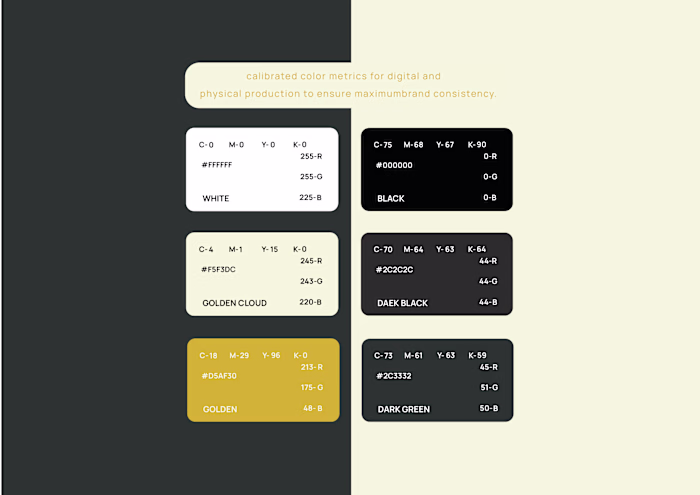
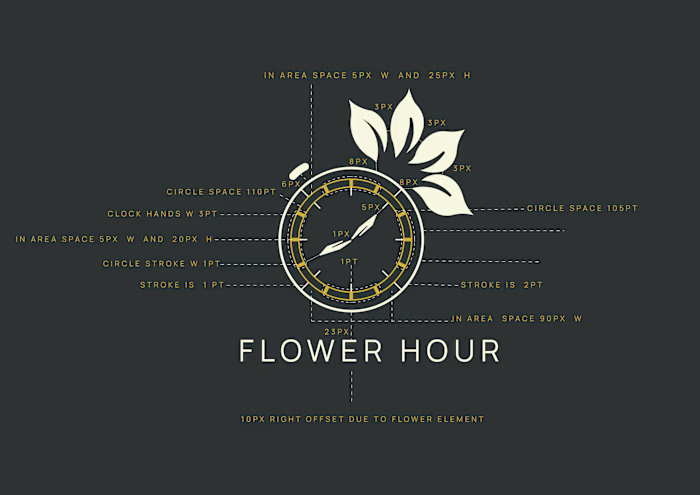
This section outlines the supporting visual elements of the 'Flower Hour' brand identity. I carefully selected the primary and secondary typography to ensure clarity and to complement the brand's elegant tone. To maintain visual impact, I established a Logo Safe Zone (Clear Space) rule, ensuring the logo remains unobstructed and prominent in any layout. Additionally, I developed a custom brand pattern derived from the logo’s floral motifs, which adds a layer of sophistication and versatility to the brand's physical and digital applications. These elements collectively reinforce brand recognition and professional consistency.
Like this project
Posted May 28, 2026
This section outlines the supporting visual elements of the 'Flower Hour' brand identity. I carefully selected the primary and secondary typography to ensure...