WRITE WISE Case Study: A Framer Website Development

Shahmeer Khan | AirWeb360
0
Web Designer
Low-Code/No-Code
Framer Designer

ChatGPT

Figma

Framer
Overview
This case study describes the development of a modern website template that was created as an example of advanced design and front-end development techniques. The project was conceived as a platform to experiment with and showcase innovative design ideas, modern user experience (UX) practices, and responsive layouts that adapt seamlessly across devices. The template was meant to be an inspiring and functional design that will provide a solid starting point for web projects to come.

Design Objectives
From the start, the project was directed by several important design objectives:
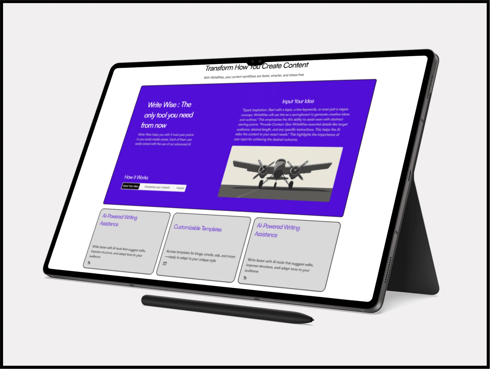
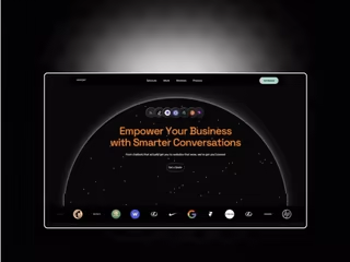
Clean and Modern Aesthetics: Minimalism and clarity are at the heart of the design. Using whitespace, subtle color palettes, and crisp typography ensure content stands out.
User-Centric Experience: Each element was built with the rough final user in mind, so that navigation, readability, and interactivity are seamless and engaging on the site.
Responsiveness and Accessibility: With consideration for the varied devices of the users and needs of accessibility, the template is fully responsive and follows best practices in accessibility, ensuring a smooth experience for everyone.
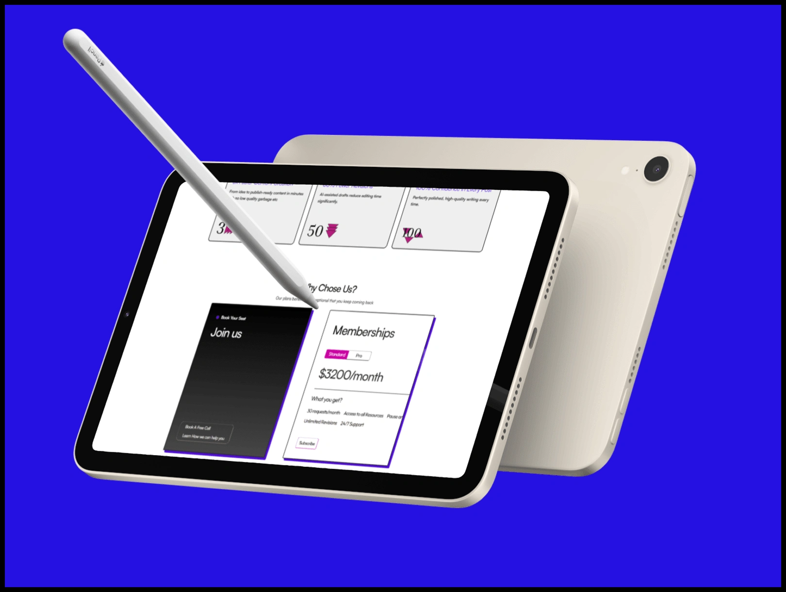
Flexibility and Scalability: By keeping the design modular, the design allows for easy customization and expansion, making it a versatile base for a range of potential web projects.
The Design Process
Research and Inspiration
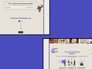
The project started with a design in mind already and found an inspiration (Beehiiv) for ittrends and the analysis of successful websites in different industries. Inspiration was drawn from minimalist layouts, intuitive navigation systems, and the effective use of visual hierarchy. This research phase was critical in establishing a clear vision that balanced aesthetics with usability.
Visual Design and Iteration
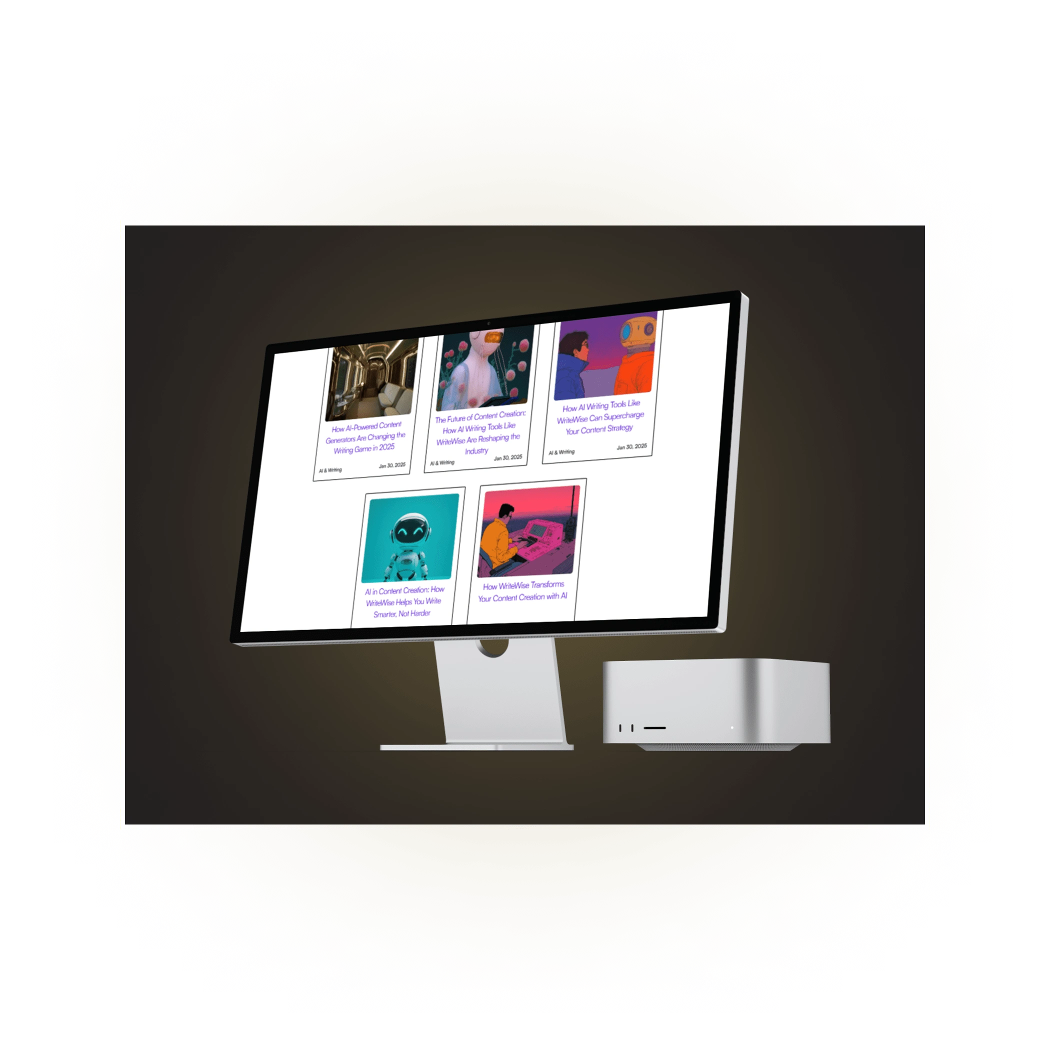
The visual design phase involved testing different screen layouts through typography, color schemes, and imagery. The selected palette is understated yet cutting-edge, bringing forward a sense of professionalism while still remaining accessible. Typography was carefully chosen for readability across varying screen sizes, while high-quality imagery was optimized for performance without reducing its visual impact. Feedback from iterative cycles of testing led to refinements that improved aesthetics along with functionality.
Visual and Interaction Design
Layout and Structure
Grid-Based Layout: A strong grid system is the backbone of the template, making sure that content is properly structured and aligned. This makes it not only visually appealing but also consistent in different sections.
Whitespace Utilization: Generous spacing between elements creates a sense of openness, allowing users to focus on the content without feeling overwhelmed. This strategy is key in guiding the user’s eye flow and emphasizing call-to-action areas.
Typography and Color
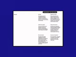
Typography: Only Satoshi font is used in all headings, body font and buttons etc
Color Palette: The chosen color scheme reinforces the template's modern aesthetic. Soft background tones are paired with accent colors to highlight important elements, such as buttons and links. This not only enhances visual interest but also improves usability by directing attention to actionable items. The primary and secondary colors were pink and purplish blue
Navigation and User Interaction
Intuitive Navigation: The navigation structure is clear and easy to use. A navigation bar, or an equally accessible menu structure, means that key sections are always available without requiring a great deal of mental effort, making it easier to access important content quickly.
interactive Elements: Subtle animations and hover effects enrich the user experience by providing visual feedback. These micro-interactions contribute to a dynamic and engaging interface without distracting from the overall content.
Technical Considerations
Responsiveness
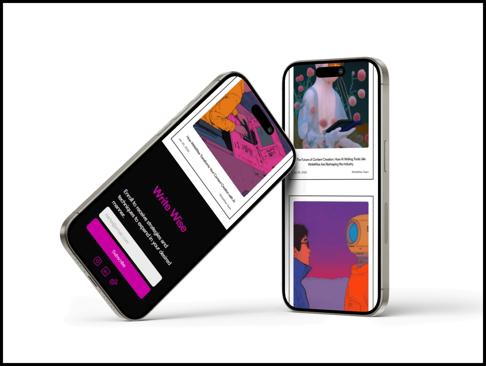
The design of the template scales nicely across a variety of devices, from large desktop monitors to smartphones. This is done by using responsive design techniques so that layouts, images, and text adapt smoothly to different screen resolutions.
Challenges and Learnings
Creating a website template also entails several challenges:
Balancing Aesthetics and Functionality: The right balance between a visually appealing design and a highly functional interface was something that required continuous iteration. Early prototypes helped refine the design to ensure that decorative elements did not compromise usability.
Ensuring Cross-Device Consistency: Achieving a uniform look and feel across multiple devices demanded rigorous testing and responsive adjustments. This process reinforced the importance of a flexible grid system and fluid layouts.
Performance Optimization: Creating strong graphics with instant load time was a double-edged sword. It only required the monitor of constant performance against aesthetic demands for fine-tuning changes in both directions.
This process brought valuable insights and further refinements that eventually improved the overall quality of the template.
Conclusion
This website template represents the very epitome of modern web design: aesthetic sophistication fused with user-centricity for creating a richly versatile online experience. It carefully plans through iterations, emphasizing both performance and accessibility, thereby effectively delivering a strong foundation adaptable for a vast spectrum of future web projects.
Like this project
0
Posted Feb 6, 2025
This is a Framer Website Development called WriteWise
Likes
0
Views
0
Tags
Web Designer
Low-Code/No-Code
Framer Designer
ChatGPT
Figma
Framer

Shahmeer Khan | AirWeb360
We Design Internet

GrowWithUS AI Chatbot & Lead Gen Agency | Framer Design & Dev
Framer Design Template | Framer Development
Designer Portfolio | Customization
Bidly Landing Page Design | Framer Development