Jejak Pâtisserie - Branding and packaging
Reyhan Triadi
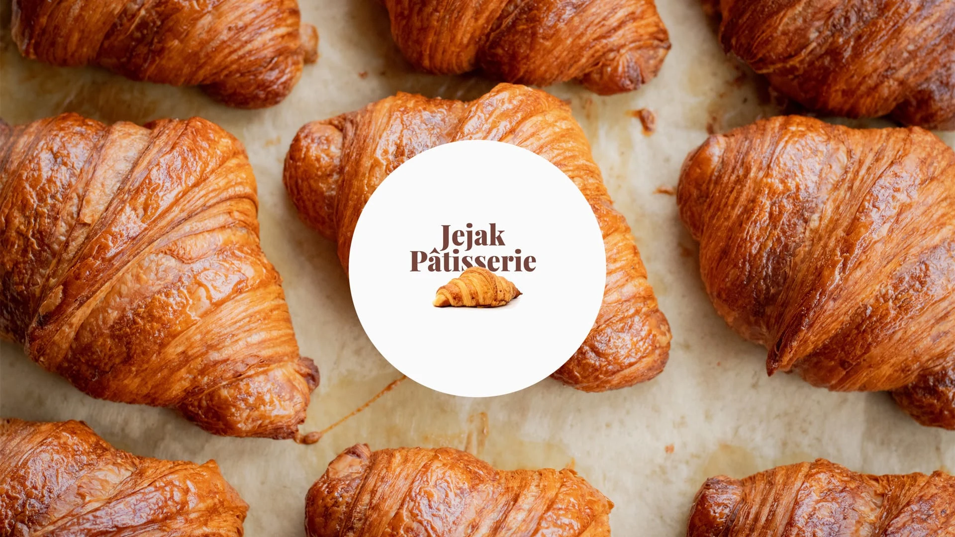
Jejak Logo
Jejak Pâtisserie embodies the exquisite fusion of French baking traditions with the vibrant flavors of Indonesia. Our name, "Jejak," meaning "trace" or "footprint" in Indonesian, symbolizes our journey to trace and blend these rich culinary heritages into delightful pastries.
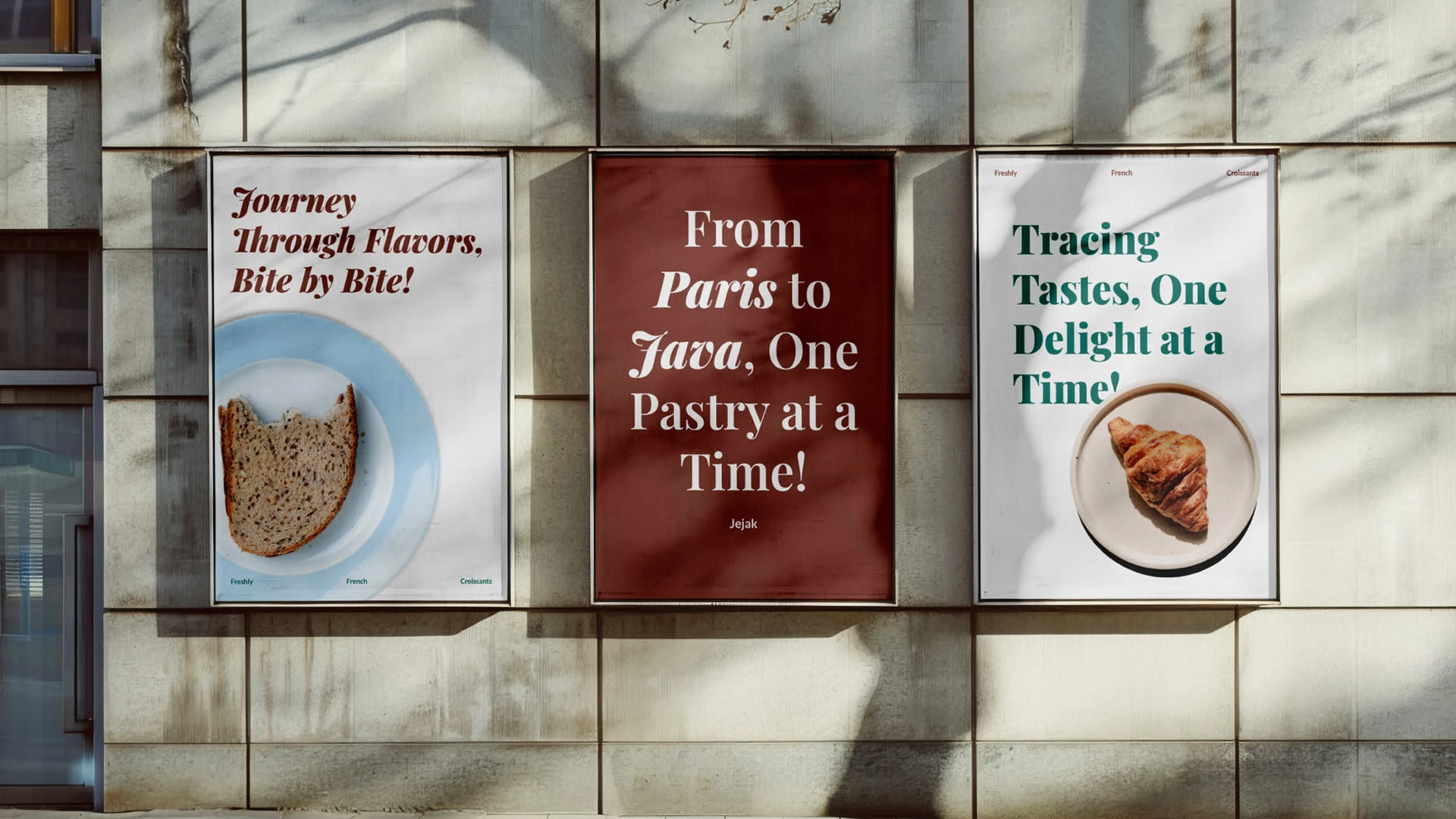
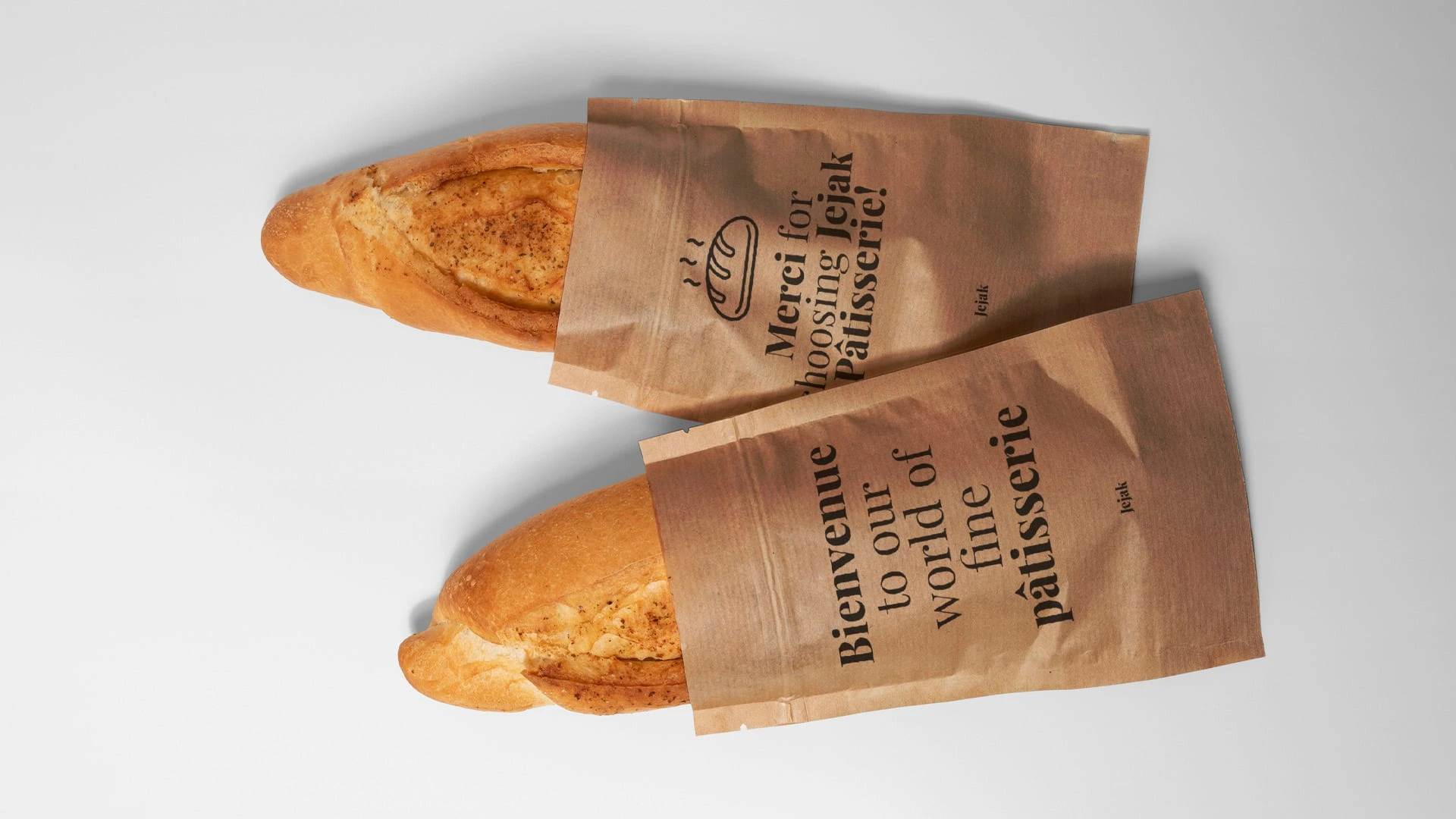
To strengthen Jejak Pâtisserie’s brand identity and effectively convey our story and values to consumers, we developed a comprehensive branding package. This package includes an identity system, a distinctive logo, and thoughtfully designed packaging, among other elements.
We chose terracotta and green as our primary brand colors to embody the essence of our unique fusion of French elegance and Indonesian warmth.
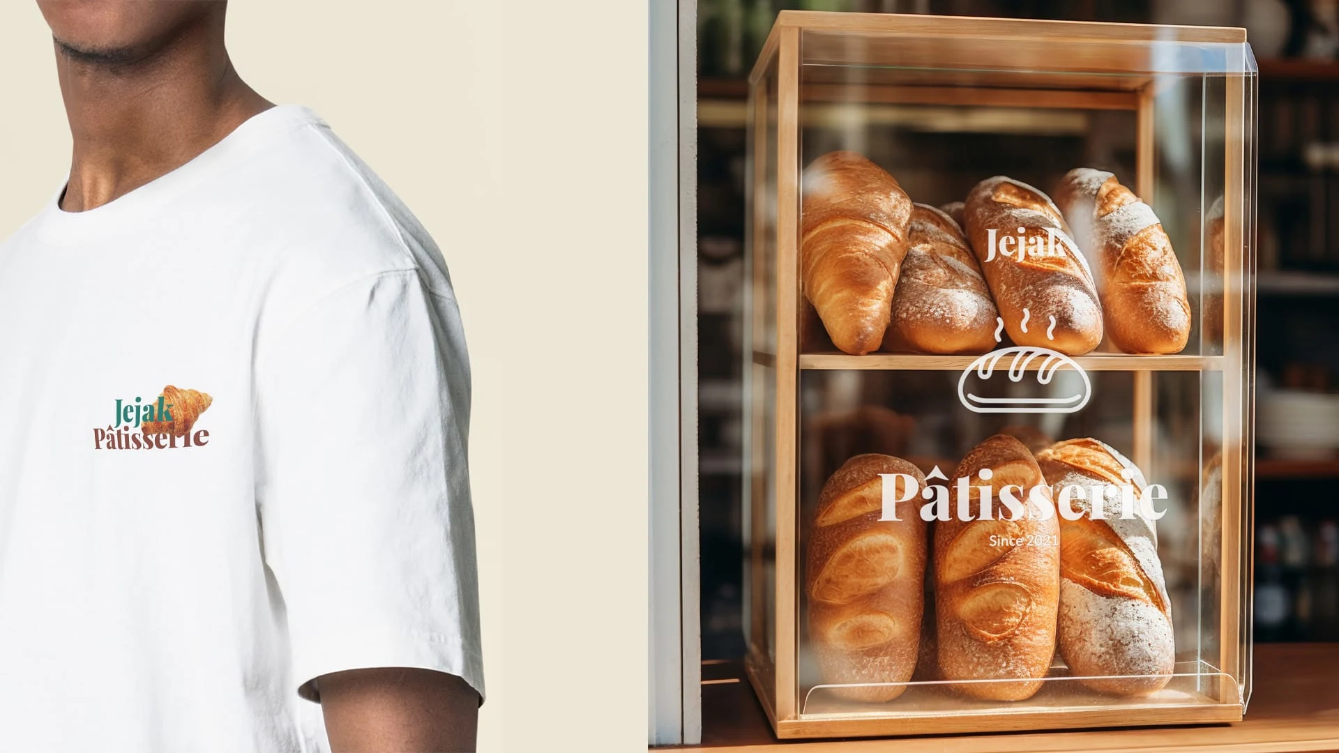
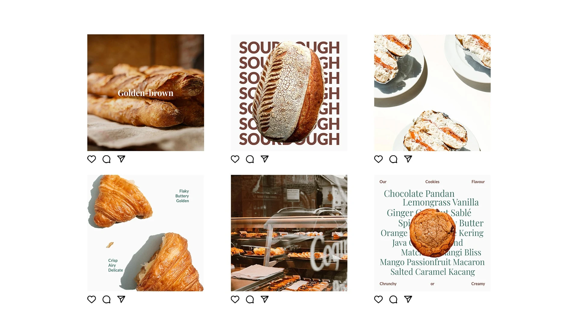
Choosing Playfair Display and Lato to reflect the brand blend of French elegance and Indonesian warmth. Playfair Display, with its refined and traditional serif style, mirrors the artisanal craftsmanship and timeless quality of our pastries. Complementing this, Lato's modern, clean sans-serif design ensures readability and a contemporary touch, making our brand both sophisticated and approachable. Together, these fonts create a harmonious balance between tradition and modernity, perfectly capturing the essence of Jejak Pâtisserie.
Like this project
Posted Jun 14, 2024
Jejak Pâtisserie, Where French elegance meets Indonesian warmth in every bite.