Premium high-end website design for Parisian Restaurant

Eldar Dizdarevic


The Room Looked Expensive. The Website Didn't.
Le Royal is a brasserie on Rue Saint-Honoré, a few minutes from the Louvre. Blue velvet, white tablecloths, gold lettering. It's been there a long time and it looks like it.
Then you opened the website and it felt like a different place.
Long paragraphs of French prose about the warmth of the welcome and the charm of an era gone by. Centred text. A gallery. Nice to read, but it wasn't selling anything.
Old Website
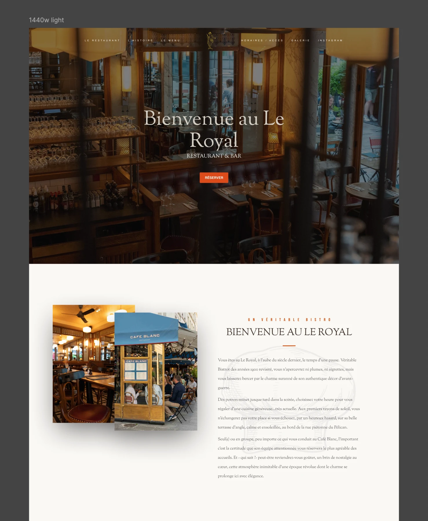
Le Royal's old website design (before Eldar's redesign)
For years the room did the work. People walked past, looked in, came back. Online you don't get that. You get type, photos, motion and speed, and that's it.
So the job wasn't to make it prettier. It was to make it feel like walking in.
Three other things were broken.
The booking form wasn't connected to anything.
There was no reservation or privatisation system. They host private events and there was no way to ask about one.
And SEO didn't exist. Everyone who ate there had walked past the door first.
The Process
I sat one day and mapped all of the competitors. What works for other restaurants. What makes them more premium. What makes some of them show up in AI results.
The results were obvious.
Clearer positioning. Not "best restaurant" but "restaurant that does X for Y in this area."
Hours, address and menu as real text, not inside images.
Pages that answer one question each.
The same info everywhere the restaurant is listed.
So I started on it.
Logo Explorations
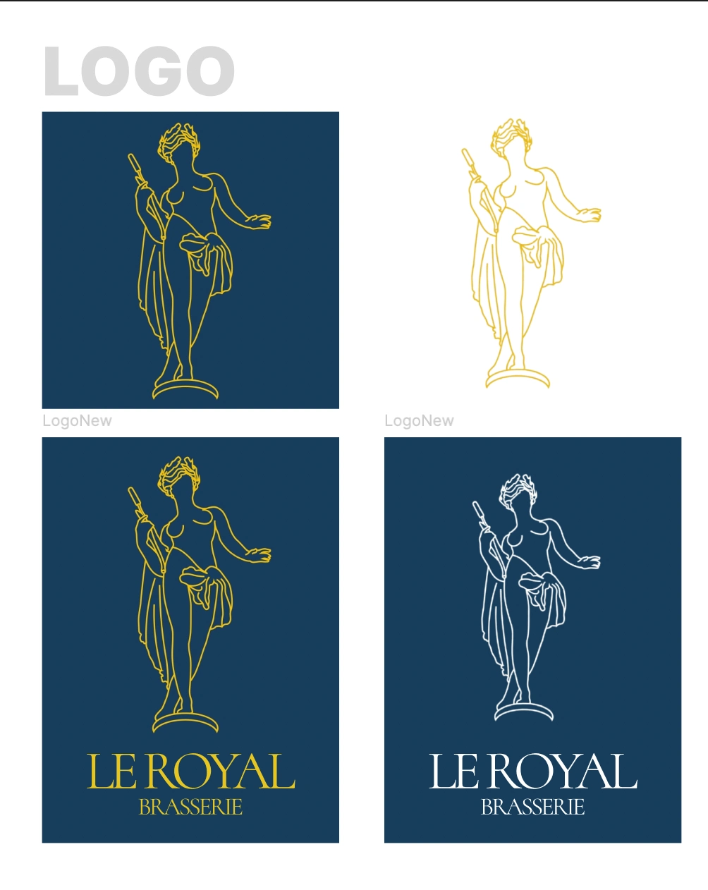
Brasserie Le Royal - Logo Explorations
New Website Feel & Look with GSAP animations
Brasserie Le Royal - New website feel
Hero and Covers
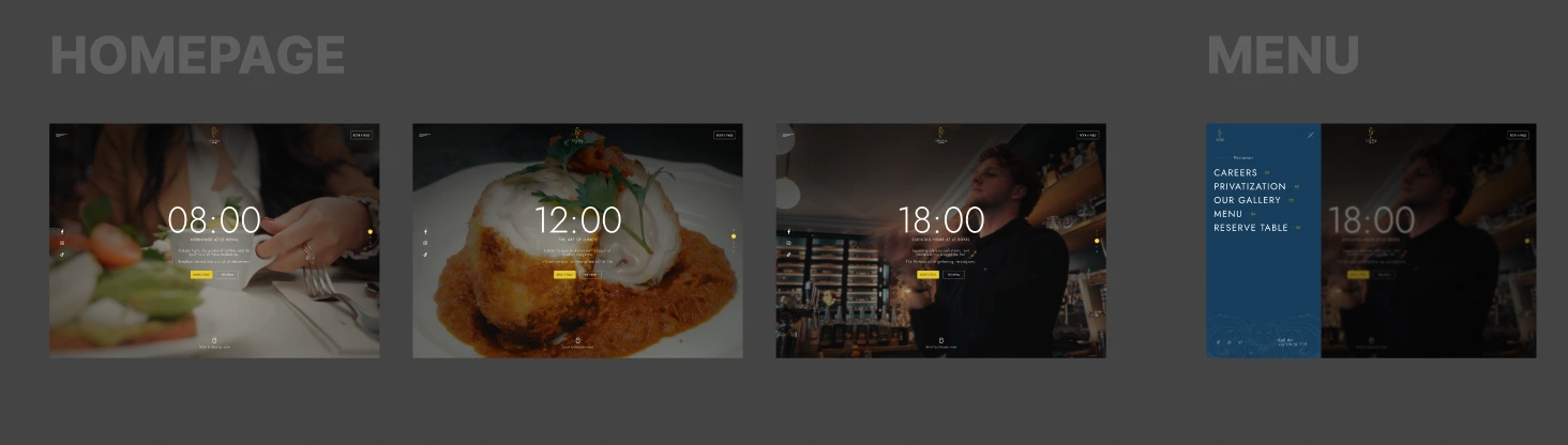
First hero versions + opened menu state
Content Sections
Then the client asked for one more thing. He wanted to show up in ChatGPT, Perplexity, Claude and Gemini.
That's harder than it sounds, because most of what makes a restaurant site feel expensive is invisible to those models. Video heroes. Text inside images. Scroll animations. A homepage with just the name in serif, centred.
A model reading that finds a name and a phone number. It can't tell you if they take reservations, if you can book the upstairs room for twelve people, or if they're open Sunday.
So I built it twice. Once for the person scrolling, once for the machine reading.
Every animated section has a plain answer inside it. Hours as text. Menu as text. The privatisation page written as an answer to "can I book a private room near the Louvre."
Organization, Restaurant and FAQ schema. llms.txt. Robots. An AI info page with all the business details in one place.
Then GSAP on top of all of it, multiple scripts, and still 90+ on Pagespeed.
That part took the longest.
The Actual Work
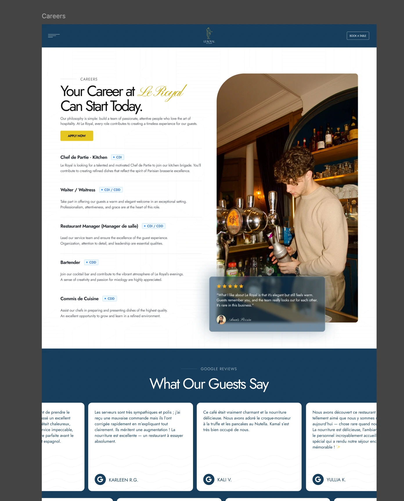
Careers Page for Brasserie Le Royal Paris
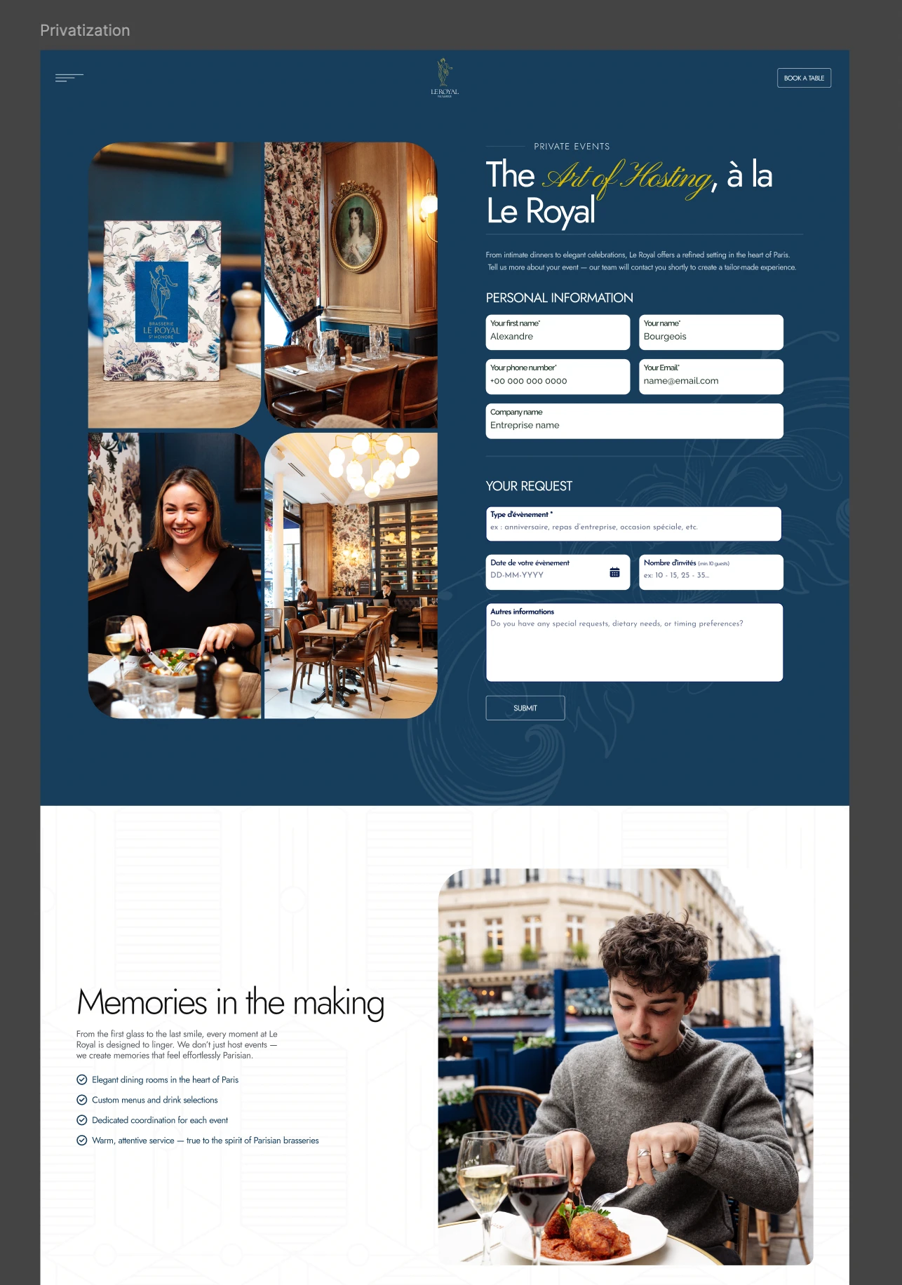
Privatisation Form Page - Custom Booking Reservation System & Page for Restaurant Brasserie Le Royal in Paris
What I Learned
The easy mistake here was making it look new.
A place like this isn't competing with the new restaurants. The whole point is that it was there before them. If I designed it like a 2026 launch I'd have thrown that away.
So it behaves like a new site and feels like an old one. Fast, animated, structured for search and for AI, but still blue velvet and gold serif when you look at it.
Like this project
Posted Sep 13, 2026
A Parisian restaurant site designed and built in Webflow. Most restaurant sites list dishes. This one makes you feel the room before you book a table.
Likes
0
Views
5
Timeline
Aug 13, 2025 - Sep 1, 2025

